Design Skills 1

In class I have learned a number of skills that have aided in the production of my magazine.

Production Skills

One production skill that I have learned in the creation of this magazine is how to arrange production meetings and effectively lay out an agenda. I have managed to create clear plans as to how my photoshoots will proceed, including location, materials needed, direction of my model, and composition of the images themselves. On top of this, I’ve also learned how to incorporate mise-en-scene to convey a certain message as effectively as is possible.

Design Skills

An example of a design skill that I have learned in InDesign is the manipulation of fonts. I’ve learned that by changing aspects such as the height, spacing, width, thickness, size, and italicization, fonts can convey vastly different messages while still remaining in the same family of fonts.

A skill that I have learned in Photoshop is the ability to adjust the colour levels in my images in order to make them as clear as possible. Previously, I only know how to change the brightness on the basic slider, but I now know how to use the different light levels to finish with a more balanced end result.


A New Improved Front Page

Magazine Cover 2nd Draft

Side by Side Comparison

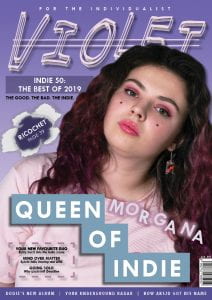
In order to improve on my first draft, I followed up on the feedback that I was given for Draft 1. The main 5 targets that I set myself were:

  • Work in Photoshop to improve the edit of my cover star
  • Add all necessary information by the barcode
  • Use a different, better body text
  • Ensure all features match colour scheme
  • Remove the border from the cover

I have used more consistent body fonts in this draft in order to make the cover look more put together. I did this by sticking to fonts from the same family, which I feel made my cover look a lot more consistent stylistically.

I’ve also improved on the consistency of the colour scheme, and have now ensured that I stick to 3 main colours, as well as black and white: pinks, purples, and blues. In doing this I think that the overall aesthetic of the cover is a lot more consistent, improving its overall appearance.

I removed the border from the cover, as I felt it looked clunky, and that it didn’t work with the rest of the draft.

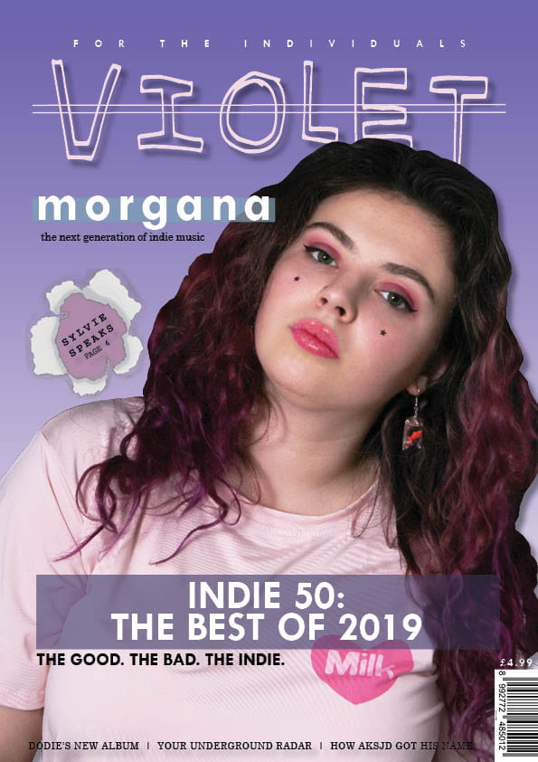
One of the significant changes I made to my cover from the first draft to this draft was the rearranging of the cover lines. Before, the cover line of ‘Indie 50’ was featured below the photo of my cover star, Morgana, and took up a very large portion of the page. On the contrary, the cover line of ‘Morgana’ was fairly small and next to my model’s head. I feel that this arrangement didn’t make much sense since Morgana was the cover star of the magazine, and so should be the main focus of the cover itself. To alter this, I switched the positions of these titles, and also added the line ‘Queen of Indie’ to gain the audience’s attention and interest. I edited the appearance of the logo ‘Morgana’ in order to make it more visually interesting.

I altered the pug of the magazine to say something more fitting contextually than what it was previously. As the pug’s appearance is of paper that has been burst through, I felt the word ‘Ricochet’ made more sense, as if a bullet had ripped through the paper.

The bottom of the magazine previously was plain text directly over the image of my cover star, with a drop shadow behind it. An issue with this was that the colour of the text blended into my star’s hair, and so became quite illegible at points where it crossed over. To remedy this, I placed a small block of colour over the lower portion of the cover and placed the text over this, enabling it to stand out more and be significantly more legible.

In the photo of my model, she is wearing a t-shirt with a logo of a pink heart with the word ‘milk’ written inside it. As this didn’t link with anything to do with my star image, I covered this with the line ‘Queen of Indie,’ as it didn’t add anything to the overall look of the cover.

I edited the formatting of the text above my masthead slightly, and changed it to ‘for the individualist’ as I felt it sounded better.

I increased the size of my masthead as I felt it wasn’t big enough previously, and italicized it slightly to add the home-made feel that the Indie genre is associated with.

In draft 1, I only had 2 cover lines on the magazine, so I added some extra lines and brief descriptions of their articles below them.

Targets

My main targets for the next draft of my cover are:

  • Re-cut out my star’s hair in order to make it less clunky
  • Add further information (publish date, issue number)
  • Ensure that my fonts are still within the same family, by with slight alterations to increase variety

Draft of Front Page

First Draft of the Front Page

Feedback from the 1st Draft

  • Don’t like the border around the edge
  • Masthead – Good font, nice bold drop shadow, strike-through needs to be bolder
  • Possibly change plug to ‘for the individualists’ instead
  • ‘Morgana’ cover line font good, change background colour to match scheme more, shorter body text and a different font
  • Pug good, nice effect
  • Editing around model’s hair looks messy, don’t keep the logo on the shirt if it’s not going to have any significance
  • Remove negative in main cover line, consider the design of it more
  • Include issue date and price by barcode
  • Bolder cover lines along the bottom of the page

My Main Targets 

My main 5 targets to improve this draft are:

  • Work in Photoshop to improve the edit of my cover star
  • Add all necessary information by the barcode
  • Use a different, better body text
  • Ensure all features match colour scheme
  • Remove the border from the cover

I will take these notes and targets into consideration in order to create a more successful second draft.

First Shoot Contact Sheets

Studio Shoot Contact Sheets

My Favourite Images

I think that I achieved the aims that I set in my PMA effectively, as the details of costume, makeup, and hair were all met according to my plans. I also directed my model according to the PMA, and I think the results reflect this well. The makeup and attitude of my model help to convey the sense that she is confident in her unconventionality.

However, I feel that the photographs are quite dark, as, while the flash equipment was working, we were in a studio with a dark backdrop. To help remedy this issue, I will adjust the light levels in Photoshop in order to make the images clearer and brighter.

Overall, I feel that I have achieved a high quality end result for this shoot, and that my photos effectively convey the Indie genre, making them suitable for my magazine.

Mast Head Designs

Possible Fonts for my Masthead

Above are some of examples of fonts that I feel are appropriate brand-wise, and which I could potentially use for the Masthead of my magazine.

My personal favourites are fonts 2 and 6, as they appear hand-drawn, and I think this lends itself to the Indie genre. Since much of the Indie genre focuses on an almost DIY and highly personal approach to music, a hand-drawn look suggests that this magazine is original and creative; something that is unique and has never been seen before.

My favourite font is font 2, and this is the one which I intend to use for my masthead. I will ensure that the masthead takes up a large portion of the magazine, as this is conventional to the magazine cover format. In order to add an edge to the masthead, I type it out in block capitals, giving an almost anarchic feel and a certain boldness to it. To emphasize this, I will have a strike-through through the title, further add the feeling of originality and standing out from the crowd.

So… I am ready to photograph my star

In order to construct my images effectively, I have looked into how I can make my final photographs as successful as possible.

Mise En Scene

I have researched various Indie artists in depth in order to gauge the way in which the stars are presented. Through his research, I have considered the ways that I will style my model, the lighting, and the ways that I will direct her. Additionally, the Pinterest board I created for inspiration will aid me in the styling of my model, from the photography to the clothing she will wear.

Technology 

I studied the various functions of the camera, such as ISO, Aperture, and Shutter Speed in order to ensure that I understand how to work with the camera to the best of my ability. I was also taught how to set up and use the studio flash equipment, allowing me to get the most successful and clear photos possible.


Richard Dyer

In class we have studied the theory of Richard Dyer, the theory of the star. This theory outlines that, depending on a way that a star is represented, they can be perceived as ordinary or extraordinary. This means that the audience can relate to them more or less, depending on the ways that they are presented.

Production Meeting Agenda for 1st Photoshoot

Overall Aims

Overall in this shoot, I am aiming to ensure that the costume, lighting, acting, makeup, and hair are appropriate reflections of the Indie genre, and that the message portrayed is clear and understandable.

PMA

Below is my PMA for this photoshoot. This contains the agenda of my shoot, including the date of my shoot, the location, and the name of my model, and the equipment that is being used. As well as this, there are details of costume, makeup, hair, accessories, and who’s responsible for what.

Language Analysis

Q Magazine – Article Analysis

I will be analyzing an article taken from Q Magazine (2017). The article, titled ‘Cash For Questions – This month: Alt-J’ was written by Paul Stokes.

This structure is in the format of a Q and A. When reading this text, you are aware of a journalist being present, and the article is written in 1st person; these features work together and give the article quite a personal feel. The article has a clear introduction with an outline of who Alt-J are, where Stokes describes their music as ‘a shape-shifting hybrid of indie, folk and electronica.’

The introduction to this article gives the reader an idea of location, as opens with a description of the setting where it describes ‘The Long Room’ at Trinity College Dublin as ‘one of the world’s most impressive libraries.’ In the standfirst of the article, Stokes describes Alt-J as ‘the boffin rock trio,’ and the description of the library as their location suggests to the audience that the band are nerdy and bookish. A quote that has been chosen for this article is “I know being photographed in a library isn’t a good place to play down our bookish image,’ which further emphasizes this idea. These choices of language make the band seem more relatable to the audience, meaning that the audience may feel desire to listen to their music to see if it’s as personal.

The language used in this article is fairly colloquial with a chatty tone which fits the genre of a Q and A, a conventionally casual article format. As a result of reading this article, the reader will experience a personal insight onto how Alt-J are in real life as opposed to just through what they choose to convey through their music. The fact that the questions that were asked of the band were sent in from the readers of Q magazine rather than constructed by the journalist themself creates a feeling of inclusion for the audience, making them want to engage with the text more.

In conclusion, the use of language by Paul Stokes effectively portrays Alt-J as a nerdy but down-to-earth band, encouraging the audience to engage with both the band’s music and Q magazine in order to see more of them in the future.

So what am I up against?

My Voice Thread

This is a voice thread detailing my research into what my magazine will be up against. I’ve looked into various Indie magazines and blogs in order to focus on their conventions, and what the most important things to include are. This task has helped me gain a more thorough understanding of the Indie genre, allowing me to create a more effective magazine overall.

Communicating My Brand

Music Magazine – Inspiration Board

Click the image for the full board.

In this task, I created a moodboard which I felt reflected the genre of my magazine and the brand I was hoping to communicate. I included photos of Indie artists, the main colour scheme of my magazine, other magazine covers which inspired me, clothing, fonts, and some other images which I felt I could draw inspiration from. This board will aid me in visualizing how I want my magazine to look, and what impression I want it to give overall.