

After being sent my screencstify by my teacher, I have made some of the adjustments that my teacher suggested.
FRONT COVER
-Aligned the text either side of her head, so the writing faces inwards
-Made the cover lines slightly smaller
I did this to make the cover lines symmetrical either side of my model, this way it would be more pleasing to the eye and will look more formal
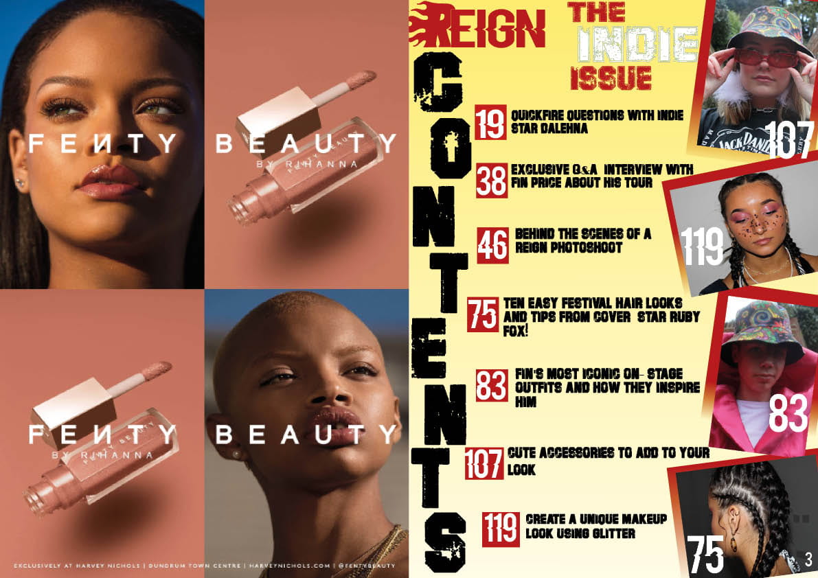
CONTENTS PAGE
-Added a red gradient to the background of the images to match the gradient on my front cover
I did this to incorporate the colours and design of my front cover to my contents page to portray my brand further and so as the reader turns the page from the front cover to the contents page, they will notice the colour scheme being incoporated throughout my music magazine, red and especially yellow is a common theme within the Indie Issue.
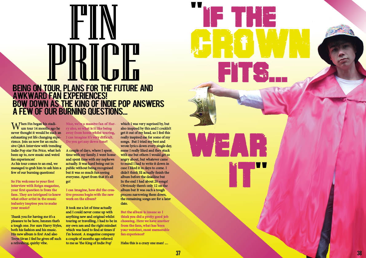
DOUBLE PAGE SPREAD
-Made the background yellow to make the page pop as I felt as though white was very dull especially as I cut my model out, there was no background anymore. Adding a colour makes the double page very vibrant and quirky.
-Added pink lines to create a bit of structure to the page and to also match my models’ coat
-Changed my pull quote to a different phrase, sounding less arrogant to portray a kinder, more Indie vibe
-Changed the font of my title ‘Fin Price’ because it was the same font as my masthead, my masthead is a brand and has to be unique and this font can’t be seen anywhere else throughout the magazine.