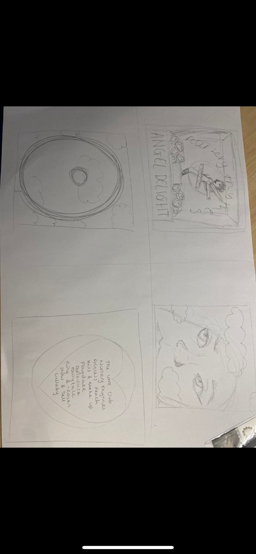
We sketched out a rough drawing of what theme we are going for in the digipak and the layouts of all our components such as the tracklist etc. We did 4 small drawings for each side of the digipak; we will keep coming back to this sketch when filming our shoot and the first stages for our draft 1 on InDesign we will use this drawing as a basic structure.
Here is an image of our hand drawn mock up, it is very rough but it is what we will follow when shooting. The first image is of our model which we are going to photoshop onto a music box with the titles around her.
The second image is going to be an extreme close up of our model as she is going to have some really exaggerated makeup, using pinks, blues and gems. We are also putting a purple transparent sunset image over the top of her face.
The third image is going to be of a cloudy sunset, which we already have the image for as we need the inside right to be a plain image without the model in it.
And the back pane is going to be the tracklist, on an image of a ‘love heart’ sweet, if it looks effective when shooting, if not we will use another image of our model.
The digipak overall is going to be a similar colour scheme to our music video, therefore it is going to be sunset themed. The main pastel colours we are going to be using are:
- Light blue
- Light pink
- Purples
- Yellows
We decided these because of our sunset theme and conveniently ‘love hearts’ sweets are pastel colours also which works well with our theme. On top of this the music box that is going on the front cover is light pink, so the rest of the digipak has to match this.