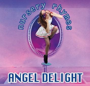
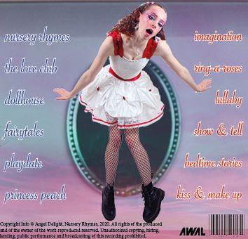
Finally we have draft 3 of our digipak in which we have altered to the feedback we were given in our screencastify from our teacher. She really liked our overall product but we have a few alterations to make which I have noted down below.


We have added the barcode and copyright etc, made the model bigger on the back page and most drastically, we have added some coloured opaque lines to the inside right page to add some effect as it was a dull image. We chose these colours because they match the inside left colours of the sunset really well and brings the whole theme together.
We asked our classmates what genre they thought our digipak was from first glance, without any indication, and everybody guessed pop. This is good because it means our brand is portrayed well in the colour scheme, name of the album and star and also the model and her mise en scene.
We are still yet to decide on a font for the name of the star on the front cover, but for now this is our draft 3!