I have taken my double page spread feedback on board, and made some adjustments in order to produce draft 2 of my double page spread. Here is a jpeg linked to a pdf of my new improved spread.

What I changed:
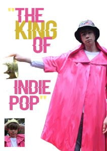
- I moved the image to the other side of the spread as it opened up the page more.
- I rearranged the layout of the words in the pull quote to adjust to the new placement of the image .
- Removed the steps from the image using the magic wand and eraser tools on photoshop so I had more room to write.
- Moved the title, stand first and article to the left hand side.
- Removed the pink highlight over the text as it wasn’t the right colour for my theme, I felt a transparent highlight looked neater especially as I am changing the colours of the questions when I insert my real article.
The impact of the changes I made are that I believe the page flows a lot nicer and reads well, whereas before the text looked sectioned off which made the double page look like 2 separate pages when I wanted it to look like one large page. Also the colour over the text has been changed so my colour scheme is a lot more specific now, is clear and matches my star image.
What will I change for draft 3?
- I will insert my real article into the columns instead of placeholder, as my article is a Q&A I will make the questions a different colour/bold so they stand out.
- I will also remove all the drop capitals and only have one at the start of the article instead of at the start of every paragraph.
When I make these changes, I am hoping that the double page starts to come together especially when I insert my article instead of placeholder text, it will become more real. When I remove the drop capitals and insert the questions in a different colour, it will stand out and look like a Q&A as soon as you take a first look at the page which is what I want it to look like, to entice the reader to read.