January
20
A New Improved Complete Magazine Draft

Here is my second complete draft of my music magazine, I have made a lot of changes to mainly the front cover and the contents page. Alongside additional minor changes to the double page spread.
What did I change on the front cover?:
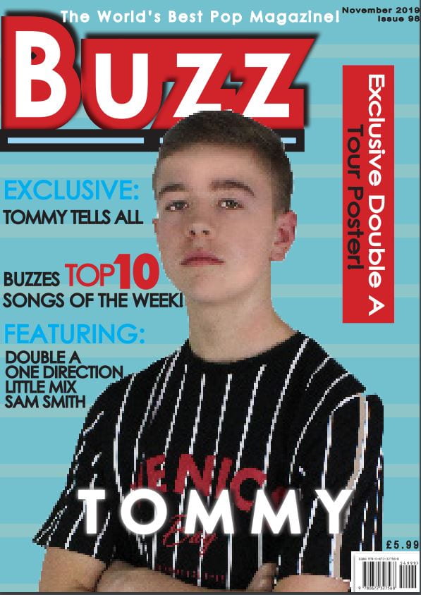
- I firstly moved ‘Tommy’ into the center of the page so he is more of the main focus
- I moved the barcode and price from the left hand side of the page to the right hand side of the page
- I lowered the price of the magazine from £7.99 to £5.99, as this would appeal more to my audience as it isn’t as expensive
- My masthead was changed from a pastel blue to a bright and bold red as I needed more colour in my theme then different shades of blue.
- In the masthead originally the font was black but as it was changed it red I felt that the text would be more suited in white.
- In addition to that I changed the pug with ‘exclusive tour poster’ from blue to red, and then changed it to ‘Exclusive Double A Tour Poster!’ I made the words Exlcusive Double A are in white, while Tour Poster is still in black.
- In the featuring section I got rid of Ariana Grande’s name and added Little Mix and One Direction in instead.
(I am aware that the image of my main cover star is pixelated, it is being fixed during editing!)
What did I change on the double page spread?:
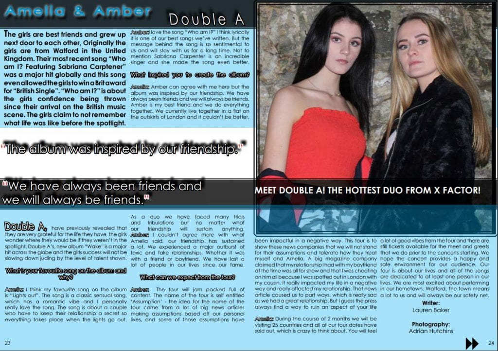
- I played around with the line spacing of the columns, I moved the writer and photographer to the bottom of the page
- When using quotation marks instead of them being blue and white, I changed them to be red and white.
- I added a caption underneath the girls, so my target audience can get an understanding as to where Double A got their start in the music industry. It says ‘Meet Double A! The Hottest Duo From X Factor!’
- Finally I enlarged the image of the girls to make them stand out more.
What I did change on the contents page?:
- I changed the triangles with Double A in red to go along with the theme of red and blue
- I added the name Amelia and Amber on the girls to show who the girls were
- I made the social handles smaller as it was taking too much attention away from the catchy captions
- I changed the @ handles from blue to red
- I made Tommy be the background for one of the triangles as the previous placement of the image didn’t showcase him enough
- I removed the hyphen after each number as it was becoming difficult to make all of the text inline
- With the page numbers I made the outlining of them white
- For every other catchy caption such as ‘tells all’ and ‘take over’ I made them in white text as I felt as if it would stand out more
- I removed ‘The real reason’ in the caption: “One direction Split up!”