Draft of Content Page
Draft of contents page
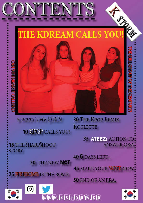
Below is the first draft of my contents page, within the page I have linked the colours from the front cover to this page to help to make a connection for the readers. Along with this I have put the name of the magazine i the corner as a stamp to reinforce that everything in the magazine is owned by K STORM magazine. This cover is very bold and bright which will catch the attention of the readers and interest them into reading the articles.
I have put the KSTORM website link to show that readers can get more articles and gossip from the website, the Instagram and Twitter symbols are present to show presence on these media platforms. For a first draft I think this contents page is very effective as it is not boring and looks very exciting, with the red giving a sense of urgency to read the articles.
What’s New?
I have added many more aspects to this contents page to make it more interesting for readers, these points include changes in the fonts within the captions to make them each stand out and look exciting for readers, however this could overwhelm some readers as it can get difficult to focus on one article name. The Korean flags give a reminder where the magazine originates from and what it covers in the music, the caption that goes with the main photo of KDREAM is on yellow which gives a powerful contrast to the red in the photo making the members of the band stand out. Finally, the touch of the lines going down the sides and under the contents gives an edge of design and professionalism making this contents page very effective that speaks to the target audience and demographic.
What’s Next?
- Play with the image more to give a greater effect
- add in another image
- write a message for the readers
- change and edit the captions of the articles
- play with the fonts more
- Tone down some caption fonts