Up2Date draft 2 pdfBelow is my second draft for the front cover of my music magazine.
Please click on the image to see it clearer.
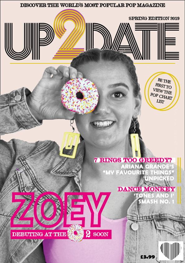
I have made many improvements; from both personal improvements and ones from my peers. They are listed below:
- I have made the plug slightly larger to make it easier to read.
- I have made the masthead larger and have added a pink two behind the yellow one to make it more interesting. (This has created a golden colour)
- I have edited my main cover star photo so that it is black and white but has certain features that pop out. For example the doughnut is still in colour and I have made her top and earrings coloured to match the masthead. I have also made the image larger and have overlapped it slightly over the masthead. This allows even more attention to be drawn to her from my audience.
- I have made the main cover line slightly bolder to stand out and have added a pink strip behind the white text to make it easier to read. I have also played with the doughnut from the main cover star photo to create the 0 in O2. This adds even more detail and excitement to interest my readers.
- I have changed the bar code from the normal rectangle to a more interesting heart.
- I have added a second cover line and have swapped them over to the right side of the front cover. This creates a more structured look and stops it from seeming messy. I also made the already existing cover line shorter and less complicated.
- I have changed my pug by editing the text to be simpler and have added a second ring to make it less boring.
- I have taken the insert off so that the cover doesn’t seem too crowded.
- I have added a pale background so that it isn’t just plain white.
- I have added small details such as yellow lines next to the cover lines (to link in with the masthead font) and a line under the masthead. These lines add extra detail which add excitement.