Here is the third and final draft of our digipak.
Overall I am really pleased with the way in which it has come out. It is very powerful and expresses her star image as very influential and resilliant. The message that media is dangerous and destroying us is presented very strong and the images really connect and impact the audience.


What have we changed from draft 2:
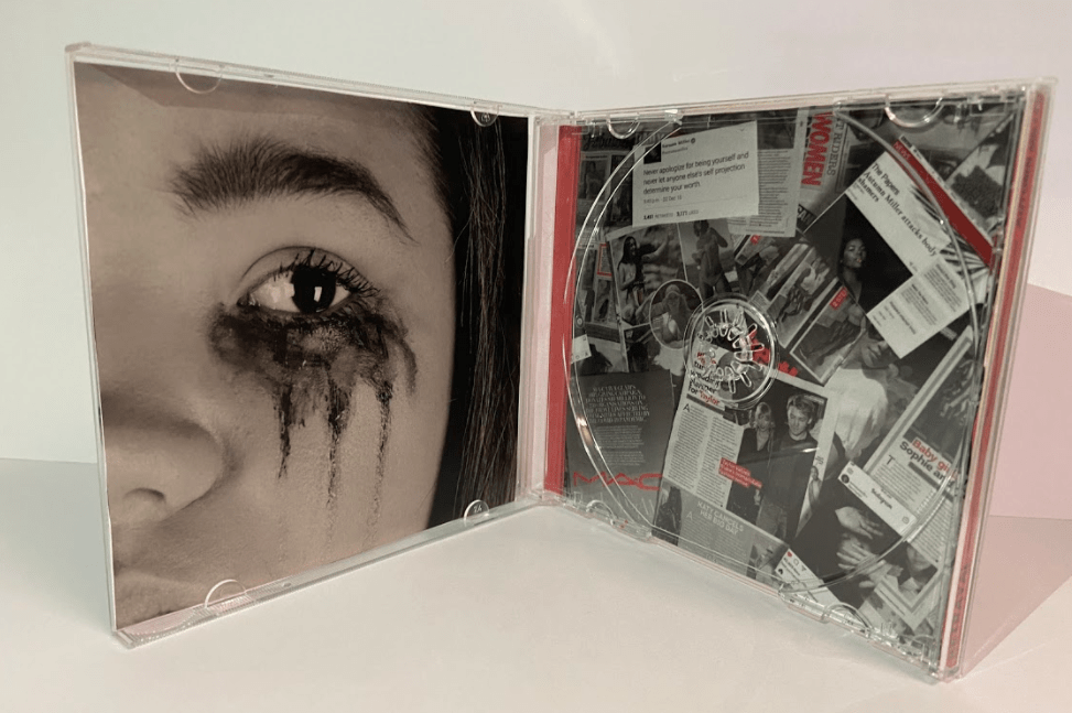
- We pulled out the reds from the collage on the front cover to enable the colour scheme to be presented even more. This enables her star image of power and the idea that media is a very negative thing to be portrayed even more.
- We have added a drop shaddow to the title on the front. This enables it to seem like its reaching out and impacting the audience even more. It creates lots of interest and enforces the name of the album.
- We have also pulled out more reds in the third page (the collage) to reinforce the hatred towards the media.
- We have added two extra songs so that the album follows the typical conventions.
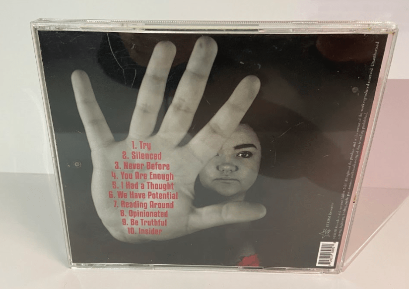
- We have altered the colour of the font of the song titles slightly to follow the colour scheme even more. This shows continuity.
- We have rotated the bar code to follow the same orientation as the other components. This makes it seem less awkward.
This is our final draft and so we printed it out using CAM and placed the printed pages into a CD case to present a prototype of our digipak. Overall we are really pleased with how it looks.


We showed our prototype to people to get their feedback on it. It was all very positive. We also asked them which genre they thought the artist was. The genre is Indie Pop which is what people thought. This shows that we have been successful in using the right conventions to convey and represent the genre.
