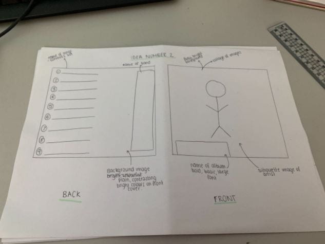
On these designs, it says what our colour pallet is and where our images and text will be placed. We have also annotated the designs with the conventional technical elements such as:
- Barcode
- Title
- Image
- Artist
- Song title
It is also important for our artists’ star image to be unique and different to other artists of the genre to keep the audience and engaged with the album cover and it will relate to their preferred reading. We need to include a repertoire of elements in order to engage with our target audience. Our digipak needs to be conventional but in order to make it even more unique we need to challenge the conventions which will allow it to stand out.
We want to make our digipak bright and colourful, this is conventional for our genre and will make it stand out from the rest of our competition. We will include colours such as green, blue, purple & pink as not only do they work well together but they are also bright. It is important we choose the right colours otherwise our digipak will not look conventional.