My Audience Profile

In order to make my magazine cover successful I will aim to produce it for my intended audience.  It is important that I use my encoded idea for the audience to use the decode for useful reading.  This particular thing is called preferred reading. If this is unsuccessful, my magazine cover would have not portrayed the correct idea and my audience do not read it this is called oppositional reading.

It is important that I have gained the correct knowledge in order to create my music magazine because I know what my audience will get from my creation and what I have produced.

I used You Gov in order to find out some more information about my music genre, POP.

Branding Ideas + Mission Statement

Genre of my Music Magazine- POP

Name of my Music Magazine- RISE

I think the name of my music magazine fits in with my genre as overtime there is becoming a rise in music, especially in pop. I have personally chosen to use the genre of pop as it is the type of music I listen to the most and relate to, I really enjoy listening to it. The styles correlated with this music genre also have a particular interest with me. From research, I have seen what pop posters look like and have made a word cloud full of connotations which suit the genre of pop. This will also assist me with my mission statement:

Please click on link for full image

Mission Statement- Rise is the next best magazine to come to your shelves. It keeps you up to date with the latest music crazes and up to date releases of the charts. We also include top stories and facts from the top pop artists of our time. We try to inspire and inform the youths o the latest music to bring out their love and passion for it. A way in which everyone can express themselves, and it all do to with the RISE.


So…I’m ready to make some media!

What do I need think about when I make my own magazine cover?

When making my own magazine cover I need to think about the different conventions that are associated with magazine covers. I have gained the knowledge necessary so I know what to do and furthermore how to do it.

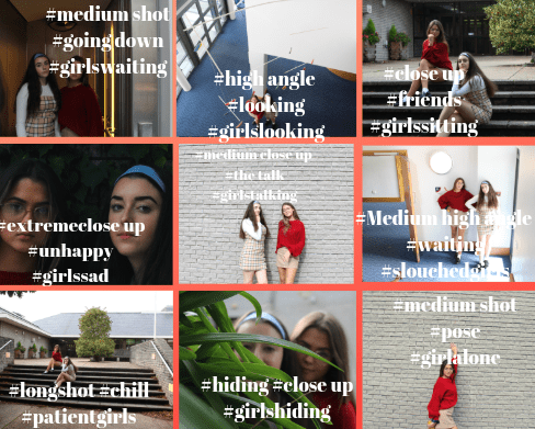
Camera Features –I will need to ensure I capture when taking pictures for my cover include high angle, low angle, long shot, close up, mid shot etc. These will collectively create and bring about the meaning and purpose for my magazine. It is a key feature for the eye line when first looking at it.

Mise-En-Scene-All these features are important for my inclusion of my magazine cover.

  • Costume
  • Lighting
  • Actors
  • Props
  • Hair and Makeup
  • Setting

Target Audience-Before creating my magazine I will need to research into my target audience finding out their demographics and psychographics in order to make it appropriate for the audience.

AIDA- For my magazine cover, I need to make sure that it attracts the target audience, interests them, creates desire and gives them information on things like where to get their tickets from.

Layout– I need to ensure that when creating my magazine cover that I include all the conventions necessary, e.g. masthead, main cover line, pug, plug etc.

Colour Scheme-after research, I will need to ensure that the colours which I include on my cover will be conventional to my magazine cover.

Typography-After a detailed research I will need to  include fonts of the suitable genre. I will also adapt them with some features which I have learnt on Indesign. These include stroke, alignment and size of the text.

My Tour Poster

I did some research and found out the different features and conventions of tour posters and album covers of rap artists. From my research I have found out that it is typical of a rap artist to include the following features:

  • Bright colours.
  • Graffiti font or a block font which is easily readable, although some have a serif font.
  • Majority of the posters/album covers which I found had an image of the artist or a symbol which fans would recognize them from.
  • Illustrations rather than actual images.

please click on the image for a clearer image (PDF)

I created a tour poster in this task reflecting my particular music genre of rap. I added suitable conventions and included my knowledge of creativity on Indesign and Photoshop in order to make it.

My Magazine Front Page Swede

please click on image to see the PDF

My Magazine cover

ORIGINAL MAGAZINE COVER^^

This week we talked about indesign and now I know the basic skills on how to use it. Putting my knowledge into practical practice I created a duplicate of the magazine cover, these skills allowed me to  make it as similar as possible. From creating my own copy of the NME cover I have further been able to include the different magazine conventions, many of these were the Masthead. cover star lines and captions, all of these pieced together the final product.

What went well in creating my cover?

  • I managed to find a similar picture of the the original, it was not the exact same pose but looked as if it was from the same shoot.
  • I was able to use the correct colours for my font etc.

What did I struggle with?

  • In this task I struggled with finding the font which was close the to the original. I found some but had to do a lot of alterations to the size and spacing between, thankfully the skills which I was taught using indesign meant I had a slight chance of making it similar.
  • Another thing which I struggled with in this task was getting a correct layout of everything. Personally I feel i struggled with this due to the positioning of the image. On the original magazine cover Rhianna is quite slanted meaning where the space was writing was able to be included. Where as the picture which I selected she was straight in the middle with limited room for writing.

These particular youtube videos are great tutorials on how to use indesign. They all give detailed instructions and advice on how to use it and create the best piece possible.


A Front Cover Analysed

By analysing and looking into detail for this magazine cover I have learnt and now understand how every aspect of it contributes to the intended narrative; how it looks and its target audience appeal.

This specific magazine cover allowed me to find out what the particular target audience demographics were. It included the age range (middles aged men) as an example. The further information following the audience demographics mean I could textually analyse other features which makes the poster such as; font, colour palette, images, language.

To my advantage, the skills which are involved with Audience Profiling and Textual Analysis will allow me to produce the best music magazine cover possible with the combination. I can ensure I have successfully portrayed my intended narrative along with making my target audience age range suitable. As a result I will be able to create it as best as I can.

Audience Profiling

This task consisted of me pulling apart a magazine cover and further analyse its uses and gratifications. By doing this I was able to find out its demographics, psychographics and target audience.

Demographics are categorised in terms of concrete variables such as age, class, gender, geographical location and socio-economic groups.

Psychographics refers to the groups of people by personality, values & beliefs, attitudes, interests and lifestyles and this may be due to the communities of each person- they differ between different ones.

Whereas the target audience is just the age range group of people the magazine is targeted towards.

When creating my own music magazine it is really important I take all these things into consideration as it will allow me to portray my intended narrative as effectively as possible.

So.. How can an imagine communicate meaning?

Throughout the media the are many features which will show a big part in demonstrating a meaning, these are included in mis-en-scene.

  • Costume
  • Lighting
  • Makeup and hair
  • Props
  • Acting
  • Setting

All these features of the mis-en-scene are important factors in portraying the intended narrative in media. For example the costuming will be help indicate to the audience maybe a specific era, or a characters’ personality by what they are wearing. It is representation of a person.

The camera angle is another thing to take into consideration, either a high or low angle will give different views or intentions.

  • A low camera angle maybe represent to the audience different sizes. Low angle look up so it could be a child looking up to an adult or an inspiration.
  • A high camera angle can represent someone looking down on someone. A character maybe be looking down on someone with a lower social status than them, higher up in the heirarchy. It may represent superiority.

The distance between the camera and what it is trying to represent will also help to show the intended narrative in media.

  • A close up shot may have the intentions of showing a specific relationship, a possible approach of how close it may be. It can also represent intimacy or how intense a situation is. It all depends on the narrative.
  • A long shot is used to portray a character within its surroundings.
  • Mid shots may be used to present a characters body language and also a shot where we may be able to see their emotions and other characteristics.

By having this knowledge I will be able to use it when creating my own Music Magazine and it will give me an idea in what is best to do so my intended narrative is portrayed successfully.

The Camera Talks

As part of the tasks within my photo shoot I had to pick my favourite 9 images. On top of the selected 9 i had to annotate each of them with connotations and denotations.

Out of the 9 my favourite photo is the extreme close up of my two models. This close up demonstrates how close this friendship is and the serious face is a representation of how serious it is also. Therefore this close up image is very successful in portraying the intended narrative.

After learning about the DSLR in lessons and then putting it into practical work I have gained a knowledge in how to use them. Although, in some of my images you can tell that there are improvements to be made before actually making my own music magazine. In a few of my photos the focus is a bit off and the background is quite dark, taking that into account next time I will need to put on a slower shutter speed and reduce my F numbers. It is also important that I make sure the angle and distance is appropriate for the magazine. All of these will be important for inclusion as it will have an impact on sales and popularity etc.

Conventional design features of a magazine

A magazine cover has loads of different features to it, each feature makes it unique and therefore successful.

  • Plug
  • Pug
  • Cover lines
  • Issue date
  • Price/Barcode
  • Inset
  • Main cover star
  • Captions
  • Masthead

When making my own Music Magazine cover I will need to ensure that I include all these technical conventions  to show my intended narrative. In this task I was able to correctly identify these different features on a popular music magazine front cover. With this knowledge I hope that I will be successful when creating my own.