Reflecting on the feedback on my first draft of my double page spread I was able to produce a second draft I was happy with.
Please click to view a PDF.
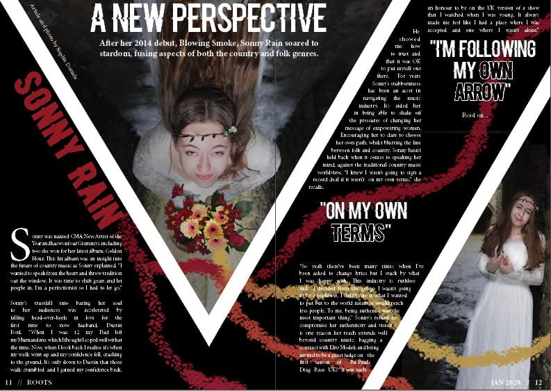
What have I changed?
- I’ve added a standfirst.
- I changed the font of ‘Sonny Rain’ and ‘A New Perspective’ so that it is easier to read, whilst still matching a font from the cover of the magazine.
- I added a byline and photographer.
- I also added another photo to fill the space and make it more interesting.
I think that my DPS reflects the country-folk genre well as the colour scheme includes reds, oranges and yellows which are all warm colours and reflective of the country genre. Also the fonts used are very well-suited to the country genre as they have that western feel, as well as matching the front cover fonts well. This is very important so the magazine feels coherent and themed. Finally, I do think the models costume fits the folk category of country which was what I was aiming for as she looks free, whimsical and very boho-chic.
In order to improve my DPS for my next draft, I need to check the alignment of my article and make sure all of the text is clear and easy to read. I could also consider brightening the spread as country music feels warm and homely and at the moment the white and black seems colder.