
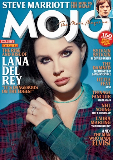
In order to try and understand media magazines better, I used a software called indesign to try and replicate a professional magazine cover to the best of my ability. We learned to use indesign through a few lessons and then we were left to try and play around with indesign to make this mock cover page. We used this knowledge on how to use indesign with out knowledge on key features of magazine covers (such as the masthead, pugs and main cover lines) in order to try and get the most effective result that we could. The top image is my finished product and the bottom is the original that I replicated. During the process there were some things that I struggled with however I also think that there were plenty of things that I did well. In order to improve my skills for my future magazine cover, I’ll need to take into account what went well and what I could do better so the outcome for it is better. Some things that I believe went well are:
- The text of the masthead is effective in capturing the same atmosphere as the original
- Used clever alternatives for lack of knowledge about certain tools in order to try and replicate the original
- Everything from the original is on mine in some way shape or form, whether it be a direct mimic or an alternative that achieves the same goal
For the things I need to improve upon, there is:
- The main cover stars size in comparison the rest of the magazine cover, as my one seems very zoomed in when compared to the original.
- The colour of my text is slightly off and it also is on the main cover star (due to the image size) which makes the text hard to read in certain areas
- Copying exact, smaller details such as the spikiness of the pug or the text font on “the music magazine”.
I have also looked up some videos on indesign usage to help me in future when it comes to creating my magazine cover. These videos cover sme of the things that I ended up struggling with in my mock cover.
In future, I will use the lessons I learned when creating my mock image, annotating a magazine cover and the videos embedded above in order to try and create my music magazine to the best of my ability and try to match a professional standard in my work. For example, when creating my media magazine I will be careful when using images and text together as they can have a powerful effect together and when poorly designed (e.g pink text on a pink background) it can ruin an audience members emmersion in your product as well as coming across as very cheaply done. I will also try to use these lessons beyond my A-levels and try to apply them to both my everyday life to see how media is evolving and in a potential future job, to make sure that my work meets the expectations of both my colleagues and those who will consume the media that I produce.