
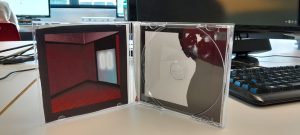
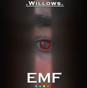
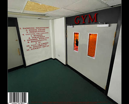
In this draft we have only made a few small tweaks to our work, in particular, we have added some more symbols to the back cover, as well as slightly changing the burn effect on the front cover.
In this draft we have only made a few small tweaks to our work, in particular, we have added some more symbols to the back cover, as well as slightly changing the burn effect on the front cover.

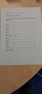
For draft 3 of our digipak, we printed off the digipak and put it in a case to then show other people. We asked them on two separate sheets at genre they thought our music package was based off of the sheet. The first sheet indicated that most people were split between either grunge (which is our genre) or heavy metal which does share some more of the extreme horror type imagery with grunge. For our second one, grunge wasn’t included so the majority of people went for alternative / rock which does also have ties to grunge in terms of the social and political contexts behind the genres being similarly born out of social conflicts and mistrust of the government.
In future I will hold different kinds of votes among random audience members in order to gauge how accurate my products are to the genre that I am trying to convey and to avoid any mismatching messages to the audience regarding the product.
Targets for Improvement:
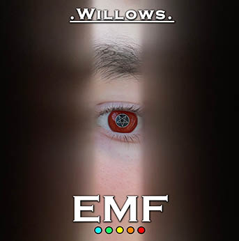
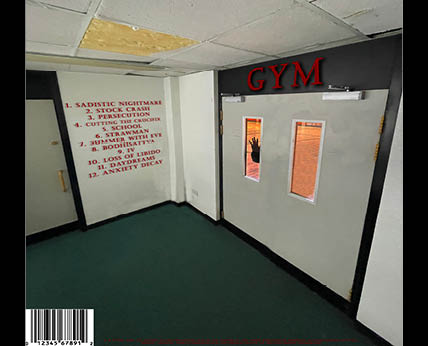
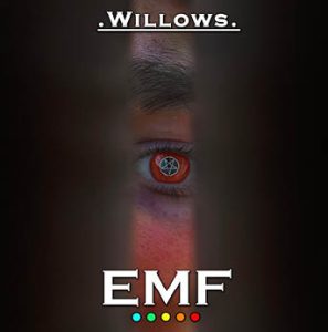
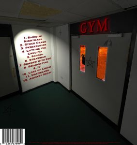
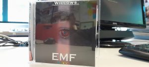
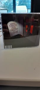
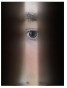
Here I’ve got my first draft for my Digipak. Currently it only consists of the front and back covers. The front cover consists of the album name ‘Willows’ at the top with the band name ‘EMF and their logo at the bottom. The image itself is an image of an eye through a door crack that is coloured red with a pentegram covering the iris of the eye. For the back cover we have the main image being that of the enterance of the schools Gym with Gym in dark red letters. The inside of the Gym is red with a hand pressed up against the window trying to escape. There is the track list on the wall next to the door and the barcode and copyright information at the bottom.
As this is a first draft, we have reflected on it and came up with a few things we would like to add / change in the next draft. These consist of:
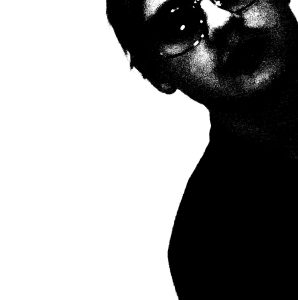
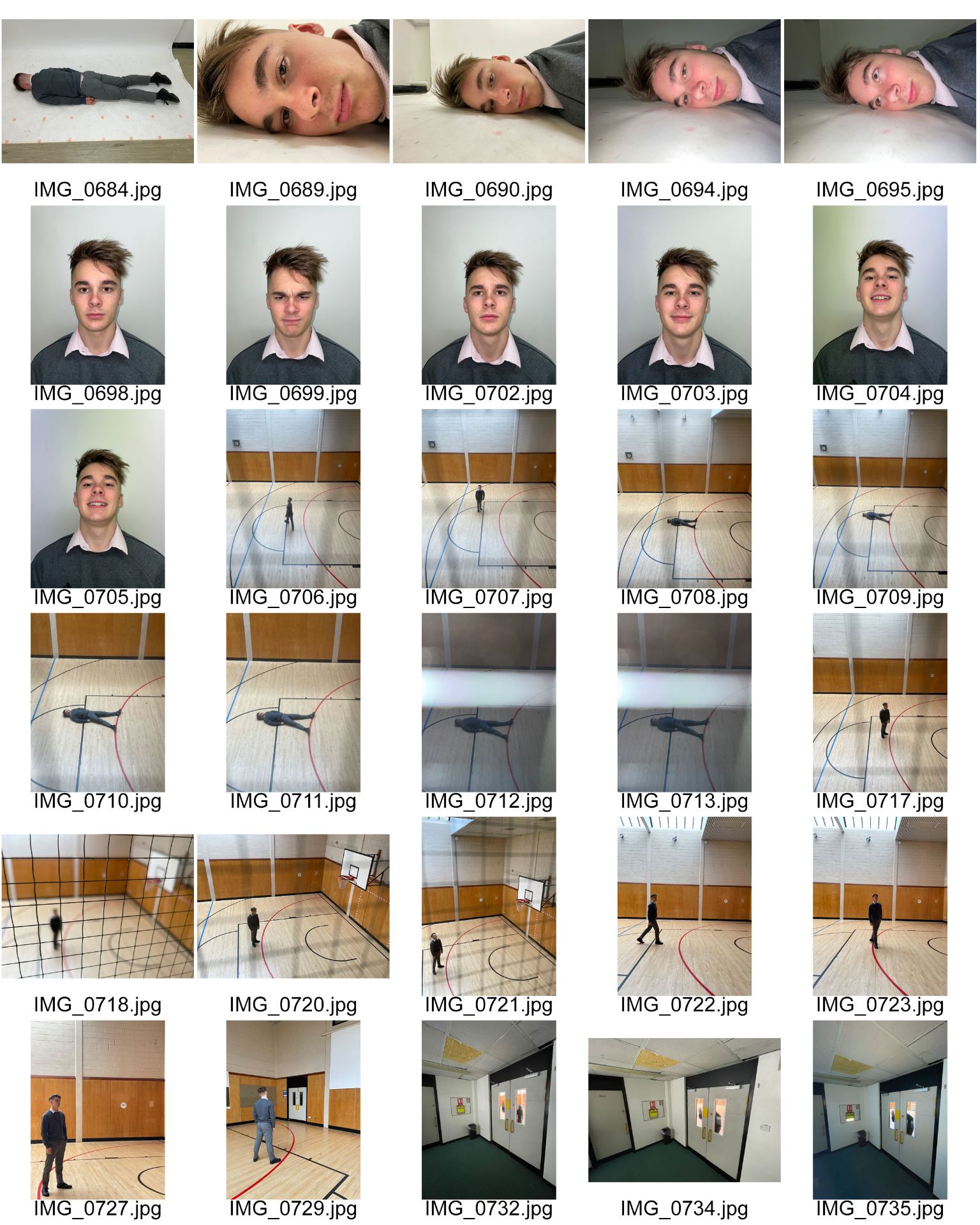
Above are the images that we have decided to use in our digipak in order from the front page to back page. I believe our first, second and fourth work well as we tell a consistent narrative between them of the person trying to escape the gym however whilst shooting we realised that we didn’t have a proper CD page that would fit this narrative so we decided to improvise by using a shot of a band member. This shot works well as it has lots of dead space in the image, which will allow for a good place for the CD to go as well as inferring an anarchic, distorted vibe to the whole image.

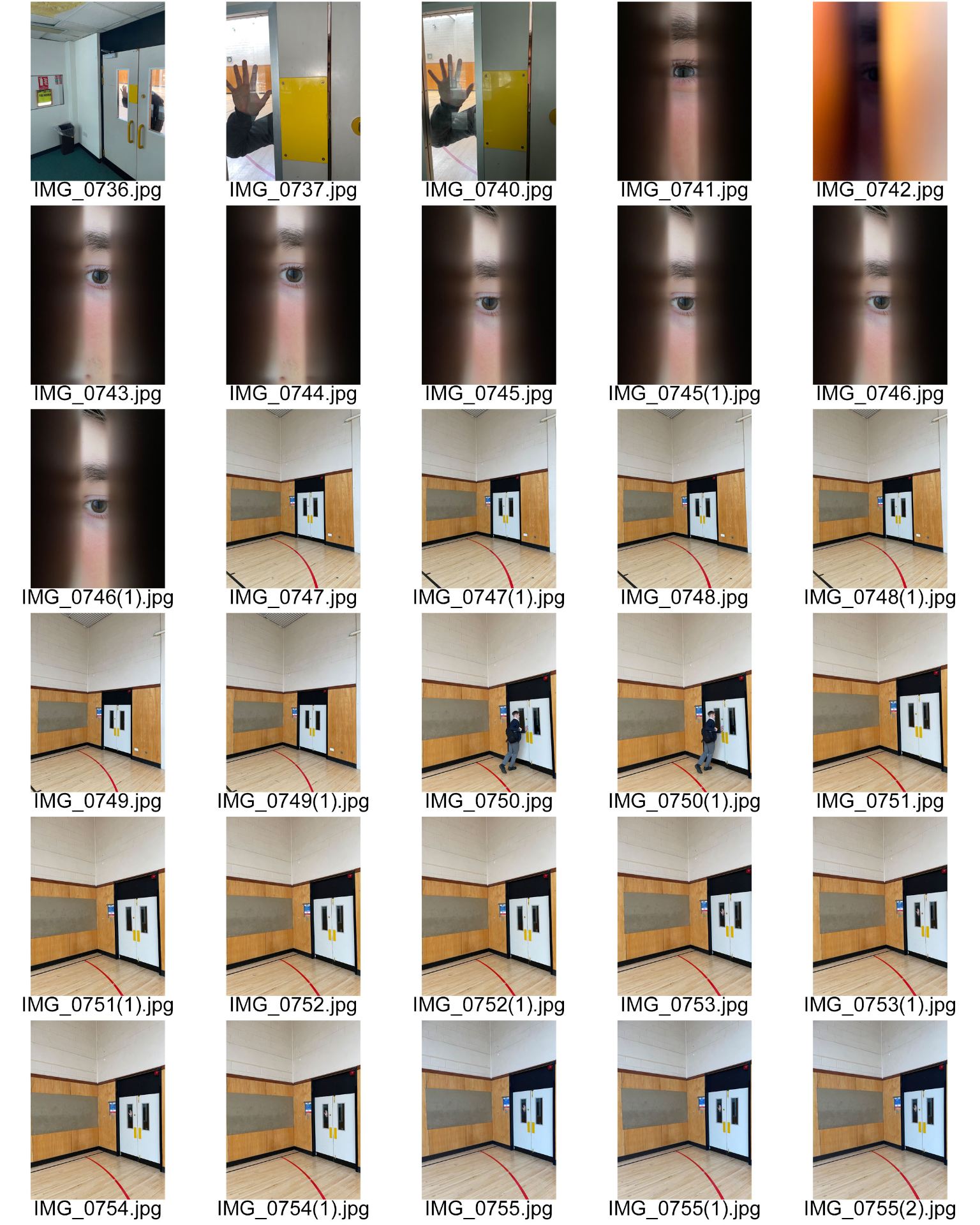
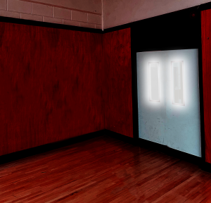
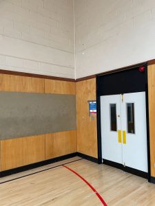
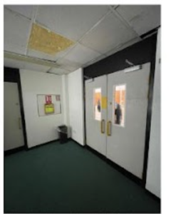
Here is the contact sheet that contains all of the images that we took for our digipak cover. For this I was the actor whilst Nate took the photos although it really should’ve been the other way around as I am an actor in the music video, rather than a band member as the point of a digipak cover is to sell the artist(s) star image rather than the music video. Still we have several ideas on what could be used in our digipak, particularly the shot of my hand through the doorway of the gym from the corridor. Where we believe we could colour correct it so that the inside of the gym is firey and miserable like hell and the corridor is light and perfect like heaven. For our inside cover we currently plan on using one of the shots of the inside of the gym and editing it to look hellish and demonic, whilst the second panel on the inside cover will be of the band in a reshoot looking demonic or corrupted.
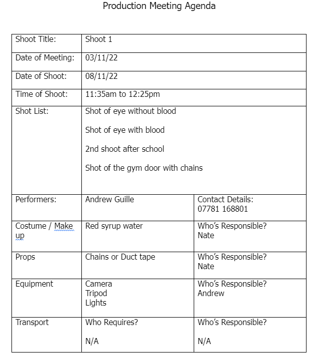
Here is the Production Meeting Agenda that I have made for my Digipak shoot. In order to arrange this shoot me and Nate got together and had a meeting to decide what we needed to do book a studio for a shoot so that we’d both be able to attend the shoot. We decided on the 8th of November at 11:35 – 12:35 as it was the time that fit us both the best. After that we filled in the different shots we would need to get for our digipaks so we would be able to experiment with our cover and back pages. Then we had to split who would be responsible for each aspect of the shoot. We decided that the costume / make up as well as the props would be Nate’s responsibility meanwhile I would be responsible for the equipment.
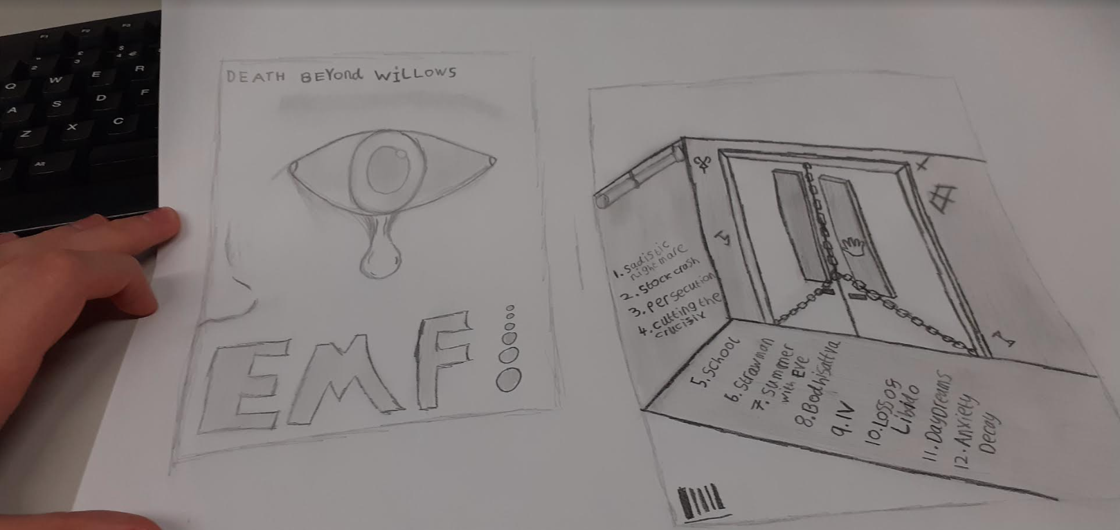
For my digipak mockup I have made drawings for the front cover and back cover as well as creating names for my band, album and songs. Our front cover design is planned to be an extreme closeup of someones eye with a tear of blood coming out from it. Below we have the band name EMF as the largest piece of text right below the eye and then above it is the name of the album ‘Death Beyond Willows’ which was created as a mashup of our favourite ideas for the album name. The back cover shows a room that with a glass pane on the door with a hand pressed up against it, the door is also chained up, preventing their enterance. On the walls and floor are the song names along with some cult symbols. At the bottom of the image is a white space containing the barcode and where the copyright notice will be.
In future, when designing any image based media product I will create a mock up design in order to try and create an early visualization of what we would like the final product to look like so I can have a constant reference for what to do if I ever get stuck.
In order to further my understanding on digipaks for the grunge genre, I decided to analyse a digipak from a professional example, for this I decided on the soundgarden album, ‘Down on the Upside’ as it’s one of the more famous albums from one of the most famous grunge bands, meaning that it must’ve fit well within the conventions of the genre.
In future, when designing any form of media I will stop to analyse professional works from within the genre in order to gauge what the conventions are and how I can work them into my narrative so that I don’t end up working against my intended audience.
Here is the work we have done in research for our digipaks and in order to come up with our mission statement.