
In this draft we have only made a few small tweaks to our work, in particular, we have added some more symbols to the back cover, as well as slightly changing the burn effect on the front cover.
In this draft we have only made a few small tweaks to our work, in particular, we have added some more symbols to the back cover, as well as slightly changing the burn effect on the front cover.
Branding is the way a company makes an ideology that a consumer is able to buy into. For music bands or artists, rather than the company holding the brand image, the star acts as their own brand. Our goal for our brand is to show anarchy and resistance which is fueled by rebelion and difference which can make people feel feelings of mistrust of power, resentment and resistance to authority in order to aid the common people and issues that the government rejects. Within our music video we hold a clear narrative of the student holding resentment towards the authority seen in the video, the teacher, who abuses him verbally and punishes him relentlessly until the student stands up to him, which shifts the power dynamic between the two, showing how the common masses need to rise up against those in power that oppose their progress. Our digipak uses hellish imagery throughout the 4 pages to describe the school and to an extent society as a kind of nihilistic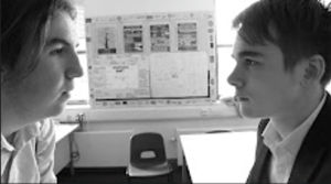 prison that traps us within it to a lifetime of sorrow and misery. Finally our social media page holds a different side of our band as we show a strong charged campaign for change through our announcement regarding our charity collaboration, where our band aims to help save the habitats of animals on the brink of extinction, signifying how our band hopes to enact social change for a better society throughout our entire metanarrative.
I researched the Grunge rock genre and analysed the conventions of music videos within the genre. One particular one I took inspiration from was Note to Self by From First to Last as it contained many of the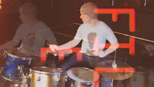 conventional fast paced cuts and overlays on the screen to make it appear quite glitchy and disrupted. I also took note from various other music videos to come up with ideas in regard to how different members of both the band and the narrative act, such as how the bassists will typically move around a lot in beat with the music for the band whilst the main character is extremely anti-authoritarian and anarchic in the narrative leading to the message of rejecting authority and embracing recidivist values.. This repertoire of elements (Nick Lacey) all come together and form the genre of grunge rock. In our music video we have a costume change from the student who goes from someone who is trapped in a place they wish to escape from (in this case detention) to someone who has broken free from the shackles that bound them to it (the teacher). Narratively we took inspiration from many 80s and 90s American teenage coming of age films. This is signified in the quick fade
  from the narrative being in monochrome to being in full colour. Another part of our music video that we took inspiration from was the overlay on the band when they’re in the studio. We first found this as one of the stand out aspects of MES in the song ‘Letter from a Thief’ by Chevelle. We took this blueprint and expanded upon it by making the overlay occur throughout the vast majority of the performance rather than just small scattered segments as it is a deliberately disruptive, anarchic, artsy convention.
Our goal for our brand is to show anarchy and resistance which can make people feel feelings of mistrust and resistance to power in order to reject the stereotypical authority figure. Presenting our stars as being genuine in their beliefs and believing the message they’re putting out helps to avoid any mismatching representation that could appear from the star image. For our star we seek for them to appear as being, what Dyer would call, extraordinary people among the ordinary masses as they are these freedom fighter types of people that have their own personal, social and political beliefs that are quite radical, being born out of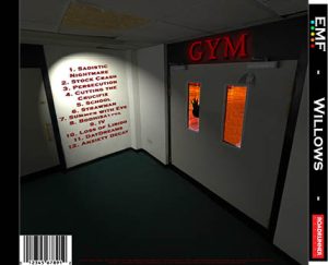 anger at the faulty norms of society. These stars have the power and influence to spread that message through their music to other like-minded people. Within our digipak we represent the gym as a hellish prison, which also links back to the
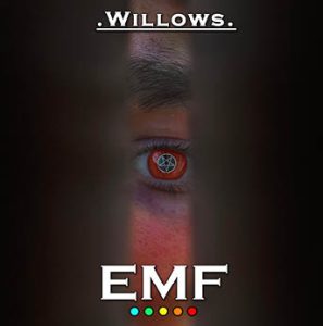
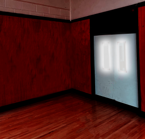
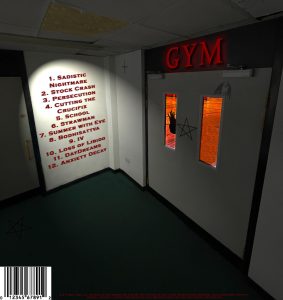
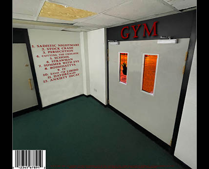
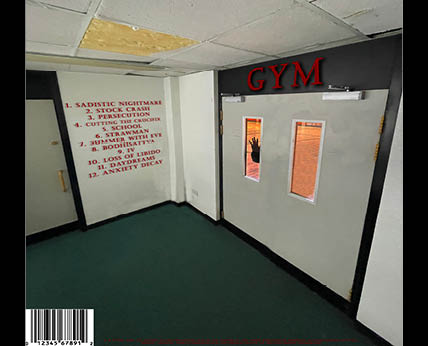
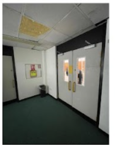
whole school and in turn, society. This is a key message throughout our media package however in the digipak the metaphor is shown more as we include a person’s eye being possessed with a pentagram through a crack in the door on the front cover with this same person’s hand trying to escape the gym on the back cover. To add to the MES of the main hallway, I added some symbols and figures on the walls to further drive the symbolic code of the gym being hell. On both the back cover and the inside cover on the left, the Semic code inside shows it as very red and demonic, which acts as the main signifiers to present the inside as a type of hell with the outside, although not pretty, being better than where they’re at now in a similar sense to ‘The Wall’ by Pink Floyd.
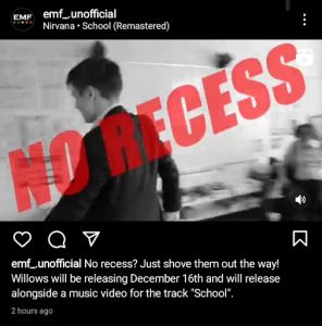
A social media page is a tool used by different artists in order to further advertise and broadcast their messages. Social media pages will typically be made to look visually appealing, which promotes the AIDA process within the audience. Social media pages also appeal to the audience’s Uses and Gratifications as they allow for social interaction between fans, reinforcement of personal values and identity as well as being a hub for entertainment and information for the audience to go to at any time. Due to the influence of the modern, digitalised era, the audience have a much larger impact on the star outside of sales and artists need to play into this dynamic in order to survive, so artists will 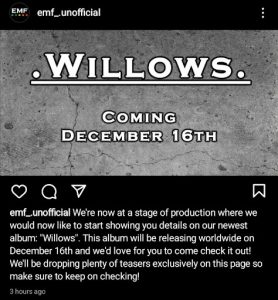 encourage an active audience to engage with their products, decode and then spread their messages to those that may not have heard of them before. Throughout our advertising campaign we have encouraged interaction with our audience. The most direct means was the Q&A we held in the build up to the release of willows, where we got questions from the audience that we answered on our story. This type of marketing allows for the audience to get information regarding our next release, as well as creating a level of social interaction between the audience and the band according to their uses and gratifications. One other post that encourages engagement is our tour poster, which helps us to engage with our audience as concerts allow for audiences to feel a sense of belonging among the community of fans which helps reinforce their own social identity and encourage interaction. Another key post is the announcement of the name and release date of the album. In this post we reveal that there’ll be several other announcements before the release of the album which’ll help build up interest over time and encourage the audience to come back for updates according to the AIDA theory where we build a level of interest until it turns into desire, which leads to the audience taking action and buying the album.

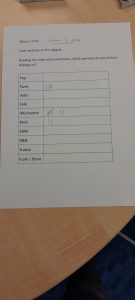
For draft 3 of our digipak, we printed off the digipak and put it in a case to then show other people. We asked them on two separate sheets at genre they thought our music package was based off of the sheet. The first sheet indicated that most people were split between either grunge (which is our genre) or heavy metal which does share some more of the extreme horror type imagery with grunge. For our second one, grunge wasn’t included so the majority of people went for alternative / rock which does also have ties to grunge in terms of the social and political contexts behind the genres being similarly born out of social conflicts and mistrust of the government.
In future I will hold different kinds of votes among random audience members in order to gauge how accurate my products are to the genre that I am trying to convey and to avoid any mismatching messages to the audience regarding the product.
Targets for improvement:
Here is a self reflection I have made for the first draft of my social media page, where I compare it to the assessment criteria.
In future, I will use the drafting system in order to be able to stop and reflect on my work so far so as to see whether it is meeting my original vision, as well as filling out the requirements needed of it (in this case the assessment criteria)
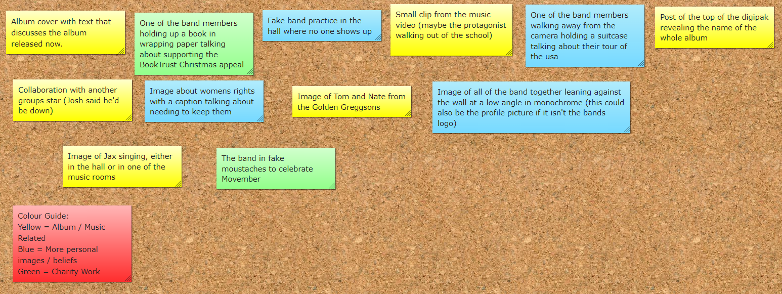
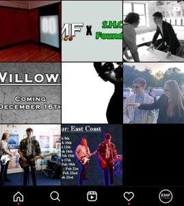
Above is the timeline we have created for our social media page. It features different ideas that each promote a different aspect of our star image and / or music. We have been careful to tread a fine line between our stars being ordinary by doing many down-to-earth things whilst also being these extraordinary stars that ought to be praised for their work everywhere they go. We have also considered the Uses and Gratififications theory by raising awareness about different political and social issues which will both inform and reinforce the identities of our audience as well as entertaining and hooking in our audience with our music and teasers of the upcoming album.
In future, I will make sure to plan out each post I create on any stars social media page as it could be negative for your star image if a poorly planned post could appear as contrapuntal and fans could be turned away as they could view it all as fake.
Above is a screencastify I have done with my partner where we analyse the conventions of an average social media page, with us choosing to look at Soundgarden’s Facebook page. We go in detail about many reasons as to why they have their page specifically the way it is, such as why they chose a glamour shot as their banner or why they post so often about their backlogue.
In future I will make sure to take a look at the social media pages of other bands in order to collect ideas that I could borrow for mine, as well as to find any key conventions that could help boost the AIDA process or fit in with Blumler and Katz’s Uses and Gratifications theory.
Targets for Improvement:
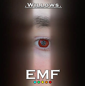
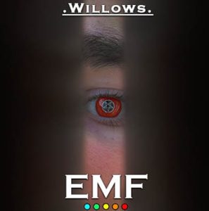
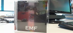
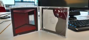
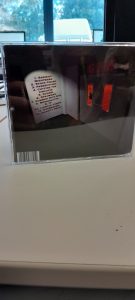
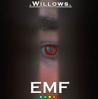
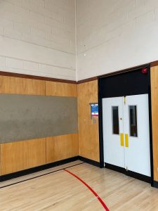
Here I’ve got my first draft for my Digipak. Currently it only consists of the front and back covers. The front cover consists of the album name ‘Willows’ at the top with the band name ‘EMF and their logo at the bottom. The image itself is an image of an eye through a door crack that is coloured red with a pentegram covering the iris of the eye. For the back cover we have the main image being that of the enterance of the schools Gym with Gym in dark red letters. The inside of the Gym is red with a hand pressed up against the window trying to escape. There is the track list on the wall next to the door and the barcode and copyright information at the bottom.
As this is a first draft, we have reflected on it and came up with a few things we would like to add / change in the next draft. These consist of:
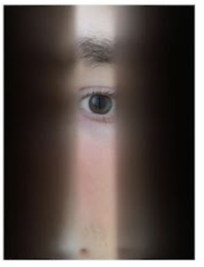
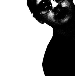
Above are the images that we have decided to use in our digipak in order from the front page to back page. I believe our first, second and fourth work well as we tell a consistent narrative between them of the person trying to escape the gym however whilst shooting we realised that we didn’t have a proper CD page that would fit this narrative so we decided to improvise by using a shot of a band member. This shot works well as it has lots of dead space in the image, which will allow for a good place for the CD to go as well as inferring an anarchic, distorted vibe to the whole image.