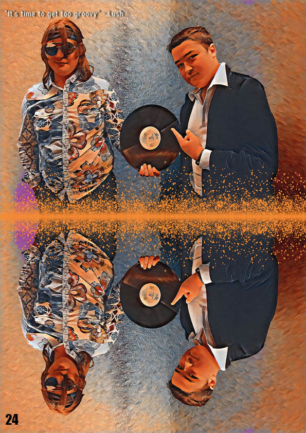
Here is my double page spread. I have made this after taking my second shoot and working with what pictures I got in order to make a draft article to use. In order to improve in future, when I make my real double page spread, I have decided to reflect over what worked and what hasn’t worked for this double page spread.
What went well:
- Used photoshop in order to create a good looking image out of one that would’ve been hard to use otherwise
- Colour used can highlight the important parts of the article
- The picture is very fun and colourful, which represents my genre well
What can be improved:
- Background colour on second page can seem quite bland and out of place
- Make the orange spots on the image more spread out
- Try to reduce the contrast / difference between the first and second backgrounds
- Make the artists names a different colour or a different size during the Q&A section
- Make the main writing smaller and make the title bigger