Evaluation of Shoot

Above are the images that we have decided to use in our digipak in order from the front page to back page. I believe our first, second and fourth work well as we tell a consistent narrative between them of the person trying to escape the gym however whilst shooting we realised that we didn’t have a proper CD page that would fit this narrative so we decided to improvise by using a shot of a band member. This shot works well as it has lots of dead space in the image, which will allow for a good place for the CD to go as well as inferring an anarchic, distorted vibe to the whole image.

Digipak Contact Sheet

Here is the contact sheet that contains all of the images that we took for our digipak cover. For this I was the actor whilst Nate took the photos although it really should’ve been the other way around as I am an actor in the music video, rather than a band member as the point of a digipak cover is to sell the artist(s) star image rather than the music video. Still we have several ideas on what could be used in our digipak, particularly the shot of my hand through the doorway of the gym from the corridor. Where we believe we could colour correct it so that the inside of the gym is firey and miserable like hell and the corridor is light and perfect like heaven. For our inside cover we currently plan on using one of the shots of the inside of the gym and editing it to look hellish and demonic, whilst the second panel on the inside cover will be of the band in a reshoot looking demonic or corrupted.

PMA for Digipak Shoot


Here is the Production Meeting Agenda that I have made for my Digipak shoot. In order to arrange this shoot me and Nate got together and had a meeting to decide what we needed to do book a studio for a shoot so that we’d both be able to attend the shoot. We decided on the 8th of November at 11:35 – 12:35 as it was the time that fit us both the best. After that we filled in the different shots we would need to get for our digipaks so we would be able to experiment with our cover and back pages. Then we had to split who would be responsible for each aspect of the shoot. We decided that the costume / make up as well as the props would be Nate’s responsibility meanwhile I would be responsible for the equipment.

Social Media Page Terminology

Here are screenshots from Pearl Jam’s Twitter page, Instagram page and one of their most recent instagram posts. I have analysed some of the important parts of these pages and posts to see how an audience will engage with the band, as well as how the band sell their stars as being both ordinary, upstanding people that care about social and political issues we are currently facing such as women’s rights being taken away, but also extraordinary stars that are on a higher level to their fans and need to be looked up to.

In future, I will look at other professional examples of social media pages in order to help spread awareness of my stars by making a platform for them to promote their upcoming projects as well as for them to sell themselves as more humble, down to earth people that people can relate to.

Digipak Mockup

For my digipak mockup I have made drawings for the front cover and back cover as well as creating names for my band, album and songs. Our front cover design is planned to be an extreme closeup of someones eye with a tear of blood coming out from it. Below we have the band name EMF as the largest piece of text right below the eye and then above it is the name of the album ‘Death Beyond Willows’ which was created as a mashup of our favourite ideas for the album name. The back cover shows a room that with a glass pane on the door with a hand pressed up against it, the door is also chained up, preventing their enterance. On the walls and floor are the song names along with some cult symbols. At the bottom of the image is a white space containing the barcode and where the copyright notice will be.

In future, when designing any image based media product I will create a mock up design in order to try and create an early visualization of what we would like the final product to look like so I can have a constant reference for what to do if I ever get stuck.

Final Music Video

For my final music video I am very pleased with what I have produced. I believe that the tone and mood of the music video matches that of the song itself, as well as the MES, effects and overall atmosphere are done to fit the conventional dirty, rebelious nature of the genre.


Digipak Conventions Analysis

In order to further my understanding on digipaks for the grunge genre, I decided to analyse a digipak from a professional example, for this I decided on the soundgarden album, ‘Down on the Upside’ as it’s one of the more famous albums from one of the most famous grunge bands, meaning that it must’ve fit well within the conventions of the genre.

In future, when designing any form of media I will stop to analyse professional works from within the genre in order to gauge what the conventions are and how I can work them into my narrative so that I don’t end up working against my intended audience.

The Look Book

Made with Padlet

Here is a look book consisting of 20 images with descriptions on each one as to why they are significant. This was made as a future reference as to what we should look to for inspiration when creating our Digipaks & Social Media pages. This look book mainly consists of different artists album covers, tours, looks and social media pages as these are what we find will be the most important for coming up with different ideas.

In future, I will create look books when starting any future media projects in order to have a reliable source for any potential design ideas that relate back to the genre of the media I’m creating

Peer Assessment

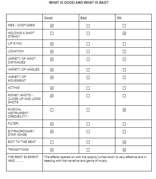
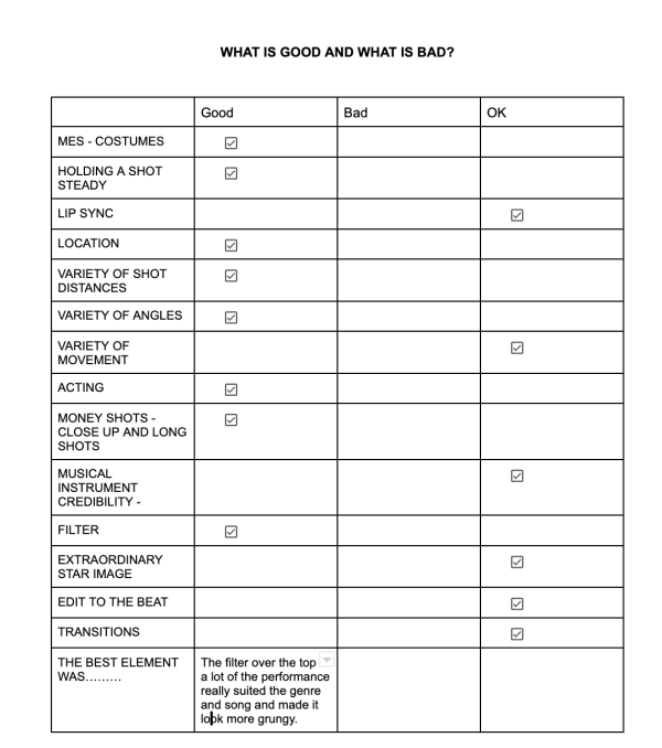
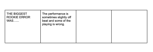
Here are two batches of peer feedback from two different people. I had them watch the video and then fill out the boxes to show us what we’ve done well, alright or poorly although no one said we did anything poorly / not at all. At the bottom they included personal comments on what we can precisely do next in order to improve our video.

What we can improve upon:

  • The performance shoots could be redone as they can appear as a contrast to the music itself.
  • Make sure all shots of the performance are on beat to the music.
  • See if we can include any more transitions.

These critiques are fairly general and we found that people seemed to be a bit too generous with some things that we thought we could improve upon such as the money shots so a better way to get feedback could be for each student to mark and grade an anonymous music video rather than telling them whose it is to avoid any potential biases, with this according to a set mark scheme. I also believe that the teachers should try to encourage complete honesty in the comments and grades given.

In future I will make sure to use peer feedback as it allows for us to see any imperfections in the product that we may not be able to see as well as a regular viewer and then get the proper advice we need on how to tackle these issues in order to create an overall better product.