Here I have made a moodboard of 10 magazines that I think look good and can take inspiration from. One thing I think most of these have in common with each other, is the quality lighting and colour. Many of these are monochrome with close up pictures, which I think works well as it emphasises the face of the model and makes them feel important. For the ones in colour, the lighting as well as the background colour make them the main focal point of the image. The colours also contrast with each other which makes them fairly eye catching, which is a key aspect of magazine design. One other aspect I think lots of these magazine covers do well is the positioning of the camera and the pose of the model. Lots of these covers have the star either in a fun, more carefree pose or a close up of their face which makes them seem very important. Some parts I particularly enjoy from these are the colour palette in the middle billboard cover, the posture of the man in the jazz magazine, the low-key lighting and positioning of the man on the jazztimes cover and the close up camera in combination with the facial expression of the man on the variety cover.
Category: Component 1
Production Meeting Agenda for 1st Photo Shoot
A Production Meeting Agenda (PMA) is a table of components that go into a photoshoot. Before doing a photoshoot you will need to fill this out in order to help see your artistic vision through properly. Here we can see a production meeting agenda for my first photoshoot. This will help me when I go to do my photoshoot as it is very direct and to the point with the important information it holds.
In future I will need to always remember a PMA due to their importance to the shoot. They act as a way for us to finalize our plans and start visualizing the future outcome by using features of MES. It will help us figure out who needs to do what and when they need to do it by.
Star Image – Theirs VS Mine
In order to get me thinking about what my star should look like & act like, I decided to study Kenny G as he is one of the most famous Jazz artists out there. Kenny G’s star image is that of someone that is very suave, down-to-earth and fun. He is portryed as someone that is fairly ordinary, yet in an extraordinary position so he uses his time at the top to have fun, like any regular person would. He is also portrayed as someone who is dedicated to & spends the majority of their time honing their craft, in his case it’s his music with the saxophone. This repertoire of elements builds Kenny G’s star image that has been built by not only himself, but the people around him such as his managers.
My star would come across as very fun, casual and artistic but also very cool and chilled out. These connotations would come from their pose and costume. They would have a fairly conventional costume, mainly being a suit with the top button undone along with some sunglasses and a fedora to top off the look. This costume would also connote him being a musician that works in jazz clubs which would further connote him being down-to-earth and fairly ordinary.
In future I will try and think about other stars of the same genre when creating the image for my star so I can more accurately represent my genre by using the repertoire of elements borrowed from several other stars whilst also keeping things fresh and adding my own twist to the formula so my stars image will stand out but also fit in within the conventions of the genre.
My Audience Profile


KYC – Know your client
In order to know my client, I used YouGov.co.uk to research some of the top jazz artists audience demographics and psychographics. For example, I found out that although Gen X aren’t the biggest fans of Jamie Cullum, they recognise him the most. I also found out that Frank Sinatra has an equal percentage of fans from both Men & Women however slightly more men have heard of him than women.
In future I will try and know my client before making a product for them by doing proper research in areas such as their age, gender, class, race, political beliefs, etc. If we encode our product using this research then our audience will decode it and it will appeal to their uses and gratification. It will also avoid oppositional reading which would be bad press for us.
Branding and Mission Statement
To create a great work of media, you must have a passion for it. So when deciding which genre of music I should choose for my music magazine I decided to go with a genre that I have a passion for and interest in. For this, the first genre that came to my mind was jazz. This music magazine will also need a name so I decided on The Jazz Hustle.
"Jazz Word Cloud"
Click on the link above to see this word cloud at WordItOut. You may also view it on this website if you enable JavaScript (see your web browser settings).

Hustle attracts people who love all things Jazz, from the musicians to the positive, fun vibes. Our magazine has paved the way forward for many jazz lovers, young and old, in pursuit of good music from any era. When new and hot information is coming out, trust us to be the first to report on it as well as our exculsive interviews with top musicians. If you want to know anything about jazz, our magazine is the one stop shop.
In future I will have to think about my branding and mission statement when creating a product in my future career in order sell my USP (Unique Selling Point) accurate enough for my consumers to be properly informed on what genre / news we cover and what our goal is so they can hopefully become repeated customers and have our magazine as a part of their uses and gratification.
My Tour Poster

 In future I will try and use the skills I have shown today in both photoshop and indesign in other pieces of work for media but also in a potential future job in media. I will also try to improve by trying out different colour schemes and being more developmental with my background, typography, layout so more potential consumers will start the AIDA process whilst staying true to the conventions of my genre.
My Magazine Front Page Swede

In order to try and understand media magazines better, I used a software called indesign to try and replicate a professional magazine cover to the best of my ability. We learned to use indesign through a few lessons and then we were left to try and play around with indesign to make this mock cover page. We used this knowledge on how to use indesign with out knowledge on key features of magazine covers (such as the masthead, pugs and main cover lines) in order to try and get the most effective result that we could. The top image is my finished product and the bottom is the original that I replicated. During the process there were some things that I struggled with however I also think that there were plenty of things that I did well. In order to improve my skills for my future magazine cover, I’ll need to take into account what went well and what I could do better so the outcome for it is better. Some things that I believe went well are:
- The text of the masthead is effective in capturing the same atmosphere as the original
- Used clever alternatives for lack of knowledge about certain tools in order to try and replicate the original
- Everything from the original is on mine in some way shape or form, whether it be a direct mimic or an alternative that achieves the same goal
For the things I need to improve upon, there is:
- The main cover stars size in comparison the rest of the magazine cover, as my one seems very zoomed in when compared to the original.
- The colour of my text is slightly off and it also is on the main cover star (due to the image size) which makes the text hard to read in certain areas
- Copying exact, smaller details such as the spikiness of the pug or the text font on “the music magazine”.
I have also looked up some videos on indesign usage to help me in future when it comes to creating my magazine cover. These videos cover sme of the things that I ended up struggling with in my mock cover.
In future, I will use the lessons I learned when creating my mock image, annotating a magazine cover and the videos embedded above in order to try and create my music magazine to the best of my ability and try to match a professional standard in my work. For example, when creating my media magazine I will be careful when using images and text together as they can have a powerful effect together and when poorly designed (e.g pink text on a pink background) it can ruin an audience members emmersion in your product as well as coming across as very cheaply done. I will also try to use these lessons beyond my A-levels and try to apply them to both my everyday life to see how media is evolving and in a potential future job, to make sure that my work meets the expectations of both my colleagues and those who will consume the media that I produce.
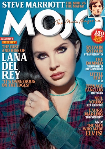
A Front Cover Analysed – Attracting ‘That’ Audience
Here we have a cover of billboard magazine with Alicia Keys. Next to it I have annotated some of the key features to analyse and research what kind of people would be interested in this magazine. This was in order to get a better understanding of audience demographics and psychographics and what technical design conventions can suggest about the target audience. For example I came to the conclusion that the primary demographic of billboard magazine were women in their 20’s. In future I will think about how to research my audience when creating my music magazines cover in order to get a better understanding of who they are and what they are interested in.
Conventional Design Features of a Magazine

Every magazine has a cover of some kind. It’s best to have an eye catching one to immediatly engage and interest the audience. There are several elements that go into a good magazine cover, such as the main cover star, masthead and the main cover line. These elements can have the same denotations, however their connotations can make them more appealing to their demographic. For example, the main cover line can help potentially unaware audience members understand the main cover star whilst also attracting the main cover stars fans to the magazine. The text of the main cover line can further add to the appeal of the magazine to its target demographic. To understand these different elements that go into a cover of a magazine, we annotated one ourselves to pinpoint some of these key features.
Here we’ve got a cover from MusicWeek featuring Dua Lipa as the main cover star. This cover is very interesting as it refuses many technical design conventions as it doesn’t contain any pug’s, plugs or insets. This helps the audience focus on the main attraction of this edition of the magazine, being Dua Lipa. This is further shown by how the main cover line is larger than the masthead, which also isn’t a very common thing to happen. In future I will think about these features when creating my own magazine cover to make it as eye catching and effective as possible for my target audience.
The Camera Talks
Media Hashtags by Andrew Guille
Anytime you take a picture, the camera talks and tells you a narrative of what’s going on. Using things such as, camera angle, proxemics, actions, facial expressions, etc you can tell a narrative without using words. We took these pictures in order to get a better understanding of how narratives can be formed through images by using these camera techniques, mise-en-scene, proxemics, facial expressions and body language as when they’re used together they have a powerful relationship in making a scene with powerful denotations and connotations. In future I will think about how to use these camera techniques can be applied to other works such as my music video or music magazine to represent a certain genre.