Author: aoifetodd (page 1 of 8)

Creative Critical Reflection Essay

How do the elements of your production work together to create a sense of ‘branding’?

How did your research inform your products and the way they use or challenge conventions? 

How do your products represent social groups or issues? 

How do your products engage with the audience?

The Mission Statement: “Freya offers a multi-genre vibe into the pop world. Mixing R&B soul, pop and electronica, Freya’s emotive atmosphere and tones give an ethereal and quirky performance style, providing fans with an ocular kaleidoscope with a multi-coloured and freaky aura. This new album ‘Faces In The Crowd’ features the new hit song ‘There Isn’t Much’ along with the most unique new songs. This extraordinary album is destined to rise to the top of the charts, connecting emotionally with fans all across the world, leaving everyone to want more.”

Any brand within the industry needs to be easily recognisable to its audience. This means that it is crucial for producers to create a blended, cohesive campaign and convey the above mission statement across all platforms.

Our mission statement includes key descriptors of our artist such as “quirky” and “emotive”. It is important that we focused on the mission statement that we created a package of products that is cohesive across our brand. The products we create need to be an accurate representation of our artist and her star image that allow us to create a metanarrative on top of presenting her as ordinary and extraordinary.

For example, my target audience would expect to see our artist as calm, elegant and ethereal. This idea is evident across all of our products, – during our music video whenever our artist is on screen she is shown wearing smarter, more elegant  clothing and either in nature or in a home setting. At the same time, our digipak creates an ethereal, mysterious vibe that helps to uphold the image created on our social media page.

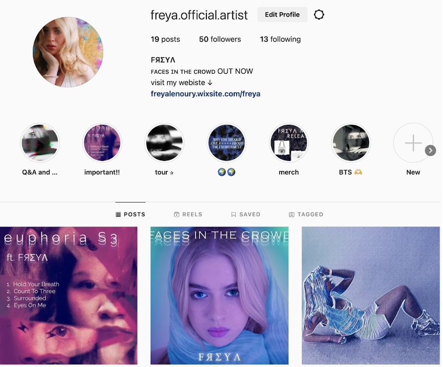
The theory of ‘The Paradox of the Star’ is crucial within our marketing and branding aims, as it helps to present our star as both ordinary and extraordinary. To help signify this paradox, we chose to use our instagram page. By posting our star in normal everyday situations, such as hanging out with friends or going to the beach she is shown to be ordinary. However, we also posted behind the scenes images and clips as well as sneak peaks at our album and tour.

We researched professional Pop music videos, in doing this we were able to understand that videos within this genre often include a performance and narrative aspect, editing to the beat and have a strong sense of MES which includes bright colours, many different camera angles and shot distances, this included longs shots, tracking shots, low angles and high angles, as well as natural makeup and simple jewellery. We reviewed the Dua Lipa video, ‘New Rules’. It goes without saying that in doing this task we were able to focus on the generic conventions found within pop videos with the intention of using them within our own work.  These refer to Lacey’s idea of the Repertoire of Elements –  these are the key “ingredients” , this included the use of close up shots, editing to the beat to switch between angles or scenes, lip syncing, as well as the use of special effects and overall to sell the star. It was crucial for us to utilise the relevant forms of media language within our product to help signify and represent our narrative and brand as a whole.

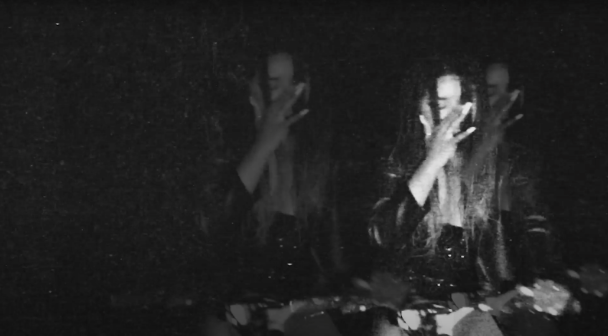
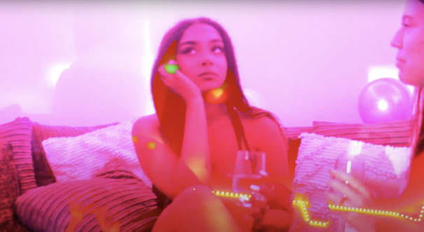
During the production of our music video, we aimed to challenge the conventions of pop as we want to represent our star as a multi-genre artist. We chose to have a balance of performance and narrative throughout our video, this is not a part of the blueprint (Altman) that the audience would generally expect, however we felt that the use of these aspects combined with key features from the repertoire of elements (Lacey), together would allow us to create a music video that would fit the expectations of our audience, leaving them satisfied and fulfilling Altmans term of the contract and Lacey’s repertoire of elements. We were able to challenge these conventions through the use of editing to the beat, lip-syncing and selling our star. The use of narrative allowed us to convey the story of a broken hearted teenager trying to navigate life after the loss of her boyfriend. Throughout scenes such as the party, there is use of hand held filming, this is to help create the feeling of chaos within her life, this is then backed by the use of special effects such as flashing colours, fading between scenes and transitions.

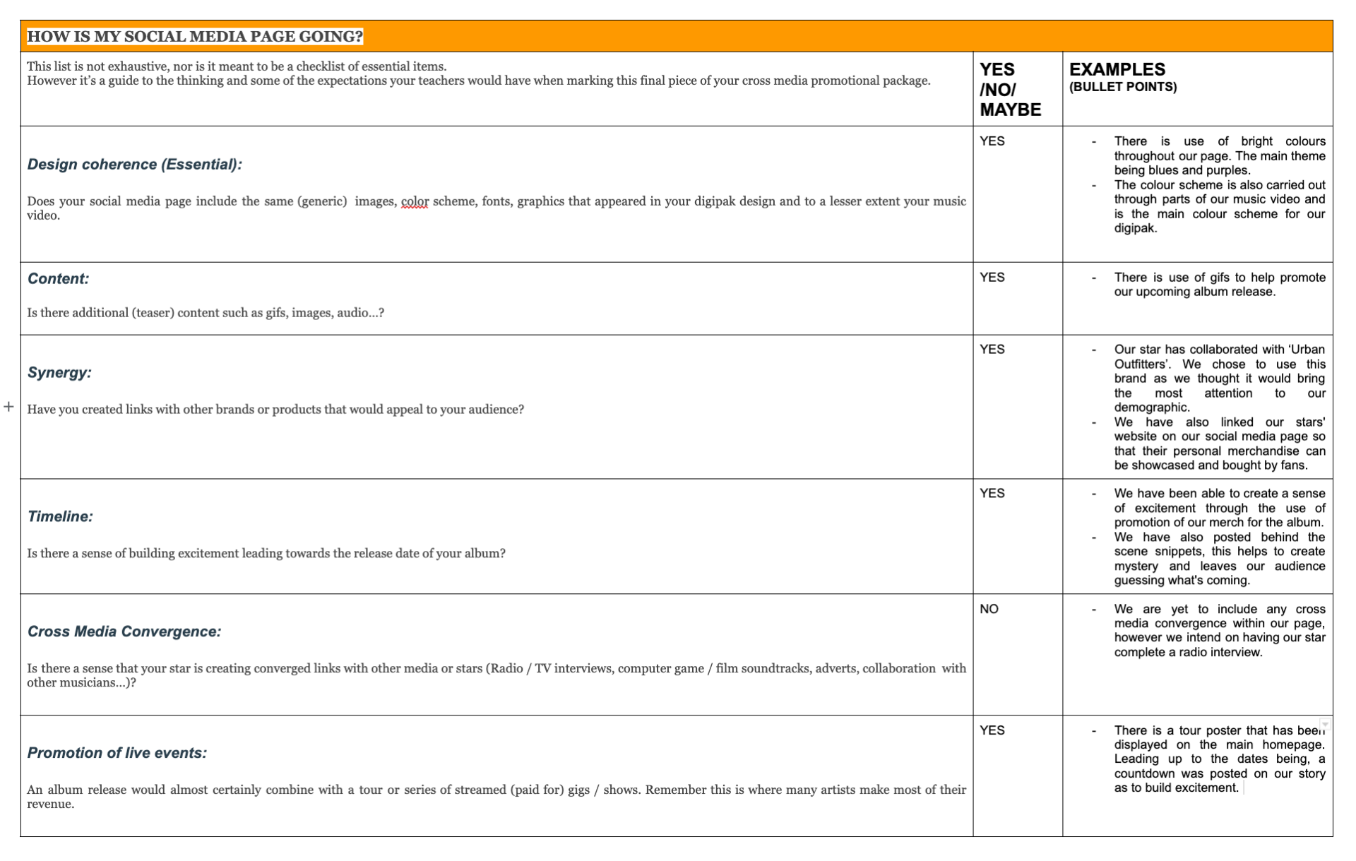
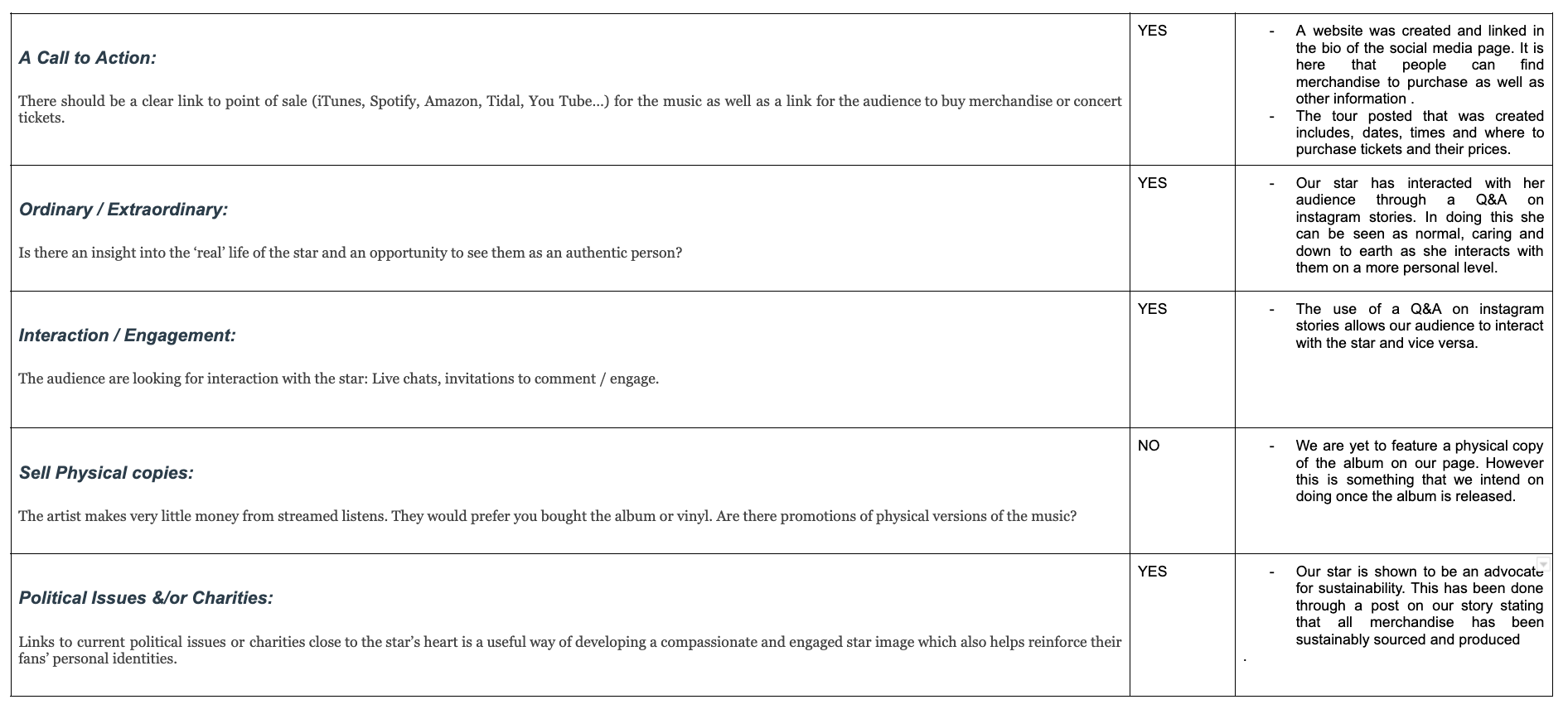
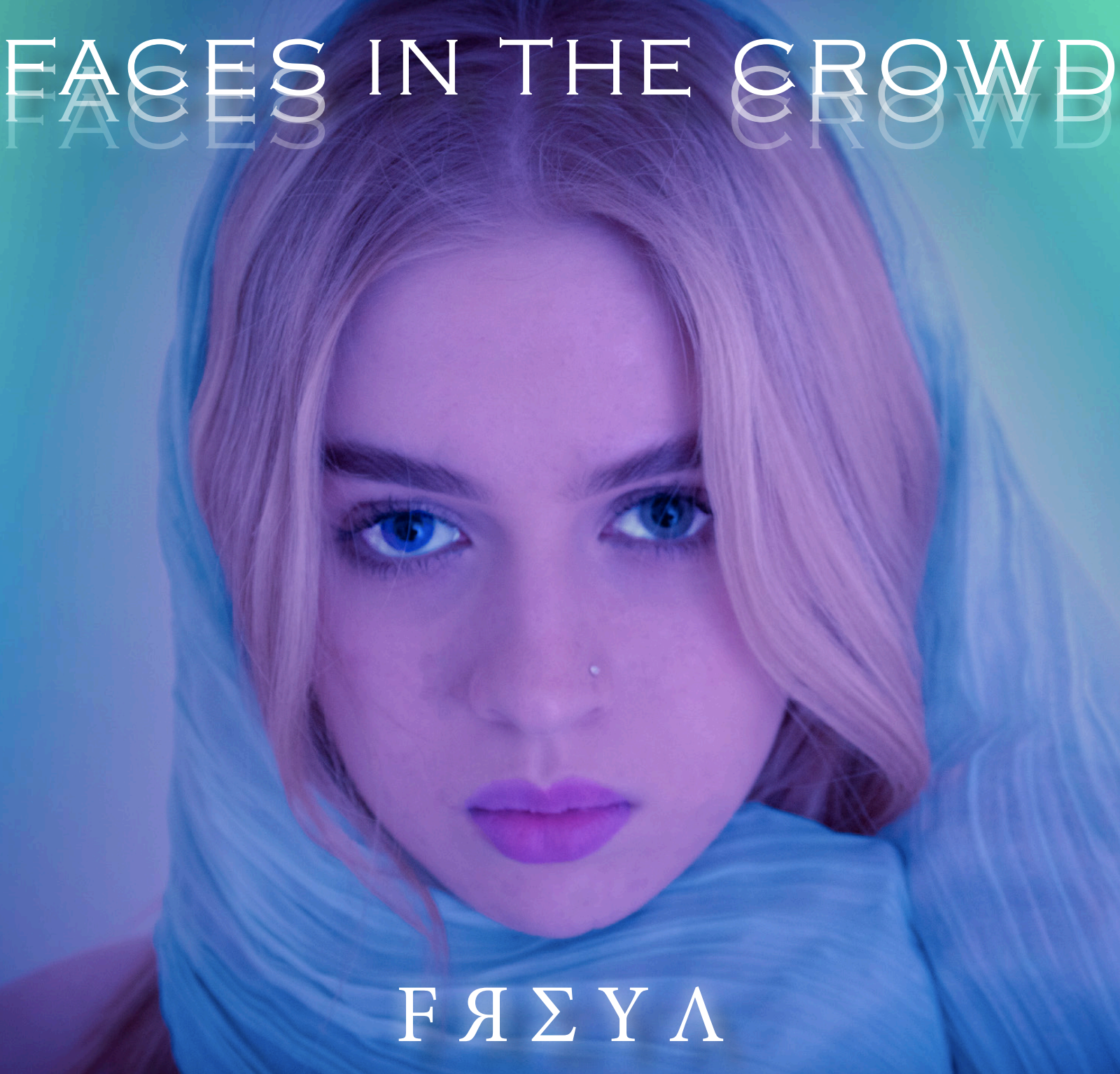
It is important to represent our star and the genre in an appropriate way that fits our branding and helps to create a successful package across all of our products that appeals to our target demographic. It was important to think about the use of colour, font and composition when creating our product as it is crucial that the digipak produced reflects the correct genre.

When thinking about representation we need to think about showing our star as extraordinary and ordinary simultaneously. This refers to Dyer’s theory of star image when a star is presented as present and absent.

The main focus for our star image was representing our star as mysterious and a higher being. In order to represent our star, we employed the use of media language. This included images, colour, fonts, body language and costume to help us represent the genre and our star simultaneously, as it was important for us to have a clear use of visual signifiers to help represent our star correctly.

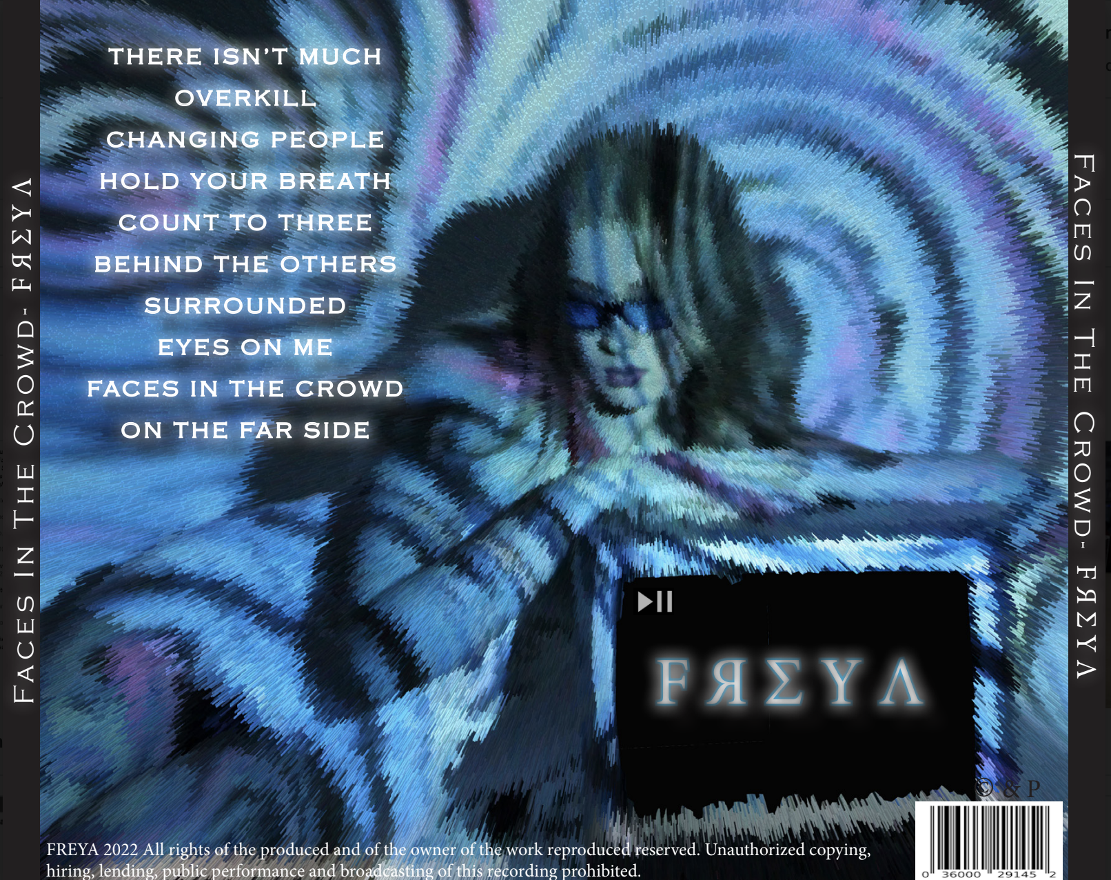
Through our DP, we wanted to represent our star as thoughtful, ethereal and mysterious. Our use of colour symbolises our star as an ethereal, dream-like artist. On top of this the use of an echo shadow on our album name infers to the psychedelic representation of the album and genre. Our front cover consists of a simple close up headshot of the star with a scarf carefully draped over her head and simple makeup. This helps to symbolise (Barthes) our star as a higher, intelligent being. It could be argued that Barthes’ idea of semic codes is prominent throughout our digipak, through the use of soft, atmospheric lighting and carefully chosen special effects that help our product to fit with other digipak designs seen throughout our chosen genres.

The most important aim of any marketing or advertising strategy is to engage the audience. Our main demographic was focusing on young females, however we allowed for our products to attract both genders. A perfect way to engage FREYA’s audience is through the use of a Social Media Page. It is imperative that any media text is encoded with signs and symbols that our target will be able to decode to help them receive the preferred text.

Gauntlett argues that we are all prosumers; we produce social media content as much as we consume it whilst Shirky adds to this by arguing that  that the wall between consumers and producers has broken down and that all consumers are partially producers, this is due to democratisation, so we were careful to include the audience in all of our decision making.

It was important to ensure that our SMP included Blumler and Katz essential elements to help engage our audience with our media text. These elements include social interaction. An example of this within our SMP is the use of the instagram stories feature to conduct a Q&A with our artists audience. This helps to create a more personal interaction from our artist to her audience and helps to keep the audience hooked on the content that she shares.

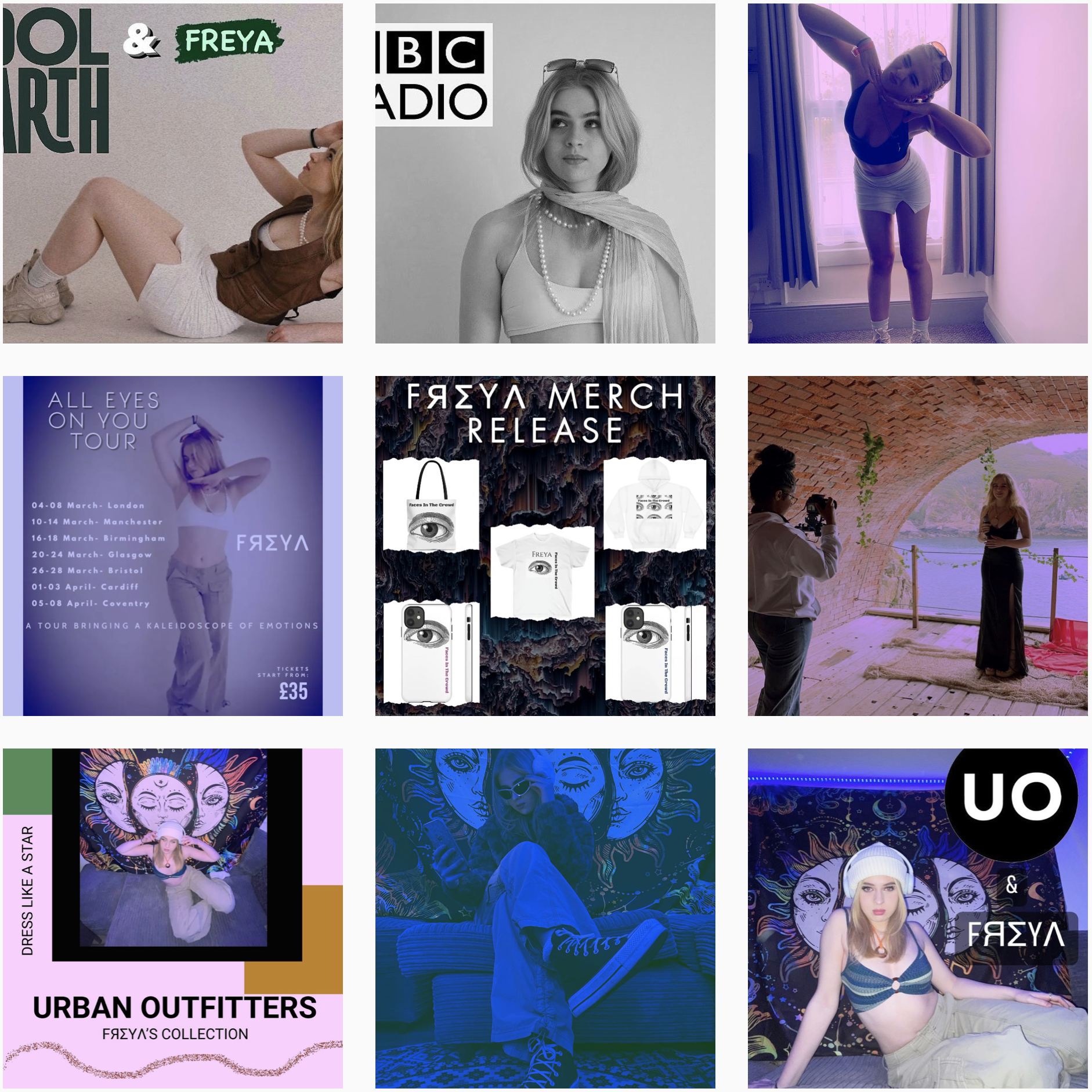
It was also extremely important that all the relevant information about our artist was readily available for our audience to find and consume to help adapt their personal identity. We were able to produce this information through the uses and gratification theory by creating a website, which we linked in the bio section of the instagram page, leaving our audience able to buy merchandise, find out more personal information about our star and other information such as tour dates and album releases. Our SMP also included captions, photographs and comments that fit with the ‘language’ of our genres encouraging the preferred reading of our audience.

Social Media Page – Draft 2

Link to our Social Media Page – https://www.instagram.com/freya.official.artist/

Once we had completed the first draft of our social media page, we continued to onto our second draft by making new main feed posts as well as stories and reels. Attached below is a small presentation showcasing the newest posts that have been made. In order to improve up our first draft, we used our reflection targets and acted upon them. It can be seen that we posted about political topics such as climate change. We chose have our star to highlight this issue by posting a collaboration with a climate change activist group ‘Cool Earth’, for this we shared an Instagram Reel for a one night only concert in Hyde Park with other large artists also supporting the cause. As well as a post on the stories feature encouraging our audience to look into why they should care about the planet and its environment.

We have now also included cross media convergence on our page, as our star was seen to be promoting an upcoming appearance on BBC Radio 1, giving her audience the time it would be on and hinting at what secrets she would be spilling. A Vogue feature edit was also posted during this draft, which included an interview article with our star, encouraging our audience to go buy the latest edition on read it. This helps to show that our star is established within the industry, people know her name and she’s  able to work with big brands and companies. In order to ensure that our audience is still able to interact with our star, our star has been seen to be replying to comments as well as sharing posts that the audience can interact with. Our final and most recent post within this draft, was a teaser of our stars new single and music video.

To know where we could still improve within our work, it is important that we receive a variety of feedback from people not in our production group. Below is a screencastify which we received from our teacher, in which she goes through what she likes about our page and what could still be improved/included within the page. Included below is a list of positives and a list of improvements that need to be made.

Positives:

  • The page layout is coherent and has created a brand and Image for our star.
  • Collaborations with charities – Raising awareness for serious issues.
  • Clear use of Cross Media Convergence
  • The use of behind the scenes content to keep our audience hooked.
  • Presenting our star as ordinary through the use of interactive posts.
  • Brand collaborations and promotions – Extremely important.
  • The wide variety of post types. (Reels, Stories, Main Feed Images).
  • Our star has an image where she is portrayed as ordinary and extraordinary.
  • The use of a website gives a different vibe and effect to the page.

Improvements:

  • Attempt to use Guerilla Marketing. (One Off Marketing).
  • Try to use more Cross Media Convergence. (Potential to have the stars music used in a movie or tv show).
  • Release the Album when page is complete.

Overall the progress that we have made during our second draft is encouraging as we have received positive feedback. We have been able to create a page that has a coherent image and branding for our star. There has also been a variety of posts included within this draft such as, collaborations, cross media convergence, behind the scenes exclusives and promotions. All of these posts help to build a stars image, provide information and entertainment, and help to encourage social interaction to keep our audience involved and interacting with the page.

Our next steps are to include all improvement points in our next draft to help make our social media page as successful as possible. It has been suggested that we try to include guerilla marketing as well as more use of cross media convergence. It has also been recommended that we release our stars album as one of the final posts for our social media page.

Social Media Page – Draft 1

Link to our Social Media Page – https://www.instagram.com/freya.official.artist/

Included below is a presentation of myself and my partners first draft of our social media page. Within this slideshow there are screenshots of every post that has been made so far, whether it was on the main homepage or on stories. These posts have included information such as a release date for our stars single, merchandise that available for purchase, collaborations with brands and behind the scenes exclusives. During this process, it was important that we thought about how our star was being marketed to our audience and how the audience is able to interact with the social media page as well as the artist themselves. The use of persuasive and exciting language helps to keep the audience engaged and interested.

The main colour scheme seen throughout our page is typically bright and uses lots of shades of blue and purple, this helps to with the continuity of our products as these are colours seen within our digipak and music video. In doing this we create a brand for our star, by using colours that the audience can attach to their image. Throughout our page there is clear use of the typical conventions that many other music artists display on their own social media pages, this guides the audiences and allows them to navigate through the page easily. We also use Blumler and Katz theory of entertainment, information, social interaction and personal identity, in doing this it helps our audience to resonate to our artist more easily.

In order to have a clear plan of our next steps with our social media page, it is important that we evaluate the work that we have completed so far.  In completing the evaluation below, we now know that we are on the right track and have completed many of the items within the checklist, however we have an understanding of what we need to include in the upcoming drafts of our social media page.

Please click on the image to view the PDF


Overall the first draft of our social media page has been successful and our star has been portrayed in the way we had hoped. However we understand that there is still room for improvement and that there are crucial aspects that we are yet to include. This means that posts within our second draft need to include the promotion of a physical copy of our album and the use of cross media convergence. In using these two key elements we will complete the criteria and will be able to continue on with our social media page successful.

Final Draft – Digipak

My partner and I have now produced the final draft of our Digipak. Overall we are extremely happy with the outcome of our products as we believe it connotes to the genres that we aimed to promote. As well as this we believe it fits our ideal branding. We aimed for our star image and brand to be promoted as ‘ethereal’, ‘powerful’ and a ‘higher being’. Throughout our digipak, there is clear use of media language that help to keep our product inline with the blueprint (Altman) of our brand. The clear use of a consistent bright colour palette across the digipak creates a coherent brand and helps to promote our star as unique and ordinary yet extraordinary. Our use of a modern, bold, sans serif font helps to create a media text that entices a young audience. The use of simple and effective designs throughout the product allows for it to connote to many different ideas, such as a spiritual feel with the use of a ghosting and glow effect on the text used. We feel these elements help to create an exciting and attractive product.

Dyers proposition of ‘The Paradox of the Star’ allowed us to represent our star as extraordinary throughout our digipak product. To create a sense of mystery within our front cover, our star is shown as expressionless and emotionless which contrast the design choices of special effects and other features to give all of our panes and energetic and exciting feel. We wanted to stay true to our mission statement and follow a multi-genre vibe through our digipak and we believe that we have been able to do this successfully. Our digipak product clearly supports the statement; ‘you are able to gather different genres of music within it through different technical conventions and elements’. As well as this there is concise use of the common conventions often found within Pop, Electronica and R&B digipak’s. These conventions included, a close up of the artist facing the camera on the front cover to create a direct mode of address, as well as portraying our star as ‘god-like’ and ethereal’, and finally a psychedelic and hallucinogenic feeling often found within electronica digipak’s.

Changes Made Since Draft 3

  • The change of font on “FREYA” on the front cover. This has been done to keep our digipak inline with our social media page, keeping our branding consistent throughout all our products. It has now also been centred.
  • We have adapted and changed the colour palette used on the inside panes. The left side has been changed to a cooler blue tone as to fit in better with the other panes. The right-side has become lighter, with the eye being brightened and the blue and pink tones becoming the main feature.
  • The spines have been changed to include the new font used for “FREYA”.
  • Along with the front cover and spines, the use of “FREYA” in the TV on the back cover has also been changed to the new font to creating coherence.

Overall, as a pair, we believe that our digipak fits perfectly with our mission statement. It is clear the our digipak product offers a multi-genre effect to our audience and promotes an eccentric star image. Finally, we believe that our audience will ‘accept the text’ produced and we are very happy with our final product.

Digipak Draft 3

We have now produced the third draft of our digipak, as a pair we feel that the design process is going well and we are near reaching our final product. During this draft, we made the suggested and necessary improvements that were pointed out to us during our last set of feedback. We have enhanced the ghosting effect that is used on the album title, as well as this we have adapted the background of our front pane to create a halo like effect to our artist to help with our image and branding. We have changed the colour scheme on the two inside panes to a lighter palette, this helps the double pane to have a more coherent look with the rest of the album. There has been very little adaptation to the back pane, however we have now included a play/pause button on the TV screen as well as placing ‘FREYA’ in the middle of the screen.

Attached above, is the digital and physical copies of our third digipak draft. By having a physical copy of this draft, we are now able to grasp how our album would look in person and we can gain a different insight into the improvements that still need to be made. It is also important for us to understand how our album is perceived by our audience, so to do this we asked members of our peer group to name which genre they thought our album belonged to. The results that we collected found that the album we have created fits our desired reading of three main genres, Electronica, Pop, and R&B. The results collected are what we had hoped for as the album fits with our mission statement of ‘a multi-genre artist’. Overall we are happy that there is visible representation of these three genres within our digipak.

Overall, our digipak is on the right track for completion, as well as displaying our desired genres to our audience. We have taken the most useful, key repetoire of elements (Lacey) and technical conventions seen within the genres of Pop, Electronica and R&B, while at the same time putting our own personal stamp on the work. At this stage there are very little changes to be made, however we will continue to make them relevant improvements in the final stage.

Timeline and Marketing Ideas

In order to create and produce a coherent and successful marketing campaign, it is vital to create a timeline for our social media page to ensure posts are created in an appropriate order. The information that needs to be included within these posts is imperative to the branding and marketing of an artist that can be presented to and reach an audience on a global level. It needs to include information such as tour dates, new releases, merchandise and teasers to help generate AIDA through entertainment. Our promotions also need to spark social interaction that allows our audience to gather a personal view of our star as well as helping them to adapt and grow their personal identity. Attached below we have included a range of posts we plan on uploading to our page this includes behind the scenes exclusives, brand collaborations, tour dates and interactions with fans.

The timeline above will help my partner and I to create a star image for our artist that promotes them in a positive and exciting way as well as helping our audience to engage with the text. In order to keep the audience engaged we intend on posting behind the scenes exclusives, tour dates, brand collaborations, a snippet of our music video and our artists own merchandise. In doing this we are thinking about the uses AIDA (Attention, Interest, Desire, Action) as well as producing information and entertainment, and allowing our audience social interaction with our star and the ability to adapt their own personal identity.

Moving forward, my partner and I now have a clear and organised plan of what we intend on doing with our social media page (Instagram). This plan will help us to create a common theme throughout our page that fits our brand, star image and genre. It will also encourage us to use a variety of marketing techniques such as synergy and guerrilla marketing. This marketing timeline has given me and my partner a target to focus on and that allows us to use certain features such as AIDA to keep our help audience engaged, interested and attracted to the image and branding of our star.

Digipak Draft 2

Whilst producing this second draft, it was important that we consider the reflections and targets for improvement from our first draft.  During the production of this draft, we had the opportunity to look at more images from our shoot and play around with them to find the best fit for our all four panes. In looking through our wide variety of photos, we were able to select the images which best portray our photography skills. Included below is a rough draft of all four panes of our Digipak. These designs are nowhere near completion and there is plenty of room for improvement in our next drafts, however we believe that it is going in the right direction to fit our branding and star image.

During the production stages of our digipak, it is important to get a range of relevant feedback that will help in gaining an outside perspective of our product. Attached below is a screencastify from our teacher which includes feedback on the good and bad aspects of our digipak. This means that we are able to gather a list of what needs to be improved within our next drafts so that we are able to produce a product that best fits our brand.

Teacher Feedback – 

This screencastify outlines what our teacher likes about our digipak so far and what could be improved in the coming drafts. Overall the feedback we have received on our second draft is mainly positive however there are changes that need to be made in order for us to have a successful final product.

Positives:

  • The front cover image fits well and looks professional.
  • The use of the echo effect on the title ‘Faces in the Crowd’
  • The style of our back cover is effective
  • Our teacher is confident in the design of our front cover as it is simple but effective.
  • There is clear use of the typical conventions of a Digipak

What needs to be improved:

  • Increase the echo effect on the title to create more of an effect.
  • Move the artists name into the centre of the cover.
  • Remove the text box outline on the front cover.
  • Include the album title as a song title.
  • Include the artist name on the spines.
  • Include the copyright information on the back cover.
  • Try different fonts on the back cover to create a more mature look that better fits our genre.
  • Adapt the middles panes to a lighter colour palette so they fit with the rest of the digipak.

We have made effective progress on our digipak, finalising our designs will be simple and easy to carry out. Overall, we are pleased with the design and layout of our digipak, but we understand that there is still room for improvement within certain elements of the design. Throughout the digipak, our use of photography and design is coherent. The colours and effects used our also tie in to the designs within our social media page. The use of similar design techniques helps to create familiarity between our products, as well as representing our star properly and efficiently, and helps to create a suitable brand image.

Digipak Draft 1

Front Cover:

Included above is the first draft of our digipak front cover. The draft we have produced is no where near completion or perfection however it has allowed us to combine our images with other digital design elements to gather an idea of what will work within our digipak. During the production of our first draft, there was a specific criteria that needed to be followed. It included:

  • The use of camera and photoshop to gather a variety of images and to create and manipulate enticing and engaging images.
  • A wide variety of Mise-En-Scene to help communicate meaning to our audience.
  • An imaginative and creative use of DTP to combine image, text and digital design together.

In order to compile our first draft, it was important that we focused on the criteria listed above. To help ingage the audience, there is a clear use of direct mode of address through the use of a close up shot of our artist, in doing this it helps to create a sense of involvment for our audience members. Our use of a bright colour palette helps to create feelings of excitement and mystery the fit with our ideal star image. The use of lighting and MES also add to our star image with the creation on an edgy and eretheral theme. To fully achieve our ideal star image we chose for our model to have a neutral facial expression as to not give our audience any clue to what the album might be like. The last point of the assessment criteria is yet to be completed however we will focus on this in our next drafts.

Back Cover:

The back cover of our digipak include similar elements to our front cover, with the use of the same typeface a neutral facial expression on our model as well as a typical composition of our artist in the centre of the cover. The back cover of our digipack needs to follow the same assessment criteria as our front cover which is listed above. For our backcover we have also included an image from our shoot however in post production it has been digitally manipulated to add to the pshcadellic background. Currently we have only included our list of song titles and barcode, within our next draft we intend on including the copyright, music group, branding and year of production. Including those finer details in our next draft will help us to achieve our whole assessment criteria. Our back cover design in also no where near completion and we intend on playing around and adapting other images, chosing certain designs and effects as well as playing around with different colour effects, we will also need to include the designs for our spines.

As we have now produced a first draft of our front and back covers of our digipak, my partner and I are now able to continue with the design process while adapting and improving our designs and changing neccessary elements to best fit our star image. We know that our first draft is very simplistic and extremely far from being completed, it is crucial that my partner and I think about the path we would like to take our branding and star image down. In doing this it will help to ensure that all elements of our work fit well together as well as following the typical conventions of a pop digipak.

Audience Interaction With A Social Media Page – An Analysis

It is important that before my partner and I begin to create our own social media page, that we gain a knowledge and understanding of how to present a brand and star image. It is also important for us to look at how artists promote themselves and their work within the music industry. Together, we chose to look at Tinashe’s instagram page and analyse her work and how she connects with her target audience and demographic. Through studying her page, we began to think about how we would like to promote our star, we understood that the general atmosphere of her page is something we enjoyed and that we would like to portray within our own. Below is mine and my partners screencastify where we have analysed and highlighted the technical conventions that are typically seen throughout her social media page. 

After analysing her page, we now know that Tinashe is an established artist and star within the industry, we were also able to see and understand all the typical conventions that she has used throughout her social media page as well as how she markets herself to her audience. Her instagram tends to follow the conventions of AIDA through the use of her colour palette and unique images. There is also clear use of Blumler and Katz theory of uses and gratification with promotion of information, entertainment, social interaction and personal identity.

With the knowledge and understanding that we have now gained, we are confident on how to promote an artist and how to keep them relevant within the industry. We have a solid idea of what is important when keeping our audience hooked, this includes promoting our star as ordinary but extraordinary. Going forward we will use thing information and knowledge when creating and promoting our own artist.

Social Media Page Terminology

Through analysing a social media page, I have been able to gather a wide variety of information regarding the technical conventions of a social media page within our genre. Everything that is posted within an artists social media page is created to meet the needs and desires of their target audience and fanbase. By having content that fits there branding, artists are able to easily promote themselves on a wider more likely global level. 

The content that is often posted on these types of platforms is often merchandise or products created by the star or promotions for their latest albums or releases. The use of a social media page is key in representing the star and their image, it also allows for direct communication between the star and their fanbase and helps the star to be presented as a normal human as well as this global star.

Looking forward to producing our own social media page, it is very important to think about the planning, timeline and structure of social media posts that will help to gain the most engagement. By analysing a social media page, I have been able to understand what technical conventions we will need to replicate within our own page to maximise engagement with our audience.

Older posts
Skip to toolbar