Category: Music Magazine
Final Draft 4
Reflection
It was critical to learn about the various conventions before launching the magazine. This includes the front cover, contents page, and two-page spreads. We also had to choose a genre with which we were familiar to conduct research. I chose Hip Hop for my music magazine because I already had some good ideas for what I could do.
Due to the fact that every piece of content on my magazine pages is entirely original, I believe I successfully met the requirements. I selected the fonts, wrote the text, photographed the images, and designed the entire magazine. I also managed to include four of my images, as suggested by the brief.
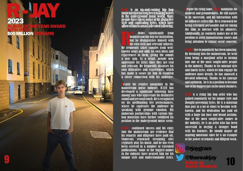
A lightbulb moment for me was probably discovering the lighting tools that were available to me in InDesign. I used these for my Double Page Spread to edit the cover star into the photo and blend him in using lighting and shadows. I had to create the shadows by myself using the brush tool, where I created a bit of a shadow and darkened the left side of the model, and then I discovered the lighting tools that made it a lot easier for me to blend him in.
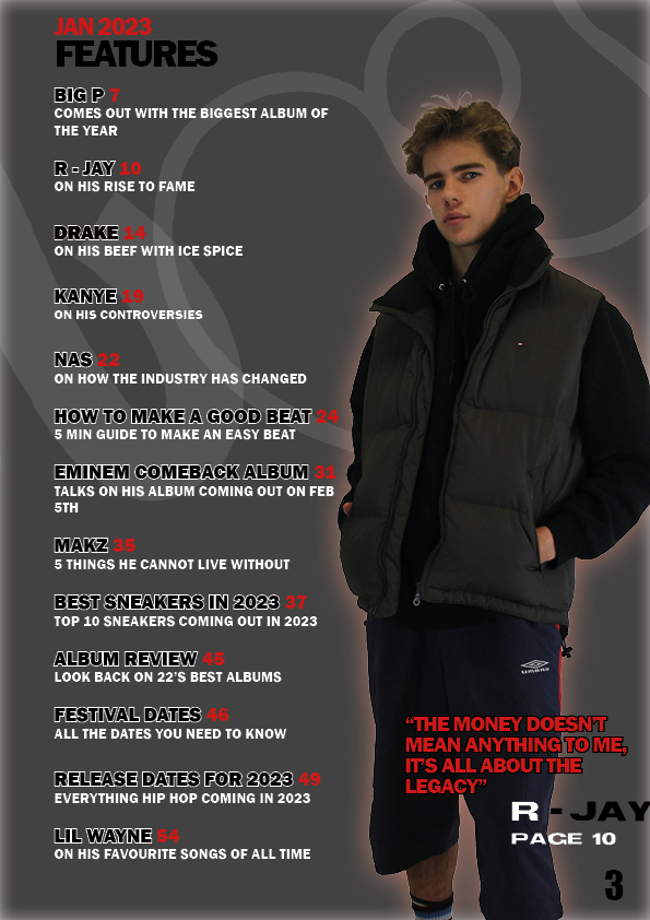
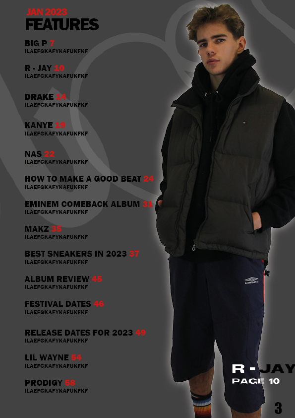
If I had to tell myself to start again I would tell myself to perhaps use a wider variety of colours as all three of the pages are based on the same few colours, which I think work well but I should have changed the colours for every page. I would also make my contents page more exciting as I think that it looks a bit bland and there is not much going on.
Chosen Adverts
My Chosen adverts need to be relevant to my target audience so that the adverts are successful and they are genuinely interested in the product being advertised. To be able to do this, I need to completely understand who my target audience are and what their interests are. I have previously researched who my target audience is and their interests in a previous post (My Audience Profile) and i have come to the conclusion that these are some of the things that they like. The audience are mostly young people who care about how they look and tend to be more relaxed people who enjoying playing videogames with their friends. That is why I have chosen these adverts:

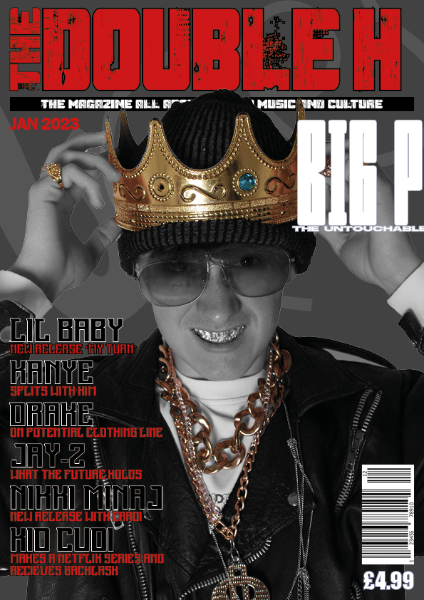
This advert will appeal to readers of Double H because fashion is a huge part of Hip Hop and people highly value what they look like. I believe that this advert will be very relevant to the readers and rather than just skipping past this they will actually look at it and potentially buy the shoe.

This is another advert that I believe to be very relevant to my target audience. Basketball is widely recognised to have a huge impact on Hip Hop artists and is a part of the Hip Hop culture. 2K23 is the leading basketball videogame which is widely played by Hip Hop fans all over the world. Even the cover star of this advert is a Hip Hop artist, J. Cole, who is a staple in the Hip Hop world.
Draft 3 of Front Cover, Contents Page and Double Page Spread

Some final touches could be…
- Remove pug as it doesn’t fit well with the rest of the magazine
- Make the text under the masthead more visible
- improve the clarity of the cover lines as they may be difficult to read
- Increase the price of the magazine as this is very cheap for a magazine

And some final touches will be…
- Improve line spacing of captions in the top left
- Add a name to the page, who wrote the article and interviewed the artist
- Add the correct page number that corresponds to my contents page

Finally I will…
- change the quote as the nature of it doesn’t fit in well with the rest of the magazine
Double Page Spread 2

Some things that I have changed in this draft of my DPS are…
- The font of the text
- The format of the text which makes it easier to read and you know where to start reading
- Added social media’s of cover star
Some things that I want to include in draft 3 are…
- A different background Image that I need to have taken myself
- change the font as it looks very bulky
- The Image of the cover star does not look as if it is actually in the photo, I will need to take a photo with the cover star in it to make it look better.
Double Page Spread Draft 1

It is far from what I want it to be however I think that it is a good start that includes things such as Drop Capitals and I think that the caption in the top left suits the mood of the magazine well.
Some things that I want to improve are…
- The background Image as it is not my image and it does not look as if the cover star is actually in the image
- The text does not look appealing as there is a lot of it and if someone sees that they will not want to read all of it
- I also want to change the font of the text as it does not fit in well with the theme
Some things that I like are…
- The idea of the background image, when I get my own with the cover star actually in it I think it will look very good
- The Cover line as it fits in well with the theme of the rest of the magazine
Draft Feature Article


2nd Draft of Contents Page
What’s New?
- New fonts which are simpler and easier to read
- New cover star
- New layout of the whole page
- Changed background
- Added where to find the star image
What’s Next?
- Improve the image by changing the glow
- Add more headlines
- Change colour of headlines
- Add an ediors note
- Add a quote from cover star
2nd Draft of Front Cover

What’s New?
- New text
- New Fonts
- Added Price
- New Masthead
- Now Black and White, less colour
What’s Next?
- New Background
- More Colour, I want to try with black and white not applied to jewellery
- Add a date (edition)
- Make cover lines bigger and more readable
- More Information on the contents to attract an audience
Second Shoot Contact Sheets


These are all of the pictures from the second shoot, where I used a different model and a complete different mood to the shoot. In this shoot I decided to have a more relaxed, relatable mood rather than having the model look like a celebrity. I feel like this will create a vocal point for the audience as they can discuss the clothes being worn and they can even wear the clothes themselves.

