Draft Feature Article


What’s New?
What’s Next?

What’s New?
What’s Next?


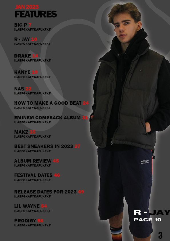
These are all of the pictures from the second shoot, where I used a different model and a complete different mood to the shoot. In this shoot I decided to have a more relaxed, relatable mood rather than having the model look like a celebrity. I feel like this will create a vocal point for the audience as they can discuss the clothes being worn and they can even wear the clothes themselves.


When crating my Double Page Spread, I will need to ensure that I keep in mind all of the aspects to Hip Hop in mind to try to replicate a Hip Hop artist the best I can. In this shoot, I have chosen to represent the Hip Hop artist as a more relaxed person in this shoot to try to get a relatable feel. Hopefully this will attract more readers as they will be able to relate to the outfit and the style of the artist. The aim of the second shoot is to hopfeully get some good photos which I can use on my double page spread and also in my magazine either on the front cover or on the contents page

This is a Biography on James Lavelle, who is a British DJ, record producer, and founder of the record label Mo’ Wax. He is best known as the co-creator of the UNKLE project, which has released several albums and singles since its inception in the 1990s. A biography should contain information on their journey to where they are today as this is the main focus of the article, which this one does along with a quote on his journey and his struggles. He states that he struggled financially and what he went through to get where he is today. This Biography took place because James Lavelle wished to show why his recent release is the way that it is, showing the struggles that he has been through over the years. The article was released not long after he published his recent album so that people were talking about it and it was a hot topic. An indirect biography which is not very reliable as the information is gathered from other sources which may be untrue. James Lavelle takes up over half of the page which attracts consumers which know him and are interested in his story. There is also a brief summary of the biography in bold which people will read first as it is more attracting. People will read this and may be intrigued and wish to carry on reading.
In conclusion, The article is structured well and will attract an audience that is interested in James Lavelle and and want to know what the rest of his story. In future, I will need to think about this and how I will attract the desired target audience into reading my article and all the ways in which I can do so.


Based off of this peer assesment I have made some targets for myself when creating my final draft of my contents page,
Click on these slides to see inspirational contents pages along with some hand drawn mock ups of what my contents page could potentially look like.
These slides contain some inspiration as to what a contents page in a magazine should look like. The Second slide consists of some hand drawn mock ups which I will consider using as a template for my contents page.
A contents page is a list of the main topics and sections in a publication, along with corresponding page numbers, that helps the reader navigate the document and find specific information quickly. It may also include coverlines, short phrases summarizing the main points of an article or section, to create interest and curiosity in the reader. An index, a list of key terms or topics with page numbers, may also be included to aid the reader in finding specific information. The contents page serves as a roadmap and can use marketing techniques, like the AIDA model, to grab the reader’s attention and create interest in the material.
10 catchy headlines that I could potentially use

This is my first draft of my Front cover for my magazine. Some things that I thought went well is the framing of the shot as I believe that it presents the model well and is well suited to the hip hop genre as the model looks menacing and edgy. I used a variety of shots with different angles and distances and I decided on this one because the close up presents how a hip hop artist would be very aggressive and fierce.
5 targets that I would follow for my second draft would be


This is a contact sheet for my first shoot where I took around 80 photos of my model. They consist of three different outfits and plenty of different poses and props used to portray the genre of Hip Hop. I think that it went quite well in that I have many different photos to choose from. One thing that I struggled with is the lighting. It took me a while to get the flash to the right setting so that my model’s face was not too bright. However I think that there are many photos that I will be able to use in my magazine. Next time I will ensure that I get the lighting correct to make more of the photos usable.
This is one of my favourite photos from the shoot and one that I will most likely use. I like it because all of the jewellery is on display and I think that I got the lighting perfect for this photo. The mise-en-scene used represents the Hip Hop genre well and this was my favoutie outfit of the few I used aswell.
This was also one of my favourites from the first shoot as again all the jewellery was well presented and contrasts well on the white T shirt. However I may not end up using this photo as the lighting was too low in my opinion. Also, I used a white T shirt on a white background so this may be difficult to cut out on photoshop.