Category: Component 1

A textual Analysis of a Magazine Cover linking the font, colours, images language to the target audience, why is it designed this way?

I chose this magazine to analyse as I thought it was very simple yet still attractive to the  audience as the vibrant, neon text stands out and it is the first thing you look at. You could also quite easily decode what type of target audience would be and their psychographics. As you can see I stated that the audience would be young, fun seeking and creative as the target audience are people who enjoy making modern music, which will mostly be young, creative people.

In the future I need to consider things such as the fonts that I use when making a music magazine as it can have a huge impact on the way the magazine is represented. I also need to keep in mind the audience demographics and their psychographics as I need to know who I am making the magazine cover for. For example if I am going to be making a Jazz magazine then the audience are going to be very different and have different interests to someone that would read a Pop magazine.

Comments Off on A textual Analysis of a Magazine Cover linking the font, colours, images language to the target audience, why is it designed this way? Posted in

The Camera Talks


This is a variety of different shots which all represent different narratives while all using the same models and camera. For example, high shots look down on the model which imply that she is weak and vulnerable given the small presence represented by the angle. Another example of angles and shots being used is in the bottom left picture where a long angle shot is used to represent how lonely and powerless she is as she has nobody near her and she is surrounded by huge walls and trapped in a massive hall.

In the future I will need to consider using all of these different angles as it determines how the media is inferred. For example, if a high angle is used, looking down on somebody then they are interpreted as somebody who is weak and powerless as somebody is looking down onto them. This media language is hugely important as it engage the audience and they can tell the mood of the scene just from the media language

My image that uses mise-en-scene to communicate meaning

Made with Padlet

This Mood Board represents the genre of Punk. I was given this genre and was asked to create a mood board and tour poster of Punk and try to exemplify the punk lifestyle. Punk music originated in the mid 70’s and was much more than a music genre. People who followed punk music and were passionate about it very much made it a lifestyle. As you can see from the clothes they wore and the crazy haircuts they enjoyed expressing themselves through their appearance. Some fans more extreme than others as you can see the body modifications and attitudes that they conveyed. The rest of the world looked down on them as if they were crazy but the people who were really devoted to Punk and were passionate about it did not care what anybody thought of them.

I asked my peers to assess and decode the model and feed back the connotations that came to mind when they looked at the model. They did not know what genre of music I was portraying and as you can see they described the model with words and phrases such as chaotic and cheeky which perfectly describes a Punk artist as you can see from the mood board which contains similar connotations of a Punk star. This means that as a group we successfully represented a Punk star.

We decided that this was going to be our final photo as it best represents a Punk Star. The model portrays the genre the best and best presents a hectic, rebellious and edgy which is perfect for a Punk Star. This image works best as the model is holding the guitar and really looks as if he is passionate about their performance which perfectly portrays the Punk star. This uses good Mise en scene with all of the props and body language to represent the Punk culture and the model’s body language provides a realistic feel.

A Textual Analysis of a Tour Poster

I have deconstructed and decoded the media language used in this tour poster. I have deconstructed the meaning that this poster has and what it represents. For example I have decoded that the colour red signifies a firey and earthy feel to the music. The fonts communicate the violence and mayhem of the tour and represents how the mood of the performances will be. This posters was good at conveying what type of feel the shows will have as you know how the show will be before the event.

In the future I will need to consider every aspect such as fonts, colours, signs and symbols to enguage the audience and to represent the genre of music correctly and the lifestyle that the poster portrays. In my tour poster I am going to use all of these different components to create something that will enguage the target audience.

Media Concepts

There are 4 main media concepts;

Audience. These are the consumers who read or watch or listen to the media.

Industry. These are the makers who produce the media for the audience. They need each other to survive. They create media with a target audience based on things such as their occupation, age, gender and political views

Media Language. This is the way in which the Industry convey the media and how they represent the media text. They use different things such as a wide range of fonts, camera angles and lighting to determine how the audience interpret the media which is put in front of them

Representation. This is how the Media is put in front of the audience’s eyes. For example there may be manipulating and not conveying the truth or reality to the audience.  This is how the idea of the producer of  the media is represented and portrayed to the reader or watcher. The publisher is able to manipulate the audience into interpreting the media how the maker wants them to

I will need to consider all of these when producing my magazine and will need to make sure to include them all.

In the future I must think about…

For my magazine I will need to consider all of these concepts. For example I will need to take into consideration the people that the media is directed towards such as people who like jazz or people who enjoy Reggae. This will be very  important as I will need to reach my target audience by considering their age and interests for example.

I will also need to keep in mind how I portray the message. I will need to keep in mind the media language that I will be using for example I will need to use different fonts and colours to correctly represent my message and to attract the target audience. This is important when producing media as the media needs to be appealing to the target audience or else they will not be interested in the magazine.


My Media Diet

My Media Diet is a collage of plenty of different platforms and Media texts such as Spotify and Instagram.

Blumler and Katz came up with the uses and gratification. There are four main uses and this theory applies to why we use social media. The four uses are Personal Identity, Entertainment, Information and for Social Interaction.

My diet is personalised for me and is not the same as anybody else’s diet. This is because as a prosumer I create and intake media unlike anybody else. A prosumer is somebody who creates media. I create media by liking and commenting on posts.

There are many different reasons as to why we consume media and one of them is to reinforce our personal identity. I do this through Spotify where I listen to music that reinstates what kind of person I am and if someone were to look at my Spotify they would get some sort of idea as to what kind of person I am

Another example as to why we consume media is to be entertained. I watch Netflix on the daily as it passes time and engages me. This keeps me distracted and steers me away from boredom.

Social Interaction is another reason why we use social media as we are able to keep up with people we are close to. I use Snapchat daily to talk to my friends about what they are doing and to plan social gatherings. 

Focusing forward, I will need to consider all of these components when producing media as I need the audience to relate to the media. I will need to make sure that the media is entertaining to the audience and it is appealing to them so that they enjoy consuming it. I will also need to make sure that my media is informative to them and will give them the right information on whatever the media will be about, for example for my magazine I will need to write about the music genre to inform the audience about the genre and about the artist that the magazine is about. I will ensure that my media will be personal to the target audience and that they can relate to it and that the media reinstates who they are and what they like. I need to make it enjoyable for them so that they can relate to other people with the same interests and socialize and interact with others about the media.

WELCOME

Component 3 Brief:

“A promotion package for the release of an album, to include a music video (major task), together with an official social media page for the band or artiste(s) and a digipak for the album’s release (minor tasks).”

Music  Video

Digipack

Front Cover


Inside Left


Inside Right


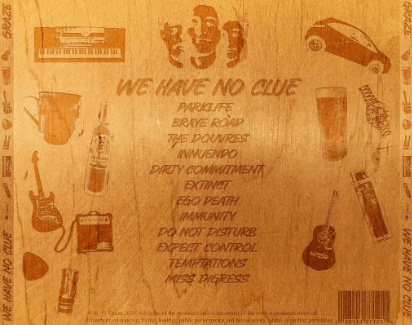
Back Cover and Spines

Click here to view the PDF

Social Media Page

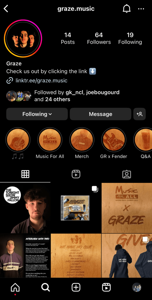
click the image to view our Instagram Page


Component 1 Brief:

The front page, contents page and double-page spread of a new music magazine. This is an individual edition of a music magazine.  All of the images and text in the magazine are original and produced by me with a minimum of 4 of my own original images.


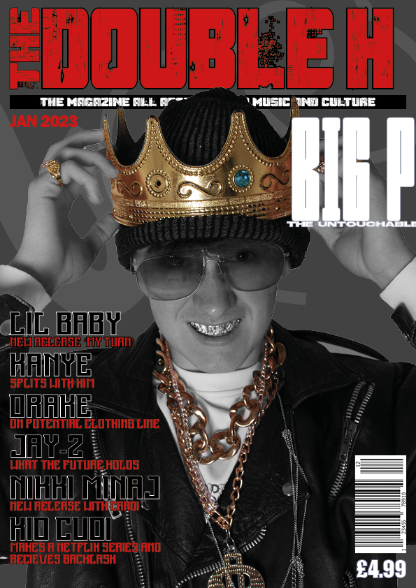
My Final Front Cover
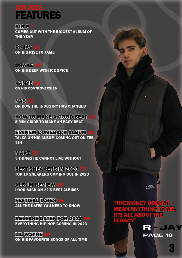
My Final Contents Page
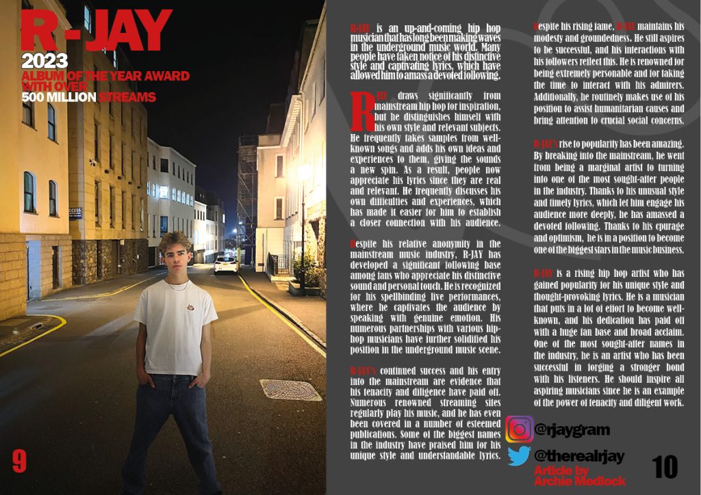
My Final Double Page Spread


My Final Draft of my music video

Comments Off on WELCOME Posted in

Sample Page

This is an example page. It’s different from a blog post because it will stay in one place and will show up in your site navigation (in most themes). Most people start with an About page that introduces them to potential site visitors. It might say something like this:

Hi there! I’m a bike messenger by day, aspiring actor by night, and this is my website. I live in Los Angeles, have a great dog named Jack, and I like piña coladas. (And gettin’ caught in the rain.)

…or something like this:

The XYZ Doohickey Company was founded in 1971, and has been providing quality doohickeys to the public ever since. Located in Gotham City, XYZ employs over 2,000 people and does all kinds of awesome things for the Gotham community.

As a new WordPress user, you should go to your dashboard to delete this page and create new pages for your content. Have fun!