Chosen Adverts

I have chosen these adverts to feature in my music magazine based on their relevance to my demographic of teens/young adults that will be interested in alt culture. Dr. Martens is a conventional piece of alternative fashion and are the leading brand in the boot market. Boots are usually the primary choice of shoe for people who listen to metal and alternative music so the advert would be fitting.

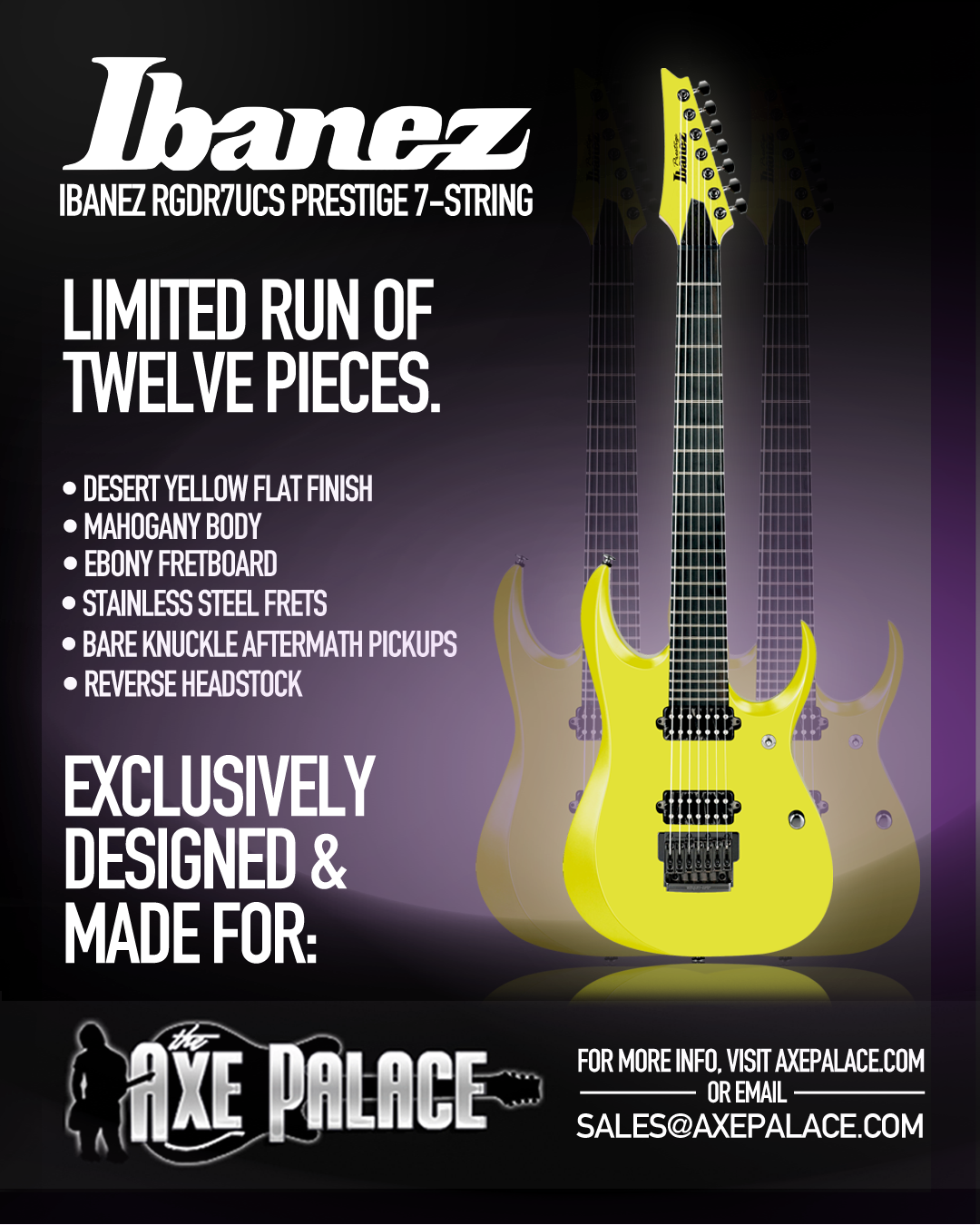
As well as this, I have chosen 7 string Ibanez guitars to feature in my magazine. This is due to Ibanez being such an important and iconic guitar brand in metal music. To make the advert even more specific, I have chosen to advertise 7-string guitars due to extended range guitars becoming increasingly prevalent in modern metal music, compared to ordinary 6 string guitars. A lot of metal music listeners also happen to be musicians as well so advertising a guitar brand would work well in a metal music magazine.


Complete Magazine Draft 3

What’s new?

  • Cover star photo edited and cut out more cleanly
  • Replaced pug on front cover with a banner
  • Restructured contents page so the title ‘contents’ was at the top because if it is at the top it’s the first thing the audience will read
  • Another snake added in contents page to fill some more space
  • Band name in English on DPS
  • ‘Q&A’ added on DPS
  • The questions on the Q&A are pushed in a bit so they wouldn’t be cropped out of the magazine

  • Bigger masthead
  • Bring ‘Oscar from Ghost’ closer together
  • Coverlines on the left smaller and more involved in the story
  • Add price and edition
  • Page number
  • Make photo link to story
  • Continuity with ten56.
  • First para bigger bolder font
  • Drop capital second paragraph
  • make question on the left line up better
  • fix hyphens
  • add by line
  • page numbers
  • move down q&a
  • make ghost the logo
  • meet the band a bit higher

2nd Draft of DPS

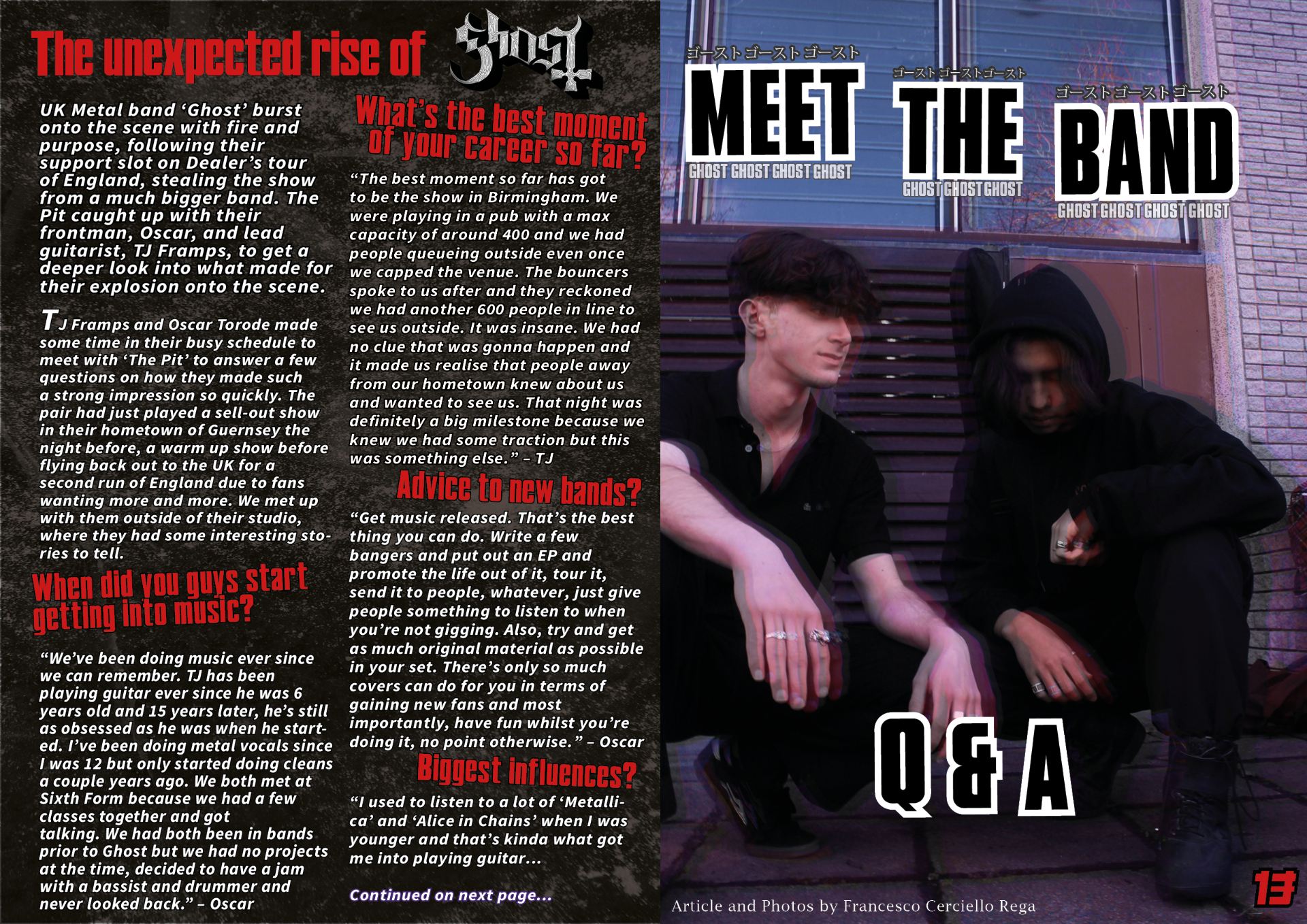
After spending some time criticising my double page spread and finding things that I’d like to change, I gave it another go to get my second draft.

What’s new?

  • I changed the image on the right to a more engaging image as well as editing it to demonstrate photoshop skill
  • I changed the background from a black one to a dusty one as I thought the plain black was a bit boring
  • I changed the layout of the title and made it bigger
  • I moved the questions so they didn’t get cut off by the double page
  • I added Japanese writing into the title to carry on with the modern metal theme

What’s next?

  • Try and make the text more legible
  • Add the band name ghost in English somewhere as it is currently just in japanese
  • Add some more text to the right side to give more content

2nd Draft of Contents Page

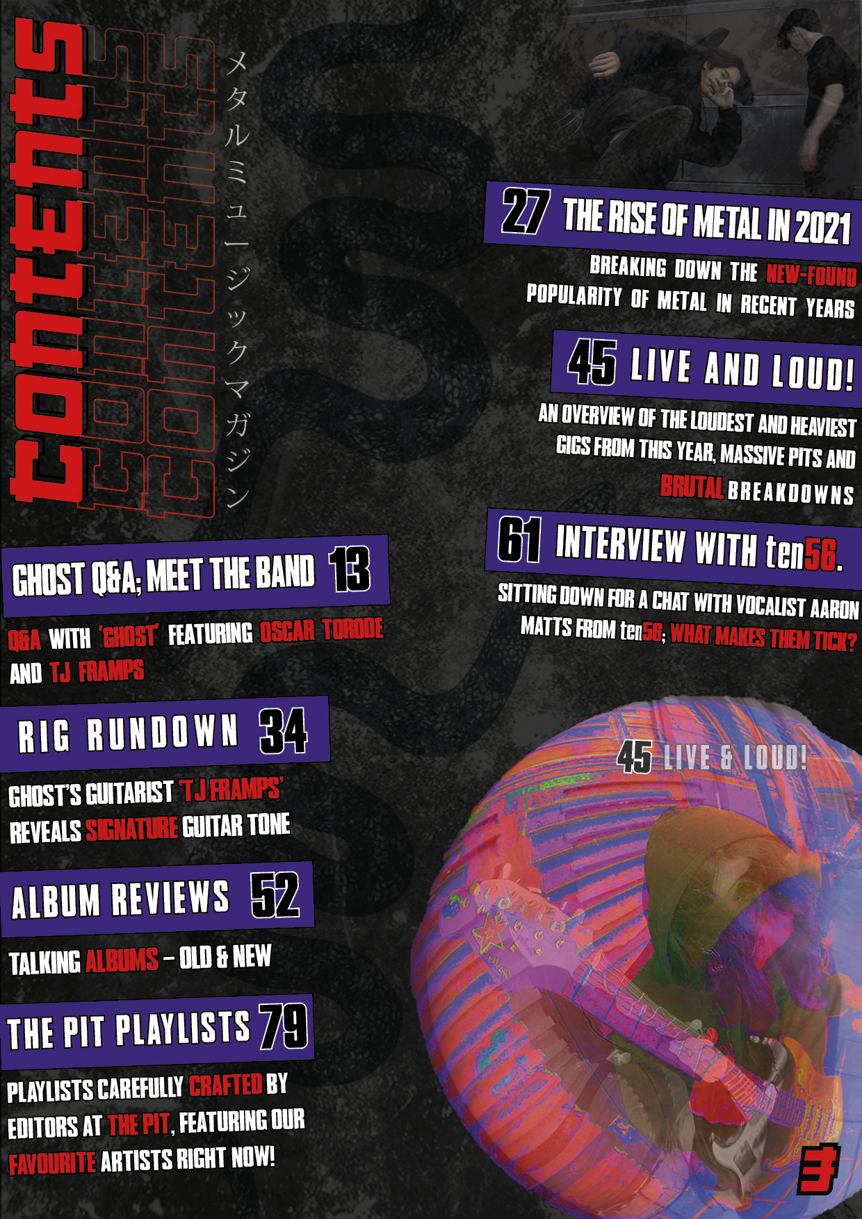
After spending some time criticising my contents page and finding things that I’d like to change, I gave it another go to get my second draft.

What’s new?

  • I changed the background to a different dust/noise image as I found the one I had before to a bit tacky and made my cover look like a pop music cover.
  • I restructured the design a bit to fill up more space
  • I added more contents because it was minimal and didn’t have enough pages
  • I added different images and a more interesting, highly edited picture to capture attention
  • I added Japanese writing and a snake into the background to make it more visually appealing and modern

What’s next?

  • Blending the images better in the background
  • Making the font more legible
  • Filling in the gap in middle

2nd Draft of Front Page

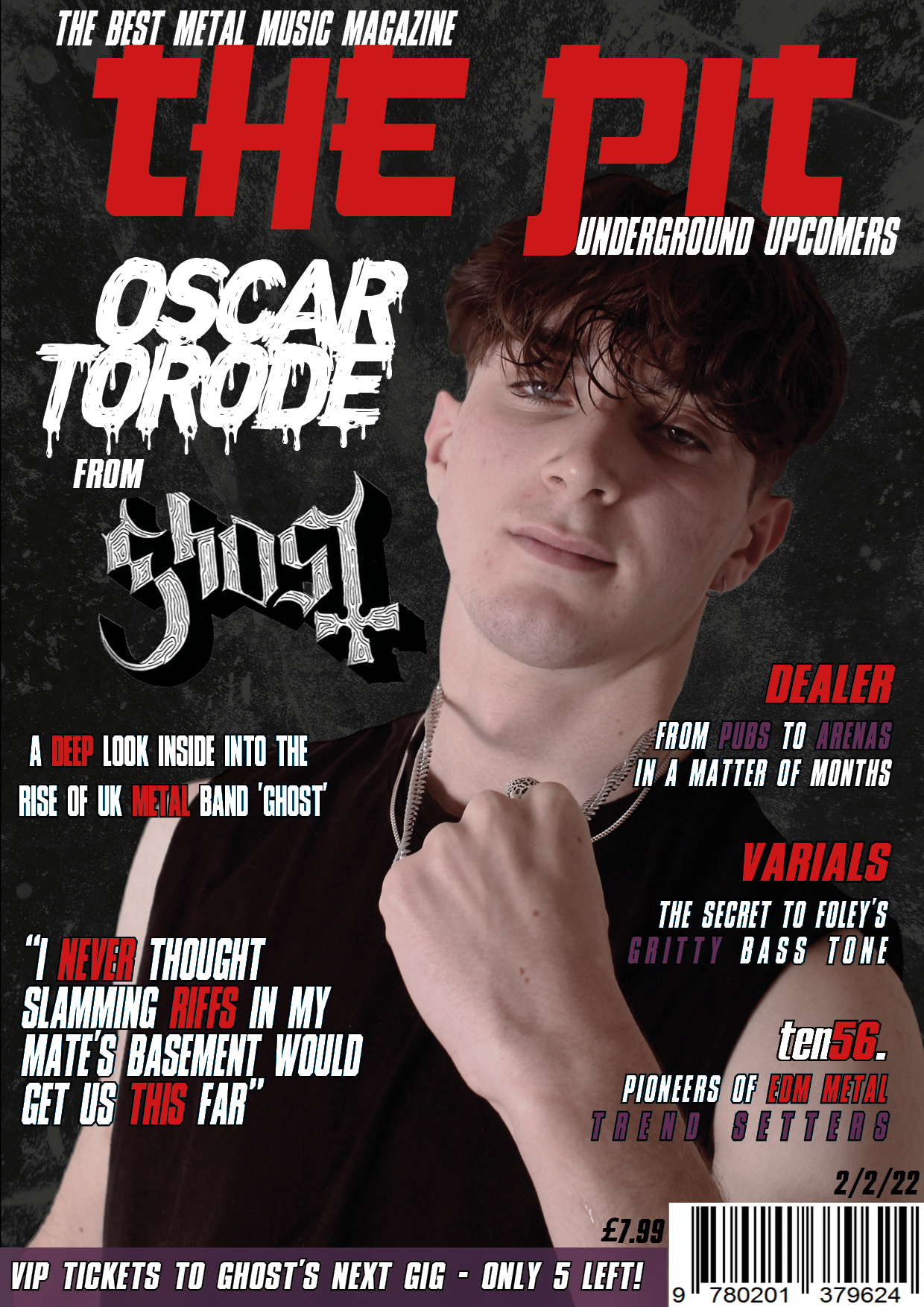
After spending some time criticising my front page and finding things that I’d like to change, I gave it another go to get my second draft.

What’s new?

  • I changed the background to a different dust/noise image as I found the one I had before to a bit tacky and made my cover look like a pop music cover.
  • I also flipped the cover star horizontally.
  • Added new cover lines which talk about other bands in the magazine and not just the cover star.
  • The masthead was adjusted to make the smaller writing closer to the main masthead
  • Added more purple to give more variety in colour

What’s next?

  • Editing the cover star
  • Cutting him out better
  • Potentially rearranging the composition
  • Changing the pug