CCR3

How do the elements of your production work together to create a sense of ‘branding’?

How did your research inform your products and the way they use or challenge conventions?

How do your products represent social groups or issues?

How do your products engage with the audience?

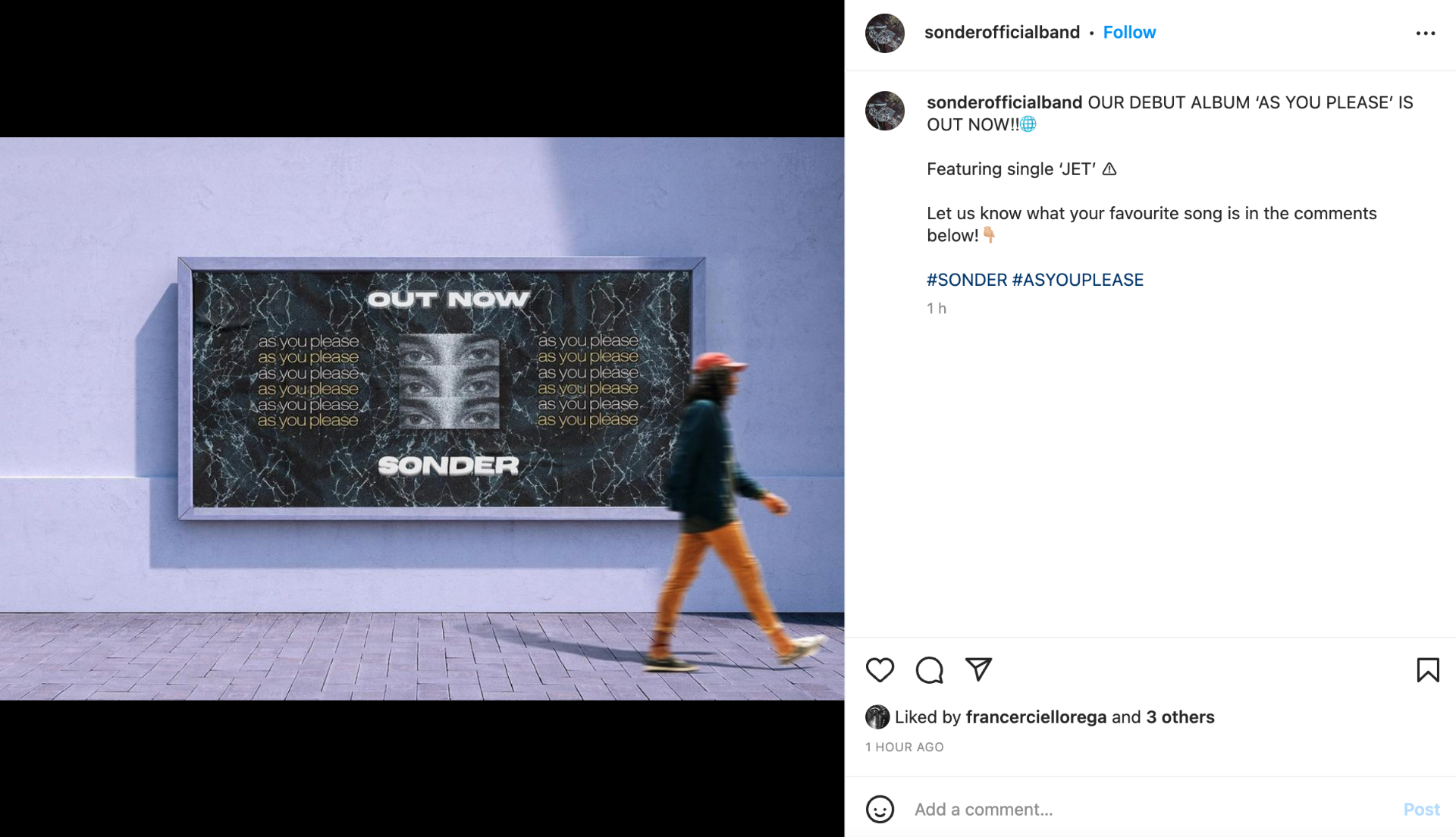
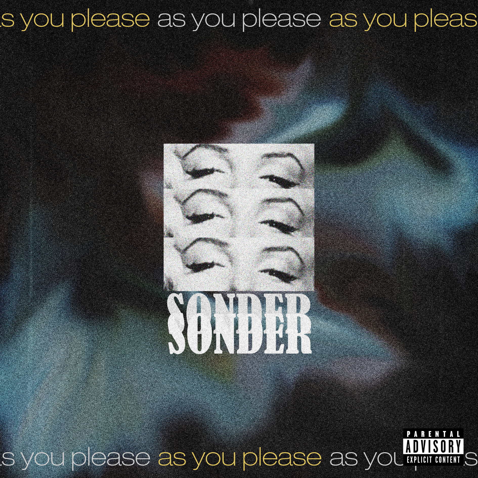
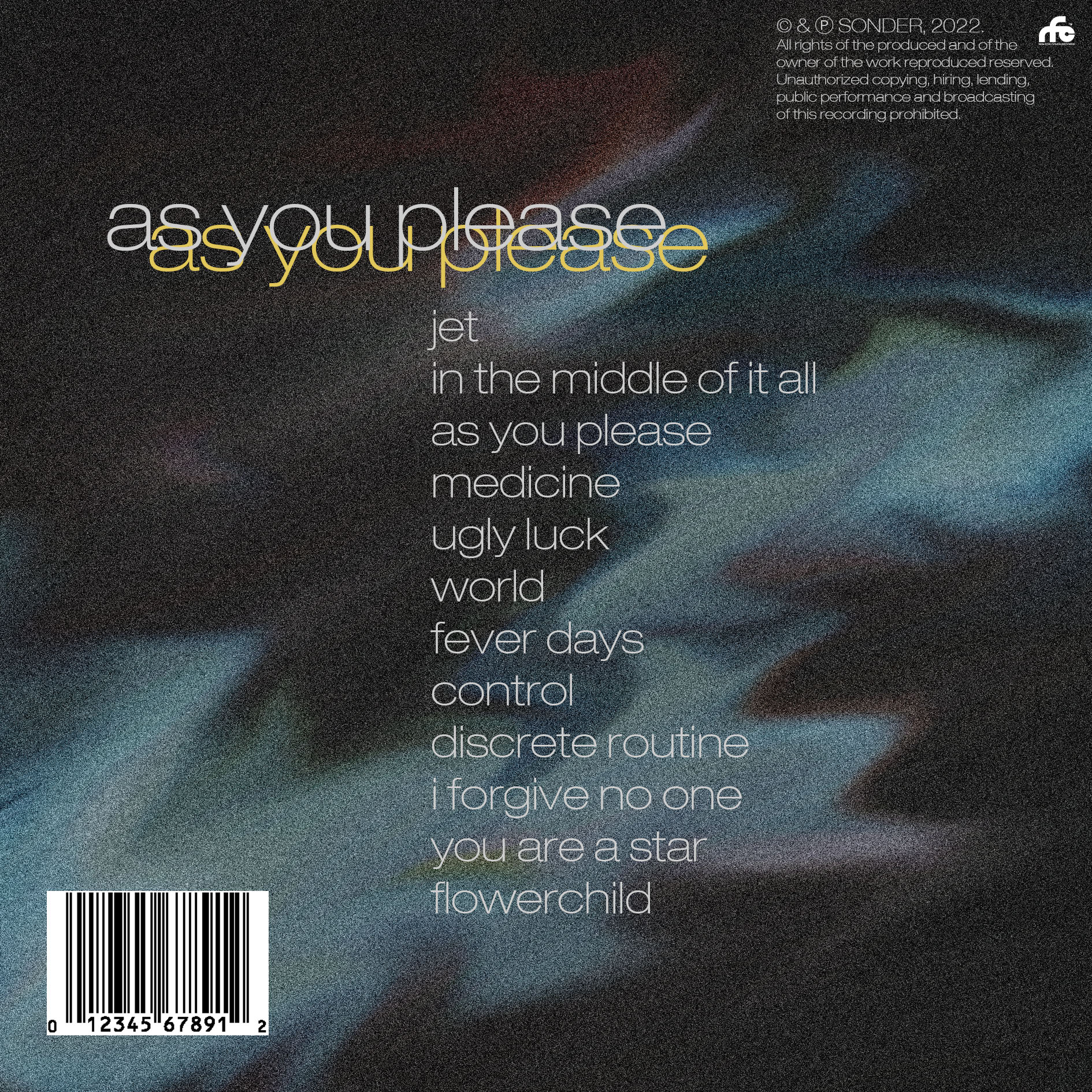
Coherence and continuity across all products are vital to constructing the brand image of the artist. Prior to starting the production process, we stated in our mission statement that we want to create a brand image that ‘makes a positive difference, provides a visual and musical experience, innovative media, and is relatable and enjoyable whilst allowing the audience to express themselves beyond what society deems normal’. It was important that across all of our branding that this message was consistent and accurately represented our star as both ordinary and extraordinary, as explored in the ‘paradox of the star theory’ (Dyer). Our music video and Digipak help portray our brand as sombre, intense and emotional. This was done through the use of low-key lighting and dark colour palettes, which helped signify (De Saussure) the band’s trademark sub-genre of punk. This representation is carried throughout into the social media page, however, providing a contrast to the typical characteristics of the branding. Whilst we still aimed to portray the band as more introspective, we contrasted that with some colloquial language as well as more humorous aspects, more specifically in our stories/highlights to allow the audience to relate to the band and create an ordinary star image. We also used a modern typeface in our digipak with distorted effects, contrasted with grainy textures in order to reinforce the ‘vintage-but-modern’ aesthetic that we were aiming for in our brand image. The contrast of the typeface to the general aesthetic reflected the music by aligning with how the music is intense and fast-paced but the lyrics are more low-key and sombre.

We researched professional pop-punk music videos and they had a convention of performance-based, energetic videos. They often featured handheld shots as well as lowkey, neutral clothing and conventional MES such as instruments and microphones. An example of one of the videos we researched was ‘Kept – Movements’. What we liked a lot about this video was the vintage, grungy connotations it had, through the use of low-key lighting, antique MES like paintings and old wallpaper, whilst contrasting the vintage feel by using modern post-production effects. These are referred to as the repertoire of elements (Lacey) and present the audience with a certain combination of conventions that demonstrate to the audience the genre of the video. This is argued by Altman to be the blueprint for pop-punk music videos.  In our video, we tried to conform to the genre conventions, as researched, and we are relatively happy with the outcome. We planned to have more of a narrative in our video, but fortunately, the genre conventions allowed us to get away with a more performance-driven video because that is commonly seen for our genre. Due to our genre having many subgenres, it allowed us the opportunity to experiment and have creative freedom as most things could be argued as conventional for pop-punk. From our research, we included handheld shots in our video to convey an energetic mood, as well as using large amounts of post-production effects like overlays and glitch effects to further add to the energy. This was contrasted by less camera movement and effects during calmer moments in the video which helped convey the theme of emotion and loneliness throughout the video.

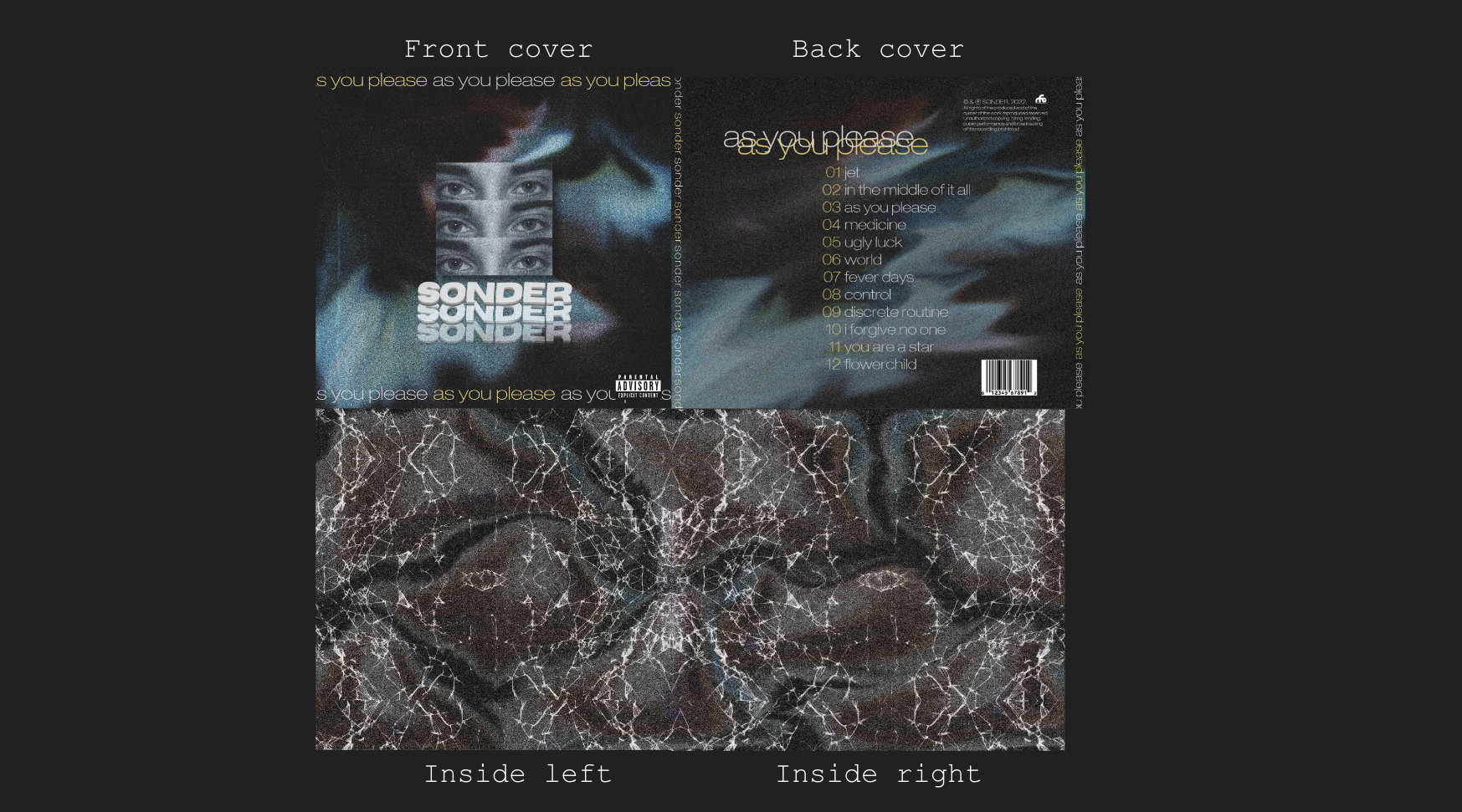
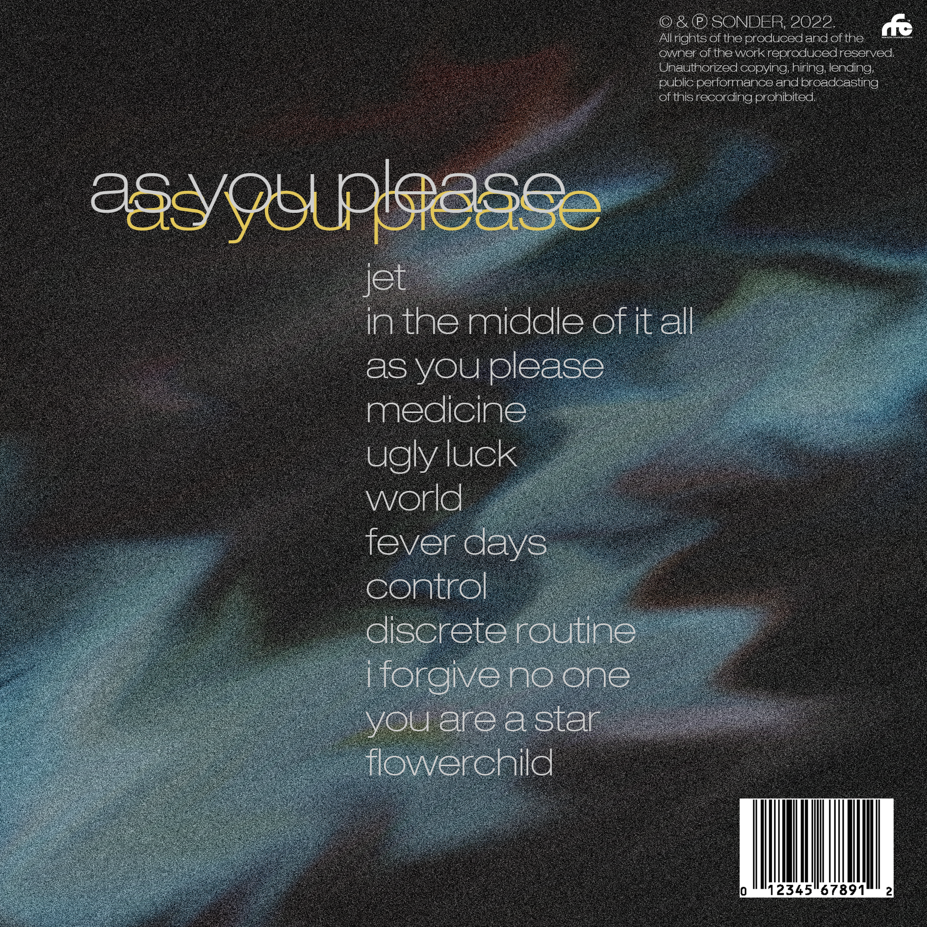
After having researched how the star image is typically presented in pop-punk, we concluded that across all branding, the star was rarely the centre of attention. This meant that our digipak production had to include more graphic design elements rather than an image of the star, as well as a large focus on representing the genre. We aimed to do this by using appropriate media language like colour palettes and typefaces. Typically, the artwork and branding reflect the emotions the music conveys, and although not necessarily featuring the artist, their album artwork still has to represent the artist to some extent. For example, more youthful, rebellious and party bands may opt for a more colourful colour palette and unique, stimulating graphics which reflects their aggressive, upbeat music. Alternatively, if the artist’s music was more stern and carried more emotional content, the colour palette and visuals would reflect that, which is the route that our Digipak followed. The star not being the centre of attention gives connotations of the star being more absent and extraordinary (Dyer).  Due to the focus not being on the star image, it was more important to focus on representing the genre. Dark colour palettes with ambiguous patterns across the panes helped convey a gloomy feel which reflects the emotional lyrical content of the album’s songs. As well as this, a modern, lowercase sans-serif typeface helped reflect the mysterious feel of the album, whilst also acting as a cultural code (Barthes) by giving the Digipak a modern, industrial feel.

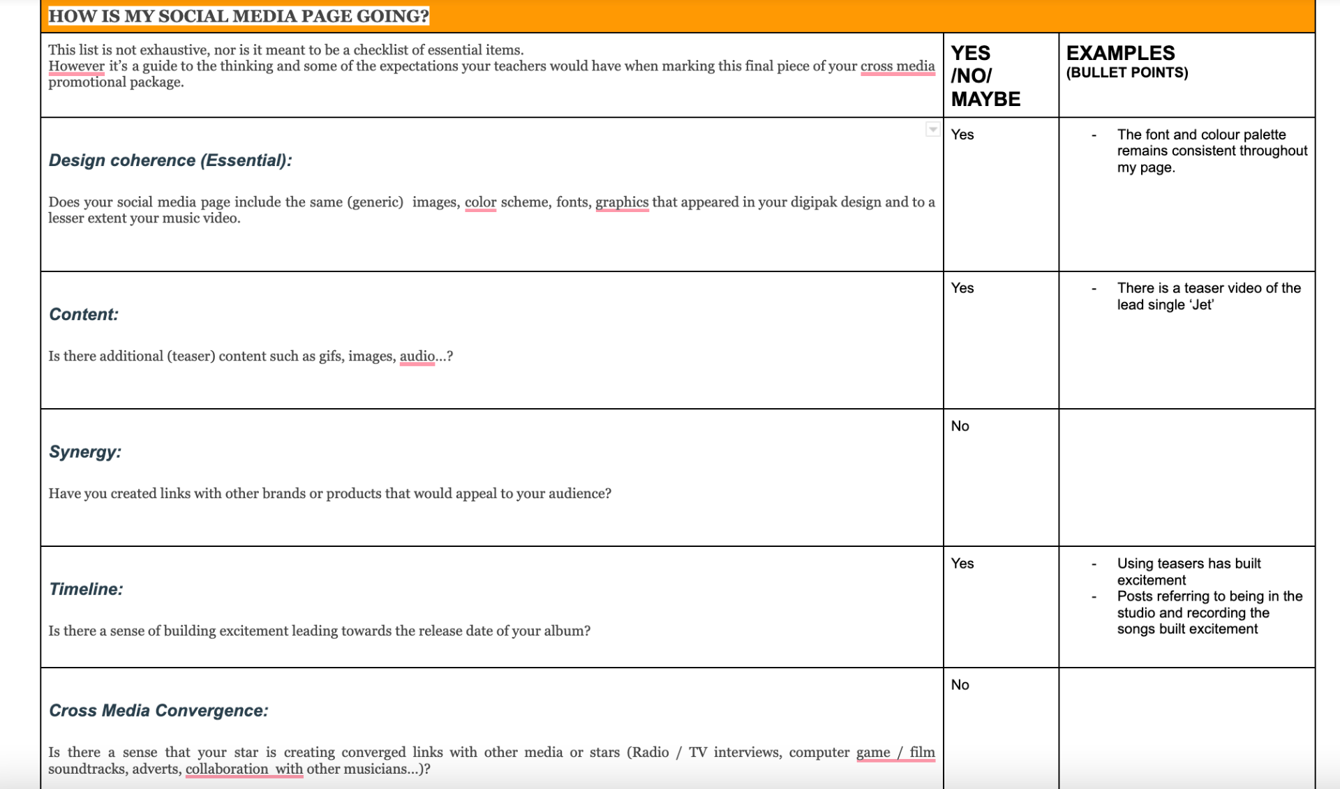
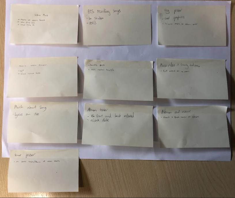
A successful social media page is one that spreads awareness of the artist to reach their target demographic and psychographic (Hall). For our artist, this would be teenage/ young adults, predominantly male, that have interests in alternative music. As well as this, it should allow their audiences to engage with the page to create social interaction, entertainment and give information regarding the artist (Blumler & Katz). From our research of bands in our genre, such as Citizen and Movements, we concluded that although at face value the music was serious and carried deep meaning, social media was an aspect of the artist that allowed the audience to see a different side to the band. In order to keep the brand image, it was important to include some posts that mirror the content of the music, however, it gave us the opportunity to potentially open up to the audience and show a more immature, fun or ordinary side of the band, which contrasts the sombreness of the music. This links to the ‘paradox of the star’ theory (Dyer) as it demonstrates the artist as both extraordinary, but also ordinary, just like the audience. One of the ways entertainment and personal identity were achieved was through the use of colloquial language. Informal language such as ‘tunes’ and ‘guys’ allows the audience to connect more deeply with the artist because that is the type of language the audience would use day to day. This portrays the artist in an ordinary light which results in increased relatability between the audience and the artist. Whilst remaining entertaining, information was also presented on the social media page in the form of teasers and gig posters. These forms of content present information about release dates and future concerts whilst incorporating entertaining elements. If the information was presented in an uninteresting manner, it would risk being rejected by the audience because they require stimulation in the form of interesting visuals to engage them and retain their attention. Additionally, interesting posts can inspire the audience to comment and share the post more than they would if the post wasn’t aesthetically pleasing. Shirky suggests that the erosion of boundaries in social media allows for audiences to interact with the artist far more than what was previously achievable in older forms of media, such as newspapers and television advertisements. Social media thrives off of the interaction between the artist and the audience and relies heavily on the artist to provide content, and the consumer to take the role of a prosumer and contribute to the posts through the comments and direct messaging features on social media platforms. This is a relatively new dynamic between the artist and the audience, as previously the audience would consume the media without contributing.


Final digipak draft

The process of creating our digipak was relatively simple and there wasn’t much disagreement between our group members. A large part of the creation of our digipak was done through graphic design elements that were created through heavily manipulating images, early on in the drafts and we continued them throughout the rest of the drafting process, only replacing small aspects. This certainty in our product from the start enabled us to have a relatively efficient design process and we have created a product that I am extremely satisfied with which fits our genre of alternative rock/pop-punk perfectly.

Please click on the image to view the pdf.

After having researched similar digipaks in our genre, we concluded that a common theme in the digipaks was that the star was not the main centre of attention and that more graphic design elements are used to create a visually stimulating, unique design that reflects the music as an emotion, rather than representing the artist. The music that the album consists of is very moody, emotional and mysterious, which is what we kept in mind and tried to replicate when designing the digipak.

This was done through dark colour palettes and ambiguous patterns throughout both panes to connote a dark theme, as well as simplistic typefaces and eyes on the front cover to give a more open-to-interpretation feel to the album, which added to the crypticness of the product. The eyes being the centre of attention, and not the star, refers to the ‘paradox of the star’ theory (Dyer) and represents our artist as more extraordinary and distant. As well as this, the simplistic sans-serif typeface acts as a cultural code (Barthes) by giving the Digipak a modern, industrial feel. In conclusion, our digipak allows for the audience to relate it to the genre of alternative rock or pop-punk, but also allowing for unique interpretations of the digipak, which is what we were aiming for.


Digipak Draft 3

Draft 3 of our digipak consisted of us printing out all four panes, and inserting them into a CD case. This allowed us to view the product exactly how our audience would view it on a shelf in a CD shop, and it put into perspective certain qualities of the digipak that work well, but also could be changed. For example, the inside panes are symmetrical and complement each other when placed next to each other, however, we found that the words on the spines were going up and down in the wrong directions, which is only something we would have noticed if it was put into perspective by seeing it on a shelf.

We collected data from our classmates on what genre they thought the digipak represented. This research was essential for us to distinguish whether or not our digipak accurately reflects our mission statement, brand image, genre and our star image. These were our findings;

This data revealed that our digipak provoked a preferred reading from our audience and that the representation of our genre is evident through the design. The results from this survey are deemed successful by my group and we are content with the reception from our classmates, which reinforced our beliefs that our product accurately represents our genre.

Music Video Final Draft

Our music video’s final draft has reflected our genre accurately, whilst being aesthetically pleasing and featuring a high level of post-production effects. We are generally satisfied with our end product, despite the video being slightly different to what we had originally planned.

During the process of creating our video, my group and I made conscious efforts to not only reflect the genre of pop-punk but to ensure that the video blended in with other music videos in our genre by ensuring that we used correct technical forms such as editing to the beat and accurate lip-syncing. Using a variety of shot distances and angles was emphasised during the shooting process to prevent a one-dimensional or uninspiring video.

We aimed to represent the star image of the band ‘Sonder’ in a way that portrays the band as both distant and mysterious, whilst also being ordinary and relatable, to tie in with Dyer’s theory of ‘The paradox of the star’. This was done through appropriate mise-en-scene such as casual clothing and band instruments but also conveyed through post-production special effects to create a sense of surrealism that displayed our artist as extraordinary. We ensured to include a repertoire of elements that made our video conventional to the genre of pop-punk (Altman).

Initially, we wanted to include an equal distribution of narrative and performance, however, due to our narrative shoots not producing a standard of videography we were content with, we made the video mainly performance-based whilst incorporating narrative footage from our shoots to connote a theme (Levi Strauss) of loneliness and depression throughout the video. This influenced our production process because we had to compensate by adding more visually stimulating features such as fast-paced editing and special effects to compensate for the lack of a narrative in order to maintain our audience’s attention for the entire video.

After having been given feedback from peer assessment, we addressed some of the issues regarding editing choices, however, a lot of the feedback was referring to the lack of narrative content in our video. Unfortunately, we weren’t able to amend this, but we did aim to compensate for it through a more visually pleasing video.

Digipak Draft 2

Our second draft of our digipak includes multiple new features like the eyes in the middle of the front cover, from our shoot, new inside panes and spines.

Teacher feedback

  • Spines need to include the band name ‘Sonder’ and album name ‘As you please’ so that when it is on a shelf, customers can see the artist and album name without having to pick it up
  • Potentially add a border around the frame of our inside panes to add definition and contrast to the dark background
  • Add some sort of effect onto the eyes to make them more prominent

After having taken on board feedback from our teacher, it has given us clear targets to improve our product. We are very happy with our product so far so it will be unlikely that any drastic changes will be made. We have used a high degree of photo manipulation, graphic design features and appropriate typefaces, however, we would most likely benefit from improving the brand image and focus on representing the star.

Digipak Draft 1 – Graphics Ideas and Evaluation

Upon completing our mock-up, we were extremely satisfied with the majority of the design elements of our digipak, therefore, there are minimal changes to the backgrounds and most of the typefaces. The first graphic design elements we included were the heavily manipulated and washy backgrounds and the typefaces, which then were carried on through to our first draft.

In the next draft, our main targets are to create the inside panes and spines, make the centre image of the eyes stand contrast less to the rest of the front cover by adding a blue tint and add numbers to the tracklist to fill out the empty space. Adding more features, specifically the inside panes, will allow us to focus more on reflecting the brand and star image, in contrast to a very cryptic and open-to-interpretation front and back cover, which is something that we have found to be lacking in this draft so far. Adding some familiar and conventional elements, in conjunction with some different, unconventional elements, is an effective way of implementing a ‘same-but-different’ approach to our digipak which will help feed into our audience’s preferred reading (Hall) and allow us to create a product that won’t be rejected by our target audience.


Social Media Page Draft 1 & 2

Please click on image for the full video.

The first draft of our social media page has allowed us to outline the bulk of our page and the type of content we will be posting.

Main feedback points:

  • Include guerilla marketing
  • Try and build and also keep excitement and awareness up until the final release post
  • Add all the story content
  • Try and include some sort of synergy or cross-media convergence
  • Adding the men’s mental health charity displays a good social conscience
  • Having our aesthetics remain consistent throughout creates a theme

As well as having feedback from our teacher, it is also important to self-reflect on our social media page. I reflected against the criteria in the images below and included targets for improvement like including synergy, cross-media convergence, selling physical copies and increasing engagement with fans through the comment section. This set of self-assessment overlapped with our teacher’s feedback but further reinforced the importance of the features included in the checklist. In summary, our social media page is progressing well and has provided a solid foundation for us to further improve our page as we proceed to add more content.

Please click the images below for the document.

Digipak Shoot PMA

Due to our digipak being largely based on graphic design, it wasn’t necessary to have a well organised shoot. Our PMA reflects this which is why it is so minimal, but only a brief plan is sufficient for our shoot so we know what exactly we were shooting.

Here is an example of the shots we managed to get, which are sufficient and exactly what we were after.

Social Media Page – Timeline and Marketing Ideas

Creating a social media page schedule and timeline is essential towards the success of our page. Having a set timeline allows for the production process of those posts to be simplified and streamlined and allows us to efficiently post content on our Instagram page. It is important to take into consideration methods of successful marketing campaigns that have been shown to work in achieving virality and inspiring social interaction, providing information and entertainment, as well as encouraging fans to feel a sense of personal identity with our artist (Blumler & Katz).

3 ideas from ‘Sanbox best music-marketing campaigns’

The first idea that we could use include is ‘guerilla marketing’. This attracts mass attention from our target audience, which will encourage social interaction and cause our audience to talk about the band’s marketing stunts. Another idea is using ‘synergy’ by collaborating with brands that reflect our genre, for example, ‘Fender’ and ‘Vans’ which are popular within pop-punk music culture and can be utilised in order to attract fans of the brands to our band. Lastly, using ‘cross-media convergence’ would aid the growth of our artist’s social media page and can be done by including the band’s music in a film or video game in order to offer an exchange whereby the fans of the film are introduced to the band’s music and the fans of the band are introduced to the film. These techniques would attract a large amount of attention to the artist and result in a successful marketing campaign.

DP Mockup

Mock ups are used to be a blueprint for the final product. My group has created a mock up for our album ‘As You Please’ by pop punk band ‘Sonder’. This has allowed us to gain an idea of what techniques we will be aiming to use in image manipulation softwares like Photoshop.

Due to our genre having a large amount of sub-genres, it allows us to have a lot of creative freedom because anything we produce could be argued to be conventional, as long as it conforms to some core conventions like not focussing on star image and rather overall aesthetic. This is an advantage, but also a disadvantage because there aren’t a set of rules we can follow to ensure that we achieve our audience’s preferred reading (Hall) which means that it may prove difficult. There a few changes that will need to be made to our Mock-Up, such as some fonts, images (to avoid copyright infringement) and overall composition of the Digipak, but as long as we stick to the correct repertoire of elements (Altman), then we should create a product that is successful in appealing to our target audience,