Final digipak draft

The process of creating our digipak was relatively simple and there wasn’t much disagreement between our group members. A large part of the creation of our digipak was done through graphic design elements that were created through heavily manipulating images, early on in the drafts and we continued them throughout the rest of the drafting process, only replacing small aspects. This certainty in our product from the start enabled us to have a relatively efficient design process and we have created a product that I am extremely satisfied with which fits our genre of alternative rock/pop-punk perfectly.

Please click on the image to view the pdf.

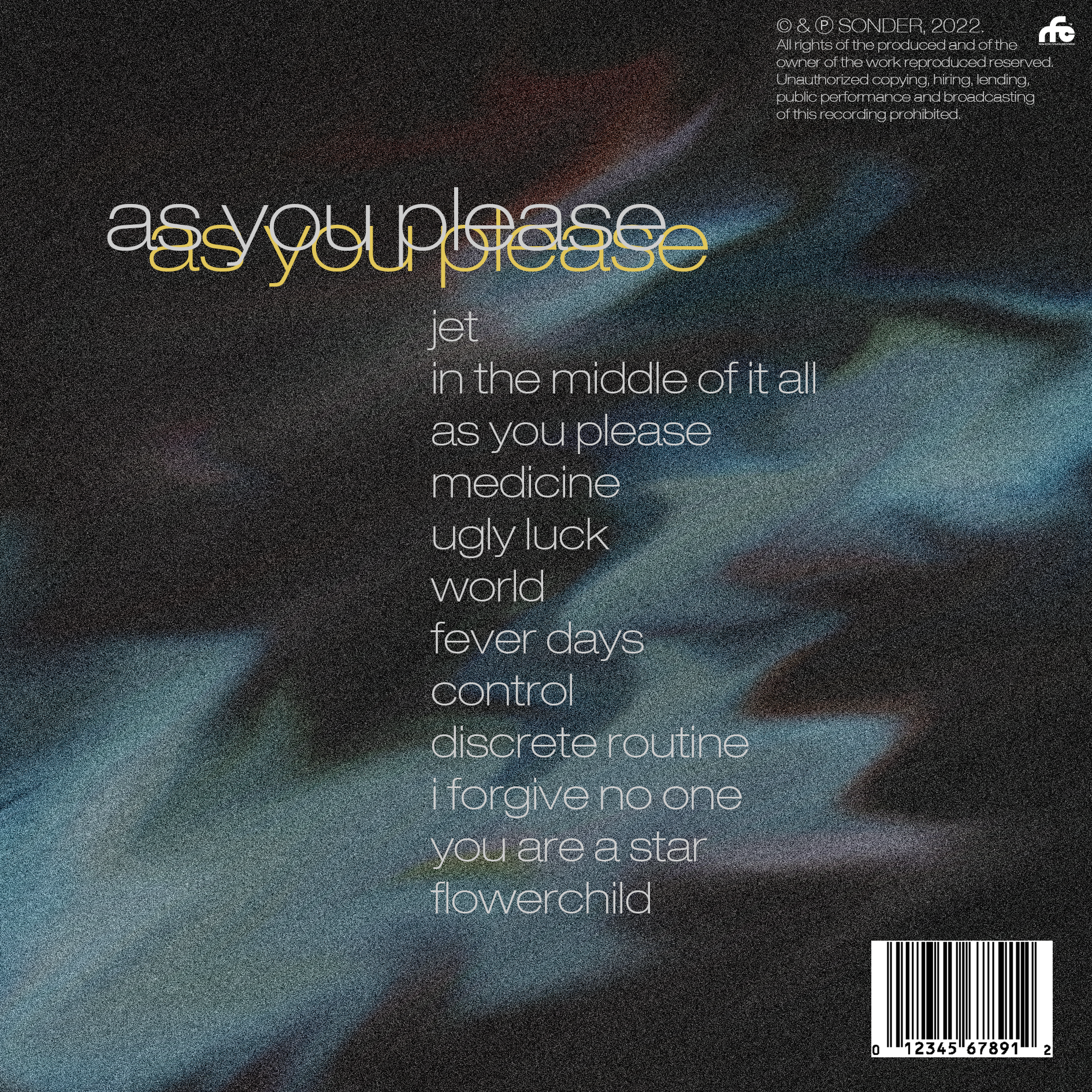
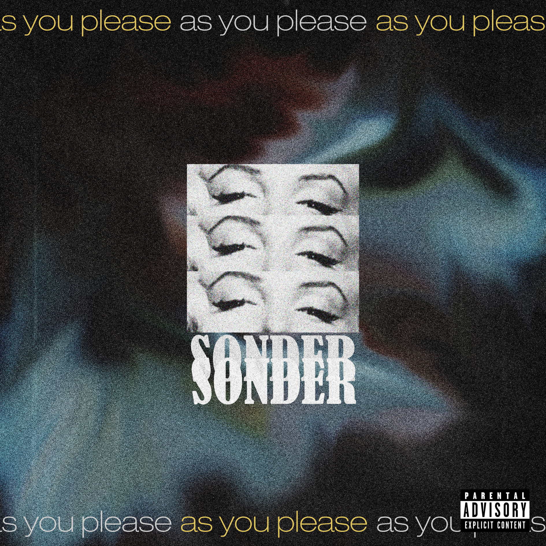
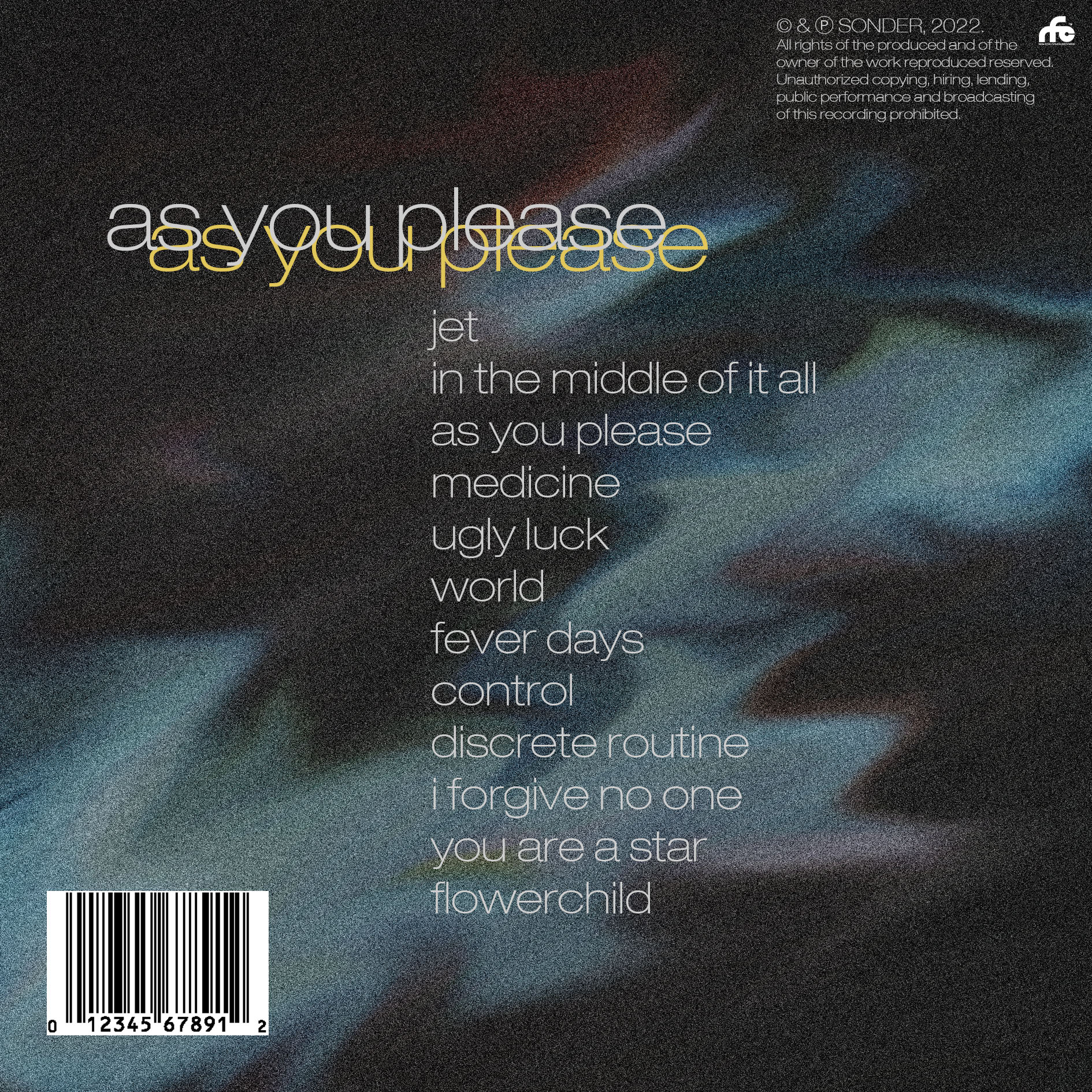
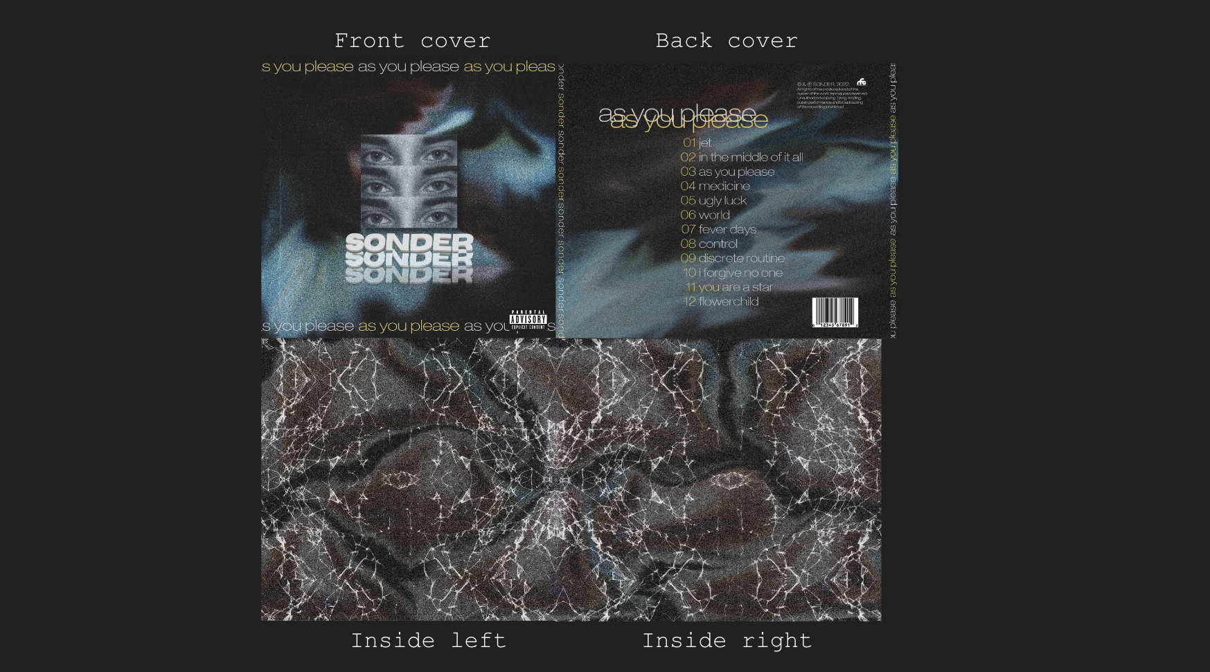
After having researched similar digipaks in our genre, we concluded that a common theme in the digipaks was that the star was not the main centre of attention and that more graphic design elements are used to create a visually stimulating, unique design that reflects the music as an emotion, rather than representing the artist. The music that the album consists of is very moody, emotional and mysterious, which is what we kept in mind and tried to replicate when designing the digipak.

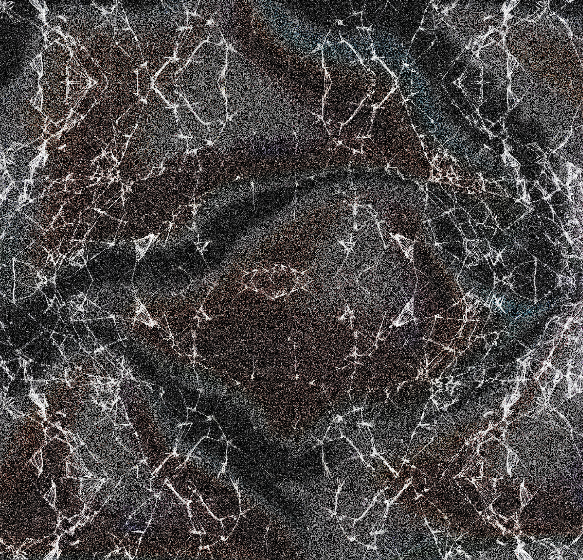
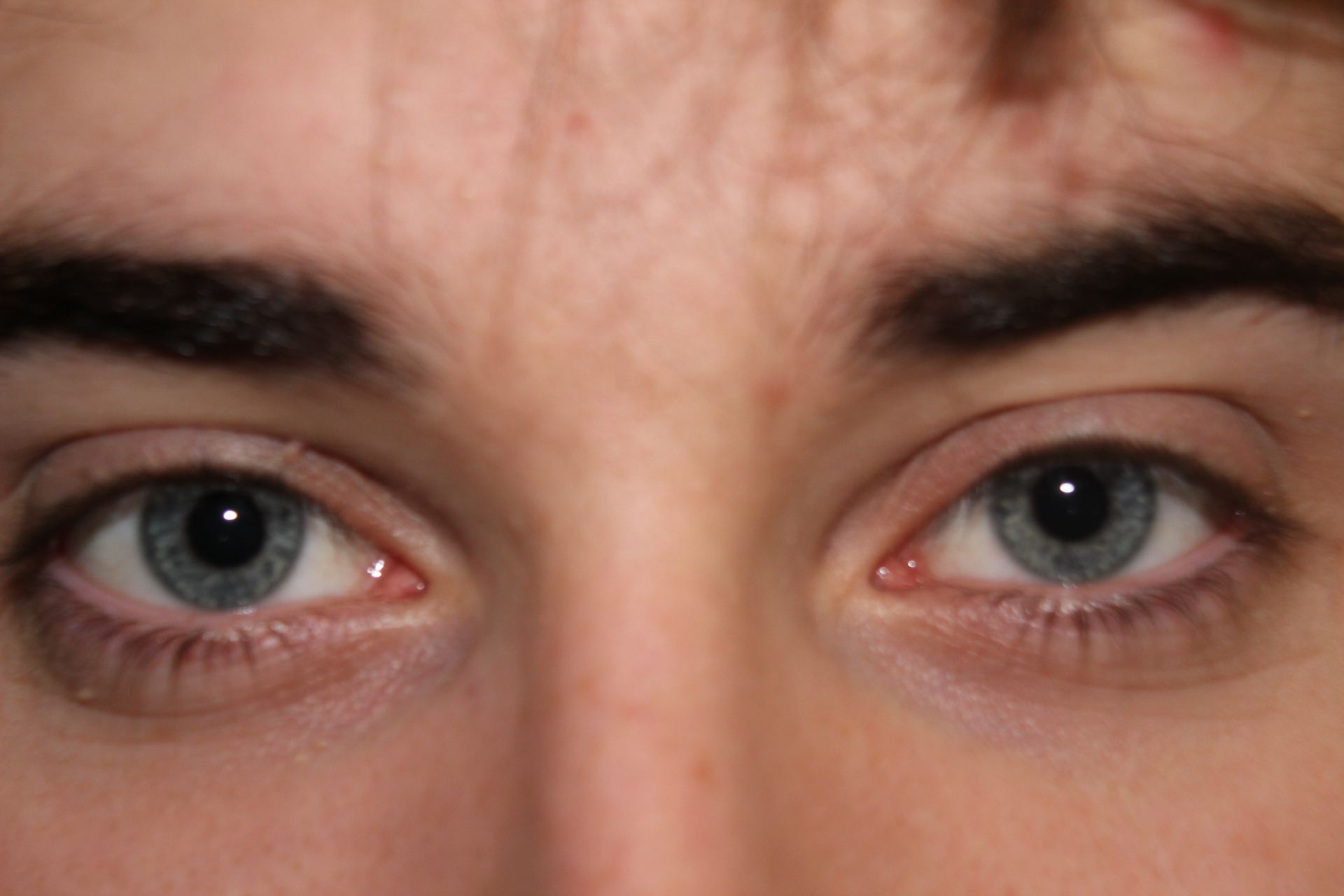
This was done through dark colour palettes and ambiguous patterns throughout both panes to connote a dark theme, as well as simplistic typefaces and eyes on the front cover to give a more open-to-interpretation feel to the album, which added to the crypticness of the product. The eyes being the centre of attention, and not the star, refers to the ‘paradox of the star’ theory (Dyer) and represents our artist as more extraordinary and distant. As well as this, the simplistic sans-serif typeface acts as a cultural code (Barthes) by giving the Digipak a modern, industrial feel. In conclusion, our digipak allows for the audience to relate it to the genre of alternative rock or pop-punk, but also allowing for unique interpretations of the digipak, which is what we were aiming for.


Digipak Draft 3

Draft 3 of our digipak consisted of us printing out all four panes, and inserting them into a CD case. This allowed us to view the product exactly how our audience would view it on a shelf in a CD shop, and it put into perspective certain qualities of the digipak that work well, but also could be changed. For example, the inside panes are symmetrical and complement each other when placed next to each other, however, we found that the words on the spines were going up and down in the wrong directions, which is only something we would have noticed if it was put into perspective by seeing it on a shelf.

We collected data from our classmates on what genre they thought the digipak represented. This research was essential for us to distinguish whether or not our digipak accurately reflects our mission statement, brand image, genre and our star image. These were our findings;

This data revealed that our digipak provoked a preferred reading from our audience and that the representation of our genre is evident through the design. The results from this survey are deemed successful by my group and we are content with the reception from our classmates, which reinforced our beliefs that our product accurately represents our genre.

Digipak Draft 2

Our second draft of our digipak includes multiple new features like the eyes in the middle of the front cover, from our shoot, new inside panes and spines.

Teacher feedback

  • Spines need to include the band name ‘Sonder’ and album name ‘As you please’ so that when it is on a shelf, customers can see the artist and album name without having to pick it up
  • Potentially add a border around the frame of our inside panes to add definition and contrast to the dark background
  • Add some sort of effect onto the eyes to make them more prominent

After having taken on board feedback from our teacher, it has given us clear targets to improve our product. We are very happy with our product so far so it will be unlikely that any drastic changes will be made. We have used a high degree of photo manipulation, graphic design features and appropriate typefaces, however, we would most likely benefit from improving the brand image and focus on representing the star.

Digipak Draft 1 – Graphics Ideas and Evaluation

Upon completing our mock-up, we were extremely satisfied with the majority of the design elements of our digipak, therefore, there are minimal changes to the backgrounds and most of the typefaces. The first graphic design elements we included were the heavily manipulated and washy backgrounds and the typefaces, which then were carried on through to our first draft.

In the next draft, our main targets are to create the inside panes and spines, make the centre image of the eyes stand contrast less to the rest of the front cover by adding a blue tint and add numbers to the tracklist to fill out the empty space. Adding more features, specifically the inside panes, will allow us to focus more on reflecting the brand and star image, in contrast to a very cryptic and open-to-interpretation front and back cover, which is something that we have found to be lacking in this draft so far. Adding some familiar and conventional elements, in conjunction with some different, unconventional elements, is an effective way of implementing a ‘same-but-different’ approach to our digipak which will help feed into our audience’s preferred reading (Hall) and allow us to create a product that won’t be rejected by our target audience.


Digipak Shoot PMA

Due to our digipak being largely based on graphic design, it wasn’t necessary to have a well organised shoot. Our PMA reflects this which is why it is so minimal, but only a brief plan is sufficient for our shoot so we know what exactly we were shooting.

Here is an example of the shots we managed to get, which are sufficient and exactly what we were after.

DP Mockup

Mock ups are used to be a blueprint for the final product. My group has created a mock up for our album ‘As You Please’ by pop punk band ‘Sonder’. This has allowed us to gain an idea of what techniques we will be aiming to use in image manipulation softwares like Photoshop.

Due to our genre having a large amount of sub-genres, it allows us to have a lot of creative freedom because anything we produce could be argued to be conventional, as long as it conforms to some core conventions like not focussing on star image and rather overall aesthetic. This is an advantage, but also a disadvantage because there aren’t a set of rules we can follow to ensure that we achieve our audience’s preferred reading (Hall) which means that it may prove difficult. There a few changes that will need to be made to our Mock-Up, such as some fonts, images (to avoid copyright infringement) and overall composition of the Digipak, but as long as we stick to the correct repertoire of elements (Altman), then we should create a product that is successful in appealing to our target audience,


CD Digipak Annotation

Analysing the technical genre conventions of other artists’ CD’s has allowed me to understand how the star image in conveyed in my genre. As well as this, when making my own digipak, I can use this analysis as a baseline checkpoint to ensure my own product has the same amount of detail and includes the same elements as this CD from the band ‘Movements’. Creating a blueprint of how to represent the star image will help give the correct connotations and denotations to the audience, as well as helping conform to the genre conventions more accurately to make a product that the audience won’t reject prior to even listening to the contents of the CD.

The Look Book

My group and I created a ‘Lookbook’ to help compile ideas for what style we want our digipak to be in. All the compiled are taken from tour posters or album covers from other artists in our genre of pop punk. This allowed us to come up with a colour palette and which font styles are typical of this genre.
We concluded that there is an extremely wide range of influence throughout the genre due to there being large amounts of sub genres and niches within it. However, one thing that resonated throughout was that the media is very graphic and heavily edited and the star often is not the main centre of attention. As well as this large bold texts with contrasting colours are often used.


We will use this information to help us create a digipak that reflects the conventions of our genre, but will also take into consideration that there are generally very varied influences in the genre therefore we have more freedom with our digipak and aren’t confined to a very specific colour palette or font. This will influence our social media page through how we display our artist with their posts and bio.

5 Key Descriptors for our genre:

  • Bold
  • Energetic
  • Grungy
  • Grainy
  • Minimalist
Made with Padlet

Our Mission Statement – The Package Brand

The song ‘Jet’ by Citizen is the song we used for our music video and will be on the tracklist on our digipak. The Digipak is for the album of made-up band – ‘Sonder’ therefore we will need to create an integrated advertising campaign to compliment the release of the album.

By creating a mission statement and marketing strategy, it allows us to have a clear idea and brand to create continuity for our artist’s campaign. Our call to action and USP will allow the audience to be persuaded into listening to the album as opposed to rejecting the text.

Going forward, we will take into consideration these factors that go into making a successful package to promote the release of the album.