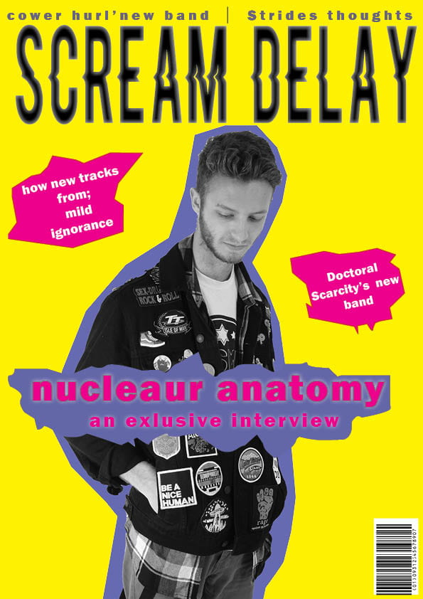
Draft 1
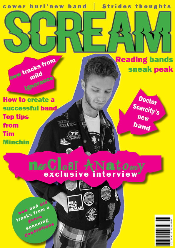
Draft 2
This is my first and second draft displayed next to each other, the second draft i believe came out quite well. I made the frame busier this makes it look less baron or desolate. I also changed the mast head by putting it in green to match it with allot of the text, I also decided to make allot of the text green as i think it adds allot more variety to the cover. The cover has taken allot of inspiration from and album cover of the punk band the sex pistols (never mind the bullocks here’s the sex pistols) there cover made use of bold colors such as the aggressive green pink and yellow. I also added drop shadow to the pugs as i believe it add allot of dimension to the cover. I think if i’m going to build on it more i want to put more on the bottom of the page as it still looks quite empty i also feel that making the star bigger it may look better and showcase him a bit more and also make him look angrier witch fits very nicely into the punk motif.