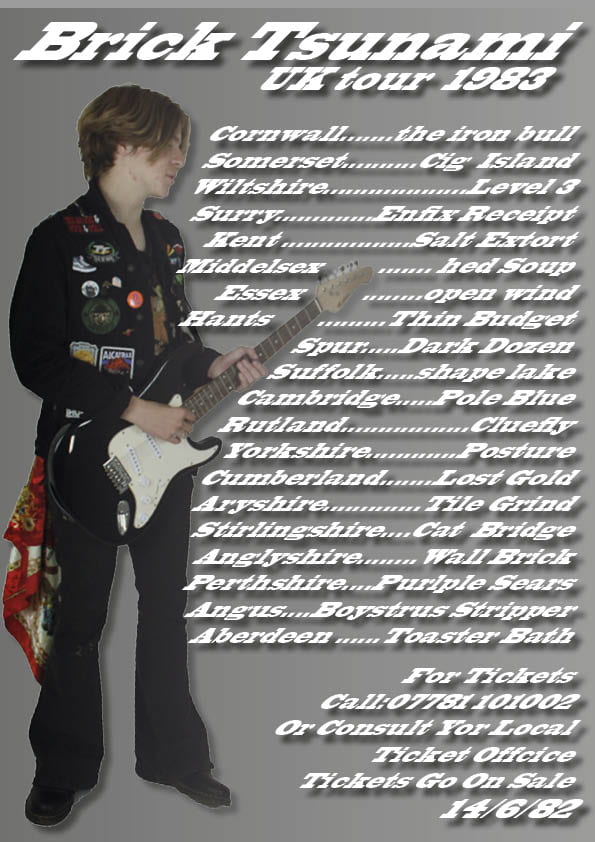
my tour poster

This is a tour poster i created from a former shoot, overall i think that this poster turned out quite well, i like the image used as well as the use of color in the image although i feel more color on the overall poster would have gone a long way For instance more yellow or purples on the titles would have added to the poster a lot. I also feel that the poster is a tad to busy  and less dates would have aided it as it isn’t nice to look at and feels like a chore just to witness it. I do feel over all that it was a success and as a result i’m now allot more comfortable with using in design.


My Mast Head Designs

This is a collection of mast heads i experimented with so that i could find one for my magazine, there is a variety of different routes and design i could use and the font reflects that. For instance the ”brush script” would appeal to a posher maybe more upper class audience than ”alien encounters” for instance. It was also incredibly helpful to experiment with effects, for instance ”Broadway” has an inner glow witch makes it look like its a sign in lights almost the same way ”brush script” has a bevel and emboss effect with makes it look like jewelry. personally i’m quite found of ”Broadway” or ”alien encounters” for my font as its bold but slightly alternative like the magazine, as i need to go for a style that is anti mainstream anti government it should be anarchic and chaotic to communicate the punk affect being attempted here.

Image result for 70s punk albums covers"

In this example i like the use of different fonts and sizes witch really give the piece allot of edge especially when paired with the otherwise minimal cover.

Image result for 70s punk albums covers"

Image result for 70s punk albums covers"

Both of these covers demon straight bold fonts with strong colors to use for the cover, as it is bold and straight to the point and very unmistakably tells the audience what the idea is its unmistakably punk although quite plane and i’d be interested to experiment with it.
 

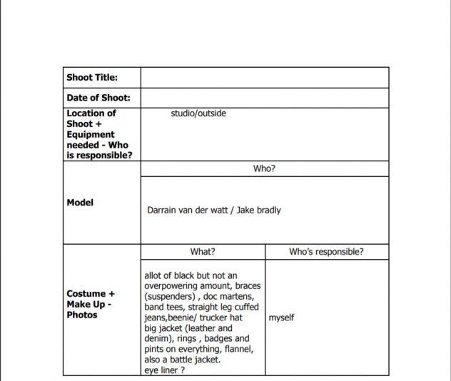
Production Meeting Agenda for 1st Photo Shoot

This is my production agenda an it ensure i have every element of my shoot accounted for so that i can be certain that both nothing is left behind so i create the product i envisioned and also so that other elements that don’t fit aren’t  incorporated that wouldn’t fit. On the day of the shoot this document will also massively help me as i wont have to remember everything on the day and leaves allot less up to chance.

Communicating my Brand

I find it allot easier to work when i have visual representation of my targets in front of me, as a result of this having  a mood board with what i’m trying to achieve in-front of me that i can work from, it is a great aid especially when not only thinking about directing and posing but also when finding props and costumes having a reference point becomes incredibly useful  so to not to stray to far in any direction and alienating an audience.


Star Images – theirs and mine

This Prezi is a visual representation of of how a star image is created, as no star is a real person and they are a brand that is calculated. Everything a star does is calculated and intentional to fit with there brand (with an exception of a few actions), i think its important to keep in mind when designing a star that they’re not people they are brands. If you think of a star like brand and not like a person it becomes immediately easier to captivate an audience that can ”engage with a star” and sell more products connected to that star through there own merchandise and product placement, when someone buys something endorsed by a star they’re buying into the star witch is incredibly important to keep in mind. I would like to try and emulate both the political themes they emulate but also the aggressive and masculine image associated with it.

my audience profile

This is a visual representation of what my target audience would look like personified into a person, its incredibly useful to have a clear image of your audience  in order to get an accurate depiction of a product that they would purchase, it also helps the consumer get a product that they personally enjoy and would continue to purchase.

After looking into Stuart Halls reception theory he states that when someone creates media that they encode there beliefs ideas and values into that piece of media and the ideal audience member is someone who shares that, This is an example of that the ideal punk consumer is someone who has similar prefers readings of ideas as the producer making it, and the meaning through that media is only made by the audience and producers shared values on the subject.

My Audiance Profile

This is a dating profile created by me to represent my target audience, this reflects there income profession and values. When creating something so reliant of someones very specific taste it has to seem tailored to them and the way its writan  and the content being shown has to reflect that,  so having a good grasp on what most of your audience looks like helps immensely.

My audiance profile

This is my mood board, this mood board will help me when coming to the design and production of my magazine. There are many elements that i wish to adopt for my magazine, i feel it will be a great help if i can keep it all in one place when it actually comes to the design of my product.


Magazine Swede

While working on my magazine, I was working inside Indesign which I had thought to be an incredibly complicated platform to use, though when I started to play and experimenting with it, it became more intuitive. That being said, it was a learning curve especially using text, getting the right font size and boldness became a challenge, even so working with images was a lot easier than anticipated and quite simple. I did notice however that the magazines only used a few colors, keeping it quite simple so as to catch the reader’s eye, with the exception of the bright yellow plug of course. They also liked to put all their text in bold and caps I don’t believe anything on this page was written in lower case but it makes sense for it to be so visually aggressive as its literally begging you to buy it.

my copy of this magazine


Original magazine cover