Introduction
After my first two drafts and all my reflection work on each I finally tweaked each page to start to finish it up a bit. At this stage I am at a point where I feel like my drafts are coming together nicely and trying to change too much may overload and ruin it.
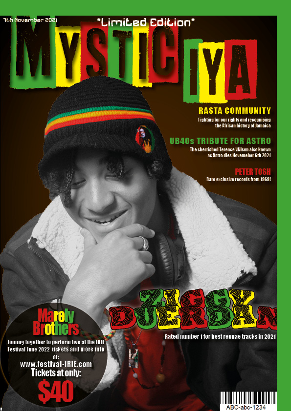
Here is my draft 3 of the complete magazine:


What’s New?
Front Page
- I changed my cover lines, and information in the pug to a sans serif font that was way clearer to read and a lot more simple. I thought that the font used in the pug was just being a little too decorative.
- I also selected my front cover image and used photoshop to make my subject black and white as there was too much color on the page, however I did leave some things colorful such as the models burnt orange t-shirt, his jewelry, Rasta bracelet and his hat. I did this so that attention would still be drawn to the cover star and so the model isn’t completely washed out.
- I also played around a bit more with the masthead as I made it a bit bigger and elongated for a bit more attention. I also took the word ‘IYA’ and place it slightly bellow ‘MYSTIC’.
Contents Page
- I changed the information under the the headlines to white just to go with the color theme more.
- I also added white textboxes around the text. I feel like this really tidied up the presentation a bit but I am still not completely sure.
Double Page Spread
- I added my article and headline to my double page spread.
- The article ended up taking up far to much room so I tried to shorten my article as much as I could give more space on the page.
- I also had the play around with the spacing of the title to fit it on.
- Lastly I placed my insets a bit further in the middle although I don’t think I am that keen on them being there.
Here is a screencastify of my teacher giving feedbacks and advice on my work:

What’s Next?
Front Page
- I think I still need to adjust sizes of my image and text to make sure that the most important features are the first and most obvious things to catch the reader’s eye.
- I also need to change the ‘Limited Edition’ to the same font as the rest of the cover line text.
- I also need to put the price on the magazine.
- I think I need to make the models shirt black and white just so the pug and main cover line can stand out more.
Contents Page
- The background on my contents page is a bit choppy so I think I need to redo it.
- I also feel as if I need move the pot plant lower so its not being covered by the headlines and text.
- I need to change some of my page numbers so that there are more pages in the magazine.
- I think I might have to change the layout a bit if I cut of part of my image at the bottom because there will probably be too much empty space at the top.
- I also didn’t add any Rasta color to the pot of the plant to I need to do that also to make my magazine contents page look a little more obvious.
Double Page Spread
- I think my article looks too boring to read. It needs to be shorted even more and I also want to increase the size of quotes of important information and make some pieces of text bold just in order to draw more attention to that.
- The insets I feel are placed badly and so I want to either try change the shape of the images or change the layout.
- For the headline of this article I feel may not be large enough and it may be too bunched up together.
- I also need to add page numbers and references to who wrote the article or who is the model in the photo.
- I think I need to add a stand first on my page also just to create a bit more variety.
Reflection
After looking at what I have changed overall for my draft 3’s I have noticed that I have been finding it harder to think about what I need to change or not. However this is a very good thing because I have gotten to the point where I am pretty happy with all my pages (especially my font page), so now I have to be very picky if I want my magazine to be as good as I can make it.