| How did your research inform your products and the way they use or challenge conventions?
How do your products represent social groups or issues? How do your products engage with the audience? How do the elements of your production work together to create a sense of ‘branding’? Our mission statement is all about teaching and providing opportunities to help people to let go of their worries that are fixated around this society and opening up your mind from the result of our EDM and messages that are educating people on the fact we are all writing our own reality, therefore we have to power to change reality for ourselves. Across all of our products we have emphasised our mission to create a sense of branding, promoting an energetic, prosperous and insightful, open minded, youthful party. Our music video We researched Electronic Dance Music and watched/analysed many different professional EDM artist’s music videos, to understand the conventions that were established within this genre. Dancing is very important to be featured when it comes to an EDM video as this is what the genre of music is purely made for – to make you dance. We found that many of these videos were all narrative and occasionally right at the end would be some shots of the DJ’s performing somewhere live. Many EDM artists such as Avicci create a sense of journey within their narrative, for example Avicci’s music video for his song ‘Wake Me Up’, portrays two sisters who are unhappy and are unable to fit in, in an old, conservative town indicated by the MES which depicted the locals in neutral coloured old farmer looking clothes, and run down buildings with dirt roads and as scorching sun. The people’s expressions are stone cold stares as the sisters walk through the town, they however also have clips of these sisters on a horse which is symbolising their freedom as they escape the town. This results in the sisters resorting to a big rave where Avicci was performing. Lacey’s theory about the repertoire of elements refers to how narrative, star image etc can help achieve the expectations of a genre, and therefore we have used these repertoire of elements to achieve a similar but different media text to previous media texts. We took inspiration from this sense of journey and so we developed a narrative similar about a workaholic who is drained and overwhelmed from her office job to help convey her emotions, we made sure to include low key lighting and desaturated the colours through our editing and many high angels to represent her vulnerable state. A vital prop we included throughout was her office chair that comes to life one day and takes her on a journey, Our star can be represented as extraordinary (Dyer) due the the content on his SMP of him DJing in front of crowds and travelling round the world. However Stuart Hall also highlights that depending on audiences ideologies they may personally have another reading of this artist and maybe not so much of a ‘preferred reading’ (painting him as extraordinary) as many may look on his SMP and focus on other content with him by himself Djing in his room which presents him to be much more ordinary and you get to understand his passions and what he is doing/like in his spare time. He clearly enforces his music on his page which also creates this absence around him because although you have regular updated content that makes you feel present with him you also do not see much exclusive content of him talking or documenting anything other than his music which highlights the absence that you don’t truly know him, and represents that on one hand he could be painted by the audience as a talented, inspirational figure living an envious, ‘forever young’, exciting/fun party life but audience members can also have a more oppositional reading of him believe he represents reckless person who hasn’t got a real job and is really seeming like a bum. In the digipak design we see that our artist has stuck to this mystery as he is absent on the cover. Blumler & Katz points out that the audience seeks social interaction, personal identity, entertainment and information from the media they consume. We have included posts that allow the audience to share, comment, like, private messages and encouragement for getting involved in conversations through captions (social interaction). Shirky makes the point that the audience has changed from a mode of passive consumption to one of participation interaction due to the internet and the web creating two way communication. What is powerful about this active audience being given the freedom to speak + encourage to use their cognitive surplus allowing people to lead movements, in this case it creates a collective of audience members with the similar sharing ideologies as our star image, therefore a community/tribe of ravers is formed and united resulting in empowerment. This makes the audience feel as though they have a sense of involvement and importance within the artist’s life. For much of our target audience come to understand through their psychographics that they seek to be fun, exciting and the life of the party. Our star image represents all of this, creating desire to get to know him or want to be him. Therefore in order for the audience to feel close to him they can buy some of his merchandise |
||
Author: malichatterton
 promotes our branding and star image through a narrative of self discovery, learning how to let go, relax and really enjoy the beauties in life. Our digipak design focuses on this notion of new beginnings and transcendence.
 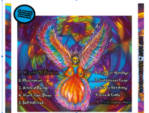 It signifies an unlocked cage positioned on a figure’s forehead, releasing a majestic phoenix rising above. The figure is also wearing headphones. This album art is a signifier (De Saussure) that connotes how listening to this EDM album potentially opens up your mind and sets you free from reality which yet again closely links back to the brand’s message to enjoy life and not take things too seriously. To complete this package and relay this message consistently across all products it seemed only fitting to represent our star image as a perfect example of someone who is living according to these morals and messages, this is how he portrays himself as present (Dyer). Therefore we included constant new updated posts of him partying and performing at raves on our SMP as well as travelling around the world experiencing different beautiful sites and wonders that the world brings and simply just loving life.
 The absent side we don’t get to see is basically anything other than the party scenes and life as an artist travelling – what is he really like behind closed doors when he isn’t performing? You can interact with him through commenting, liking, following, sharing but he won’t interact back, so no one will ever really know what he is like. Videos of him alone in his room just messing around on his decks projects hope onto the aspiring followers making you realise that you too can create a better life for yourself and it’s only your own fear that is stopping you. Overall the mission statement across this brand is to help promote mindfulness and harmony to his fans teaching them to make to most of their lives and do things you enjoy without worry about having to conform.
 we incorporated green screen and stop motion to make the chair look like it was moving, and the entirety of our music video consists of frequent short clips to enhance the experiences flashing by. On the way she has a series of different interactions, (resulting in her at the end arriving at a rave)
 from this she discovers how to loosen up, free her mind and relax. Throughout these scenes we included a lot more camera movement especially for those dance scenes to help the audience preserve themselves dancing along in beat with the music and to highlight this adrenal active and energetic buzz from EDM and her adventures. Not only that but we boosted up the saturation, lighting and included many colour/distorted effects designed to be surreal, fun, party like, euphoric and so on. Her transformation of office clothes into a rave outfit for the very last scene reflects she is now a changed and liberated person. Altman states that the producer uses the genre as a blueprint for production. Therefore by sticking to the genre conventions/guidelines we are providing expected pleasurable content for those who would be interested in EDM and so by understanding what is currently popular with what other EDM artists are doing and applying it to our own in a new twist this will minimise risk of not selling.
 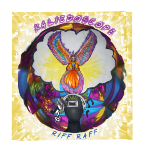 ht purples, blues, yellows, pinks drawing the audience’s attention). The signifiers (donnotation) we see is a figure cut out that is wearing headphones and listening to music. On his forehead he has an opened cage door with a phoenix flying out which signifies (connotation) renewal, enlightenment and hope as this music is unlocking and freeing this subject’s mind. Another visual signifier (de Saussure) that is present is the circular frame around this imagery with a kaleidoscope background which symbolises that you are looking through a kaleidoscope, which is significant as when you look into a kaleidoscope everything you perceive with your eyes is now shifted and new and exciting which also echoes the neon in raves.This is the message our artist is trying to reach to his audience that his music is a beautiful escape that creates a rush of excitement and enlightenment. We also chose to use kaleidoscope as our album cover title to interlink with this message emphasising the importance of being able to perceive all in a different light. On average our target audience typically seem to all be rather educated hard working people with time consuming jobs, the importance of not perceiving life as living to work but instead learn how to make the most of every opportunity, to connect with others, wind down and enjoy life. Our font choice was sans serif and in capital letters to draw busy and hard working peoples attention in making it practical and easy to read without making reading feel too much of a chore. This font choice also reflects our genre as it relates to the atmosphere of EDM and reflects the hype and excitement around it.
 This decodes that he is some sort of alien or god that is out of this world! When you think of out of this world you think of something revolutionary that is being created as well as the prospect of escaping from reality. People with psychographics that consist of being individualistic and ambitious, reformers are always actively looking for fun and excitement weather through gaming, partying etc may then gain an interest to view more on the page as this is the sort of target audience who work hard and play hard indicating they would definitely be into the high EDM brings to you.
  and keep up to date with everything going on in his life. We get a sense of entertainment through watching the many performances from his posts as well as other crazy content regularly posted on his story such as his tour delay story.
  This saves people the time of having to scroll through posts to find the information they want.
 Social Media Draft 2
Introduction
Before I could do my draft 2 on my social media page I needed to get feedback from my teacher on draft one so I could get a good idea from an outside perspective about what is doing good and what is not doing so good. Here is our Media teachers feedback on our first draft:

What Needs Improving?
- Since our highlighted stories all have the kaleidoscope pattern it enforces this pattern to be almost like our branding art, therefore the tour poster art just doesn’t quite fit in with our theme of the kaleidoscope and doesn’t quite acknowledge any sort of branding for the artist and instead seems out of place.
- The three posts that are side by side of this artist’s party life does not seem very convincing or professional. These posts simply look like a typical ordinary person who attends parties and raves. Some of these videos and images are from the point of view of an audience member and don’t even show the artist in the clips so they do not really make sense it just seems like these party posts are thrown in for no reason. They are also all grouped in one big chunk which makes you think he isn’t a consistent partier and has just had one eventful week but no more parties before or after.
- Most of these posts do not have any captions and some of these captions are very weak, as they do not really encourage the buyer to interact or do not give much information at all associated with the posts.
- Photo of the digipak is very unprofessional. You can see some paper and other utilities on the table that the digipak is on which looks lazy and underwhelming. The digipak being released should be a much bigger deal!
- The entire video being posted on the social media page isn’t a very good idea. We want to encourage our audience to go and check it out on youtube or some streaming platform where we can actually be able to receive royalties from people watching the video.
- The ‘COMING SOON’ is not bright enough for our sneak peak video.
- Some rooky typos that need to be corrected in captions as well as some blank pages on the stories that need to either be deleted or content needs to be put up.
- The website needs some original photos such as merchandise and the music video needs to be uploaded so that people can easily find and access it.
What Works Well?
- Sir liked the brought in elements from other parts of production such as the kaleidoscope patterns used for the different thumbnails that take you to different highlights. These patterns interlinks with the digipak design. Also the continuation of using trippy images (for profile picture) which connotes how EDM triggers this big ‘high’ when you listen to it as well as it presents a whole new experience that is a big escape from the stressful and boring mundane society.
- Our tour poster looks effective so hopefully will do a good job try draw attention to the viewer.
- Our sneak peak video helps create awareness and interest for the audience.
- Travelling pictures out of an aeroplane window helps the audience to keep up to date with what is going on with the artist’s life which can help to create this imaginary relationship. Also helps to create hype for fans who may live in the country he is arriving into to do some gigs.
- The merchandise creates a strong sense of branding to interlink with our digipak design and yet again help promote our album also. This also create a strong sense of desire for fans to buy the top as it is a way the audience can feel close to the artist as well as the colours and patterns are idealistic clothing to wear to a rave due to the colour and design.
- The stories are good and provide informative information, especially for those who want to learn more about the artist.
- The website is a good idea and is very easy and accessible in the bio.
Draft 2
After getting feedback on our screencastify from sir I did some tweaks to our social media page. Here are the link to our social media page:
https://www.instagram.com/riffx_xraff_/
What’s New?
Reflection
Finally, after all that we have managed to drastically improve our social media page after listening to some advice from our teacher and touching things up that we wanted. All though sir did like the fact that all the thumbnails were the same I had a contrasting view just due to the fact I never see the same pattern used across all highlighted stories on other professional accounts especially when the stories were not all topics about the digipak and it was beginning to look like a brand logo when really it just interlinks with the digipak. The main message we were trying to send through our social media page just as across all our products was the importance to let go and break out of society so different forms of art help highlight that free fluidity and backup their idea of embracing change. I believe this social media page now brings a great sense of journey throughout the posts as well due the the order which interlinks with the sense of journey established in the music video.
Social Media Page Draft 1
Introduction
Once me and my partner had felt like we had gotten to a good enough stage with our posts we decided to use what we have so far as our first draft. We then compared our first draft to an assessment criteria to see what our strengths are and what areas we need to improve or include on our page.
Here are some images of our first draft of the social media page:
Here is my comparison of our draft 1 against the successment criteria:
Reflection
After assessing the first draft of our social media page against the success criteria I found that we have no major problems with the design coherence except for maybe the fact that all of the highlights include the same design for the cover image which just seems a bit repetitive and unimaginative. The content, timeline, promotion of live events, call to action, interaction, physical copies and issues have been all successfully included within the social media page. What I really want to work on for my second draft is including a better use of cross media convergence and synergy than just a collaboration and would be nice to think of a film or game that could include some of our artists songs on. Not only this but the main criteria we are missing is presenting our star as both ordinary and extraordinary. We have already proven our artist is extraordinary but we also need to have some more exposed photos of the artist that include him being by himself or practising a different hobby in spare time etc…
Final Digipak Draft
 2
2Whats new?
- New layout of text for the back page which makes the overall page look more aesthetically pleasing as a whole and helps identify the words better now everything has been spread out.
- We also added the artist’s name and album title onto the spine with a transparent white box behind so that the colourful text stands out in front of the kaleidoscope background. Having a colourful spine with clear text is super important as the spine will be the first thing to capture a consumer’s attention and draw them in.
- The artist’s name ‘Riff Raff’ has also been changed as it is more catchy to say as well as the meaning behind the name before was a lot more complex to understand whereas Riff Raff has a simple meaning referring to a person who is described as scummy and are not considered very respectable. This works due to the rebellious nature of electronic dance music and conveys that this dj is someone who is proud to be scum as this is an empowering feature that encourages less fortunate people to respect and be prideful of this artist.
- On the front cover we have also changed the font colour to a blue to enable the consumers to distinguish between the album name and title. This is important as ultimately the artist wants people to remember and recognize his name as this will lead fans to discover more of his music, content, merchandise, etc…
- Lastly we also warped the imagery inside the digipak into a CD shape to mimic where the actual CD will be placed.
Reflection
The overall fonts that have been used are sans serif and have been typed in capital letters, this addresses an informal manner and portrays that this album is simply shouting at you to buy it as well as it reflects the typical atmosphere of a typical EDM song and the hype. The colour palette also supports the conventional attributes seen in other EDM albums that I previously analysed to receive some inspiration for our own digipak. Due to the use of mainly purples, yellows, blue and pinks on many other EDM albums I decided to include these colours as I now associate these colours with the genre. Within the imagery and design I included many visual signifiers that are a result of semiotics (de Saussure) for example the design’s include: a figure with headphones on and an open cage positioned on the forehead of the figure. This symbolises that the music this subject is listening too, opening up their mind; the rising phoenix signifies renewal, hope and enlightenment which is a result of this newly unlocked mind and the cloud behind the bird is to emphasise this holy and heavenly outcome achieved through listening to music; Lastly the circular frame around this design filled with kaleidoscope patterns connotes the the viewer is looking down the eye of a kaleidoscope and perceiving the words through a fresh, changed set of eyes. All of these signified images relate to one another to create one huge meaning which is focusing on how EDM can help to to let go, open up your mind, be freed and change your perspective however this design is open to many different interpretations and encourages you to think twice about what exactly you are looking at which supports Barthes theory when studying the relationships between these individual signs about Active Audiences.
Digipak Draft 3
Introduction
For our draft 3 we included multiple alterations including finally adding text on the front and back cover. We then printed off our draft 3 and assembled the images into a digipak so that we could see how we thought once it became a whole piece. Most importantly though this was our chance to get feedback from our peers and to test to see if our designs really reflect our genre. Here is our draft 3 printed out into a CD:
Here is a survey that my partner carried out amongst our peers. This survey includes the classes opinions about what genre they recon our digipak reminds them the of the most:
Reflection
Although the majority of votes were for trance music this isn’t a bad thing as EDM is so vast so it is very hard to pinpoint specific features towards this genre due to electronic dance music having various subgenres such as techno, drum and bass, house music etc… Therefore due to trance being a sub genre I think we did a good job at trying to imitate similar conventions however due to our messages that we wanted to send through our designs it suits more trippy and down to earth illustrations anyway which is typically seen in trance. Despite this our second most selected genre in this survey was EDM meaning that our efforts have not been a miss. Overall I am really happy and proud of the digipak so far, however I feel that on the back cover all the writing has been grouped too close together and needs more spacing out just to give a more aesthetically pleasing look that has been distributed much more evenly. Not only this but I think that the album title and artists name should have different fonts so that you are able to establish they are two separate titles and not just one big title. Lastly inside the digipak on the left hand side the imagery would also look much better if it was rounded so that the design suits and incorporates the shape for where the CD will be inserted.
Timeline And Marketing Ideas
Introduction
For our social media page we first developed a plan of what content we would include and read through 3 case studies about different artists marketing ideas that inspired us to select and use . Here is a timeline bellow which displays our ideas for our posts:

Here are our posts in chronological order:

3 Marketing Campains:
- Victor Leksell (Song Music Swedon) – To promote this artists new album launch the record label created a unique visual profile which included my cartoonish images/footage. They also designed tee-shirts with a logo which had a QR code on which you could scan taking you directly to a filter on Victors instagram which including a film of Victor falling through the sky, with the ablum title and realse date included. We believe that we should also include lots of eye capturing cartoonish imagery and footage that interlinks the album messages and art which may encourage many people to buy the album simply due to the trippy art style and aethestic. We will also include merchandise that includes the albums name and art.
- Little Mix (RCA Records UK) – This record label promoted Little Mix’s new album through releasing teaser music videos for songs that were included in the album. They also included their songs onto TikTok as this platform had hit off so well and allowed people to feel like they were interating with the artist as they had a chance to use their music to create something new. My partner will be putting together a teaser trailer for the music video for their new song ‘Introspective’ that is included in the album. This song will also be on TikTok and the goal will be to use this track to encourage people to preach about healthy lifestyles both mentally and socially. This song works well to promote these topics due to the catchy chorus which repeats, ‘take time for yourself’.
- Wojtek (The Orchard Artists Services) – This artist touches on social issues to do with the enivronment. He wanted to promote reducing emmissions which is what is album ‘Atmosphere’ touches on as well. Additionally the album was distributed soley digitally to eliminate waste. Our album also have a clear message about letting go from societal pressures therefore we want to combat many different social issues and demonstrate letting go of all that. For example our music video for the song ‘Introspective’ sends a strong message which is about letting yourself enjoy the fun aspects of life and reminding the audience that we should not just be living to work and our life should not revolve around that we need to amke the most of the time we have on this planet. We also will be including posts of our artist doing collabourations with other male artists who are all dressed up as females which is conveying that men to not need to live up to these society male pressures of feeling they should be masculine and they should not be ashamed of showing a more femine side.
Reflection
I believe that we have got a solid plan of what we need to include on our social media plan and that each post all has a purpose to sell the star image to the fans and win them over. By including bright colourful visuals we will be able to capture the attention of many viewer and hopefully inspire them throuch the messages we are preaching that includes relatable issues for all people no matter what race, religion etc (which is hugely important with such a wind range of different people who liosten to EDM). Not only this but our page makes it very easy and accessible to now find goods that can be purchased.
Digipak Draft 2

Digipak Draft 1
Introduction
Finally After finishing my graphics I have added them onto the digipack as well as covering the spines with the kaleidascope images. Here is what the digipak looks like so far:

Here is my assessment of the digipak for this first draft:
Reflection
I have still got some things to alter such as the back cover bird outline filled with a transparent white. I believe it will look much better if the actual bird is there instead and this will just mean that I will have to add some white text around the bird when writing the tracks, instead of having it inside the bird. I need to also find a really cool graphic/handwritten font in capital letters that I can use for my title and artist’s name. This will hopefully be curved around the circular graphic in the middle. For the back cover I need to add more conventions such as barcode, record label symbol and name, copyright information and tracks. This will be a challenge to fit everything on but hopefully the album will actually begin to look like an album. Lastly I need to add two more photographs/graphics/illustrations on the inside of the case.
Audience Interaction With A Social Media Page
Introduction
Me and my partner looked at an artist called ‘Domdolla’ who is similar to Chris Lorenzo (the Dj of our music video). We made a screencastify which assessed this artists Instagram social media page:
Reflection
Another thing we forgot to mention in the screencastify is his stories and live streams which is consitententy full of new updated content in his life, which is where will be making the most of his money. We must make sure that when using our conventional features they are used in an effective way that can help capture audiences attention, interest, desires and spark a call to action. Also we definitely need to include some marketing techniques such as integrated marketing or guerilla marketing. By putting a link in our bio we can send our audience straight to ticket sales for festivals, as well as options for purchasing his albums, merchandise and any other related items that can help fans to interact with their idol. We ultimately decided that we want our artist to possess humour, relatability and also promote him as the life of a party as that is exactly we the EDM target audience aspires to.
Social Media Page Terminology
Introduction
As an individual task we looked at similar artist’s social media pages and explained the different terms that are typically included across most social media platforms and why these terms are helpful for an artist. I chose a DJ called Chris Lake. We included screenshots of the top of the stars page (first thing you see), first nine posts and one individual post. Here is Chris Lake’s profile and my analysis of terms included:
Reflection
Learning some of this key terminology has helped me to understand basically what the point of having these components on my future social media platform. I have also been able to receive insight into how a similar artist to mine chooses to personalise these components for example thinking carefully about hashtags to entice certain audience members from similar scenes. Overall this was helpful and has given me some ideas on what content and information to include that would spark my target audience’s interest.