Here is my presentation on emaze:

Dear future A Level Media Student
My name is Mali Chatterton, and I am a current media student at sixth form. By picking Media as an A level you have the opportunity to develop technical, creative and transferable production skills by creating a magazine in year 12. I am going to be talking about the different skills you will acquire in this letter to give you some insight into what there is to learn and prepare for.
Technical production skills
To enhance your technical skills there are many software’s such as Photoshop and InDesign, which will be the main tools in creating your magazine. You will find out how to use Photoshop to edit your photos through airbrushing, filters/adjustments and by using the select tool you can remove certain features such as the background of your model or you can select certain features you want to be edited. For example you may only want a prop to have color and the rest of the image to be black and white or maybe you want to remove the background entirely, these are things I did for my front cover image which had a huge impact on my front cover and saved it, as before my page was over done and crowded with color, but by only choosing to keep some color with in my image it allowed more attention on components such as my masthead. InDesign is the software that allows you to create your music magazine with tools such as the select tool, type tool and by selecting objects, words or images you can change the appearance with outline, filling and also have special fx tools which gives affects such as transparency, outer and inner shadows, outer and inner glows and so on. InDesign really allows you to change every detail and you can really play around with the text by having the ability to be able to increase the space between letters, or increasing the vertical and horizontal scales of the text however you like. You can also create columns with your paragraphs and change your paragraph spacing, and in your article you will be most likely adding in a drop capital which you can also adjust and paly around with. Lastly you will also get to learn how to use a DSLR camera and learn what aperture, ISO and shutter speed is and how to use them and play around with them. This was a very helpful thing that I had learnt as getting the right photo is vital to draw your audience towards your magazine.
Creative production skills
A key skill you will learn about in Media is MES, you will understand how to use costume, lighting, action/acting, makeup/hair, props and setting in order to manipulate your images to tick every box and make it an eye-catching piece of photography that fits in with your chosen genre. This had been a very beneficial thing that I had learnt as it allowed me to consider each individual aspect. For example I had to be able to consider what actions (position) I want my model to be in, however I needed to be able to link it in with my genre and be able to talk about how a position can relate to music. I asked my model for my cover page to make their body language nice and relaxed and I had them sit down. I also got them to relax their eyes and face but keep a big grin on their face to make them look in the moment just as you would associate a reggae artist who typically goes with the flow and is chilled out most of the time. You will also learn about framing, (so this the proxemics from the model with to camera) and what different shots imply, for example a close up shot may convey that, that person is very in your face or shocked etc… whereas if the shot was a longshot it may insinuate them to appear small and insignificant. Camera angling also plays a huge part in how you want to present your model. If it was a high up angle it may make a subject look vulnerable and powerless whereas a low angle would imply that person is confident and dominant.
Transferable production skills
From everything you will learn there are a lot of skills that you can bring into the real world and will be very helpful for you. For me I found my ability to become more organized as you are given the responsibility to organize your very own shoot, meaning firstly, you need to find a model and figure out when the both of you are free, as-well-as booking out the studio, sorting out costumes and props and many other components. I had never planned so much for a shoot before. Usually I would just sort of wing it and ideas would just start to come as I go along but this time I had to brainstorm everything before such as using the MES we learnt and camera angles and framing. This made my whole shoot flow really smoothly and we made really good use of the time, so I also learned how to time save which honestly takes away so much stress and makes you and the model feel more confident because they are prepared also from you making sure to have good communication skills with them beforehand. I didn’t have the right shade of foundation or concealer for my model so I asked her to bring her own and that communication between us prevented a silly mistake from happening.
Overall media allows you to develop numerous skills that would benefit you wherever you go weather is to do with technical, creative or in order to just develop good habits such as organization and communication which is so valuable and helpful for any job which in turn will make you feel much more confident prepared.
infographic with specific real life screenshots of technology in action
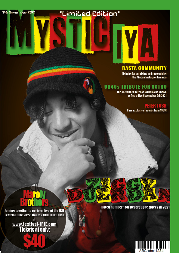
This is my music magazine. I chose for my genre to be reggae and named my masthead ‘Mystic Iya’.
My magazine’s mission statement is, ‘We aim to represent the Rasta community globally to help the world become more mindful and aware of the Rasta culture. We also provide a platform to empower Reggae artists so they get the recognition they deserve through Media. Furthermore we strive to include a range of information about the Rastafari religion and their history of suppression and slavery that they were forced to endure.’
My magazine stands out from others as it is a limited edition and includes tickets to see the marley brothers that are extremely cheap being only 40 pounds. However my mission statement is pretty typical for a reggae magazine.
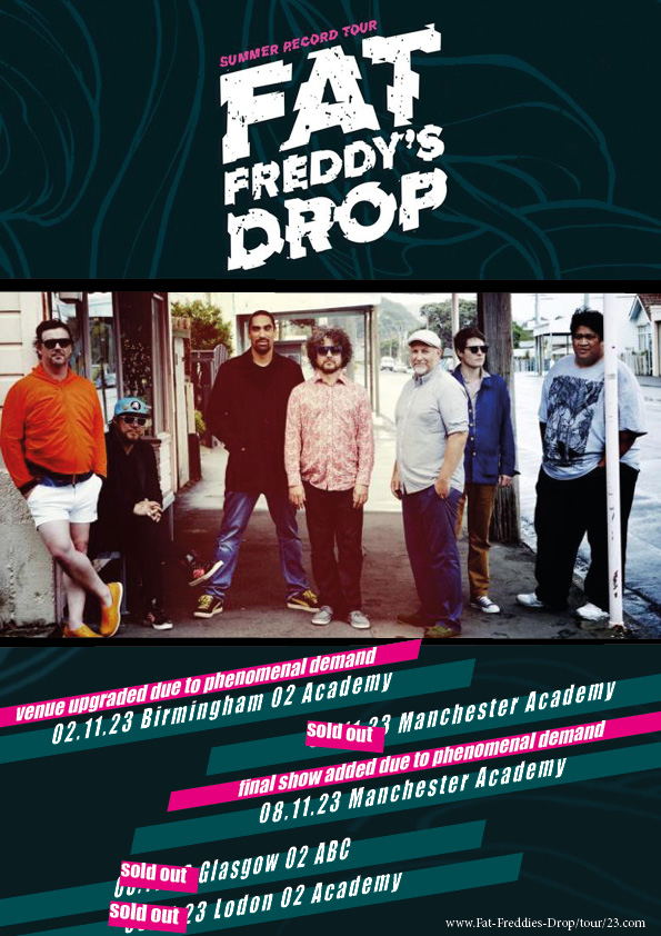
Before creating my magazine I used Yougov to understand my perfect target audience member to get a jist of their demographics and psychographics so I could have a clear understanding of what they would want out of my magazine. I found out from my research that my target audience would be a male in their late thirties to mid forties who is English and lives in the UK. This gave me a clear idea that I wouldn’t be making it a pink girly magazine with the articles about the latest gossip and who are currently the most adorable couple celebrity artists in 2022. I personally don’t believe that most men around that age who live in England tend to pick up a magazine because ‘Kim Kardashian and Kayne’s latest update’. I also found that my perfect target audience’s main hobbies are video games, surfing and playing the guitar which is what made me choose the Call of Duty advert on the page before my contents as many people would be interested in that. I also found that some of my target audience’s interests were being social people and so they thrive and enjoy surrounding themselves with lots of people. Typically people who listen to reggae also really enjoy a range of different genres such as scar, R&B, jazz, electronic dance music ect… This is what deterred me to choose my second advert being a tour poster for Fat Freddy’s drop. Being at an event firstly includes crowds of people which my target audience live for as well as Fat Freddie’s Drop isn’t just a bit of reggae it includes a range of genres of music in their songs such as dub, jazz, R&B/soul, roots and techno. As the two chosen adverts are rather creative and fun I would hope for my advertiser to promote these similar topics so maybe a music app or Netflix adverts.
To ensure people would buy my magazine I had to understand the uses and gratification theory. This is about understanding why people actively seek out specific media to satisfy specific needs. We used the Blumler and katz model to understand the uses and gratifications theory. We learnt four things that drive people to specific media which are; seeking personal identity, information or education, social interaction and lastly entertainment. Within my magazine I would say you are provided with entertainment but it also provides some information such as Fat Freddies on tour or ticket sales for the Marley brothers performance and reunion which is also a way that the magazine is interacting with the customer and these festivals are leading to social interaction in a way. I would also say that a lot of education is provided also in my magazine on political topics such as war, religion, drugs and racism. Lastly I think personal identity is a big one because people look up to and are inspired by the artists that are featured in our magazines so the way things are written and portrayed may have a big impact on your audience’s identity. We also learned about AIDA which stands for attention, interest, desire and action. I believe my magazine is full of things that can catch your attention such as the bright bold colours, the huge and unique Masthead and my main cover image. I also think that adding names of big reggae artists like UB40 and Peter Tosh will interest them to want to read on. The tickets on sale for the Marley brothers performance is also rather desirable which therefore will lure the customer to take action and buy the magazine. Those four implements work hand and hand as once they have had their attention sparked you will immediately take interest and if that interest turns into something you desire then you will have that urge to fulfil that desire by taking action and purchasing the magazine.
I did some research on other reggae magazines such as Jus Jah, The Beat and United Reggae. I found that the messages I was wanting to send out to my audience was most similar to Jus Jah as their articles and mission statements are all about awareness of culture, race and peace which is why I would want to work with them and fit for this change and bring empowerment to each other which I believe would be very motivating. On their website they say they are always looking and interested in creatives who want to work with them. They are also a magazine that is aimed at people in the UK which is perfect as we both have an understanding of the same target audience. You can get in contact with them through their website because finding out their contact number and also having a list of different emails you can also message.
In terms of distribution I am going to have an online website and a print version magazine which I hope is to complement each other as some things that are advertised in the magazine you have to get from the website but sometimes it may be a special code in the magazine that you have to type into a certain website in order to win whatever was said to win. The reason why I believe I should continue to do a print magazine is because most of my target audience doesn’t exactly go on their laptop and search up a website and read the latest news on it but if they were to have something already in their face so if you were to see a magazine in a shop that captures your attention that is when the are most likely to read it. Also people in their late 30s to mid 40s are rather mixed in the sense that many accept technology and find it very convenient and useful whereas many others of the age group would much rather sit down and read a magazine or newspaper as technology can hurt their head and eyes and they find it too frustrating to use.

After my first two drafts and all my reflection work on each I finally tweaked each page to start to finish it up a bit. At this stage I am at a point where I feel like my drafts are coming together nicely and trying to change too much may overload and ruin it.
Here is my draft 3 of the complete magazine:


After looking at what I have changed overall for my draft 3’s I have noticed that I have been finding it harder to think about what I need to change or not. However this is a very good thing because I have gotten to the point where I am pretty happy with all my pages (especially my font page), so now I have to be very picky if I want my magazine to be as good as I can make it.
There was a lot of things that I wasn’t keen on in the magazine such as my image that was surrounded by text and my drop capital. I found that the second page was very boring and there was nothing on it so I needed to distribute things out better or add something.
Finally here is my second draft of my double page spread:

I think this pages look so much better than it did before and everything comes together so much nicer. I think now looking at this I am in a much more pleased mindset and feel like all that’s really left to do is add my article in and new title and see how it looks from there. It’s really just one of those things where after adding my article it could make me realize there are things I have to change and I don’t know for sure how much space it will take up either.
For my second draft of my cover page I went for a whole different look than my last as I thought my last cover page just looked to similar to my front cover draft and there was too much color which made it look a little too much especially because a content page has lots of information you want the page to be more simple.
Here is my second draft of my contents page:

I think that comparing my new draft to my old one I think I might be going a step in the right direction. It may not be as obvious it was a reggae magazine as it did before but it looks I think a lot more toned down and simple but effective. I was pretty happy about most things on this page but trying to take a step back just to notice that there are some things that do bug me and I do notice now that I might be confusing people with what genre of music this is for as maybe I have tried to stick to this color them too much but I think in a way its different and new.
For my second draft of my front page I reflected on my last draft on things I didn’t like about my magazine such as a certain font I was using and the sizing of my text.

I feel like there is too much going on in the page now that have have changed things about. I think I might have to decide on eliminating one of my fonts but make sure is looks clear no matter what size font. There is also too much color I think on my page so I think that I will either get rid of so many font colors or make my cover star black and white. For now I think the best thing to do is to not over crowd my page and keep it simple but effective.
I think analyzing my second draft was an extremely helping thing for me to do right now. I can tell my draft 2 was starting to head in the wrong direction and it has made me realize I have been trying to add to many things onto my page to make it look better when less is more and now I can try balance out my cover page and try bring attention to the things that are most important to get the buyer to want to buy it.
After doing lots of planning and work to work up towards our double page spread I finally made my very first draft. Here is my draft of my double page spread:

Overall I am not entirely pleased with my double page spread although this was very rushed and was the first draft so there is time for improvement. I think seeing what needs to be improved has given me some clear targets to work on in order to improve my magazine but of course there is still a lot more improvement that could be made and of course I still have to add my own article in as I have not managed to finish it and I have only used placeholder text.