January
16
Complete Magazine Draft
Front cover

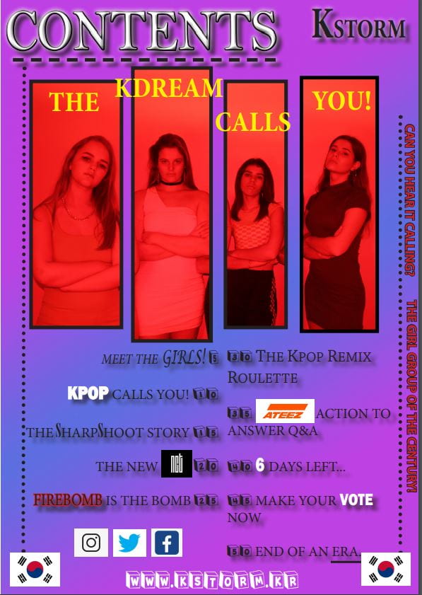
Contents
Article

Screen castify
Feedback
I have made many changes to the magazine pages as a whole to give more an effect to the audience, I have struggled most with the development of the double-page spread most as I had such a long article and had to cut it down significantly. I have enjoyed creating my magazine regardless of the stress that it came with.
The feedback I received was that the magazine had a good feel of the Kpop genre and good colour scheme, the fonts are effective and work well in the magazine. The repetition of the fonts on each page works well in the magazine, overall the magazine is effective although it is overwhelming at times and the adverts need to be put in.
Targets
- Make the front cover less chaotic
- Lesson the range of fonts on the contents cover
- Edit the layout of the article
- edit colour of article background
- make the pages pop more with less chaos
- simplify the pages