Here is draft 2 of our digipak:
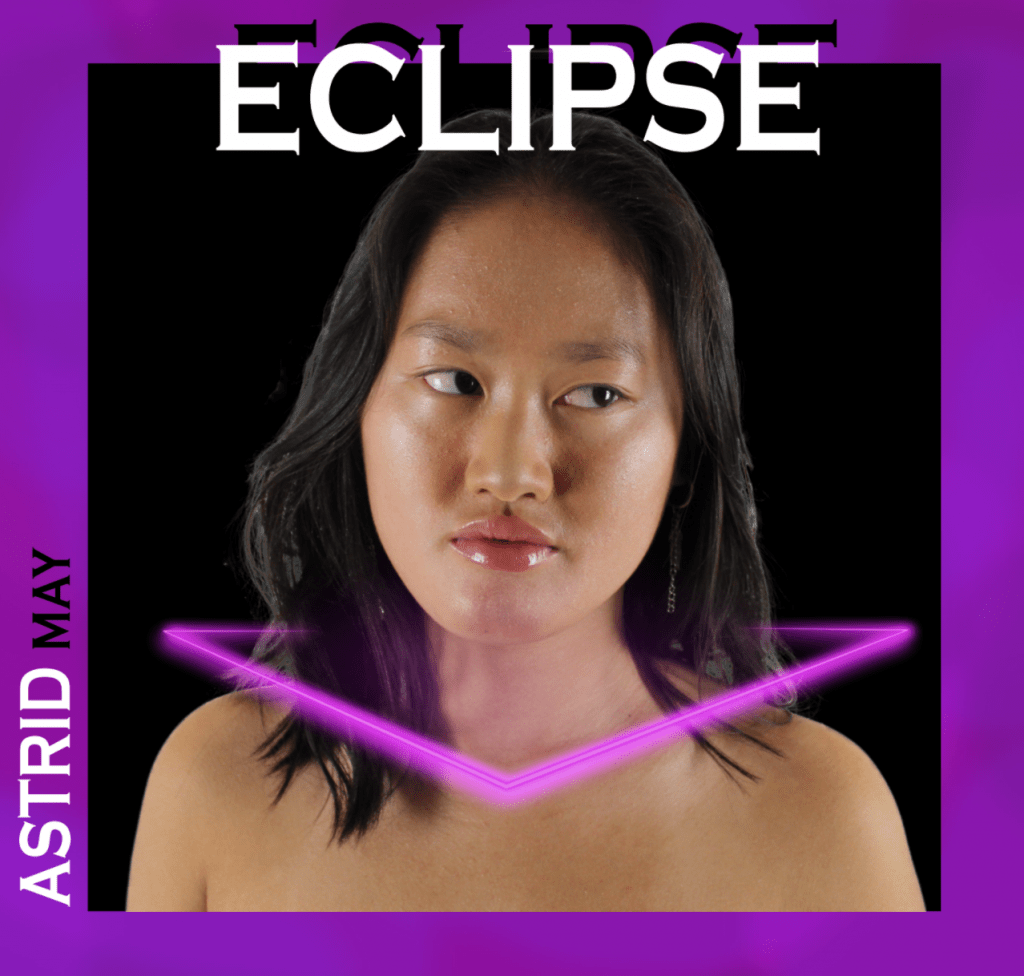


Our teacher provided us with some feedback:
From this helpful feedback we have collated some targets for improvement for our third draft:
- Try to darken Min’s eyebrows slightly
- Experiment with whitening Min’s eyes on the front pane
- Add another neon colour that isn’t purple or pink; perhaps an orange or lime green
- Change Min’s size on the back pane
- Put the name of the album on the spine and the logo as well
- Experiment with the neon glow around Min on the back pane again
- The right pane needs to be a bit wide in order to fit in the CD frame