Category: Production

Digi-Pack and Advert – Draft 2

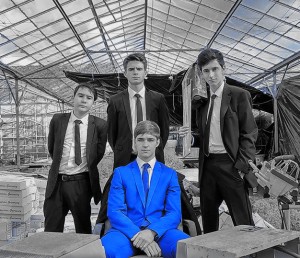
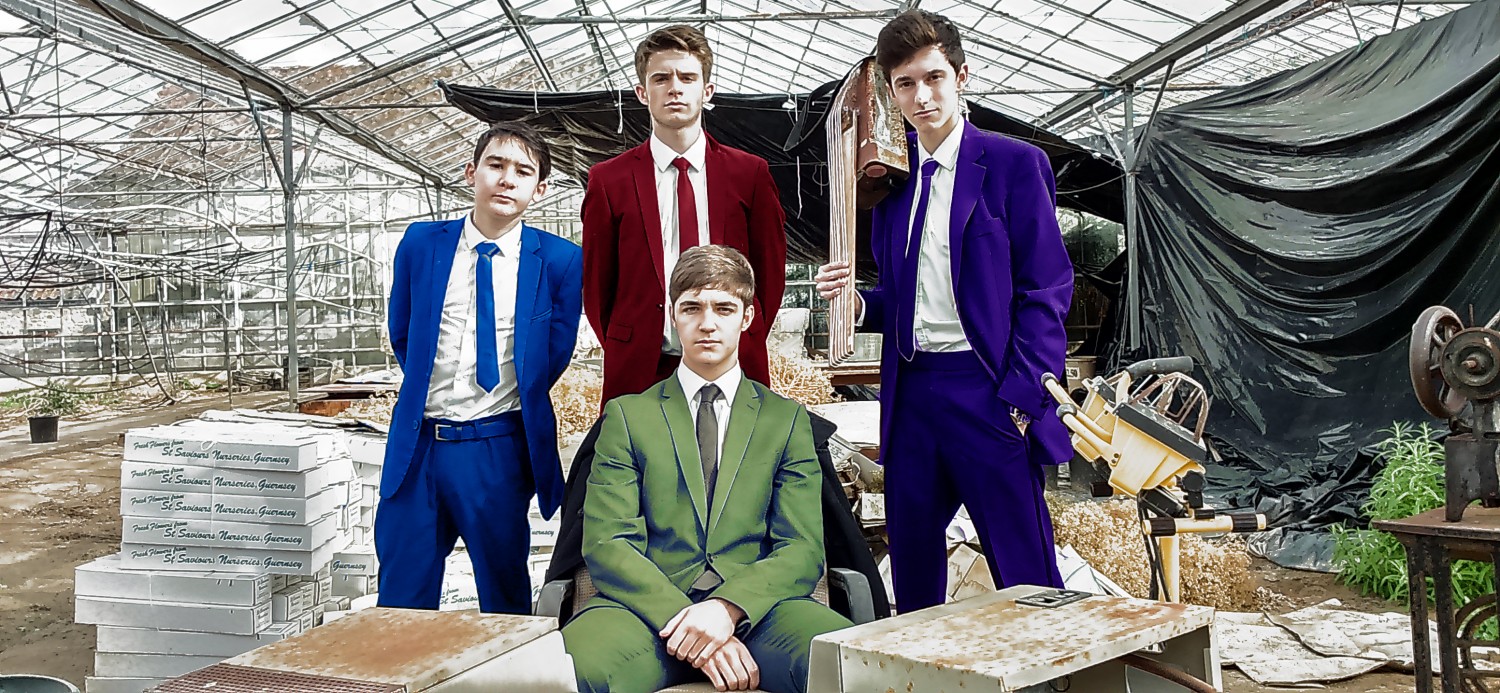
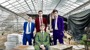
Below are the second drafts of our digi-pack for our band ClayMaker Castle. Taking our targets on board we first focused on adding more colour, playing on the idea of colourful suits, we proceeded to change the colour of all the suits of the band members using the same technique as we did for our first draft. Secondly instead of taking away all of the saturation we instead isolated everything except the suits and added a filter to the image, the filter allowed for the suits to be the focus point of the image, while the image is still able to retain colour apart form the suits.

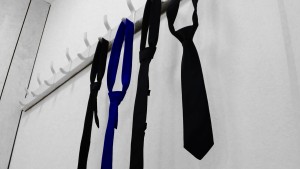
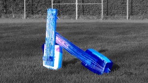
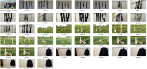
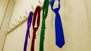
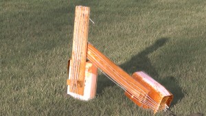
Next we proceeded to our other images. For the ties we decided that each would be a colour of one suit from the front of the digi-pack, this allowed a link between the inside and outside of the digi-pack, we also brightened the background of the image to give a neutral background to the colourful ties. For the guitars we attempted to add a filter to the background of the guitars, however due to the large amounts of green from the grass the colour of the image became strange, so instead we decide to remove 50% of the saturation and then enhance the red colours within the guitars to make them the focus of the image, while maintaining a small amount of colour in the background.

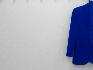
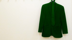
Finally for the back of the digi-pack we changed the colour of the suit to match that of the singer, this was done to keep the idea that the singer is the main star of the band, but it is more subtle than the original image where it was the whole band and the singer was pointed out, but it is obvious enough for the target audience to receive a preferred reading where we plant the idea for the audience to pick up on.

Digi-Pack Draft 2 FrontDigi-Pack Draft 2 Inlay 1


Digi-Pack Draft 2 BackDigi-Pack Draft 2 Inlay 2


In order to progress we needed to gather feedback on our first draft in order to make improvements onto our current designs, with the feedback we can then edit the current digi-pack panels to create a second or even final draft.

To see the feedback watch the video below.

From our feedback we have agreed on several targets of improvement.

  • Add all relevant information to the digi-pack
  • Tidy the edges of the ties and guitars as colour overlaps the objects
  • Remove the saturation for both inside covers Keep background colour for both outside covers
  • Crop the jacket on the back cover

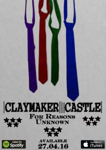
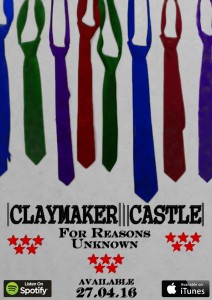
Below is the second draft of our advert. Taking on-board our targets for this draft we started by filling the the gaps either side of the ties, by adding in more ties from other images we had, this was to prevent copying ties we already had and making the advert boring or unprofesional. Next we changed the colours of the stars to be red, this breaks the bland colour that was previously there but still keeps the main focus of the advert on the image of the ties

However as a group we felt that the advert now felt too cluttered and decided to perform one last feedback session in order to find any last problems that we had with the advert.

To see our second draft of our advert, click the image below.

Advert Draft 2


In order to progress we needed to gather feedback on our second draft in order to make improvements onto our current design, with the feedback we can then edit the current advert to create a final draft.

From our feedback we have agreed on several targets of improvement.

  • Remove the number of ties at the top of the advert to create a less cluttered image.
  • Remove the number of stars as it has become slightly distracting
  • Remove the text effect on the “Available 27.04.16”

Advert – Draft 1

Below is the First draft of my Advert for Band new album, For Reasons Unknown by ClayMaker Castle. For the first draft of the advert we included the relevant information included on most adverts within our music genre. We included things such as The artists name, name of the album, when the album will become available and on what platforms the album will be available on. The conventions of a typical advert are that the front cover of the digi-pack tend to be the images used on the advert, however during our research of adverts within the American Rock genre we found that the advert is different and that the conventions of an advert are that one of the 2 inlays of the digi-pack tends to be the image used with the advert. We decided as a group that we would follow this direction and used an image related to the inlay of the digi-pack.

Instead of using the image of the ties from side the digi-pack we chose to use the same image taken from an alternative angle, this way the advert would be more appealing and something new, yet not.

To see our first draft of our advert, click the image below.

Advert Draft 1


In order to progress we needed to gather feedback on our first draft in order to make improvements onto our current design, with the feedback we can then edit the current advert to create a second or even final draft.

To see the feedback watch the video below.

From our feedback we have agreed on several targets of improvement.

  • Change the colours lower down on the advert as they are very bland and simple.
  • Fill in the gaps either side of the ties as it is just empty space.

Digi-Pack – Draft 1

Below are the first drafts of our digi-pack for our band ClayMaker Castle. Our idea for the digi-pack links the the music video we created. In the music video the main singer is in a blue suit while the others were in black, showing the significance of the singer. What we did was using Photoshop we isolated the suit by selecting the colour range in which the suit follows, blue colours, we then used the colour balance adjustment and we altered the colours to a more visible blue. Then using a similar technique we isolated the whole of the image apart from the suit and we reduced the entire saturation of the image to make the only colour in the image the suit.

Seeing that this was an interesting result we took our other three images and replicated what we had done with the original image to create a link within the digi-pack.

Digi-pack Draft 1 FrontDigi-pack Draft 1 inlay

Digi-Pack Draft 1 Inlay 2 Digi-Pack Draft 1 Back


In order to progress we needed to gather feedback on our first draft in order to make improvements onto our current designs, with the feedback we can then edit the current digi-pack panels to create a second or even final draft.

To see the feedback watch the video below.

From our feedback we have agreed on several targets of improvement.

  • Add more colour to the digi-pack
  • Reduce less of the saturation
  • Focus more on the four band members rather than just one
  • Tidy the edges of the ties and guitars as colour overlaps the objects

Digi-Pack – Contact Sheet and Evaluation

Below are the images that were taken during our photo shoot for our advert and Digi-Pack.

Overall we feel that our photo shoot was successful and that we will be more than successful in choosing image to use for our final digi-pack. With the images we choose for each panel we will use Photoshop to highly edit and enhance the photos to give them a professional look which fits the genre of our band and music video, we will then repeat this process for the advert to create our final print products, creating drafts along the way which will allow for feedback and improvements to be made before come to a final design.

The planning documents for the digi-pack largely helped us on the day as we were able to take the shots we wished to take and then to experiment upon shot ideas to give us a larger variety of shots to choose from. All risks were also avoided thanks to our risk assessment which helped avoid any mishaps that could affect our photo shoot.

For our photo shoot we had to have the original set where we shot our music video, learning from our previous mistake my partner and I went down to the venue 2 hours ahead of time and set up the set, this time we had plenty of time and where able to finish preparations before our band members turned up, meaning we had the whole arranged amount of time to perform the photo shoot giving us a successful shoot.

From our photo shoot there is one shot that we are really proud of and feel will fit perfectly for our digi-pack and it is the front shot of the band members, we have had ideas of what we could do with the image, and we will get feedback of this in our first draft of our digi-pack.

To see our contact sheet, click the image below.

contact sheet

Music Video – Draft 2 Evaluation

After creating the second draft of our music video we needed to gather some feedback in order to help us improve upon the current version of the music video and come to our final version of our music video. We we interviewed a number of fellow students who fit in the target audience of our music video and who listed to this genre of music.

We asked the students to give a single criticism that they had with the music video and felt would improve the video if it was to be changed. We then took down their feedback, once we had a large selection we cross examined it to see if there were any repeating comments, these would be our main targets for our final music video. We then would take 2 – 3 more comments that we felt would improve upon our music video and added these to our target.

After analyzing the feedback we as a group have agreed upon some targets in preparation for our Final Music Video. These targets are:

  • The editing to the beat in the first verse is too quick.
  • The editing to the beat in the second verse is too slow.
  • Use a larger variety of shots, avoid repeating
  • More shots of the drummer are needed, hes hidden by the singer

With the targets above taken from our feedback of draft two we will tweak our video in order to create our final version of our music video.

Music Video – Draft 2

After receiving the feedback from our first draft of the music video we changed a number of things within the music video.

Firstly we colour corrected the narrative to be darker when with the Mona Lisa painting, this is because we were told that the shots were to light and not sinister enough. We also colour corrected the narrative where he is following the female character to black and white as we felt this help to differentiate the performance from the narrative, as some found the transactions were not enough.

Secondly we changed the narrative and added some to the end of the performance, from our feedback we were told that the ending was way too long, so to break up the final section of the performance we added some narrative.

Finally we changed the performance, we edited the shots to the beat a lot more effectively, each cut taking place every other full beat. This added pace to the performance and made it fit the song better than our previous performance.

To see our second draft of our music video, watch the video below.

Music Video – Draft 1 Evaluation

After creating the first draft of our music video we needed to gather some feedback in order to help us improve upon the current version of the music video. We enlisted the help of a fellow student who fit in the target audience of our music video and who listed to this genre of music.

We sat down the student to watch through the entire length of our first draft and asked him to take down some notes, including anything he felt that needed to be changed or tweaked. Once the video had finished we asked if we could film the feedback in which he was going to give.

Below is our feedback for our first music video draft.

After analyzing the feedback given above, along with some anecdotal feedback, we as a group have agreed upon some targets in preparation for our second draft. These targets are:

  • More narrative is needed
  • The performance at the end is too long of a clip
  • Needs to have edits to the beat
  • The narrative needs to be more clear

From the feedback we can confidently say that we are on the right path to creating the music video we wanted. Next we need to use the feedback given to use in order to create a second draft so that come receiving feedback for that draft we are able to make final tweaks and create our final, finished music video.

Music Video – Draft 1

Once we had performed our re-shoot of the narrative we took to our rough cut and replaced and moved a majority of the narrative, inserting the new clips. We also edited the performance to include a variety of more shots and changed the pacing of the cuts.

Without the feedback which we received for previous rough cuts it would not have been possible for us to edit the music video in the way we did, we as a group are more satisfied with this version of the music video.

However, we wish to collect feedback for this draft too as we feel there are still areas which we could change and improve upon before creating our final music video. We will pitch our draft to the target audience to get the best results for our feedback.

To see our first draft with new narrative, watch the video below.


Narrative Rough Cut Feedback

In order to advance and create our first draft of our music video we needed to receive some feedback on our narrative rough cut. We do this in order to give us a clear understanding of what within the music video needs to be changed, what needs to be added and what could be removed.

In the comments we received a comment from a member of staff giving us feedback on our narrative rough cut. In the comment she talks about how the narrative feels incomplete and that the actress could be dressed better for the video, these are both points that me and my partner both agreed on and both felt that we needed to change.

To see the comment click the image below.

Mrs Cobb2


We felt that we needed more feedback as the points made by the teacher where what we already felt as a group, so in order to receive any additional feedback we presented our rough cut to a group of students.

To watch the students response to our rough cut, watch the video below.

All the comments made by the students are repeats of what we felt as a group and what had been said in previous feedback received. By doing this we have solidified our feelings towards the narrative and what needs to be changed.

After hearing feedback from both a teacher and students within our target audience we as a group decided on targets for our first draft:

  1. Include the girl earlier to allow the narrative to make more sense
  2. The repeated shot (same location, looks very similar to a previous including the stalker), removal will allow the video to flow better
  3. More air time for the narrative, allows more of a plot to develop and can connect to the audience more
  4. Include the ending and our proper start with the Mona Lisa, will allow the narrative to really make sense, and provide the motive and appropriate finish

Narrative Rough Cut

Upon returning from our narrative shoot we use Adobe Premiere Pro in order to compile all the footage which we had filmed in order to create a narrative and performance rough cut. At this point the rough cut still contains problems such as no colour correction and unbalanced shots, however, the purpose of the rough cut is not to have a perfect narrative and performance video, but, to have a rough estimate of what our narrative and performance will look like once finally edited, it also allows use to present our narrative to students in order to receive feedback on our narrative to see whether there is more we could add to the narrative.

The rough cut also allows us to decide whether there is need for a re-shoot of either performance or narrative, and we can start to make our edits to create or first full draft.

To see our Narrative rough cut, Click the Video below.