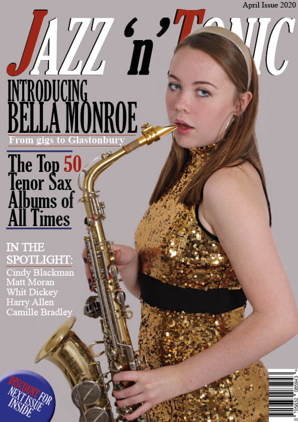
This is my second draft for the front cover page of my music magazine. I edited with the feedback I got from my first draft.
Thing I edited:
- edited the main photo on photoshop by cutting out the model and using the sharpen tool to make her appear more clear.
- added more colours to match the jazz colour scheme.
- edited the masthead to make it more eye-catching and used a variety of colours in it to make it less plain.
My Targets:
- Capital G for Gigs?
- bit more red in some of the cover lines?
- move the main cover line to over her body and then you have room top left for another coverline? move the main coverline down slightly from the masthead?
- price?
- look at the alignment of the blue lines?
- little logo of a musical note? outline of a trumpet?