These are my draft 3 versions of my music magazine. I added and changed multiple things on each of the pages to meet a nearly perfected finished magazine which might only need a few more tweaks. On the front cover I changed things such as the background from a light grey to a muted brown colour to make the cover even more retro and vintage as it could be. I also changed the main cover line and moved it over the main cover star in order for me to add more coverlines and also draw more attention to the star.
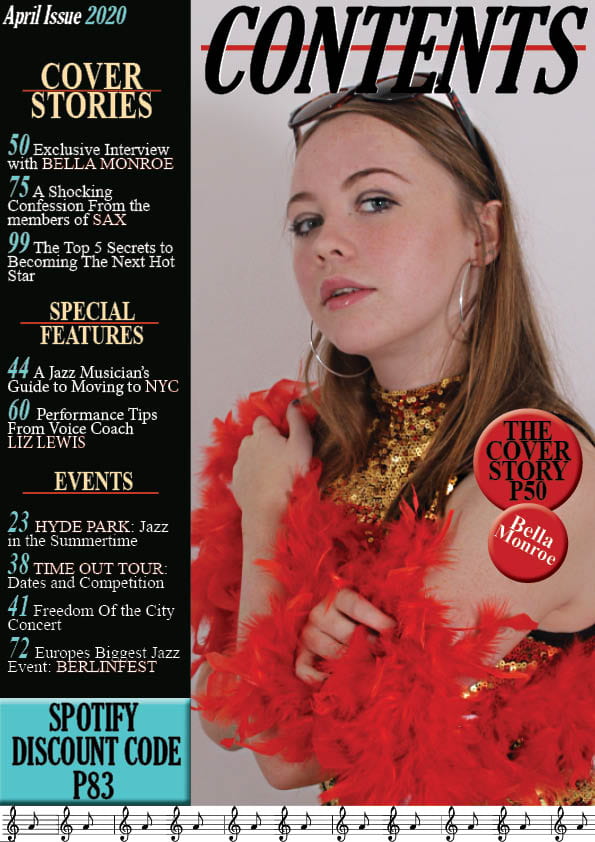
On the contents page I made the most edits and changes. One change I made was I edited the image of the model in Photoshop by using tools such as sharpen to make her more clear. I also did things such as adding more effects to the text by highlighting certain words to make the page have a bigger variety of colours to stop it looking plain and boring. I changed some of the subheading for example I changed the fashion subtitle to an events subtitle to make it for music relevant.
Finally on the DPS I edited some typos and wording to make sure there’s no errors. I enlarged the main image so that the models take up more space on the page so attention is drawn to them. I also added another quote to help fill the white space of one of the models shirt and added some text effects to the quotes.


After doing my third drafts my teacher did a screencastify for me so I know what improvements I need to make for my final draft.
Feedback:
Front Cover:
- Masthead needs to be bolder
- Pug is bunched up
Contents Page: PAGE NUMBER CONTENTS PAGE / White stripe around contents, links with masthead/ keywords could be bolder with some stripe / equal line spacing
- Add page number
- Add white to contents heading
- Keywords could be bolder with some stripe
- Equal line spacing
Double Page Spread: Quote could be moved down and justified to left / Caption the photo / Slightly thicker line under your writing?
- Quote could be moved down and justified to the left
- Caption the photo
- Slightly thicken the line under the writing