self assessment:
It is incredibly important to assess any work you have carried out, this makes the improvement stages a lot easier to identify via feedback. The only way my work can be improved thoroughly is to critique until I can see what needs changing. By assessing my first draft of my front page, this will make it a lot easier for me in the long run when creating my final piece as I can look back to my previous work for guidance. As I follow the strict criteria on the blog, this will assist me in creating a unique magazine which also attracts my target audience. I will use my teacher feedback to create a magazine to the best of my ability. Here is my first draft of my front cover:
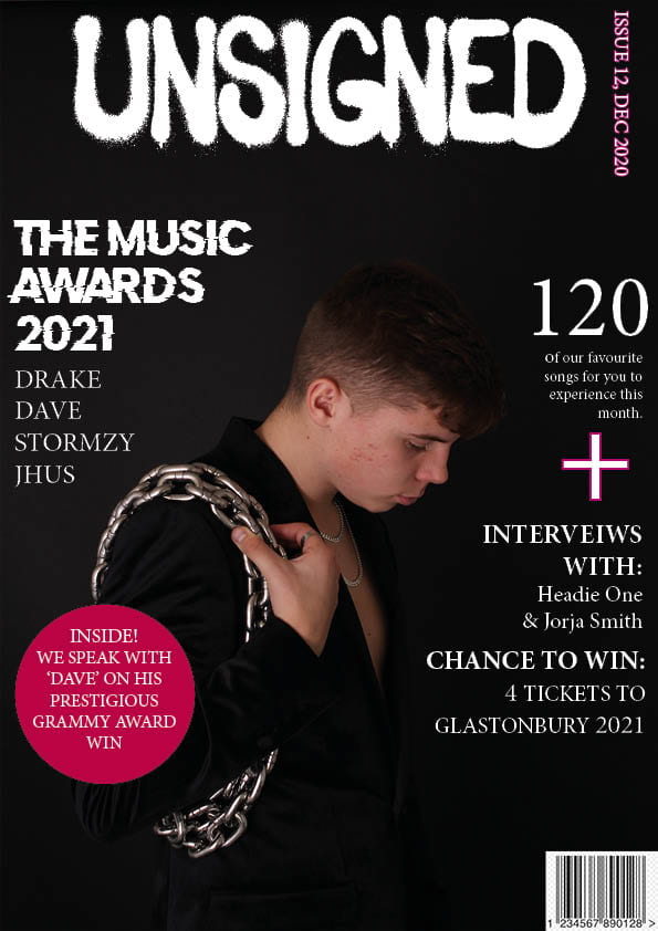
Please click on the image to see pdf.
- My masthead design is proportioned adequately, centred at the top of my front cover. The white and the black coincide with my chosen genre of Rap/HipHop as many famous magazine’s of a similar genre have this sort of design. The typeface I have used is big and bold which makes it easy to see meaning my magazine will stand out to my target audience.
- I have positioned my model in the centre of my front cover, as a result, he is the most prominent feature. By placing him in the centre on my magazine, it leaves space surrounding him to include important information as to what is inside the magazine and to also include advertisements and promotions relating to my genre. I still believe that the size of my model can be increased – I will follow through with this in draft 2.
- The type of ‘Mes En Scene’ I used reflects well within my genre. The chains, jewellery and lavish suit jacket portrays a comfortable and successful lifestyle, which is what most amendable music artists have. The pose the model is carrying out gives off a hard and fierce feel which Rap/HipHop consists of.
- Conventional Design features for a magazine are essential – I have used many on my magazine front cover, for example, barcode, issue date, masthead designs and a main cover star. My main cover star is Ben Acey. To improve my conventional design features, I will include a price of my magazine in draft 2.
- I feel I have used Photoshop and InDesign in productive ways. I used photoshop to cut out my main cover star, to cut out my main cover star I had to use the tool ‘select and mask’. I used the software InDesign to create my magazine and to use conventional features to make my magazine realistic.
Targets
- Include more colour throughout the front page
- Create more interesting headlines
- Try to stick to one font