DIGIAPK DRAFT 3 & FEEDBACK


CLICK ON THE IMAGE TO SEE FULL PDF

FRONT PAGE

CLICK ON IMAGE TO SEE FULL PDF

INSIDE LEFT

CLICK ON IMAGE TO SEE FULL PDF

INSIDE RIGHT

CLICK ON IMAGE TO SEE FULL PDF

BACK PAGE

This peer feedback has been extremely useful. By identifying what genre they think my digipak in has given me confidence as i know i am in the right direction and with a some slight adjustments we can make sure that everyone can identify what genre this is. 


DIGIPAK DRAFT 1

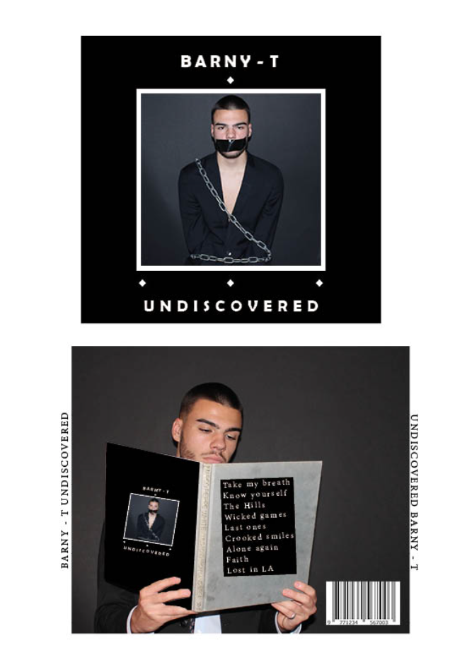
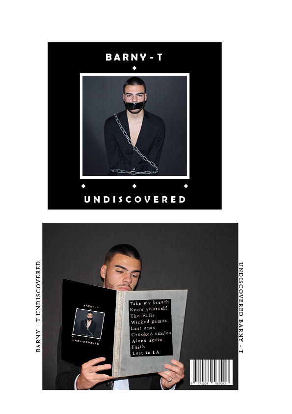
Here is draft 1 of our Digipak, together we have collated and planned how to make our Digipak stand out. We have reviewed current album covers and discovered what works well within our genre. With this we have set out and created a dark grungy style of album that correlates well with the targeted audience and will gain interest from other genre parties.

In order to create a different but original piece we have focused on Mis En Scene and how we can capture the attention of the audience. We have done this by using chains and tape to give that grungy feel and emphasis that the artist feels imprisoned within the industry and unnoticed but ultimately ‘Undiscovered’.

What to improve / Targets:

  • We need to add a subtle colour that will make our Digipak stand out instead of looking like every other in this genre.
  • We need to use a unique font that completely encapsulates and represents our brand like no other.
  • We need to make more obvious edits in photoshop to ensure that everything looks similar and has a distinctive design that our targeted audience will clearly notice.
  • We need to ensure that all the text looks clean and isn’t diagonal on the back pane.

OUR MISSION STATEMENT – THE PACKAGE BRAND

The Mission Statement and Marketing Strategy is crucial when trying to understand who your audience is. This slideshow focuses on what sort of brand we are and how we can promote our genre as something unique and distinctive. We learnt who are demographic is and how we promote our style to our audience. With this we were also able to identify who are competition and what their unique selling points are and how we can overcome them.

This has been extremely useful for gaining the understanding of our audience, who are competition will be and how we can create a product that generates positive interest. This now helps us to create an idea of what we want our digipak to look like and this will be a point of reference through out the design process.


THE LOOK BOOK – THE BRANDING PACKAGE

Made with Padlet

By creating a Padlet we have been able to review and inform ourselves on how we might be able to create an album cover that is relevant to our genre and matches the themes of the rest but with a twist. By collecting cover art from similar artists we have been able to start designing and creating a rough idea of how it might look, what colours we might use and how we can lay out the text. By reviewing each image, we have been able to identify what works well for artists of a similar theme and therefore being able to have resource that we can always use for ideas that can represent the brand.


OUR MISSION STATEMENT – THE PACKAGE BRAND

Creating a mission statement is always important when forming a brand as it allows us to identify the key factors that may affect us. for example who are target audience may be and who are competition will be and how we can overcome a rival.  A call to action is crucial when deciding where to advertise and how it might benefit us over others.

Our Unique selling point was important for us as it gives the audience a rough idea of how our star portrays himself in everyday life.

The mission statement is crucial because it tells us how we can create a strong and successful platform for consumers to discover more about their favourite artists.

Mission Statement:

Kid_Btay, a unique character within the music industry. An artist with a transparent mind who creates interest just by being himself. His distinctive style and edgy lyrics used to create a contentious response. Btay has a creative mind and has channeled this throughout his music being one of the very few have been able to hybridise Hip-Hop and alternative R&B.

Digipak Conventions Analysis

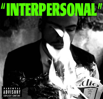
Whilst searching for artists of the same genre we were able to find Drake’s album cover which portrays very similar conventions and a similar target audience. We used his album cover to review and take a closer look of what the typical conventions are for a digipak. With this we researched what makes a popular album cover, analysing the front and back to see what makes a good cover. This has given us a rough idea of how we would like to portray our artist through a digital piece. We now know what doesn’t work and can therefore identify where to place things, what colours and fonts to use and how we can portray our artist in a positive light.