Draft 1 of Contents Page

I have tried to make my contents page understandable with lost of information of what’s where and how you can find it. I have added pictures relevant to my genre and what will be included in my magazine. However I feel there is almost too much writing.

  • It needs more colour to really attract attention
  • Make it simpler with less writing
  • Add some more pictures to showcase what can be found inside the magazine

Draft 1 of DPS

This is my first draft of my Double Page Spread, I have set the layout so that the picture is the first thing that you see, making people wanted to read on about the star.

whats next:

  • I need to add more colour in to make it more attractive
  • I need a add a few small details such as page numbers and name of photographer to make it look more professional.
  • I also need to add in my article to give it the complete magazine feel.
  • I must photoshop the second image to make the model clearer and easier to see.

Draft 2 of Contents Page

Contents Page 2nd Draft

In my contents page second draft I have tried to give it a simple feel, after my first draft I have reviewed and felt that it was too complicated for a magazine contents page so I have taken out the majority of the writing and given it a simple slick feel.

  • I have taken away the huge amounts of writing to give my contents page a clean feel.
  • I have clearly numbered the pages with what subject is on each
  • I have added a small collage of pictures at the top to give the reader an insight of what’s inside.
  • I have added a page number to give it a true Magazine feel.

By cleaning up my contents page I hope that it will attract more attention and gives the reader and easier understanding of what’s where. I’m hoping this will make it look more professional.


What’s next?

  • caption the insets
  • page number – just 3
  • swop sizing of unsigned and contents?
  • need all own images
  • make insets the same size
  • look at alignment of the numbers and coverlines?
  • add some much smaller font to add to the coverlines be retain the simplicity and shape

Draft 2 of DPS

DPS 2nd Draft

In my second draft I tried to use a bit more colour and added a red x to apply the theme to my artists pictures and the album name ‘Uncut’. I’ve added my article in to give it the complete feel of the Double Page Spread, I also lightly photoshopped my images to make them sharper and brighter making the viewing quality better and easier to see the model.

  • I have photoshopped both images
  • Added in my Article
  • Added some more colour with a large red ‘X’ that’s relevant to my genre

I’m hoping that by doing this it will attract more attention from the audience and make my DPS stand out.


What’s next?

  • page numbers
  • byline?
  • standfirst in bigger, bolder font
  • drop capital for the start of the article
  • are the columns the same width?
  • perhaps justify the copy to right and left?
  • paragraphs
  • swap size round unsigned and  interviews?
  • caption the inset on right hand page
  • is Uncut the artist….perhaps add something else in to tempt the reader to read on

Draft 2 of Front Cover

Front cover draft 2

Here you will be able to view my second draft of the magazine front cover. I have used the same image and tried to make him the centre of attention, I Have tried to add a few things so that the audience can Clearly identify who the main cover star is, I have done this by adding the artist name at the bottom in big writing and telling the audience a little bit about him, almost a teaser.

  • I have added some glimpse of red to correlate with the rest of my magazine
  • I have added my stars name in big writing at the bottom so that the audience can clearly identify
  • I have also added a quote to make the cover look like a true professional magazine cover.

By doing this I hope that it will correlate well with the rest of the magazine and attract attention from the audience. By adding a quote I hope that it will give the magazine a more profession feel and give the audience and insight of what’s to come.


What’s next?

  • placing of the text inside the pug
  • add something else red to compete with the pug as it is really big
  • make him much bigger.
  • sharpen the chain so that they stand out
  • add some colour to some of the coverlines?
  • put the quote nearer him. to anchore the main cover image
  • typo interviews
  • try bevel or some FX on the masthead
  • don’t centre the masthead – – align to the left and then you have room top right for something else?
  • barcode


Location Shoot – Contact Sheet


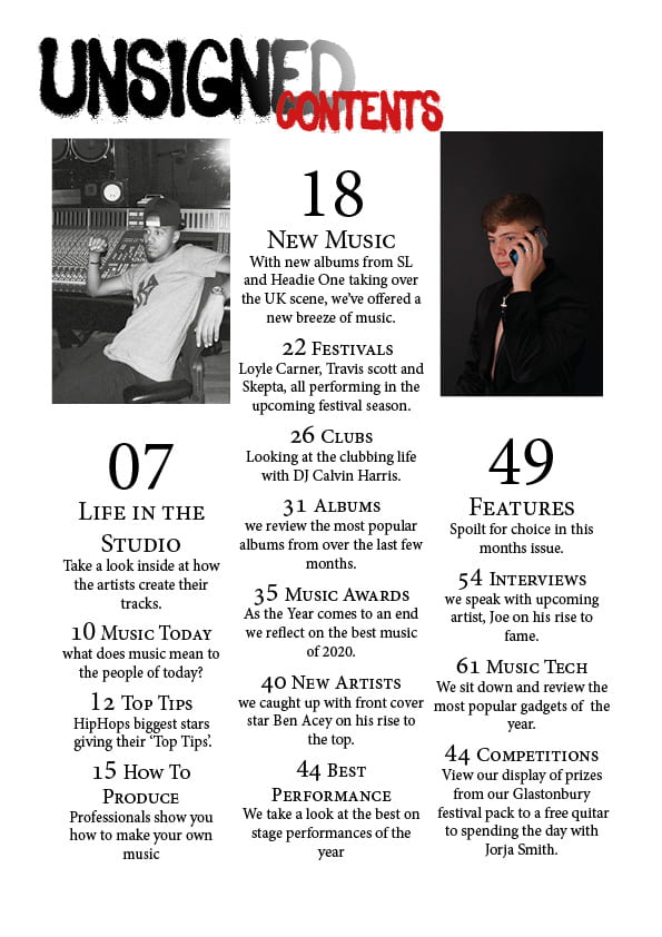
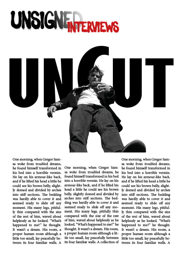
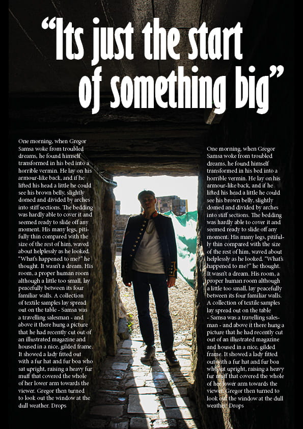
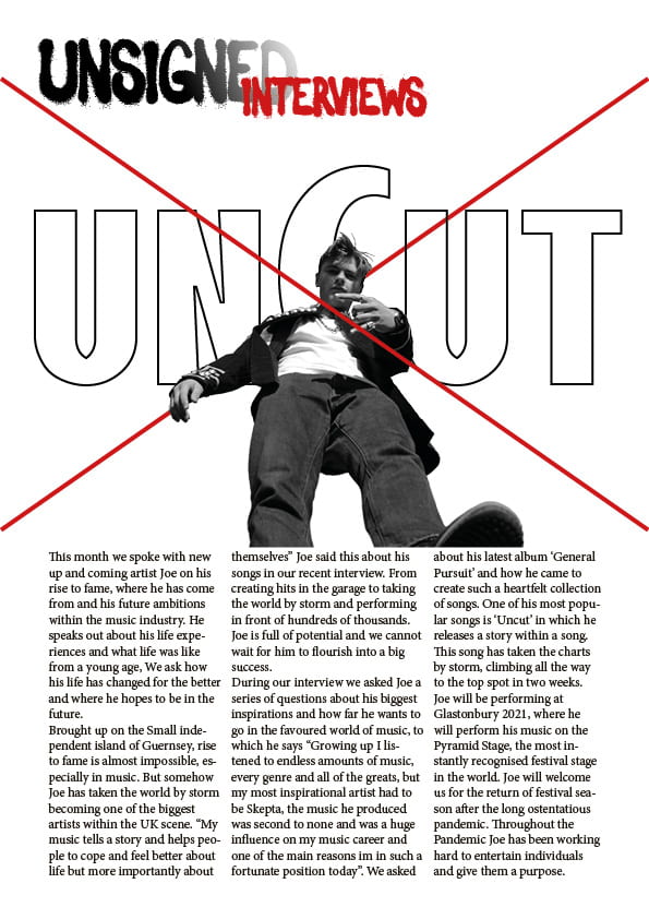
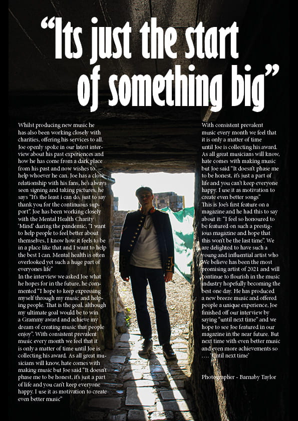
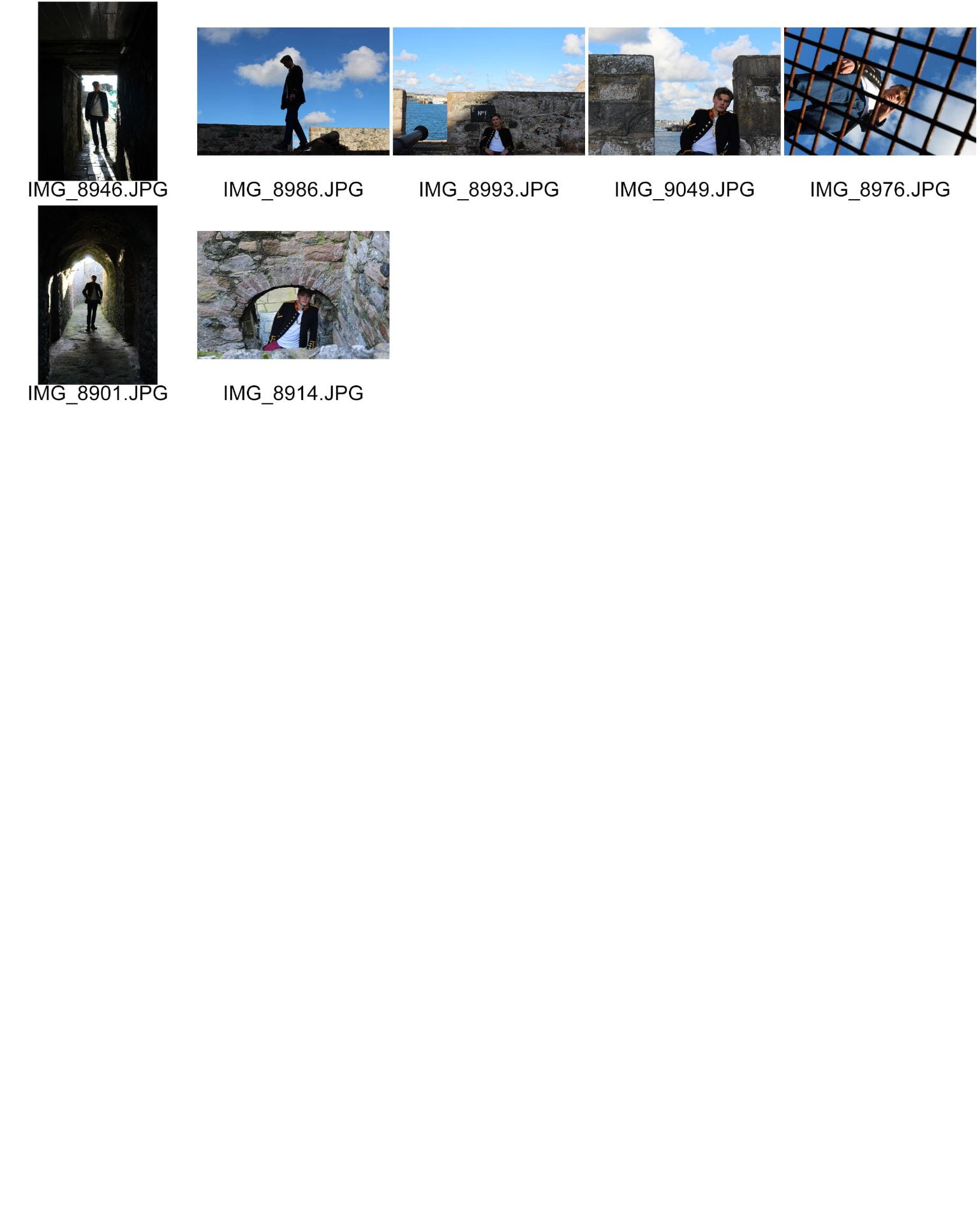
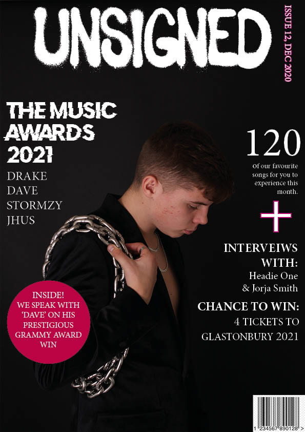
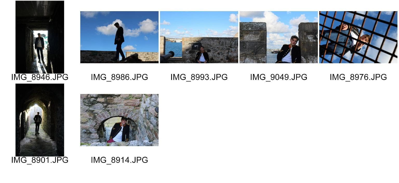
In order to create a popular magazine, pictures are crucial to attract attention and interest readers. These photos were all taken within Castle Cornet, with contrasts of lighting and using the patches of sun to our benefit. Taking close up shots will allow the reader to clearly recognise who the star is, we also took shots that use the surrounding scenery to set a scene. I dressed my model in the appropriate clothes for my genre, with chains, watches and rings to add the effect of success and confidence, the jacket I used id unique but subtle which I hope will attract attention. We used the contrast of the dark tunnels and patches of sunlight to our advantage to create photos that focus on the star with the sun shining on them but the dark grungy feel behind that correlates to my genre of Hip-Hop.

However I felt I could’ve done better, more costumes and accessories that would have allowed me to offer a wider variety of photos that relate to my genre. Brightly coloured clothes would’ve allowed me to attract more attention especially with the dark backdrops. I also think that the use of different camera angles would have given more to play with in terms of my contents page and double page spread. I used high, wide and low angles but felt I could’ve done better and used even more angles.

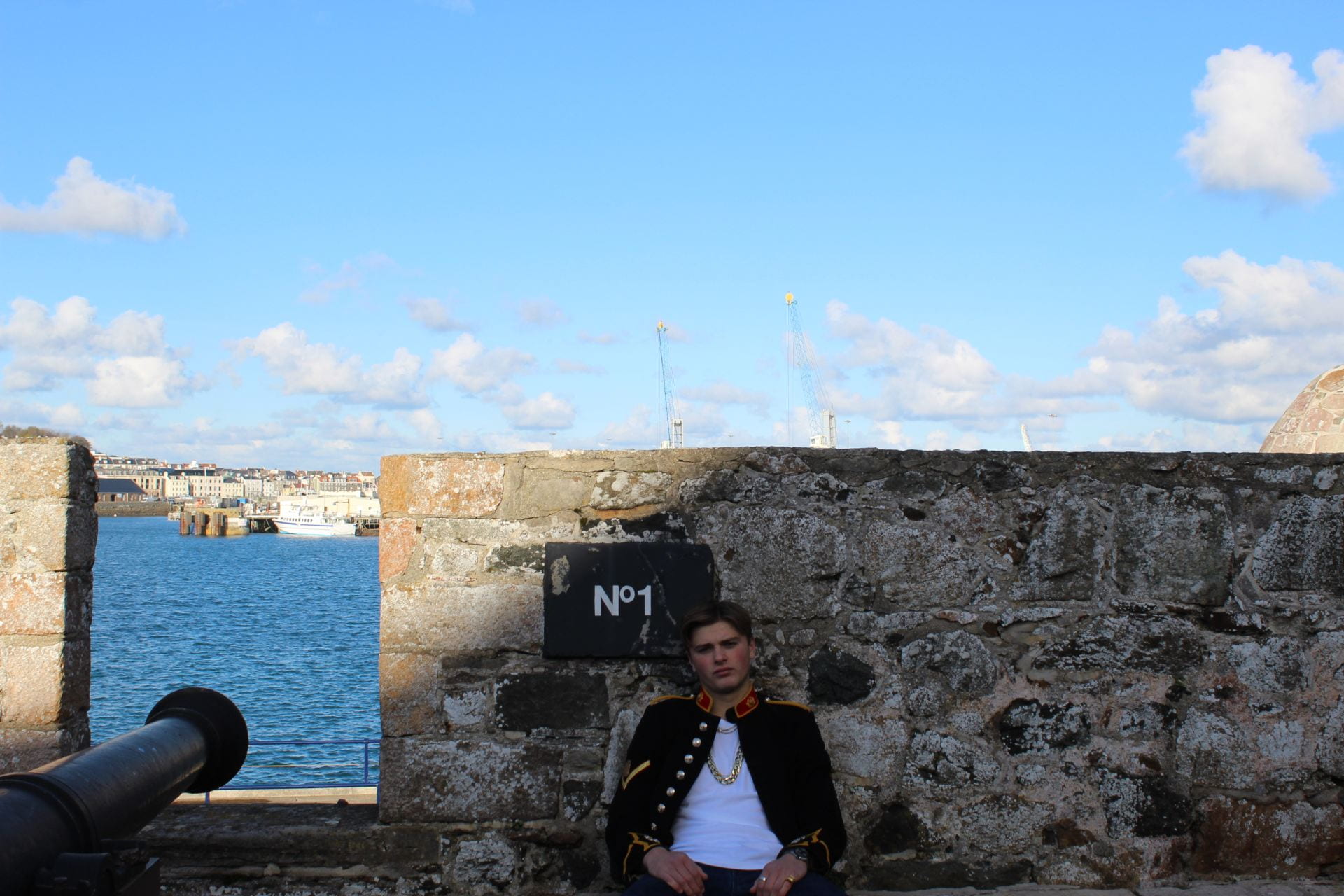
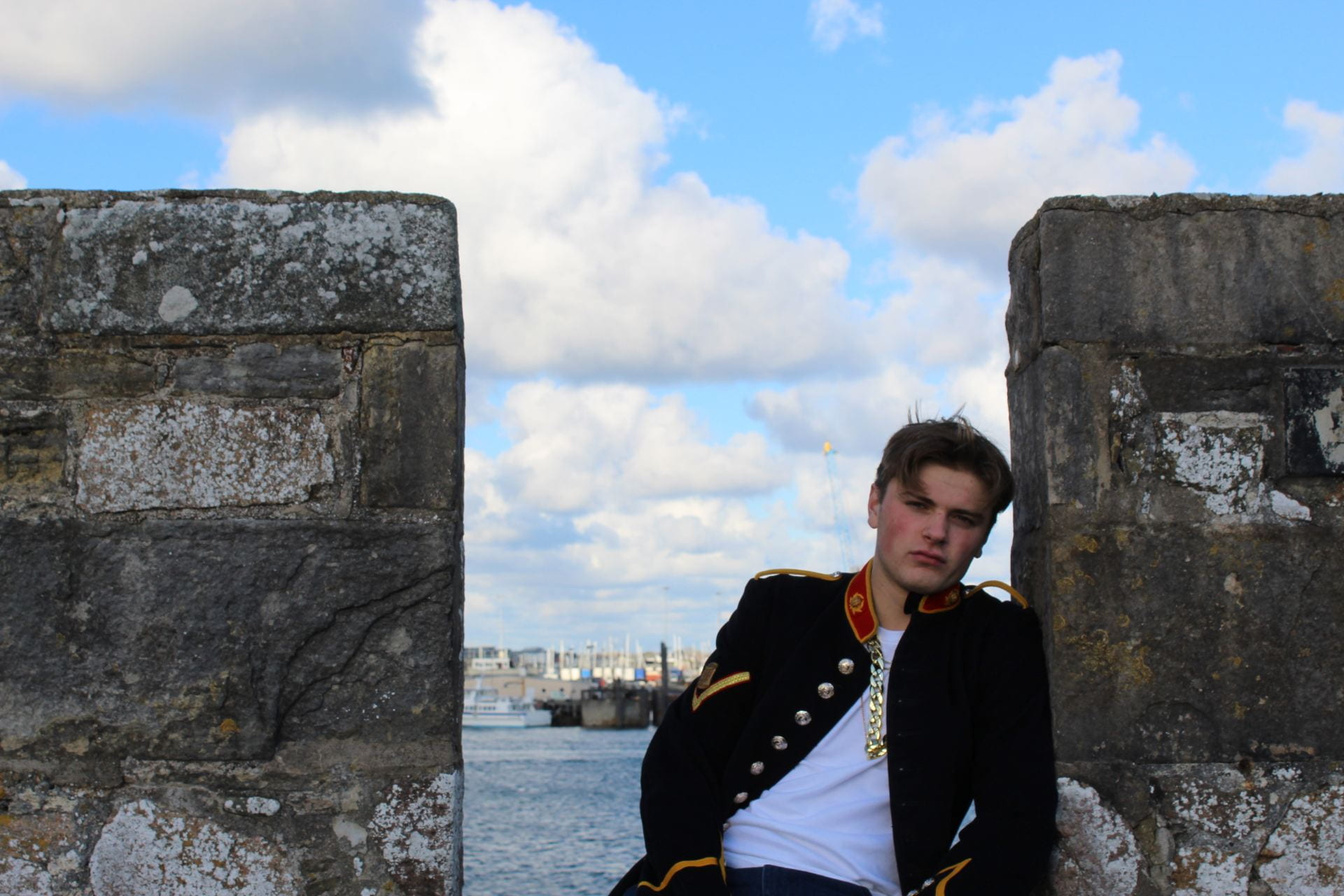
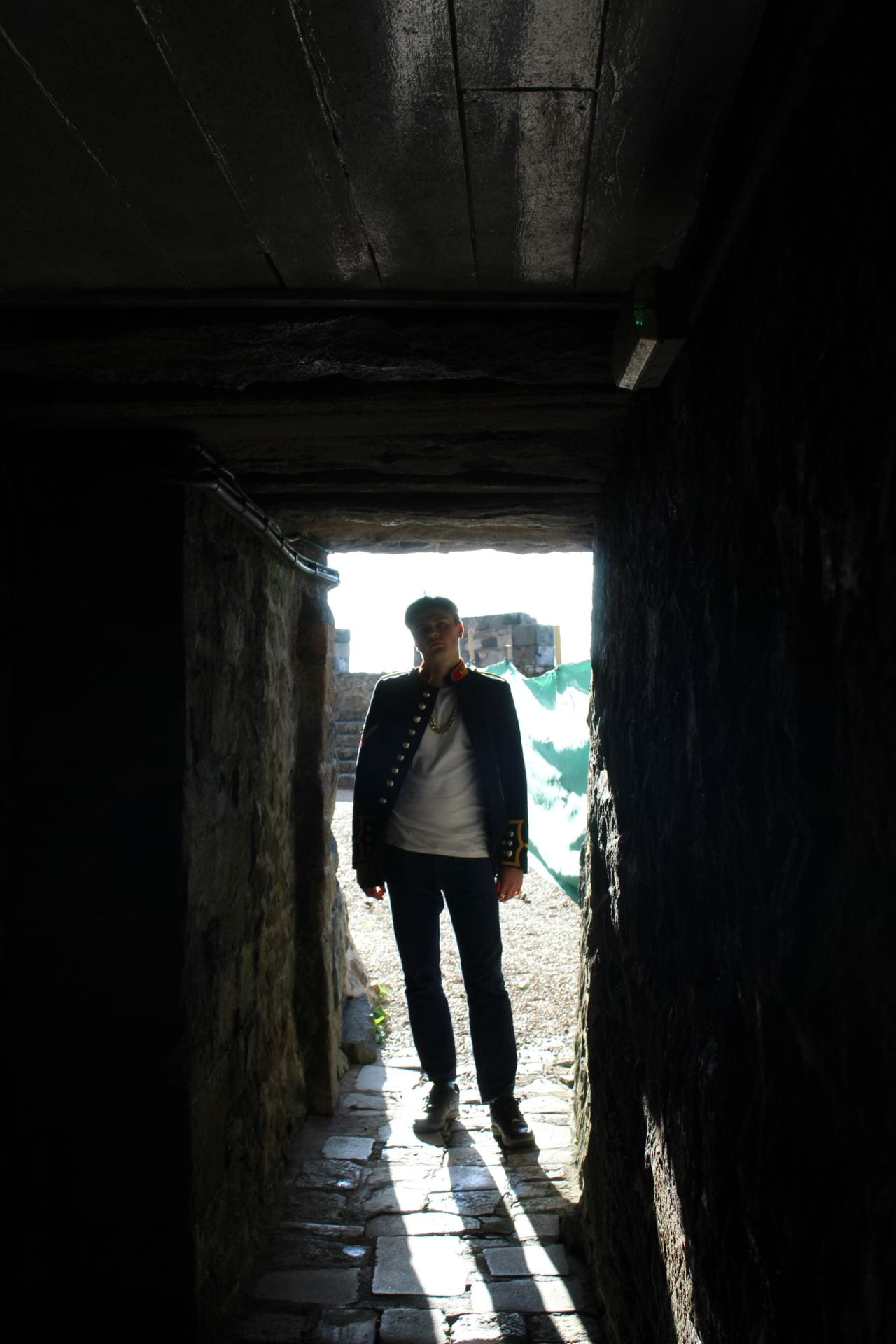
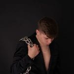
These are my three favourite pictures, I feel that they will work well on a double page spread as they focus on the star. These photos possess a dominant Mise-En-Scene with a good backdrops and lighting. These photos will represent my genre well, I have a contrast of different pictures with dark, grungy feels but also bright and attractive. Overall I am happy with my shoot as it correlates well with my genre and I have a range of photos that I can use to benefit me with my double page spread and contents page.

Production Meeting Agenda for 2nd photoshoot

Introduction:

For my shoot to be successful, I need to include all aspects for example ‘Mis en Scene’  which will help connote a story within my magazine and also plan ahead of my shoot. By using all of my ideas which I have gained through carrying out multiple research techniques, for example creating Pinterest boards on my chosen genre of Rap/HipHop. My research will aid me as I will be able to represent my style of artist using clothing related to my genre.


Draft of Front Page and Self assessment

self assessment:

It is incredibly important to assess any work you have carried out, this makes the improvement stages a lot easier to identify via feedback. The only way my work can be improved thoroughly is to critique until I can see what needs changing. By assessing my first draft of my front page, this will make it a lot easier for me in the long run when creating my final piece as I can look back to my previous work for guidance. As I follow the strict criteria on the blog, this will assist me in creating a unique magazine which also attracts my target audience. I will use my teacher feedback to create a magazine to the best of my ability. Here is my first draft of my front cover:

Please click on the image to see pdf.

magazine front cover draft 1

  • My masthead design is proportioned adequately, centred at the top of my front cover. The white and the black coincide with my chosen genre of Rap/HipHop as many famous magazine’s of a similar genre have this sort of design. The typeface I have used is big and bold which makes it easy to see meaning my magazine will stand out to my target audience.
  • I have positioned my model in the centre of my front cover, as a result, he is the most prominent feature. By placing him in the centre on my magazine, it leaves space surrounding him to include important information as to what is inside the magazine and to also include advertisements and promotions relating to my genre. I still believe that the size of my model can be increased – I will follow through with this in draft 2.
  • The type of ‘Mes En Scene’ I used reflects well within my genre. The chains, jewellery and lavish suit jacket portrays a comfortable and successful lifestyle, which is what most amendable music artists have. The pose the model is carrying out gives off a hard and fierce feel which Rap/HipHop consists of.
  • Conventional Design features for a magazine are essential – I have used many on my magazine front cover, for example, barcode, issue date, masthead designs and a main cover star. My main cover star is Ben Acey. To improve my conventional design features, I will include a price of my magazine in draft 2.
  • I feel I have used Photoshop and InDesign in productive ways. I used photoshop to cut out my main cover star, to cut out  my main cover star I had to use the tool ‘select and mask’. I used the software InDesign to create my magazine and to use conventional features to make my magazine realistic.

Targets

  • Include more colour throughout the front page
  • Create more interesting headlines
  • Try to stick to one font

Contact sheet – Front Cover Shoot

For this task we had to take the images that we would use for our magazine front covers. I had planned what style of image I wanted to get and began to shoot in the studio. The images below are the best of my photoshoot. I booked the black studio to set the tone of my Rap genre. Here I have just under thirty pictures, all from different angles, with different lighting and that’s how I’ve created my contact sheet.

Images that might make the cut


These two images are my favourite. Although there is no eye contact, I feel as if they connote with my genre well. I believe that these images could be on my front cover because they capture my ideas well and convey emotion. I used props to my advantage, making my photos look more professional. The jewellery was a key piece in relating these photos with my genre as I needed my model to look flashy and rich in wealth.


Brand Moodboard & Star Image

In order to create a popular magazine you need to research, look at pictures and magazines that attract attention and try to correlate those ideas into my own design. I have used Pinterest to do this, with a contrast of researched genres i have chosen these photos as they apply to my genre and will hopefully attract attention from my intended audience.

I have chosen certain photos within my moodboard that represent my genre as a whole. For instance there are a few photos with varying colours, Rap associates with a dark and grungy feel but still entertaining and has various stories to tell. The red lighting included in some of the photos is attractive as its subtle yet affective and attracts attention. I have taken inspiration from my moodboard and will try to include these styles of pictures within my work as it correlates well with my genre.

https://pin.it/16stGKA