Component 1
CCR2 – HOW DOES YOUR PRODUCT ENGAGE WITH AUDIENCES AND HOW WOULD IT BE DISTRIBUTED AS A REAL MEDIA TEXT?
Here is a script that explains in depth, how I wish to distribute my product to my target audience in a real media world:
‘Unsigned’ is an isolated piece which is considered fresh and unique. I have coincided with the typical ideas of the rap genre along with the contrasting styles and edits of modern day magazines. With this I have been able to create a solitary piece, different from the rest. A smart and sleek design with the grungy feel of rap and hip hop is what makes my magazine stand out among the rest.
Through carrying out research on websites such as ‘YouGov’, I have discovered suited statistics relating to my magazine. This site allowed me to investigate what sort of artists and bands the fans of my chosen music genre were into; HipHop/Rap musicians also feature in my demographic which allows me to gain an idea of who the ‘typical’ target audience is. I was able to identify who my target audience will be. J Hus is an artist who is mainly favoured by women, with ages ranging between 16-32. My target audience are men and women from their mid teens to their late thirties.
My magazine is unique because it’s something that is rarely done on a consistent basis but with this I will make sure each issue is better than the last. With the images, stories and interviews from the hottest artist, I’m sure my magazine will attract a healthy audience. Throughout the production of my magazine I used AIDA and Mise En Scene effectively to attract interest and create desire for the audience.
Conde Nast is the company which I would like to distribute my magazine as I feel we have a similar aesthetic, with the likes of GQ. Conde Nast is widely renowned as the biggest magazine distributors in the world and I feel like they would be the company to promote my piece to the right audience worldwide.
I hope to attract a variety of different brands that would be willing to work with my magazine. In particular I hope to work with independent brands that aren’t just in the music industry but have a completely different status and are willing to create a contrast between music and fashion. These two together would become vastly popular and attract a wider audience. My dream advertisers would be Nike and Yves Saint Laurent. Nike is the biggest brand in the world, and if I were able to create an advert with them, then it would not only benefit them but me on a personal level. Both of these brands have a similar audience, which can apply with my magazine, for example in 2019 musician Loyle Carner modelled for a ‘YSL’ advert which created a lot of publicity on a music and fashion level. But I feel with both of these categories an amazing product is to be made.
In the hopes of keeping the print magazine alive I will work to offer the best publicity. With interviews from the biggest artists, stories; ‘Rags to Riches’, adverts with the biggest brands and insights on all award ceremonies and the first talk with the winners. In order to do all of this my magazine must grow to one of the most popular. I hope that this can all happen through Conde Nast distributing my magazine as the best Hip-Hop/Rap magazine ever.
I could also reduce the price of the product or add free collectables to each magazine but if I am able to guarantee interviews with the biggest musicians and have the best adverts and images then I’m sure the audience will pay the price.
In order to back up my Print copies, I could create a website where extra exclusive content is posted for fans where they can interact with us and the artists. In order to make sure that print copies are the priority we will add a unique code into each hardcopy for the website. This will be the only way that fans can gain access to the exclusive content.
CCR1 – HOW DOES YOUR PRODUCT USE OR CHALLENGE CONVENTIONS AND HOW DOES IT REPRESENT SOCIAL GROUPS OR ISSUES?
Below is my Emaze presentation, previewing how my magazine challenges and uses specific conventions of my Hip-hop genre.

CCR4: HOW DID YOU INTEGRATE TECHNOLOGIES (SOFTWARE, HARDWARE AND ONLINE) IN THIS PROJECT?
Below is an infographic showcasing what pieces of technology I have used in order to plan, design and create my music magazine. Hardware, Software and online technology were all used in production of my magazine to make it what it is now.
Draft 1 of Contents Page
I have tried to make my contents page understandable with lost of information of what’s where and how you can find it. I have added pictures relevant to my genre and what will be included in my magazine. However I feel there is almost too much writing.
- It needs more colour to really attract attention
- Make it simpler with less writing
- Add some more pictures to showcase what can be found inside the magazine
Draft 1 of DPS
This is my first draft of my Double Page Spread, I have set the layout so that the picture is the first thing that you see, making people wanted to read on about the star.
whats next:
- I need to add more colour in to make it more attractive
- I need a add a few small details such as page numbers and name of photographer to make it look more professional.
- I also need to add in my article to give it the complete magazine feel.
- I must photoshop the second image to make the model clearer and easier to see.
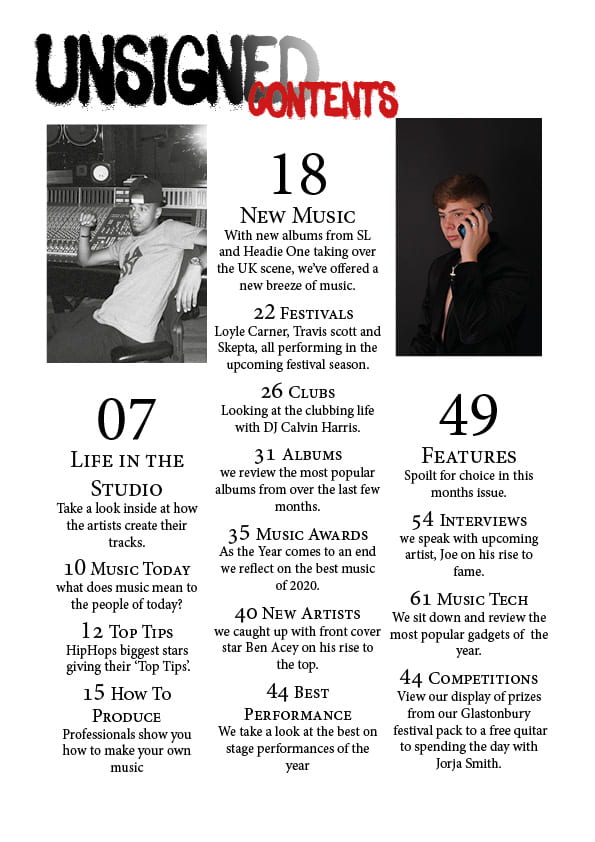
Draft 2 of Contents Page
In my contents page second draft I have tried to give it a simple feel, after my first draft I have reviewed and felt that it was too complicated for a magazine contents page so I have taken out the majority of the writing and given it a simple slick feel.
- I have taken away the huge amounts of writing to give my contents page a clean feel.
- I have clearly numbered the pages with what subject is on each
- I have added a small collage of pictures at the top to give the reader an insight of what’s inside.
- I have added a page number to give it a true Magazine feel.
By cleaning up my contents page I hope that it will attract more attention and gives the reader and easier understanding of what’s where. I’m hoping this will make it look more professional.
What’s next?
- caption the insets
- page number – just 3
- swop sizing of unsigned and contents?
- need all own images
- make insets the same size
- look at alignment of the numbers and coverlines?
- add some much smaller font to add to the coverlines be retain the simplicity and shape
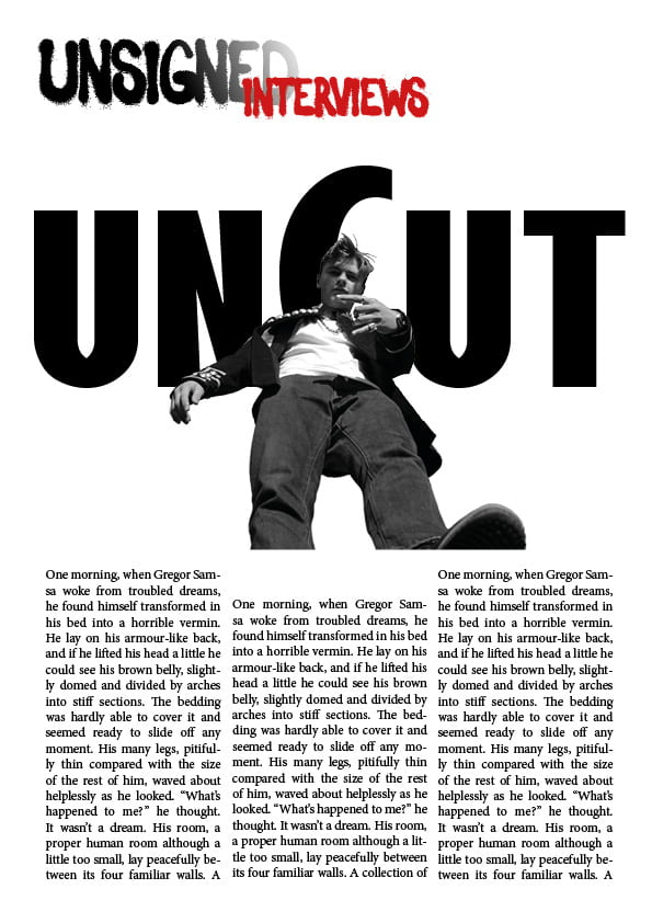
Draft 2 of DPS
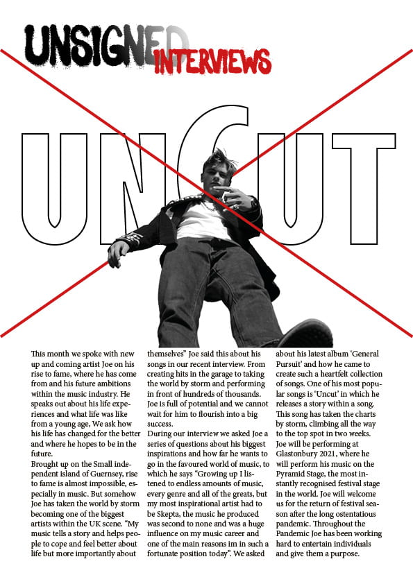
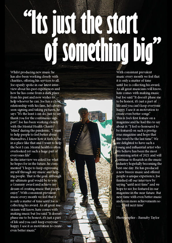
In my second draft I tried to use a bit more colour and added a red x to apply the theme to my artists pictures and the album name ‘Uncut’. I’ve added my article in to give it the complete feel of the Double Page Spread, I also lightly photoshopped my images to make them sharper and brighter making the viewing quality better and easier to see the model.
- I have photoshopped both images
- Added in my Article
- Added some more colour with a large red ‘X’ that’s relevant to my genre
I’m hoping that by doing this it will attract more attention from the audience and make my DPS stand out.
What’s next?
- page numbers
- byline?
- standfirst in bigger, bolder font
- drop capital for the start of the article
- are the columns the same width?
- perhaps justify the copy to right and left?
- paragraphs
- swap size round unsigned and interviews?
- caption the inset on right hand page
- is Uncut the artist….perhaps add something else in to tempt the reader to read on
Draft 2 of Front Cover
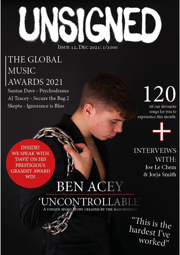
Here you will be able to view my second draft of the magazine front cover. I have used the same image and tried to make him the centre of attention, I Have tried to add a few things so that the audience can Clearly identify who the main cover star is, I have done this by adding the artist name at the bottom in big writing and telling the audience a little bit about him, almost a teaser.
- I have added some glimpse of red to correlate with the rest of my magazine
- I have added my stars name in big writing at the bottom so that the audience can clearly identify
- I have also added a quote to make the cover look like a true professional magazine cover.
By doing this I hope that it will correlate well with the rest of the magazine and attract attention from the audience. By adding a quote I hope that it will give the magazine a more profession feel and give the audience and insight of what’s to come.
What’s next?
- placing of the text inside the pug
- add something else red to compete with the pug as it is really big
- make him much bigger.
- sharpen the chain so that they stand out
- add some colour to some of the coverlines?
- put the quote nearer him. to anchore the main cover image
- typo interviews
- try bevel or some FX on the masthead
- don’t centre the masthead – – align to the left and then you have room top right for something else?
- barcode
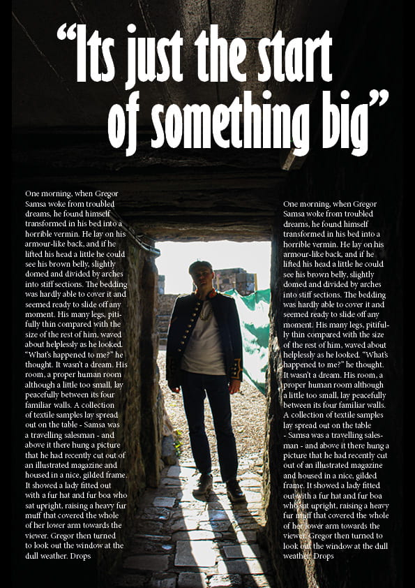
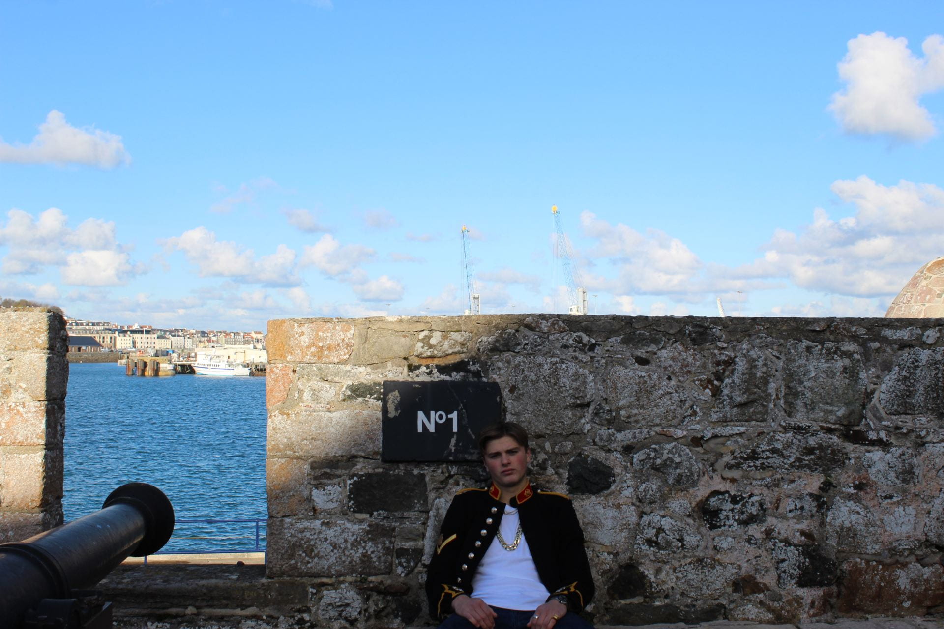
Location Shoot – Contact Sheet
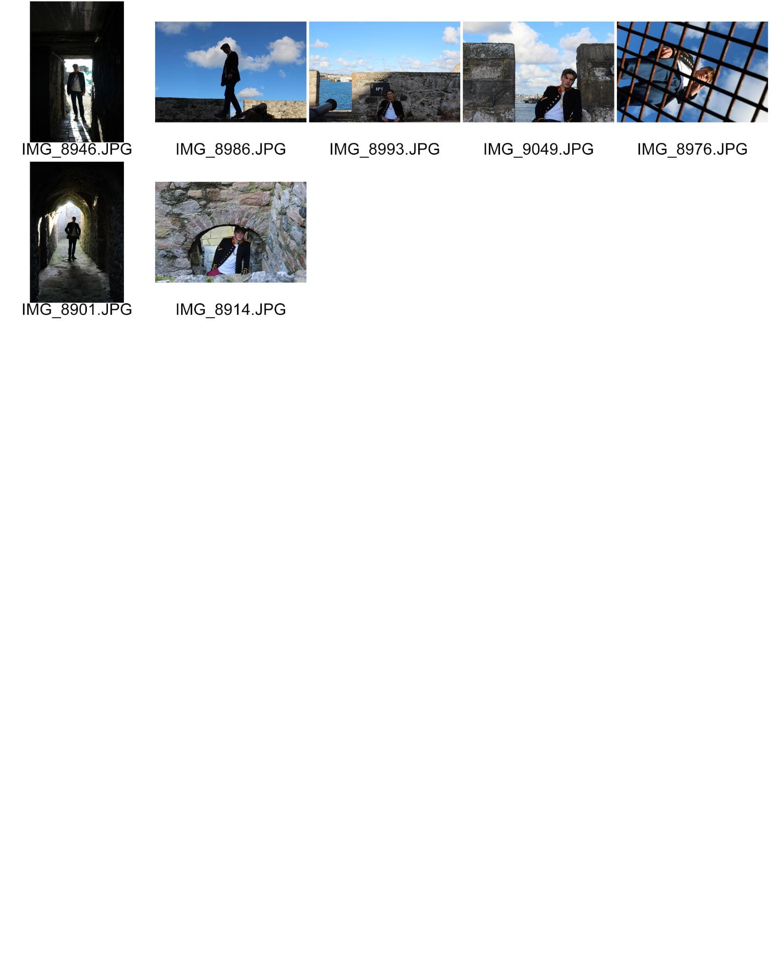
In order to create a popular magazine, pictures are crucial to attract attention and interest readers. These photos were all taken within Castle Cornet, with contrasts of lighting and using the patches of sun to our benefit. Taking close up shots will allow the reader to clearly recognise who the star is, we also took shots that use the surrounding scenery to set a scene. I dressed my model in the appropriate clothes for my genre, with chains, watches and rings to add the effect of success and confidence, the jacket I used id unique but subtle which I hope will attract attention. We used the contrast of the dark tunnels and patches of sunlight to our advantage to create photos that focus on the star with the sun shining on them but the dark grungy feel behind that correlates to my genre of Hip-Hop.
However I felt I could’ve done better, more costumes and accessories that would have allowed me to offer a wider variety of photos that relate to my genre. Brightly coloured clothes would’ve allowed me to attract more attention especially with the dark backdrops. I also think that the use of different camera angles would have given more to play with in terms of my contents page and double page spread. I used high, wide and low angles but felt I could’ve done better and used even more angles.
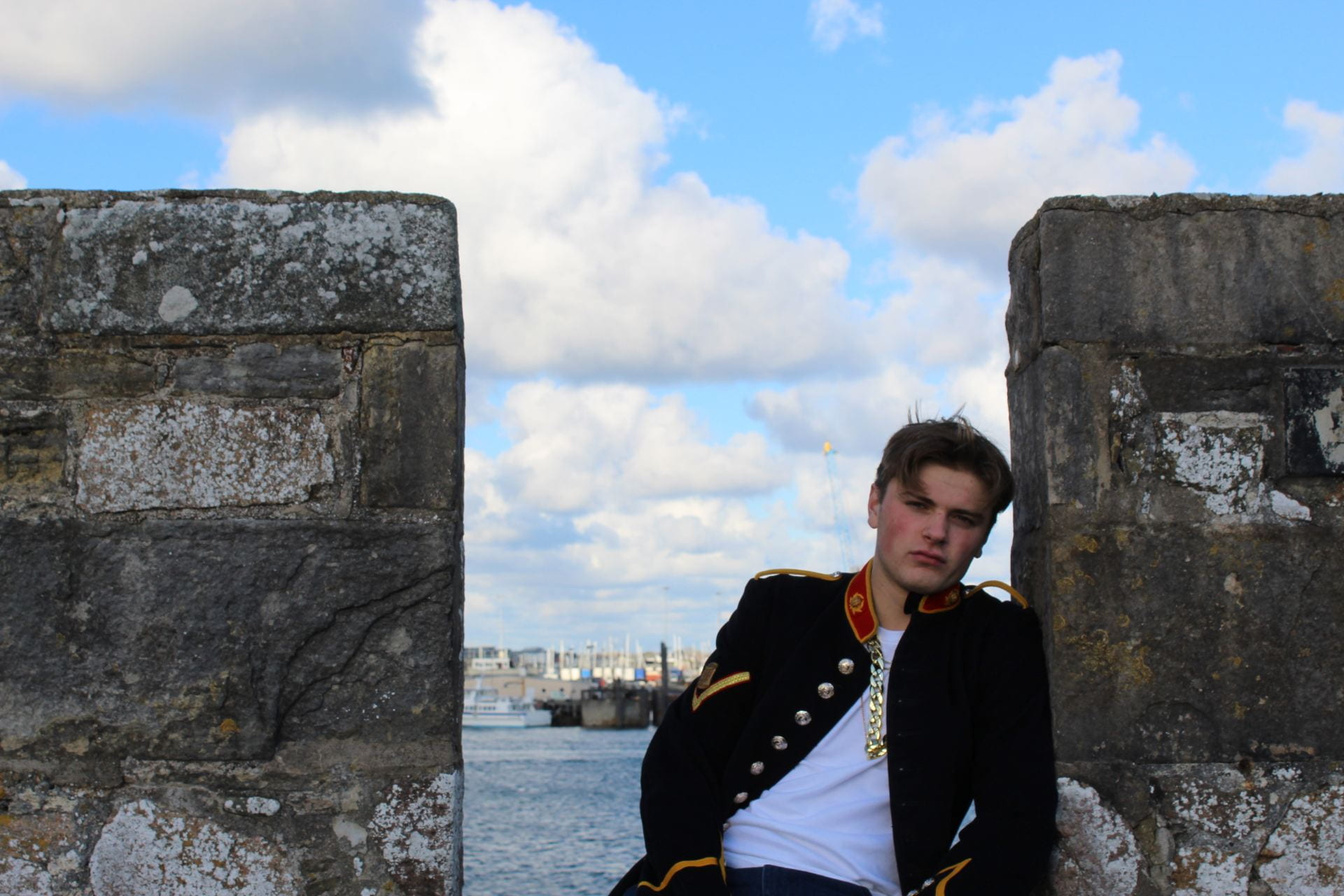
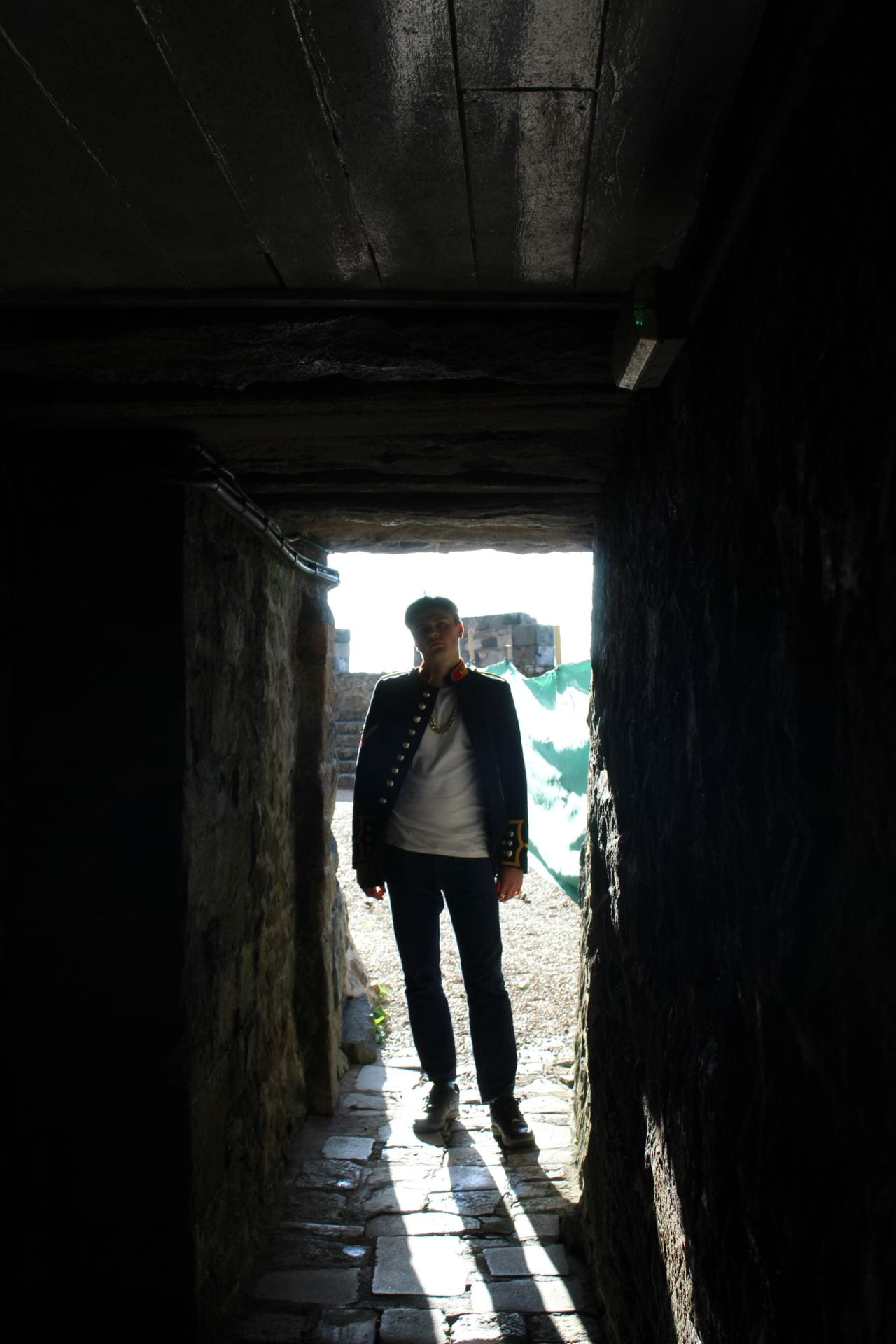
These are my three favourite pictures, I feel that they will work well on a double page spread as they focus on the star. These photos possess a dominant Mise-En-Scene with a good backdrops and lighting. These photos will represent my genre well, I have a contrast of different pictures with dark, grungy feels but also bright and attractive. Overall I am happy with my shoot as it correlates well with my genre and I have a range of photos that I can use to benefit me with my double page spread and contents page.