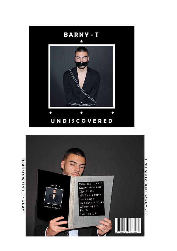
Here is draft 1 of our Digipak, together we have collated and planned how to make our Digipak stand out. We have reviewed current album covers and discovered what works well within our genre. With this we have set out and created a dark grungy style of album that correlates well with the targeted audience and will gain interest from other genre parties.
In order to create a different but original piece we have focused on Mis En Scene and how we can capture the attention of the audience. We have done this by using chains and tape to give that grungy feel and emphasis that the artist feels imprisoned within the industry and unnoticed but ultimately ‘Undiscovered’.
What to improve / Targets:
- We need to add a subtle colour that will make our Digipak stand out instead of looking like every other in this genre.
- We need to use a unique font that completely encapsulates and represents our brand like no other.
- We need to make more obvious edits in photoshop to ensure that everything looks similar and has a distinctive design that our targeted audience will clearly notice.
- We need to ensure that all the text looks clean and isn’t diagonal on the back pane.