Production Meeting Agenda for 2nd photoshoot

Introduction:

For my shoot to be successful, I need to include all aspects for example ‘Mis en Scene’  which will help connote a story within my magazine and also plan ahead of my shoot. By using all of my ideas which I have gained through carrying out multiple research techniques, for example creating Pinterest boards on my chosen genre of Rap/HipHop. My research will aid me as I will be able to represent my style of artist using clothing related to my genre.


Camera Talks

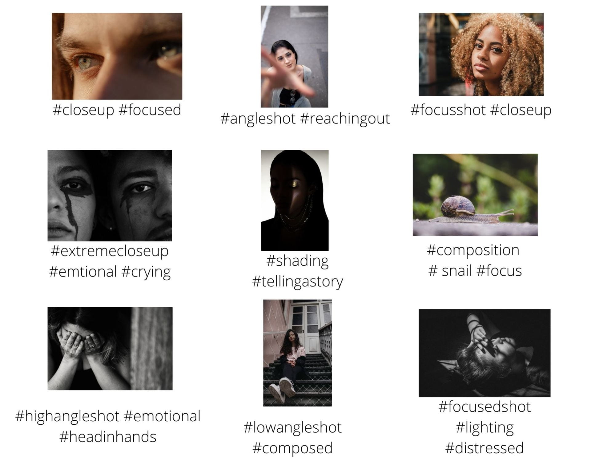
Throughout this task I have come to realised that the camera is used to tell a story, the angle of a picture and emotions tell us a story in its self. Although Mise En Scene is essential element to explain the meaning of something, there are other ways such as using the camera to tell a story in itself. I have used hashtags to describe the certain picture, the composition and the angles, this is important so that people understand the connotations. I am now able to tell a story through both MES and the Camera.

Draft of Front Page and Self assessment

self assessment:

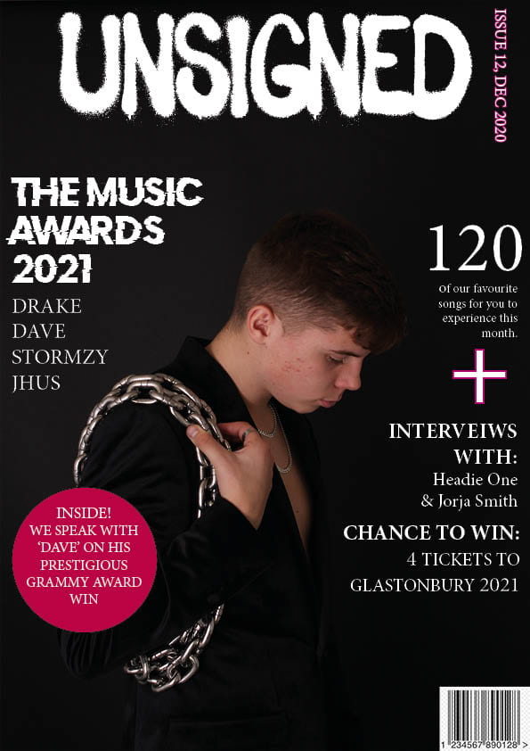
It is incredibly important to assess any work you have carried out, this makes the improvement stages a lot easier to identify via feedback. The only way my work can be improved thoroughly is to critique until I can see what needs changing. By assessing my first draft of my front page, this will make it a lot easier for me in the long run when creating my final piece as I can look back to my previous work for guidance. As I follow the strict criteria on the blog, this will assist me in creating a unique magazine which also attracts my target audience. I will use my teacher feedback to create a magazine to the best of my ability. Here is my first draft of my front cover:

Please click on the image to see pdf.

magazine front cover draft 1

  • My masthead design is proportioned adequately, centred at the top of my front cover. The white and the black coincide with my chosen genre of Rap/HipHop as many famous magazine’s of a similar genre have this sort of design. The typeface I have used is big and bold which makes it easy to see meaning my magazine will stand out to my target audience.
  • I have positioned my model in the centre of my front cover, as a result, he is the most prominent feature. By placing him in the centre on my magazine, it leaves space surrounding him to include important information as to what is inside the magazine and to also include advertisements and promotions relating to my genre. I still believe that the size of my model can be increased – I will follow through with this in draft 2.
  • The type of ‘Mes En Scene’ I used reflects well within my genre. The chains, jewellery and lavish suit jacket portrays a comfortable and successful lifestyle, which is what most amendable music artists have. The pose the model is carrying out gives off a hard and fierce feel which Rap/HipHop consists of.
  • Conventional Design features for a magazine are essential – I have used many on my magazine front cover, for example, barcode, issue date, masthead designs and a main cover star. My main cover star is Ben Acey. To improve my conventional design features, I will include a price of my magazine in draft 2.
  • I feel I have used Photoshop and InDesign in productive ways. I used photoshop to cut out my main cover star, to cut out  my main cover star I had to use the tool ‘select and mask’. I used the software InDesign to create my magazine and to use conventional features to make my magazine realistic.

Targets

  • Include more colour throughout the front page
  • Create more interesting headlines
  • Try to stick to one font

Hello Media Studies

During my two years of Media hope to improve and develop my creative skills, this will enable me to make good independent pieces of work helping me to achieve my final target grade.

Organisation and time management

This is something i hope to improve upon. I currently maintain my work however i struggle to keep up with the improvements i need to make for my blog posts, this can easily be improved if I organise my time I have available.

Research and Planning skills

I feel that I am able to research well and find the information required to learn and complete my work to a high standard. I find Media an enjoyable subject therefore I try to plan for Photoshoots as it benefits me to create adequate pictures to use for my posters and magazine.

Creative skills

I consider my self to be quite a creative person and I try to channel my creativity through my media work. Since starting media i have discovered that media helps me to bring out that creativity and develop it so it becomes unique and stands out.

Transferrable skills

Since I have started my studies within media I have been using my personal skills to profit my progress, media requires a lot of team work, students need to help each other in order to succeed. Listening is also key in media studies as there is a large amount to learn and all knowledge is beneficial.

During my time in media studies I hope to achieve, improve and develop all of my skills, in order to do this I need to carry on listening and learning.

Contact sheet – Front Cover Shoot

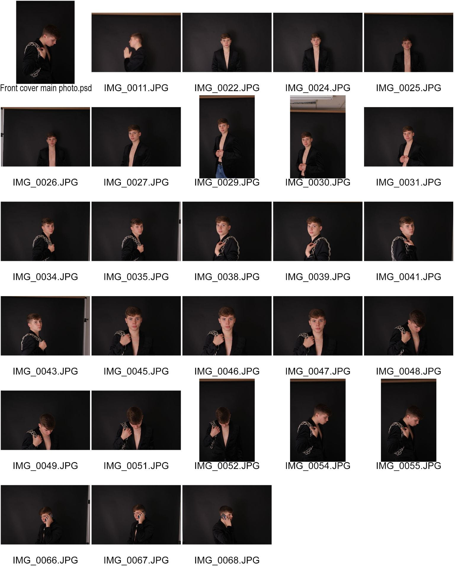
For this task we had to take the images that we would use for our magazine front covers. I had planned what style of image I wanted to get and began to shoot in the studio. The images below are the best of my photoshoot. I booked the black studio to set the tone of my Rap genre. Here I have just under thirty pictures, all from different angles, with different lighting and that’s how I’ve created my contact sheet.

Images that might make the cut


These two images are my favourite. Although there is no eye contact, I feel as if they connote with my genre well. I believe that these images could be on my front cover because they capture my ideas well and convey emotion. I used props to my advantage, making my photos look more professional. The jewellery was a key piece in relating these photos with my genre as I needed my model to look flashy and rich in wealth.


Brand Moodboard & Star Image

In order to create a popular magazine you need to research, look at pictures and magazines that attract attention and try to correlate those ideas into my own design. I have used Pinterest to do this, with a contrast of researched genres i have chosen these photos as they apply to my genre and will hopefully attract attention from my intended audience.

I have chosen certain photos within my moodboard that represent my genre as a whole. For instance there are a few photos with varying colours, Rap associates with a dark and grungy feel but still entertaining and has various stories to tell. The red lighting included in some of the photos is attractive as its subtle yet affective and attracts attention. I have taken inspiration from my moodboard and will try to include these styles of pictures within my work as it correlates well with my genre.

https://pin.it/16stGKA  


My audience research and profile


From researching my specific genre I have learnt that the demographic is mostly millennial males and females that enjoy Hip-hop/Rap, from this information I have created an appropriate profile for a young male who shares popular interests with others, which should create a potential target audience. I have included his likes and dislikes which apply to the genre as a whole. I acquired this information from yougov.co.uk, this website allows me to see the audience of certain artists and their other interests, this helped me to develop an understanding of who the audience might be and how I can create a dating profile from this information. It is important to know your audience as the producer so that you can encode everything they will like and be able to interpret for a preferred reading, therefore they can then decode it and not reject the text.

Production Meeting Agenda for 1st Photo Shoot


Introduction

For this task I set out and planned for many things, what my model was going to where, what we needed to bring and what style of pictures we wanted to shoot. This was extremely helpful because it allowed me to be more organised and ready to shoot exactly what we needed. This task allowed me to be more decisive, otherwise I would’ve had too many ideas and could have easily been distracted with one thing. If I wasn’t organised then I wouldn’t have been able to book my place in the studio to take my photos, this was crucial when trying to produce a high quality image for a product.


http://https://docs.google.com/document/d/e/2PACX-1vQ4fxnRf_Ov8SBjTS9Gnet7PJAt8-QDL5eMsyWeXXr86ELN0HQpEwHjkPzWzlJGnsvQhjrQ6V8hyFX3/pub


Masthead Designs

Branding is crucial when creating a magazine, the masthead is predominant when designing, the title must be large, eye catching and needs to correlate to the specific genre. The masthead is what makes a magazine unique and distinguishing.

I chose these particular fonts as i feel they will concur with my magazine cover, the bold text is perfect for Hip Hop/Rap as it needs to stand out and gain recognition from the audience. I edited some texts by adding weight to give them a more unique feel that will protrude above the rest. With such a varied choice of fonts i decided to choose these as i feel they apply to the genre as they have that dark, grungy feel that Hip hop absorbs.

This is my final masthead design, the graffiti feel will make my title stand out and obtain interest from the intended audience, it works well with the genre as it will perceive the dingy feel of darkness that my genre strives for. I selected this masthead as it is attracts my target audience – Following my understanding of AIDA.

My Tour Poster


please click on the image to see the pdf

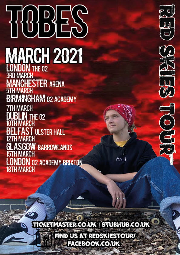
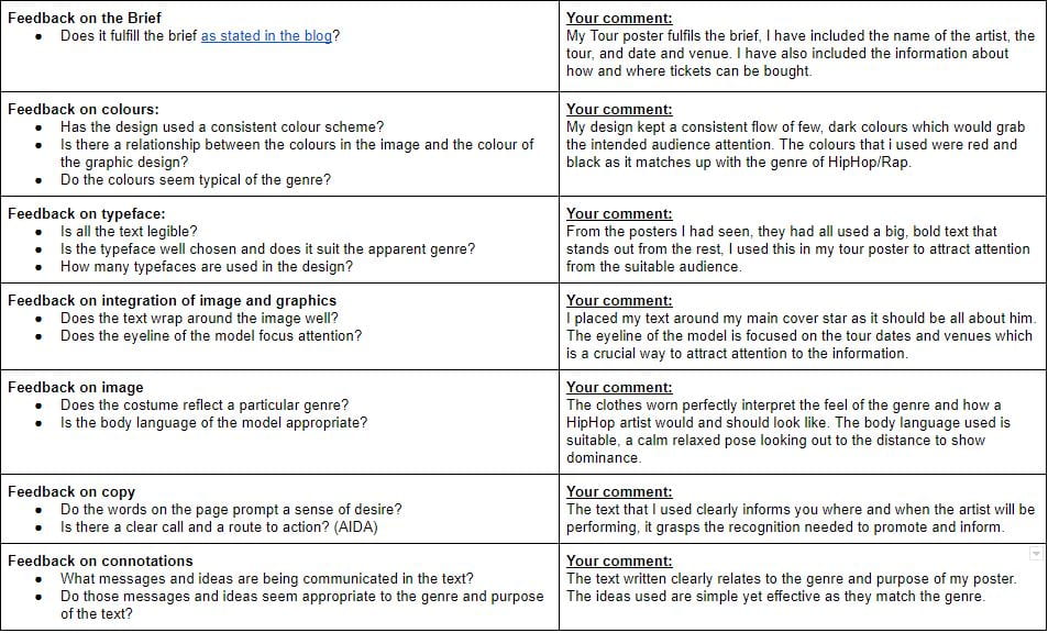
Tour Poster  

My Tour Poster is conventional because i have included the key features of a magazine cover which are:

Name of the artist – Tobes

Name of the tour – Red Skies Tour

Dates – 3rd March – 18th March 2021

Sale Information – Bottom of the page

My tour posters colour theme matches with the theme of Hip-Hop, dark text with a rich, red background. My tour poster attracts attention due to the large image of my cover star, i’ve used dark typography to ensure that it stands out from the rest. I’ve managed to make the layout of my poster look as professional as possible, from looking at posters from inspiring artists i’ve seen that large, bold fonts are most popular with my genre.