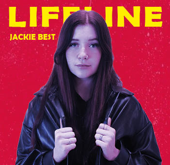


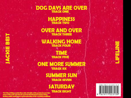
Above is our 2rd draft of our digipack. As you can see what have made a lot of changes from our previous drafts on all of the pages. On the front cover we have reshot the image, and changed the filter on the image. It is now not as blue and looks much better and natural. We have also changed the pose and make the image bigger, covering part of the title but not too much, however I feel as if this works very well. For our inside covers, we have added a photo to one of them instead of it just being a base colour as it once was. I feel as if this adds a bit of personality to the covers inside, as they were plain and bland beforehand. We also changed the background colour to a faded purple and blue look. I feel again this adds personality to the inside covers and makes it look much less ordinary. Finally on our back cover we have added our copyright information which is a formal convention to any digipack, as is the barcode which we have now added too.
Leave a comment