Category Archives: Component 1

Design skills 2

During the time from creating my contents page to creating my double page spread I have learnt more skills than the last time. The tools in that I have learnt help make my magazine conventional because I have made sure that I have used tools that a lot of magazines use to make sure that I attract a high audience. Below there is a slideshow with images and explanations as to what skills I have learnt in this time. During the process of creating my double page spread I have made sure that my star image represents my chosen genre of pop by making sure that the MES was being shown through their costume and make up.


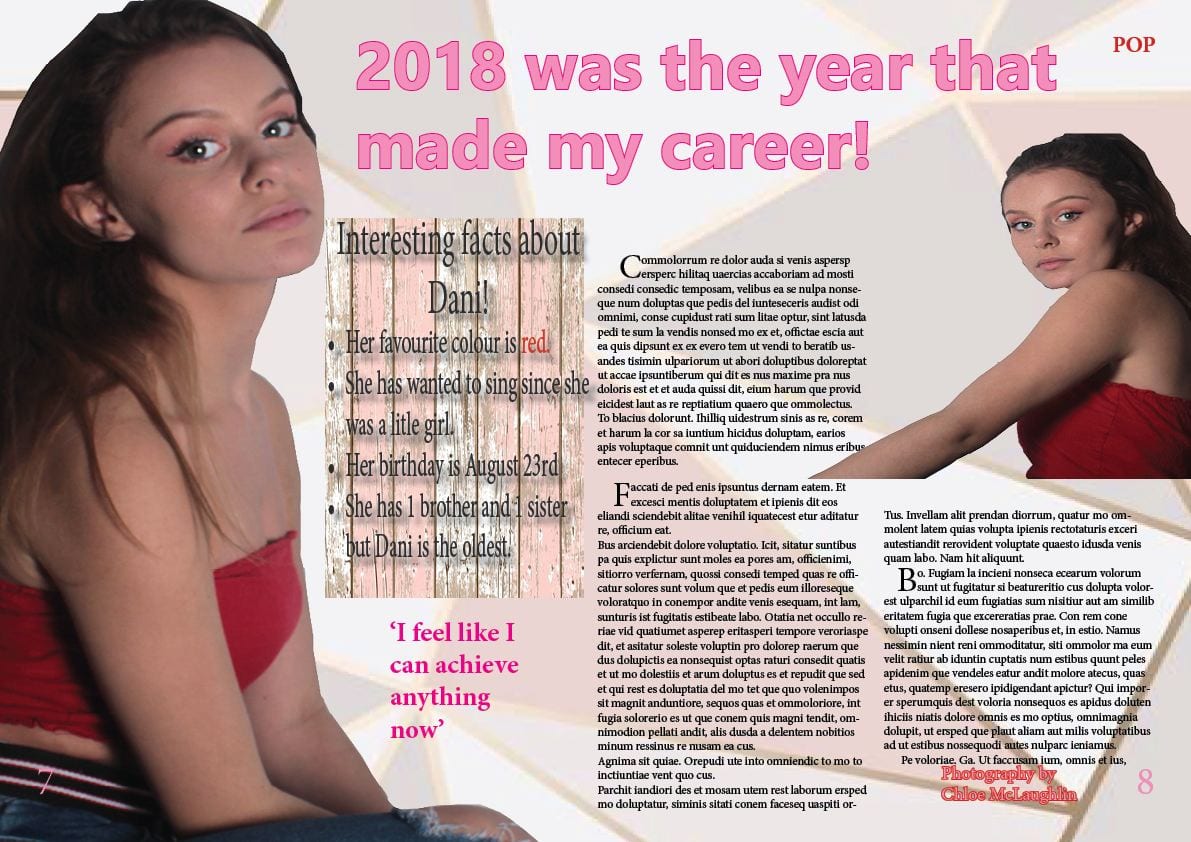
A new improved double page spread

This is the second draft of my double page spread for my music magazine which is for the genre of pop.

I decided when I created my first draft that I needed a more interesting background so I went onto pinterest to gain some inspiration and that is where I found the background that I decided to go for. I also added in another insert because in the brief that we were given, we had to include at least 4 images that we had taken ourselves and in my first draft, I had only included 3.

What has changed

  • Changed the background to something more interesting.
  • Changed the cover star because I wanted to cut it out better but I no longer had the same image so it needed changing, but I am  happier with the image that I have chosen.
  • Changed the heading because I didn’t have a photo of a man and the headline was a love story.
  • Added the interesting facts and the boarder around it.
  • Added another insert to make sure that my magazine fitted the brief of having 4 images that I had taken.
  • Changed the font of the headline so that it fitted better with the rest of the page.
  • Added who the photograph was by.
  • Added the page numbers.
Click on the image to see a clearer version.

Feedback and reflection on draft 3

I asked Harriet to give me some feedback and targets for my first draft of my double page spread so that I knew what others thought and to help me with some targets for improvement for my second draft. I asked Harriet the following questions and she proceeded to give me the following answers;

Are the media forms present that are conventional for a DPS – byline, stand first, columns text, page numbers, drop capitals, headline?

Harriet said that my main cover line being bold stands out which means it will attract my target audience. She also  said that my layout of my columns look professional and easy to read. I am happy with this feedback because I was hoping to reach a specific target audience and I wanted my magazine to look as professional as possible.

Is the layout considering where the fold will be in the DPS?

She said that it looks as though I did consider where the fold will be for my double page spread because the columns were in a good place as she said that nothing will get lost. E.g. writing or the image.

Does the image create enough visual intrigue for the reader to stop turning the page and read more?

Harriet said that my cover star image is positioned correctly  because my model is faced left which is typically the way that models face in magazines as the audience tend to read left to right so I wanted to attract their attention and she said that I had done that. She also said that my image will make people want to read on through the article because it caught their attention. I am happy with this response because it shows that I have conveyed my genre in the way that I wanted to and it shows that I chose the right image for my double page spread.

Does the language and register in the headline create enough interest for the reader to commit to reading the copy?

She said that my headline being bold will grab the reader’s attention which I am happy about because that was my main goal when I was designing and creating the headline for my double page spread. 

I then asked Harriet to give me some targets that I could improve on when it came to my second draft for my double page spread. The targets that she gave me were the following;

  • Maybe add a drop shadows to the main cover line to add definition
  • Add in bylines to attract the audience more. 
  • Put who the article is by
  • Put who photographed the image
  • Add in another photo and integrate in into the article

Draft 3- The double page spread

Below is the first draft of my double page spread and so far I am happy with it. I decided to use an image from my first photo shoot because I liked them better and I wanted my magazine to differentiate throughout.

In my second draft I need to fill in the articles and the interview and I also may add in another photo.

A double page spread should have an image, a headline and an article. So far, my double page spread does have all of the above which makes it conventional for my magazine.


Please click on the image to get a clearer version


Design skills 1

During the time that I have been creating my magazine, I have acquired a lot of new skills through InDesign and Photoshop. Below are a few examples of my work in progress and some screenshots of what changes when skills are applied and how I get my final image. Below is a slideshow of the skills that I have learnt along the way and images that show exactly what the types of skills can achieve. The skills that I have learnt has helped me make my magazine more conventional because I am now able to do to my magazine the things that professional people do. For example, without these skills I would never have known how to cut out an image and separate it from its background or how to smooth out someone’s face.


A new improved contents page

This is the second draft of my contents page for my magazine and I have taken on board the feedback that I got and have changed the following things;

  • I added a plug to attract more attention towards my magazine.
  • I made the number pages bigger than the cover lines to add definition to them and make them stand out.
  • I added dots either side of my ‘contents’ to make it more bold.
  • I added a small logo of my magazine which I got from the masthead from my front cover.
  • I changed the shade of pink to make it match my front cover and make them work together a bit more.
  • I changed some of the cover lines to make them more about music and my genre.

Overall, I am happy with the second drat of my contents page because I think that it goes with my genre which is pop and it also goes well with my front cover which means that my magazine will look good when it is finished.

Please click on the image to see a clearer version

Feedback and reflection on draft 2

I asked Harriet to give me some feedback on my contents page so that I can re-draft it and make it as best as it can be.

I asked her the following questions which she responded with some constructive criticism.

How does the Contents Page work in tandem with the front cover?

Harriet said that they work very well together because they both relate to the music genre. She said that she loved the idea that I have done a pink background and yellow image on my front cover and then the opposite on my contents page. However, she did tell me to make sure that on both of the pages they are the same shade of pink.

Describe the images of the stars using adjectives.

She used the words;  Sassy, bold, confident to describe my cover star. She also stated that my star looks like Ariana Grande which I am happy about because as I have stated previously, she was my inspiration for my magazine. I am also happy about the adjectives used to describe my star because it was exactly what I was going for when I chose the MES. 

Which cover lines tempt the audience to read on and which ones stand out and why?

Harriet said that page 11 stood out to her because it talks about the Hollywood movie and she thinks that it looks interesting and it would make her want to read it.

She also said that the page talking about Ariana Grande’s hair caught her eye because it would appeal to my target audience as they would want to know hair tips from a celebrity.

How do the cover lines reflect a music magazine? If they don’t,  which ones need to be adapted?

She said that I should make sure that there is no hyphens to make it look more professional. She gave me an example of my cover line that mentions Justin Beiber to get rid of the hyphen so that it read album and not al-bum.

She also suggested that in the cover line where I talk about Chloe’s Hollywood movie that I should talk more about her career change from singing to acting because my magazine is about pop and not about movies so to make it more conventional, I should talk more about music.

Which areas, aspects have distracting areas of integration of copy and images?

Harriet said that I should move the text with the cover lines and wrap it around the model’s body to add more dimension to it. She also said that I should make the colours the same shade as the front cover and that I should make the orange box fit around the model more as it looks slightly odd in the place that it is at the moment.

What aspects do you consider conventional or unconventional (page numbers, inserts, captions, catchy cover lines, editors comment?

She said that my cover lines are conventional as they are aspects which you would find within a contents page. She also said that images are conventional as they give you a glimpse of what is in the magazine.

However, she said that I should add more images because magazines tend to have more than one cover star on the contents page to grab the reader’s attention.

Targets to improve; 

  • I should change the shade of pink to make it the same shade as the front cover.
  • I should remove the boarder around the ‘contents’  to make it look more professional.
  • I should wrap the cover lines around the model so that it makes the magazine look better and fit the model.
  • I should change some of the cover lines so that they are more to do with the pop genre and my magazine.


Draft 2- The contents page

This is the first draft of my contents page for my music magazine and I am happy with it because I like the colour scheme and the image.

I think that my contents page does go well with my front cover because they both have the use of similar colours which I like.

To improve, I think that I could add something else to it to make it a bit more fun as there isn’t really much to it at the moment. I think I could add a plug to attract my audience or add another image.

A contents page tells you what is in the magazine and where to find it. It’s a guide to the magazine itself. A contents page is what makes the magazine conventional.

Please click on the image for a clearer version


2nd shoot contact sheets

Below are the contact sheets for the location shoot that I went to with 2 models. We went to Candie Gardens and the Priaulx Library and were assigned 2 models that we had to dress according to our MES and genre.

Overall I am happy with the results of the photo shoot because I was able to gather the images that I wanted to and I think I have plenty for my double page spread and inserts on the front cover.

If I could change one thing about the day then I think it would be the costumes because although it was the look that I was going for, I think that I should have added a bit more colour to the images and models as they are both wearing black.

I tried to get photos with different angles, poses and backgrounds and I believe that I accomplished that with my 2 models.

I like the contrast and height difference on the images where my 2 models are standing by the railing because I think it brings out my models best. I also like the images with the textured background because it brings a sense of Symmetry to the images.

The images of the models on the stairs, I am not to keen on because I didn’t get the lighting right and they look a bit dark.

I think that I have conveyed the star image as I wanted to in my pop genre. I took inspiration from Ariana Grande for my shoot because she is the type of person that I wanted to display on my magazine. I believe that I did achieve my goal which was to have multiple images that convey my genre of pop in the correct fashion that I wanted to. I wanted my magazine to have a sense of seriousness which is why the majority of the images have the models in a serious face rather than smiling.


Production meeting agenda for 2nd photo shoot

Below is my production meeting agenda for my second photo shoot that will be at the Priaulx Library and Candie Gardens. I have been allocated two models that I will need to dress according to the MES that I have decided to go for.

I am happy that I have been allocated a male and female model because I will be able to convey my MES in the way that I want to and it will make my magazine open to both males and females, which will mean that my magazine will gain as much audience as possible.

Planning out my photo shoot will allow me the maximum time allocated to get as many good photos that I can because I will have already planned out what I am going to do and can avoid any mistakes that may happen.