Category Archives: Component 1

Risk Assessment

Below is the Risk assessment for my second photo shoot that will be held at the Priaulx Library and Candie Gardens.  My photo shoot will be with Allan and Emilia who are both media students and are in my class.

On the day, I will have to be extra careful as I will not be on school grounds and so I have decided to do a risk assessment so that I can cover all basis if an accident does arise.


A new improved front page

Below is the second draft of the front cover of my music magazine. I am happier with this version because I have taken my targets and feedback on board to create something that both  I and other people like.

Things I have improved; 

  • I chose a different image of my cover star so that I was able to change that background and brighten up the image.
  • I then cut out the photo and did change the background to pink because I think it goes with the theme of the writing and the MES of my model.
  • I changed the front of my masthead to make it more modern and I added a plug to the top of my magazine which will hopefully attract my audience to my magazine.
  • I also changed the captions to make some of them shorter and more to the point because short and simple is better.
Please click on the link for a clearer image


Feedback and Reflection on draft 1

I asked Harriet some questions about my draft 1 front cover and she answered giving me some good points and some constructive criticism that I can develop on.

What genre of music is the magazine featuring?

When I asked Harriet this question she was able to identify what genre my magazine was which was good because it shows that I am conveying the genre as I want to.

Describe the front cover star using adjectives – their star image?

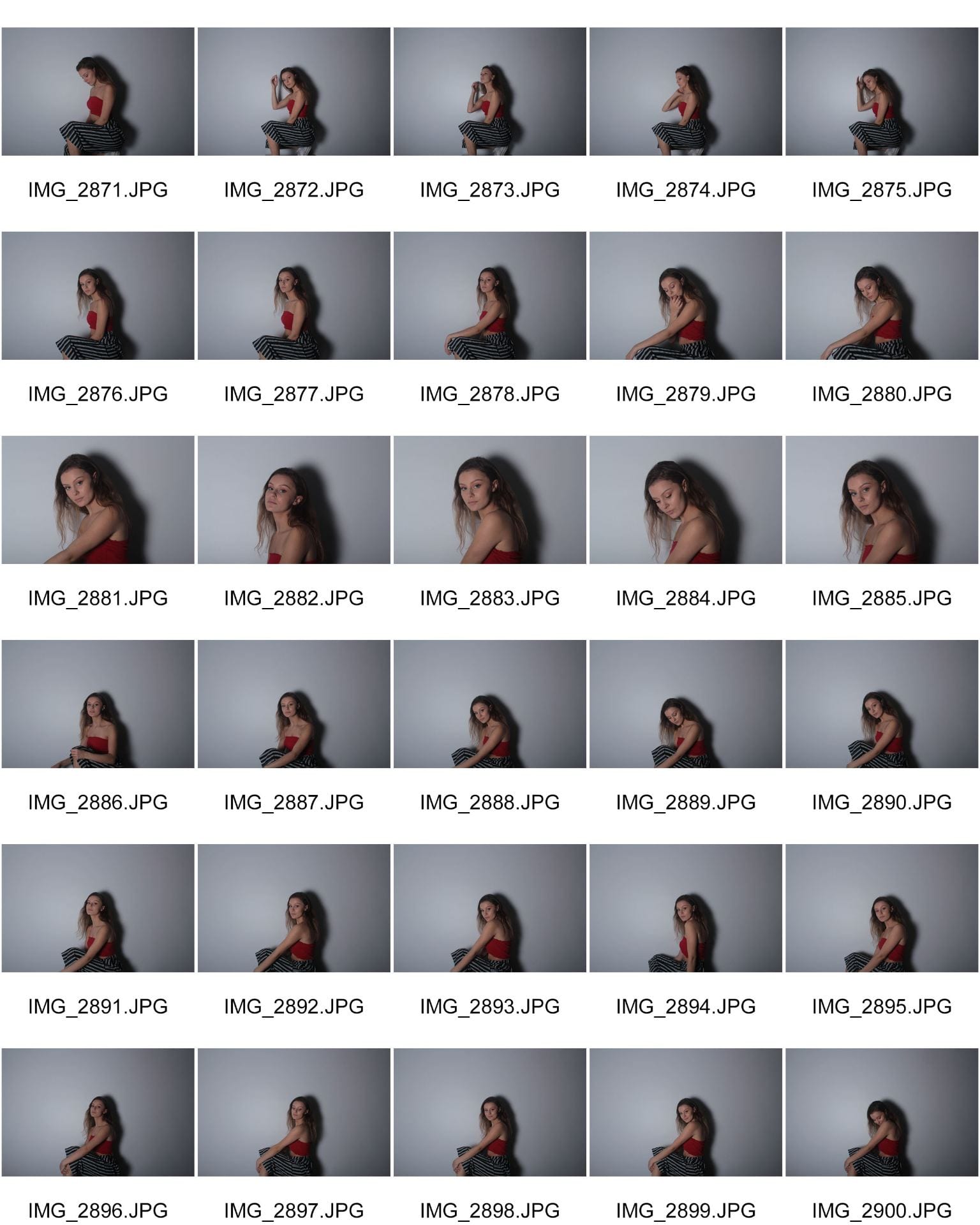
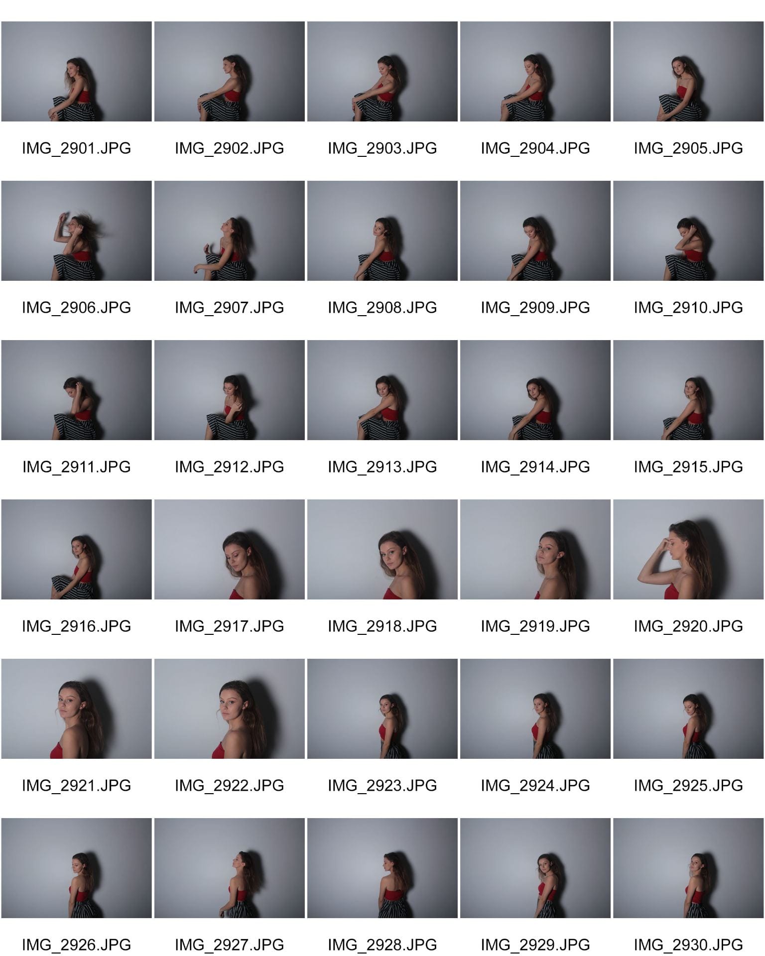
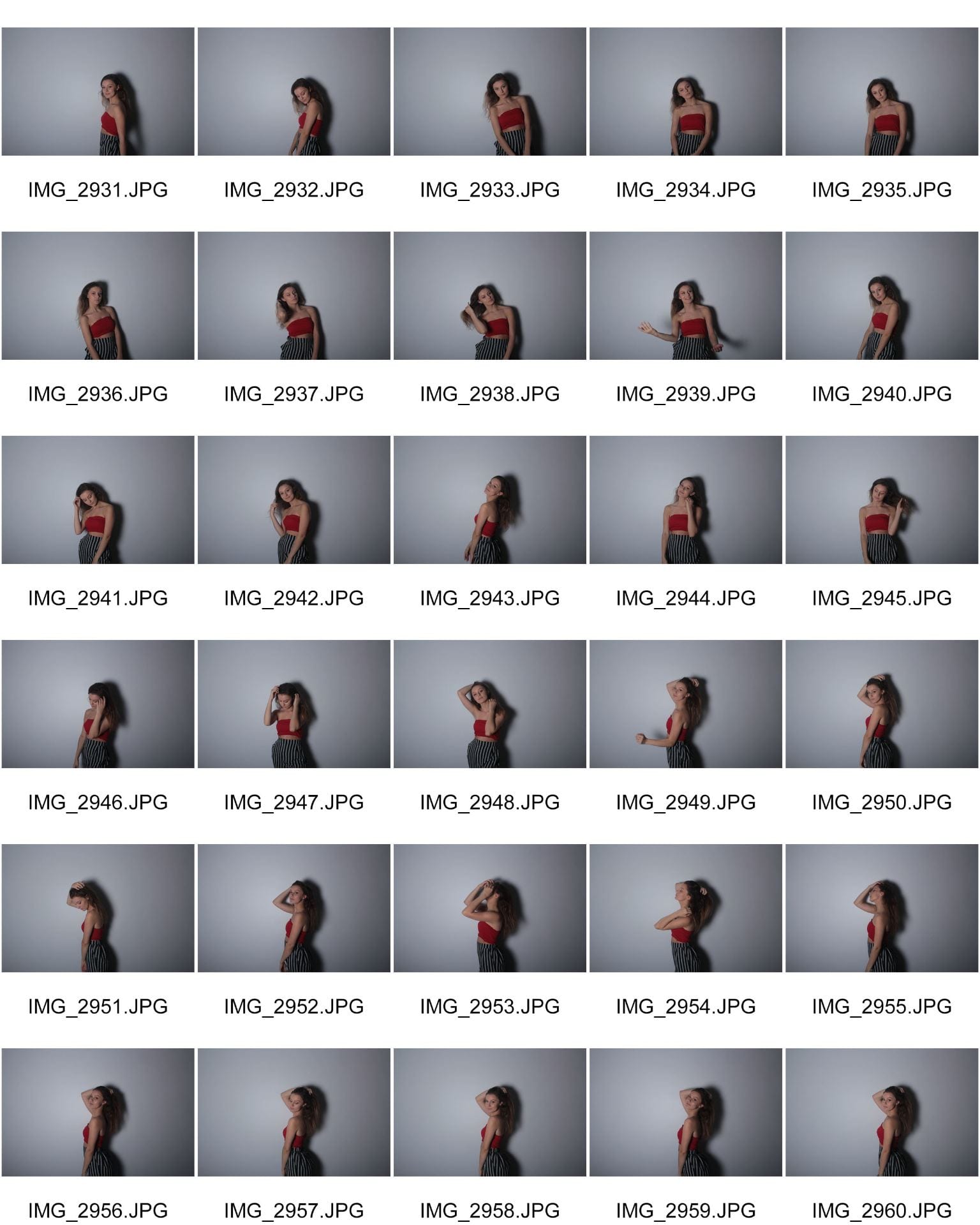
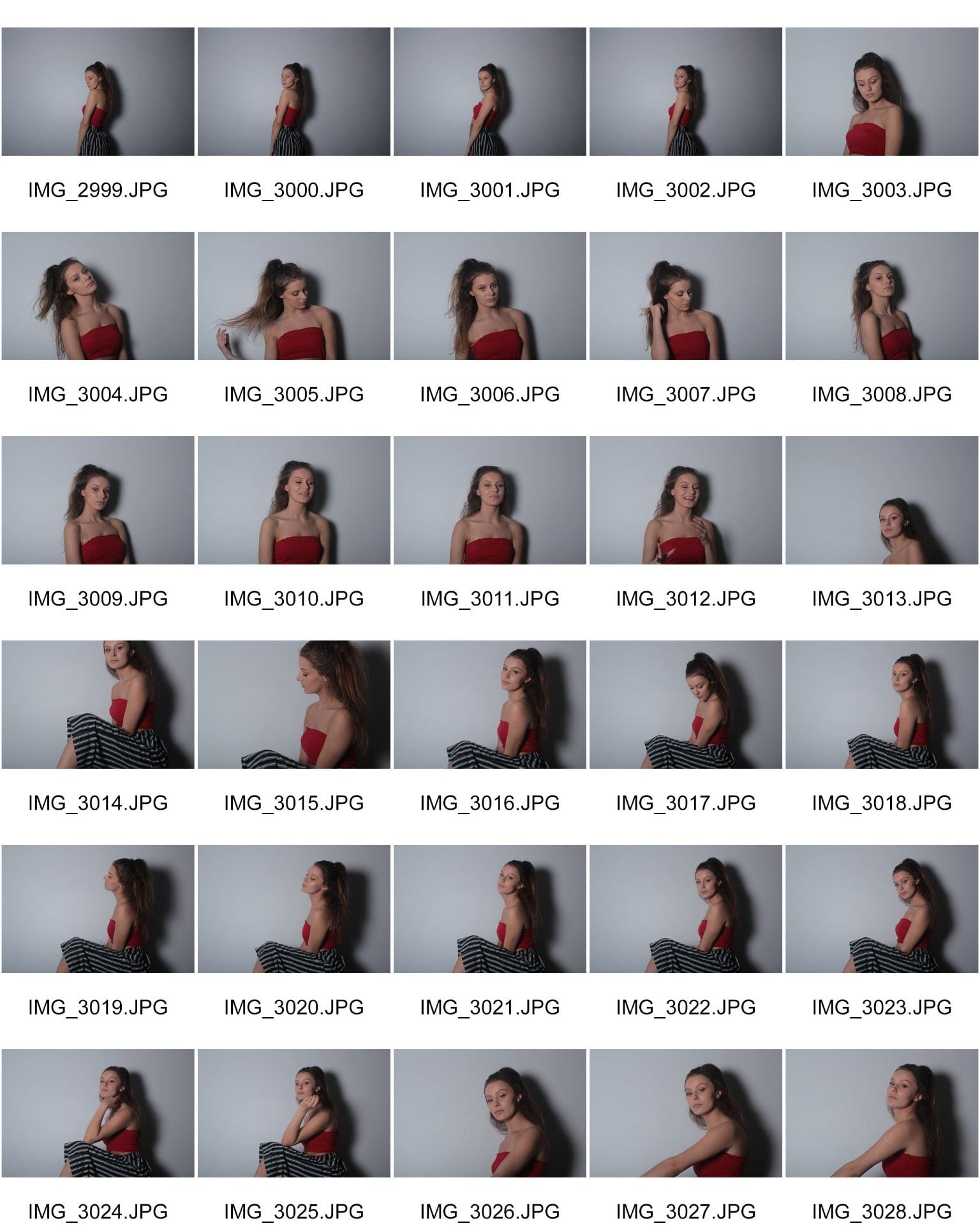
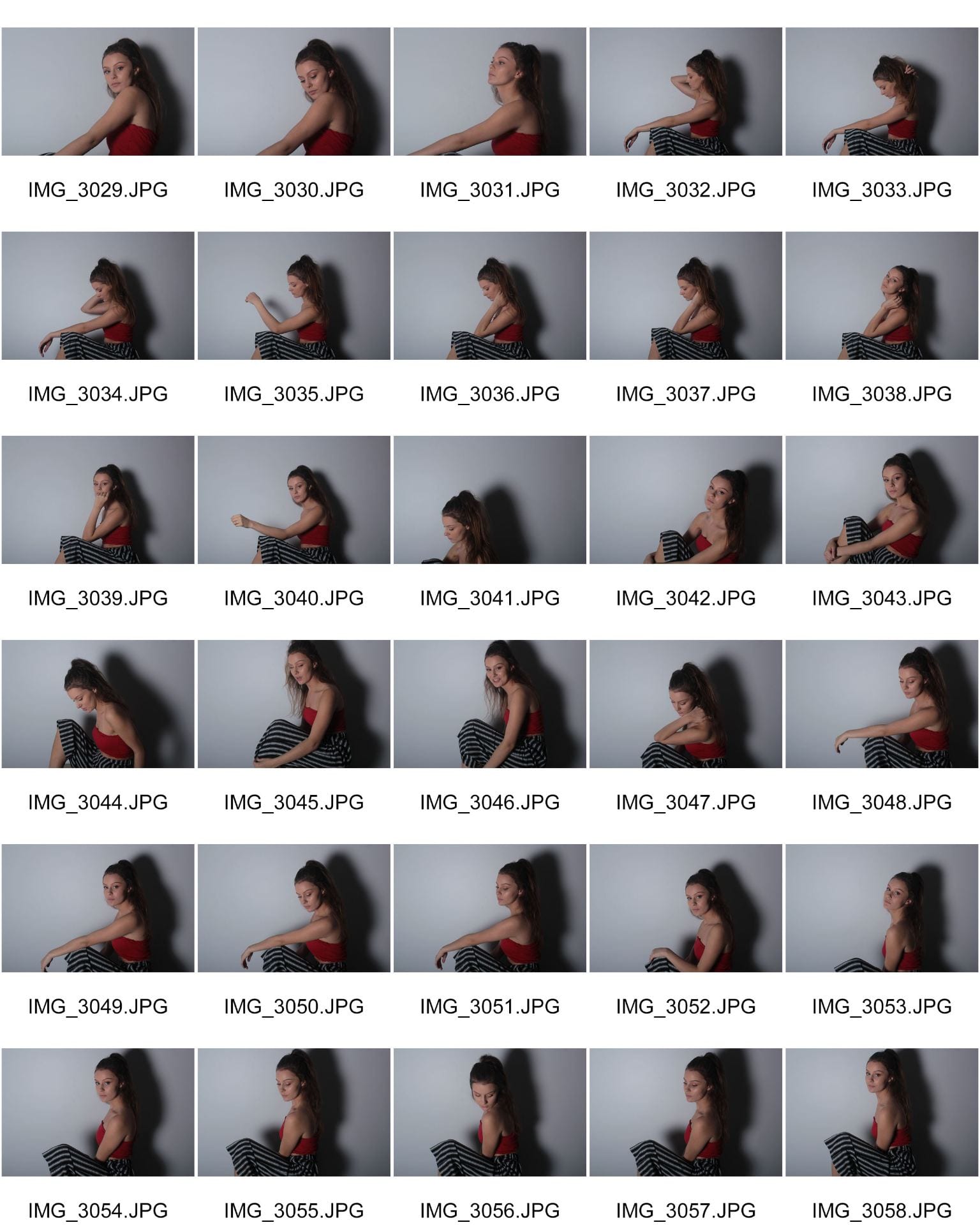
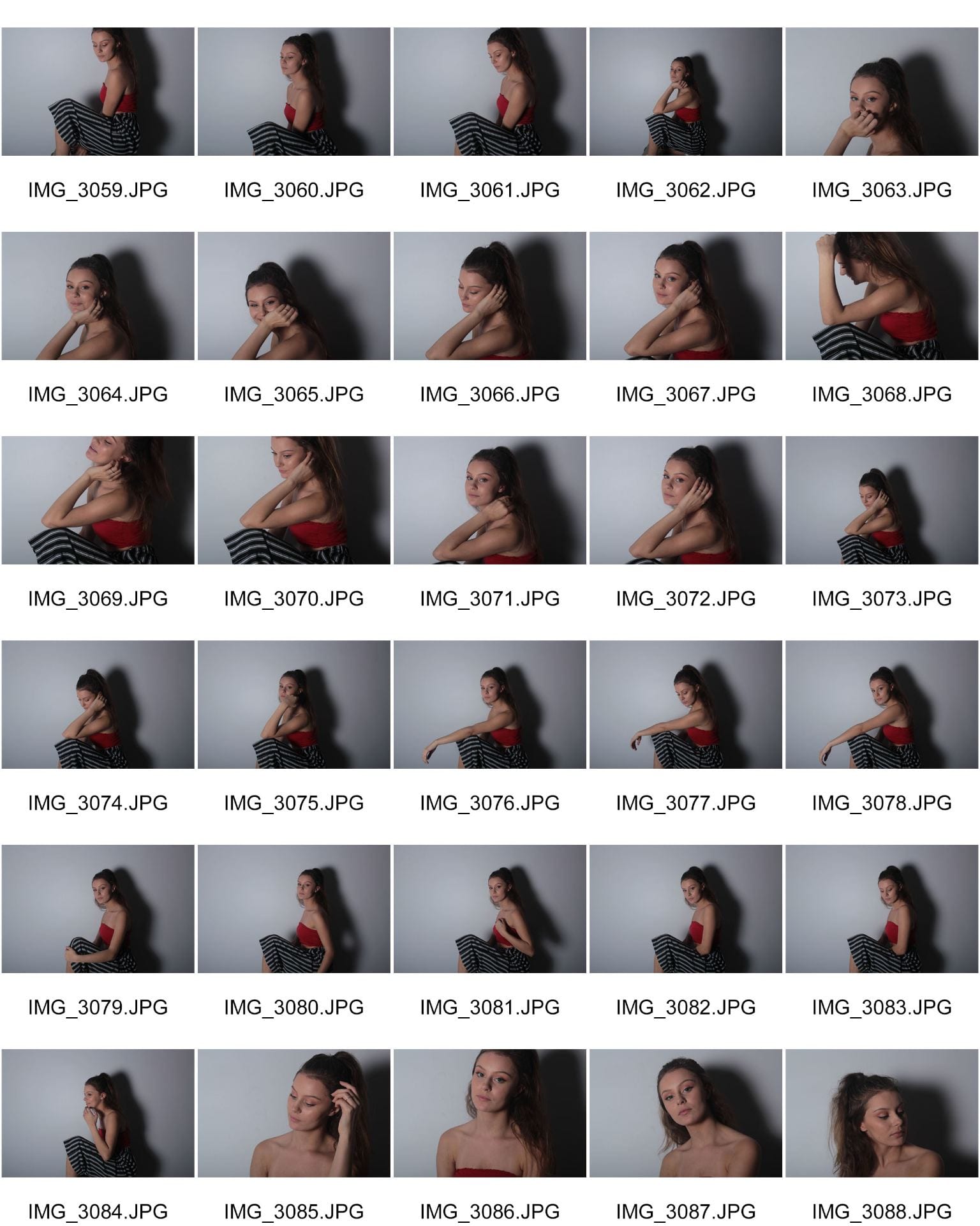
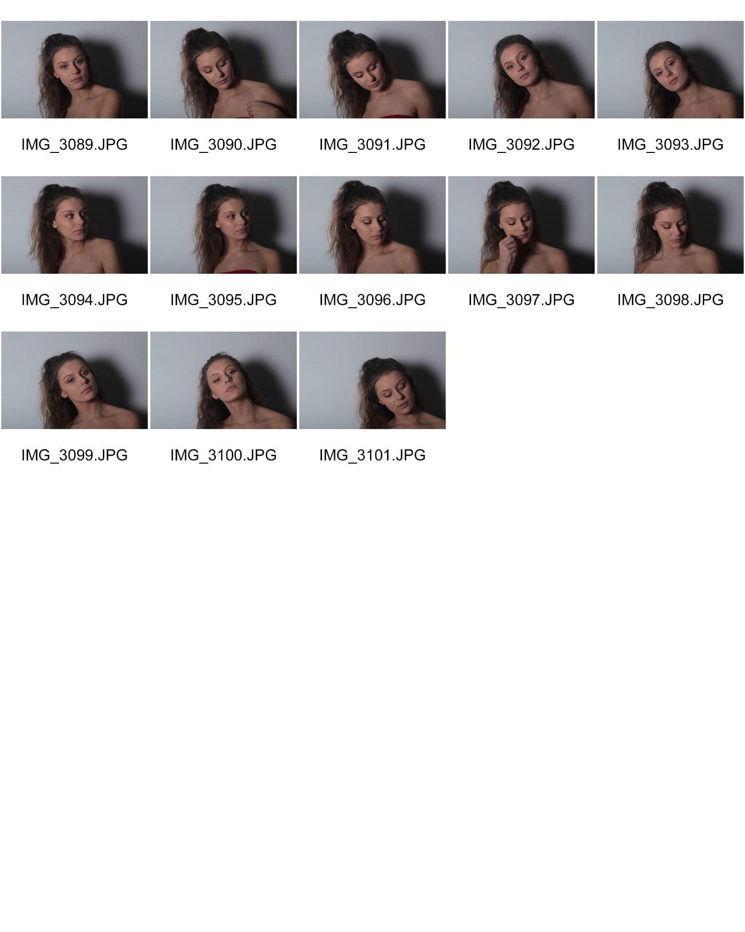
Harriet described my main cover star as bold, glamorous and slay. I am happy about those adjectives being used to describe my main cover star because they were the look that I was going for. I wanted my model to be glamorous because I think that a lot of pop stars in the industry are glamorous and bold looking. I feel like the words used go well with my genre.

Are there areas where the integration and copy is distracting?  

She said that I should move the insert that is covering a little bit of my model’s hair because it doesn’t make it stand out as much and is distracting.

What aspects do you consider conventional or unconventional?

Harriet said that the parts of my magazine that are conventional is the fact that it has a main cover star and a masthead. She also said that the inserts in the magazine make it conventional. Harriet did however give some points that I should change the layout of the magazine as it looks messy which I agree with as I want it to be as professional as possible. She also said that I should put a plug at the top that will market my magazine. E.G. ‘World’s best pop magazine’

I then asked Mrs Cobb to give me some good points and targets about my magazine.  She told me what I had done well which was that the model looked good and I had included good MES. She then gave me some targets  that I can work on in my second draft of my front cover that will make it look better. They include the following;

  • Brighter background and image
  • The masthead needs to be bigger and bolder in order to stand out more and be more extravagant.
  • The inserts need to be in line with each other as they look messy.
  • The lines on the inserts need to be closer together.
  • I should put a plug at the top of the magazine that will promote how popular my magazine is.  E.G. ‘World’s best magazine’

Draft 1- Front page

This is the first draft of my front cover which I think is good but could definitely be improved.

I decided to choose the colour red in my masthead and captions because it matches the costume that I chose for my model. I then chose the blue because I think it complemented the red and white.

I used a mixture of two fonts because I wanted the masthead to stand out in a different way that I wanted the captions to. Although I did use two fonts, I think it works because the majority of magazines that I read have more than one fonts too and I decided to take inspiration from them.

I like the photo that I decided to chose because it is taken from a high angle and has a sense of seriousness to it.

To improve I could…

  • Photoshop the image better because on my model’s shoulder there is a slight shadow which some may see as her looking dirty.
  • Take a better image because they all contained a slight shadow on the wall which prevented me from cutting it out and adjusting the background.
  • Make the layout a bit more professional looking because it doesn’t really look like a professional magazine at the moment.
Please click on the image to see a clearer version

First shoot contact sheets

This is my first photo shoot for my music magazine and I think it went quite well. I think I managed to take a lot of images that I can potentially use on my magazine which was my aim when I went into the shoot. I made sure that my model wasn’t wearing any unnecessary jewelry and that she did not have a hairband on her wrist.

Although it did go well, I could have been a bit more prepared. I should have set up the lights before my model arrived to avoid time waste that could have been spent taking more photos. I should have organised the outfits a bit more in advance because my model is wearing the same top throughout however the bottoms did change.

I prefer the close up images with the hair down because I think that it makes my model look the best and it is the image that I wanted to go for. My magazine is Ariana Grande inspired and I think those images look the best in relation to her.

Early mock Ups

This is a draft of my ideas for the layout of my music magazine. This will help me when it comes to designing my magazine because I will have already thought of the ideas and layout that I want my magazine to look like. However, saying that it is only a draft so when it comes to creating my magazine, I will be able to change snippets of the layout if I want to as these are just brief ideas.

I have chosen to put my main cover star in the middle of the front cover because it is the main focus of the front cover and is the thing that people will be looking at most. I have then chosen to add a few pugs into the front cover because if the content on the front cover doesn’t interest the audience enough then the pug is a persuasive technique that may attract a bigger audience.

I then took inspiration from magazines that I read when it came to the contents page because the majority of the magazines that I read has the contents page on the right hand side of the page so I decided to do the same as it is what I like and read myself so it must attract some kind of audience.

When it came to my double page spread, I decided to have the headline on the top of the left page because people may not be able to read it if it goes across two pages. I then also decided to have two columns where the article will go and the image of the cover star will go in the middle of the two columns. This is because when the audience is reading the magazine they will be able to easily glance back at the star while reading so that they engage more. On the right hand side of the double page spread, I decided to have the interview going horizontally along the middle of the page because it will be the main factor of the page and I decided to put another image of the cover star in the top left hand corner and the bottom right hand corner so that the audience have a variety of images of the star while reading about the article. Finally, I decided to put a quote from the interview with the star in the top right hand corner in a big font so that it will attract the audience if they were to just flip through the magazine.

Masthead designs

This is a few designs of how I would like my mastheads to look on my music magazine. I used InDesign to do this and I decided to go for red because it will suit the costume as the top is red.

I wanted to have one or two colours on the masthead because, as the title says, I want my magazine to be simple but to be manipulated so that it is can attract a huge audience.

I like the blue masthead with the different size letters because I think it looks different and unusual. I think if I were to use this masthead then it would add something extra to my magazine, as it isn’t a ‘typical’ masthead style. I also like the black outlining it because it makes it stand out a bit more.

I don’t particularly like the last masthead because I feel like having two separate colours is a little too much. I think there will be enough going on, on my front cover anyway that two colours may just be confusing. However, I do like the third one which also has two colours but they are more broken up which looks better than one letter in one colour and another in a different.


So… I am ready to photograph my star

In order for my music magazine to adhere to the criteria and attract the highest audience I will need to make sure that my MES and camera skills are the best they can be.

In relation to MES, I will need to think about the colour scheme of my magazine and what I would like my model to wear. From looking at other magazines, I have learnt that there is more to it than a cover star and a masthead, granted they are two of the most important things but they are not the only things that make up a magazine. I will also need to think about the body language of my model and how she will stand and what pose she will make, I will decide this in advance so that on the day it will go as smoothly as possible. I will also need to make a decision on what I would like my model’s hair and make up to look like, this is a feature that people may not instantly notice when you pick up a magazine however if it wasn’t there or thought of then people would most definitely notice.

I have learnt that there is more to a photo shoot than a camera and a model. For example, I will need to set up the lights, the flash and the camera itself. I will need to capture more than one image because I will need them for the insets as well as the cover star. I will also need to get different camera angles so that my magazine isn’t boring and attracts the audience.

Production meeting agenda for 1st photoshoot

I have decided to plan out my photo shoot to a ‘T’ so that on the day it can go as smoothly as possible and limit any mistakes that I may make. My aim is to capture at least one perfect shot that will be used as my cover star for the front of my magazine. However, I would love it if I will be able to capture more than one image that I will then be able to manipulate them and use them as my inset on the front cover of the magazine. My ideal outcome will be to have photographed all of the above so that my main focus for the end of the week will be to edit and manipulate the images.

Star Image

I created this slide show to help me recognise what different types of people in my genre (pop) were like and how they were portrayed in the media. I decided to use Ariana Grande as my star because she creates music in my genre and I thought it would be a good idea to delve deeper into her media. I discovered that she takes images/has images taken of her, in a very powerful, elegant and empowering way. I found out that her image in the public eye has changed over the years because she has realised that what the media perceive you as really does matter and can effect your career.

The ideologies towards Ariana are stereotyped because when people see an image of her they may think that she doesn’t really care about people and may be a bit shallow, but from researching her, I have realised that she is none of those things.

I think Richard Dyer’s paradox of the star applies to Ariana because she is extraordinary in the sense that she is in the public eye and is able to still perform after the tragedy she went through at her concert, although she is still an ordinary person.

I would like my cover star to be a bit like Ariana and be confident and stylish and most of all own the image. I would like to be able to tell a story with the MES and for people to be able to guess my genre without knowing the name of my magazine.