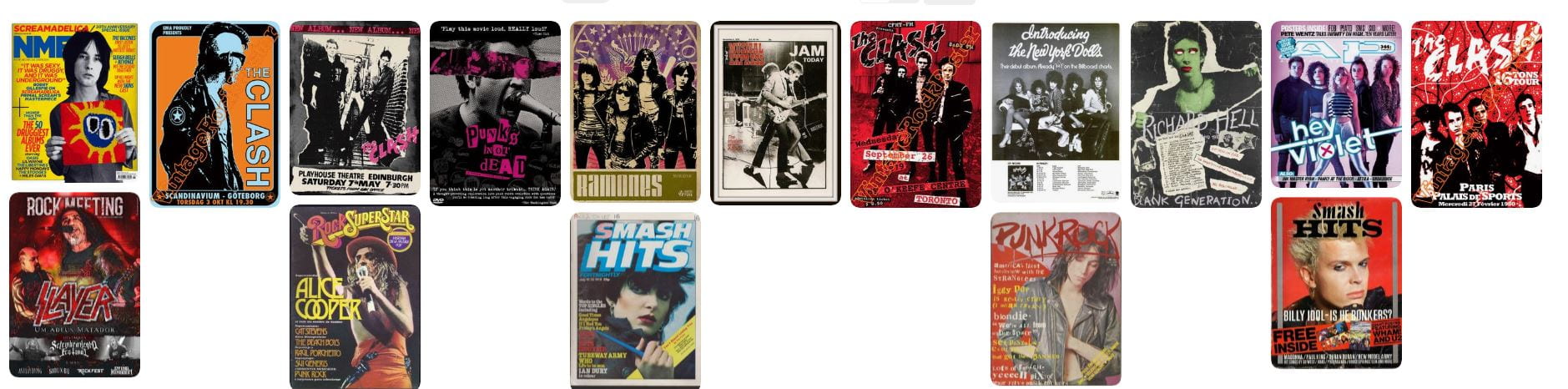
October 22

My Tour Poster

In this task I researched different types of punk rock magazines and the different features that are included in them that make it obvious that it’s punk rock.

I found that the different conventions of a punk rock magazine were:

  • Very dark/extremely bright backgrounds
  • Main title in ‘hand written’ and edgy fonts
  • A modified image of the main artist mainly in the center
  • The artists’ facial expressions are typically rebellious and aggressive 
  • Their hair and makeup tend to be over the top and very flashy to the audience

This research will help me immensely to create and design my magazine poster to fit this style of music as I will know the different conventions that I will have to include into my poster to make it realistic. 

Here is my board from Pintrest on the different magazine covers of punk rock

Please click on the board to see the images more clearly

Please click on the link to see a clearer PDF

Made with Padlet

October 20

My Magazine Front Page Swede

This week I was given the task to copy a magazine cover of my choice using in-design. However as I could not find the exact replica of the magazine to replicate myself, I had to choose a different cover to copy. Because of this I had to move around some text and titles so that it did not obstruct the Artist’s face.

This task has has helped me learn the basic features of InDesign which will help me when creating my tour poster as I will have a basic understanding of how to create it. This has also helped me comprehend typical magazine layouts.

Examples

  • Masthead
  • Cover lines
  • size,width and colour of the text

Strengths of my replication

  • General text placement was good to say the image wasn’t an exact replica of her magazine
  • Changes a lot of the text colour so that it was visible with the white background
  • Writing is in the correct places 

Weaknesses of my replication 

  • Fonts are not exactly the same as the original 
  • Could of added in the bar-code which could have been easily done 
  • Spacing between the letters
  • Text at the top right is not in the frame of the magazine
  • Text displayed ‘Rihanna’ has box around which could be easily taken out

Below are some YouTube videos which I found helped me with creating my replicated magazine

September 30

The Camera Talks

In this lesson we were put into groups of three and were assigned to taking a variety of pictures/shots from different angles and distances with the aim of creating a narrative to convey to an audience.

After completing this task we made a moodboard showing a number of different pictures that we took which includes the denotation. This is what the picture is, and it includes the connotation. This is what the audience can derive from it (make a story out of). This also goes along with the different technical camera terms included in the moodboard.

This will come in handy when creating my own music magazine as it will make me think about what different angles and shots I will need to use to create a narrative for the audience and it will also make me think about the different props and costumes etc, that I will have to include. For example , taking a low shot angled picture of somebody can create a sense of power and authority and the camera gives the audience the sense of being in their shoes and being in the scene.


September 30

Technical Camera Terms

Below are a variety of pictures/shots demonstrating the different angles and compositions used with the DSLR camera. We learned how to alter the shutter speed (how much light enters the lens) and we also learned how to use the aperture (F-stop). This affects the depth of field (the focus of the camera).

  • Long Shot (in focus) – F22 (strong depth of field) – F2.8

The shutter speed can also create meaning. For example a slow shutter speed would be used objects to show the audience the object is moving as it creates a lined blur of the object. However if you wanted a sharp shot of an object and make it in focus you would change the settings to a high shutter speed. This would have improved our pictures.

All the images below used different angles and framings to create a narrative for the audience. This will impact on my pictures that I will be taking for my music magazine as I will need to think about how to create a narrative from just a picture to bring across a message to the audience.


September 20

My image that uses mise-en-scene to communicate meaning.

Moodboard

Our selected genre was Punk Rock.Therefore in our moodboard we included  images of punk rock artists and analysed and focused on what they wore and how they were presented.We used mise-en-scene that are associated with punk rock theme.

Conventions of Punk Rock:

  • Leather Jackets
  • Rebellious Hairstyles
  • Extreme Bright Makeup/Dark Makeup
  • Chains,Gloves,Piercings
  • Aggressive Facial Expressions

Made with Padlet

We decided that some of the most important aspects and styles of punk were crazy hair, dark/light makeup, leather jackets and piercings/jewellery. This showed us that punk rock gives off a rebellious and outgoing vibe showing defiance which is a theme of punk.This helped us to interpret and create the best star image.

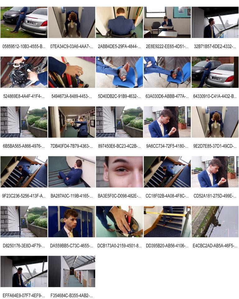
In the lesson, students were asked to stick a post it note onto our model with words in relation to describe the mise-en-scene and to the music genre. 

Some examples that the students gave were:

  • Dangerous
  • Individual
  • Angry
  • Rebellious 
  • Intimidating

This showed our group that we were able to use mise-en-scene correctly as the students(audience) were able to give the correct adjectives which were the same if not similar when creating our moodboard.

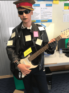
Images of our punk rock model

The Look 

In my opinion, the two images below are the best in terms of representing a punk rock artist and also using mise-en-scene appropriately to strip down the image and looking deeper into it. 

The props used to make the best aspect of a punk rock artist were:

  • The black lipstick gave off a gothic and dangerous vibe to the artist, it gave the artist a personality to the audience at first sight straight away
  • The leather jacket and Nazi hat gave off a rebellious and outgoing vibe to the artist which fit perfectly with punk rock theme 
  • The guitar was a big prop which in my opinion gave the most meaning to the image in terms of judging the artist at first sight and using mise-en-scene to create that story
  • The facial expressions and body language also played a big part in the image and vibe out group were trying to give off which was aggression,defiance and disobedience 

Conclusion

Overall I have learnt that mise-en-scene is a massive part in creating an image for an artist because every little detail will have a huge impact on the whole scene.If something is there that shouldn’t be there or if something is out of place,it ruins the whole image.

This will impact on my production of my music magazine because I will be more aware of the specific aspects that I will need to include and the use of mise-en-scene to convey the meaning to an audience.

September 17

Print Media that Communicates Meaning

In this task I obtained a variety of media analysis skills. I reflected on and analysed a music world tour poster by Ariana Grande and used this to reflect on the mise-en-scene and how it creates and help communicate a narrative.

The skills that I have learnt will help me when creating my music magazine as  I now know that all the following factors will affect the vibe and meaning of the poster which will be conveyed to the audience:

  • Colour
  • Font
  • Lighting 
  • Outfit
  • Makeup
  • Body Language

All these aspects of media analogy will make sure I send the message I want to be sent to my audience in the correct way through my music magazine.