November 23

Digipak Draft 3

In order to get some feedback on my digipak I sent out a google form with the images from my digipak which different options of genres from people to choose from. Below is the google handout. The majority of the 19 responses guessed correctly in saying the genre was Pop/R&B however the majority of these people thought I was trying to represent him as sinister and cunning rather than truthful and honest.

Below are two images of my digipak in a CD case so I could see what my finished product looked like after completion

Category: Digipak | LEAVE A COMMENT
November 16

Digipack Draft 2

Front Cover 

Inside Left

Inside Right 

Back Cover 

Teacher Feedback 

After I completed my draft 2, my teacher did a screencastify commenting on my digipak. There were many positives from the feeback such as the digital creation of the moon and space etc however there was room for improvement.

Targets For Improvement 

  • Make the artist bigger to cover the mirror image as it looks a bit weird
  • Add some coloured spotlights to the dots on the front cover
  • Make the inside right cover connect with the inside left by merging something off the two together
  • Make the fonts all the same as the front cover
  • Match the colours of moonlight and Leonardo De La Cruz for the back cover
  • Instead of the blue drop shadow on the inside left cover add in the pink to link it with the right cover
  • Add some colour onto the back cover aswell
Category: Digipak | LEAVE A COMMENT
October 23

Evaluation of shoot or graphic design

The making of my graphic designs went very well, I was able to create a realistic looking moon along with a solar flare. I did most of this creating in photoshop. I used a variety of diffeent tools in photoshop, for example new layers, masks, filters and much more in order to create a realistic moon and solar flares. I had some help from youtube videos which explained to me the step I had to do in order for me to create different colours on my image and dark spots for the moon.

Before creating these designs I was planning on going out and taking a picture of the moon to edit but thought it would be much easier to edit in photoshop if the moon was also made in photoshop. This helped me later watching the videos on YouTube as I wouldn’t have been able to create the same design if I took a picture of the moon.

After completing my draft 1 of my digipak I am going to have to have a shoot which includes me taking selfies in order for me to photoshop myself onto the digipak. Because my first draft is already completed before any shoots, I know more or less what shots and positions I want myself in so that it fits onto my digipak keeping the typical conventions relevant to it.

Images of the designs I have created

Category: Digipak | LEAVE A COMMENT
October 22

Digipack Draft 1

Below is my first draft of my digipak, I have included some of the typical features that I have seen for the R&B/Pop genre like big mastheads and images and copyright logos and the producers

Front Cover

Inside Left

Inside Right

Back Cover And Spines

Things I Need To Improve On For Second Draft

  • I will be taking pictures of myself so that I am on the front cover and the back cover of the digipak
  • Maybe adding a little more design to the front cover maybe some mountains
  • Adding some text to the inside right of the digipak

In relation to the assessment criteria, the use of photoshop is to a good standard as most of the images in this draft were made using photoshop. The mise-en-scene for my genre still needs to be added in as I should have bright colours on most of my pages. The digipak’s layout as a whole is fairly good as its set out like a basic digipak which includes the barcode and copyright etc. I think the DPT is conventional using big bold writing and different typefaces however their are no images which have not been created digitally therefore for this first draft I will probably grade it a C/B

Category: Digipak | LEAVE A COMMENT
October 22

Hand drawn mock up

Below is my hand drawn mock up of my idea for creating my digipak. This helped me get some inspiration as to what colours I want to include and what images I want to include into it. When drawing this mock up I made sure that I included most of the technical conventions of a digipak e.g big title, imaged and the copyright writing etc. This very rough draw includes the bright pink which is conventional in my genre having bright colours.

Including typical conventions of my genre into my digipak will ensure that it will reach out to my target audience

below is the colour palette that I am aiming to have on my digipak

101 Brilliant Color Combinations for 2020 | Adobe Spark

Category: Digipak | LEAVE A COMMENT
October 22

Branding Moodboard

Below is a moodboard that I have created on padlet which shows the different technical conventions of my genre for an album cover or digipak. This helped in giving me inspiration for the type of elements I need to include into my digipak such as poses for my artist and colour schemes. I discovered that my genres conventions are typical in many different artists’ album covers. This repertoire of elements and the general conventions of a Pop/R&B digipak combined, will make up our brand image so the audience can decode it successfully.

Made with Padlet
Category: Digipak | LEAVE A COMMENT
October 12

Digipak Conventions Analysis

The slide share above is a detailed analysis of an album cover which is similar to my genre of music which will be in my Digipak. This detailed analysis is very helpful as it gave me ideas in which I could potentially add into my Digipak. I looked at the technical conventions, the colour scheme, the mise-en-scene and the artists body posture. All these elements in a Digipak are key elements that I need to think about when creating my own.

The denotation of this album is that Niki Minaj is very teenage like on the front cover with the pink hair, her hands grabbing her hair however is seen to be quite provocative which does attract the audience to some extent. Her hair and shoes are pink which matches the colour scheme of the album which is pink. Keeping the colour scheme simplistic is important as you want the artist to be the main focus on a Digipak.

On the back cover we can see her holding her hand up whilst looking pristine which represents her as a queen like figure connoting to the audience that she is an important woman. We can also see her leg which is pointed out in front of her which represents her as a very assertive and powerful person.

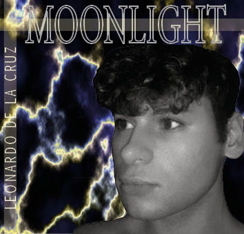
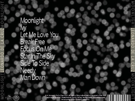
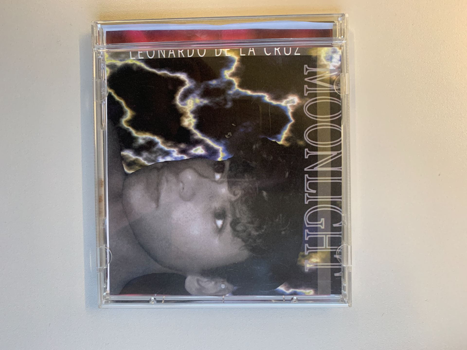
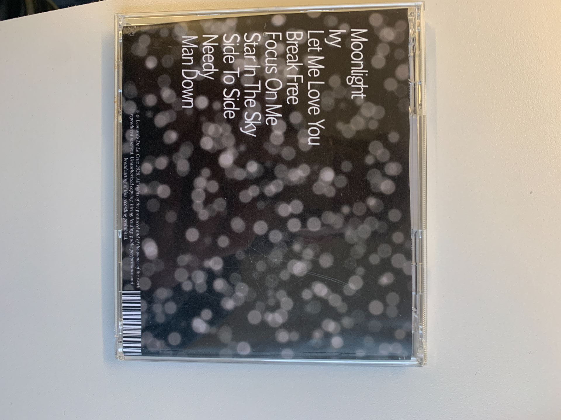
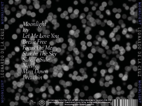
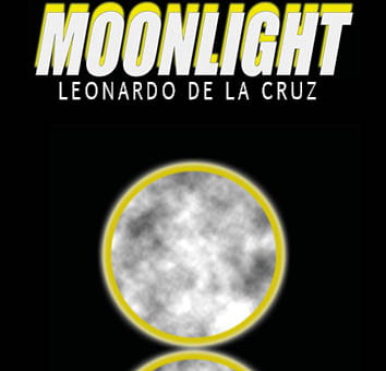
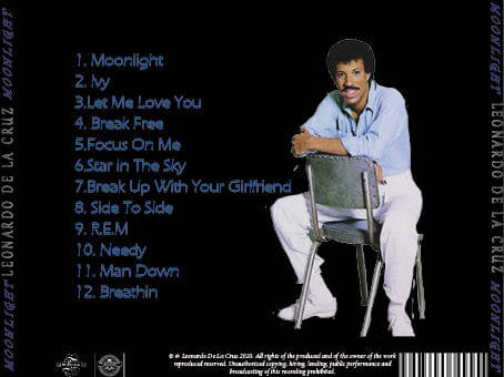
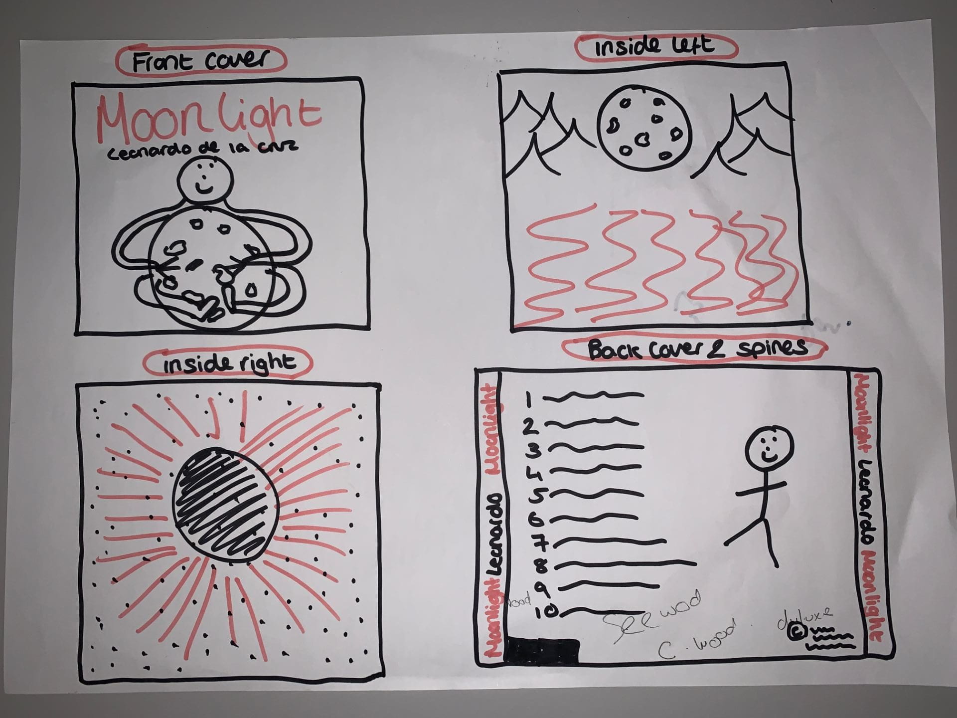
Typical Conventions Of A Digipak

  • Simple colour scheme
  • Big bold title for album name and artist
  • Artist seen in the centre of digipak
  • Barcode
  • Copyright print
  • Song names listed
  • Spines

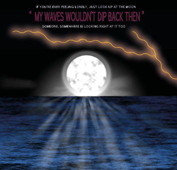
Typical Convention Of My Genre (Pop/R&B)

  • Bright colours
  • Artist wearing bright colours
  • Minimal props in the front cover
  • Artist looking at the audience not facing away
Category: Digipak | LEAVE A COMMENT
October 12

Our Mission Statement – The Package Brand

Below is a slide share that I have created which is a detailed analysis of our branding and how I can promote my album to my audience more, the slide share also include my mission statement. I also looked at the unique selling point and the call to action. This helped me researching these key elements as it helps me as the consumer and benefits my target audience as it shows interaction with them. I have created the following slides explaining the audience, social media usage, the competition, USP and the mission statement.


Category: Digipak | LEAVE A COMMENT