Below is a slideshow I have created, containing research into my target audience, a dating profile of my ideal text receiver, and an outline of Stewart Hall’s receptionist theory.
Component 1
Star Image – Theirs and Mine
A Star Image is the idea which is created surrounding a star. This is incredibly important to consider when designing a magazine, as the construction of the overall image of the star can hugely effect what audience are reached, and if they are reached effectively.
I have created a presentation which studies in detail the meta-narrative of one of my favourite Indie artists, Tessa Violet. My analysis covers her usage of social media, PR appearances, her music and lyrics, one of her music videos, her appearance on the cover of Narrow magazine, as well as other aspects of how her brand is composed.
Star Image – Tessa Violet
When I’d completed this, I moved on to create a slideshow about how I’m going to construct my star, using my knowledge gained through my research and my knowledge of the genre as whole.
Designing My Star Image
I will build my overall star image with these features in mind, so that I am able to convey the Indie genre to my audience in a way which is decodable.
Branding Ideas + Mission Statement
My music magazine is going to be called Violet. I chose this name as the Indie music genre is conventionally known for being artsy and colourful, and the colour violet could be seen as aesthetically pleasing, another ideal reflected by this genre. I therefore think that this is an effective and suitable name for my magazine.
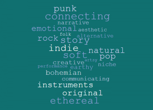
I have chosen the indie genre for my magazine as I have a personal interest in it, and I predominantly listen to artists of this nature. The lyrics are often emotionally driven, something which I am very keen on, and I like the independent feel of it. I have created a wordcloud of words that I feel reflect the Indie genre.
Indie Wordcloud
My Mission Statement
‘Violet‘ is a magazine focusing primarily on indie music, but also style. We feature top stories from your favourite indie artists, including exclusive interviews, details of tours and events, and brand new photoshoots. We even create playlists of our favourite tracks and artists, so you can discover all that the genre has to offer. ‘Violet‘ strives to inspire positivity and individuality in its readers, and we’re fueled by the support that we receive. With an aim to encourage self-expression, we provide only the absolute best of indie.
So… I’m Ready To Make Some Media!
In order to create a magazine that’s as successful as possible, I will take into consideration the following aspects.
Camera
I will use the knowledge that I have gained about camera work in order to effectively convey my desired message, and utilize appropriate framing, angles, and effects. This is important to consider, as camera usage can connote vastly different meanings, and if the wrong decisions are made, it could be confusing to the audience.
Mise En Scene
I will consider all elements of Mise En Scene when deciding what features will be included in my magazine. I will ensure that the costume, makeup, and hair of my model match the conventions of my chosen genre. The lighting will be appropriate, and my models will be posed in a way that is reflective of Indie music. Props will be suitable, as will the setting, in order to create the most effective message.
Layout
I will ensure that the layout of the magazine contains the conventional features of music magazines, such as masthead, plugs, pugs, insets, main cover star, main cover line, captions, cover lines, issue and date, price, and barcode. It will also need to be legible and clear.
Typography
My typography will be readable and clear, and I will not use more than 3 different fonts, as this is unconventional of music magazines. The cover would also appear cluttered, and messy, so I will ensure that I take this into consideration.
AIDA
AIDA stand for attention, interest, desire and action. AIDA is highly important to consider when designing a magazine as it’s what gets the pay attention; if the magazine doesn’t attract the audience, engage their interest, create desire and call them to action, it won’t be successful. I will make my magazine colourful and bold to attract attention, use convincing lexis to gain interest, use persuasive language such as imperatives to create desire in the audience, and call them to action to buy the magazine.
My Tour Poster
In order to create an effective tour poster, I first completed some research into other tour posters of the genre.
Moodboard of Rock Tour Posters
In my research, I found some of the following conventions:
- Colour schemes of red, yellow, black, and white – block colours
- Artists name usually written in capitals and in a large text size
- Image often fills a large portion of the posters
- Many artists are pictured with their instruments
From this research, I created my own Heavy Rock tour poster.
My Tour Poster
My Tour Poster – Analysis
Here is the link to my analysis for my finished tour poster.
A Front Cover Analysed
Textual Analysis of a Professionally Made Front Cover
Over my analysis of this cover, I discovered that the main demographic of this magazine were around 20-30 years old, middle class people, with quite a high disposable income.
One element of this cover that I found interesting was the bold, block colours. As general, Millenials are known for their confidence and desire to stand out from the crowd, and the choice of bold colours could entice them due to thsi desire to be different and strong. I feel that this reflects that Mixmag know who they’re appealing to, and are highly aware of how to do so effectively.
Another thing that intrigued me about this cover is that the masthead is in lowercase letters. I found this interesting because, while it may be slightly unconventional in magazines, many young people type in lowercase letters, and, therefore, I feel this is a successful decision, which demonstrates a clear understanding of their demographic.
When I create my music magazine, I will take into close account the need to appeal to the audience, and take into consideration their age, class, interests, and other key features so that I can appeal to my demographic as effectively as possible.
The Camera Talks
Moodboard
For this task, we were tasked with creating a moodboard of our favourite images from our photoshoots, and for each image, we included 3 hashtags; one for the camera term, one for the denotation, and one for the connotation. The denotation of an image is its literal, clear meaning, and the connotation of an image is what is implied. I feel that I was successful in accurately labeling the photographs I took.
I think that I achieved the aims of taking high quality images that can convey meaning through camera work. My favourite image was the one of my school bag on a wall, as I felt it effectively connotes the idea of being left behind. The fact that the bag doesn’t fill a large portion of the screen could imply its unimportance, and the smiley face on show on the bag contrasts effectively with the overall depressing tone of the image, creating almost a sense of irony.
Audience Profiling
For this task, I used the YouGov website to analyse what type of people would typically read a certain magazine, in this case, Mixmag. Mixmag is a dance music and clubbing magazine which reviews music, festivals, and club nights, as well as covering dance events. In my research for this magazine, I found that the general reader is is there 20s to 30s, making the demographic generally Millenials or Generation Z. It’s about equal in popularity between men and women, and the audience are generally middle class.
Music Magazine – Annotations
It is hugely important to understand your audience and how they think when you create any piece of Media. Identifying a target audience means that the people who are the most likely to consume the Media are more likely to be interested. I feel that the bold features accurately represent the desired target audience, mostly Millenials or Generation Z, as strength and boldness are traits generally associated with that demographic. For example, the cover star, Carl Craig, takes us a large amount of the cover, and his photo even obscures part of the masthead, implying that he stands out from the crowd. Individuality is a trait which is valued amongst Millenials and Generation Z, and therefore suggests that Mixmag have a strong grasp on who their target audience are and what they believe. The colour scheme used further emphasizes this, as the colours are bold, implying confidence and strength.
My Magazine Front Page Swede
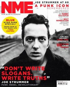
This week, my class were taught how to use the features of InDesign, a popular desktop publisher. We learned some basic skills, such as how to set up a new document, navigate the toolbar, insert text and images, and export the finished product, as well as being taught how to use columns and grids in order to arrange the aspects of our covers. We also revisited the main conventions of a magazine, for example, masthead, plug, pug, and main cover star. In order to test our skills and knowledge, we were set the task to recreate a magazine cover from NME, a music magazine, as closely as possible. The main aims for this of this were to:
- Consider and apply the main conventions of a magazine
- Recreate the layout
- Practice using InDesign and its features, such as fonts, sizing, spacing etc.
NME Cover to Recreate
My Recreation
Reflection
Overall, I think I managed to effectively and closely re-create the original NME cover which I was provided with. I managed to re-create the pug quite accurately with its background colour, spacing, and the dotted line through its centre. I also managed to source the exact image that was used on the original cover, which I found was very helpful when it came to recreating its layout, as well as giving it a sense of authenticity. Finally, I think that my font choices were as accurate as they could be within the options provided, and that they generally resemble the fonts on the original quite closely.
Something that I struggled with in this recreation was the accuracy of my colours. The default colours provided weren’t the correct shade, and I particularly struggled to find a true to tone red. Another difficulty that I encountered was with the spacing and size of the letters. Most of the text on my cover needed to be edited in order to resemble the original, and I struggled to determine which aspect of the letters needed to be changed, such as font size, height, width, word spacing, or line spacing. Finally, I found it complicated to place the text correctly in relation to the image and other text. I will need to improve on these aspects when I create my own cover in order to make a magazine which is as effective as possible.
Targets
One thing that I would like to improve on is the spacing and placement of my text, as it’s something that I struggled with in this recreation, and that I feel is vital in the creation of any future pieces. Something that I would like to learn is how to create a gradient in the background of an image, as I feel this will aid me in creating an aesthetically pleasing finished product. I would also like to learn how to use more complex text effects, as I feel they are interesting, pleasing to look at, and more visually exciting.
Conventional Design Features of a Magazine
Magazines covers often feature certain conventions. The main features are:
- Masthead
- Plug
- Pug
- Inset
- Main Cover Line
- Main Cover Star
- Captions
- Cover Lines
- Issue/date
- Price
- Barcode
They also often feature only a few main colours. Sylvie and I annotated the magazine cover below with the relevant design features.
Conventional Design Features – Annotated
I will ensure that I include all of these features when I come to create my own Music Magazine, as they are vital to creating an effective cover overall.