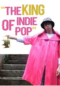
After lots of trial and error, I have finally completed draft 1 of my double page spread. I am very happy with how this looks however I could definitely improve it. I have decided I really like the fonts and colours used, the stand first and also the small image in the corner as it goes well with the pull quote; so I will keep these the same for when I begin draft 2.
Some conventional features that my double page spread contain are having a stand first beneath the central, bold masthead. Also having drop capitals evens the paragraphs out nicely and makes my article read clearly and smoothly, however in draft 2 I am only going to have 1 drop capital at the beginning of the article, which is also a conventional feature.
Another plan for my draft 2 is to move the main image to the right side of the page and the writing to the left. I feel this will better suit my image as the crown will be hanging over the text. I will also make the pull quote smaller as it is standing out more than the masthead currently and this should not be the case.
I think I will also remove the steps from the image so I have more room for text. Either that or I will edit the edges of the steps to disperse the colour so it looks almost spray painted. This is so it is less ‘blocky’ than just a straight line.

