Upcoming this week, we’re shooting our pictures for the first draft of our digipak. The production meeting agenda will help us keep organised when bringing in our props and focusing on the aims of our shoot. As we are shooting at school, there are little to no risks but we have still filled out a risk assessment for the studio.
Category: Component 3
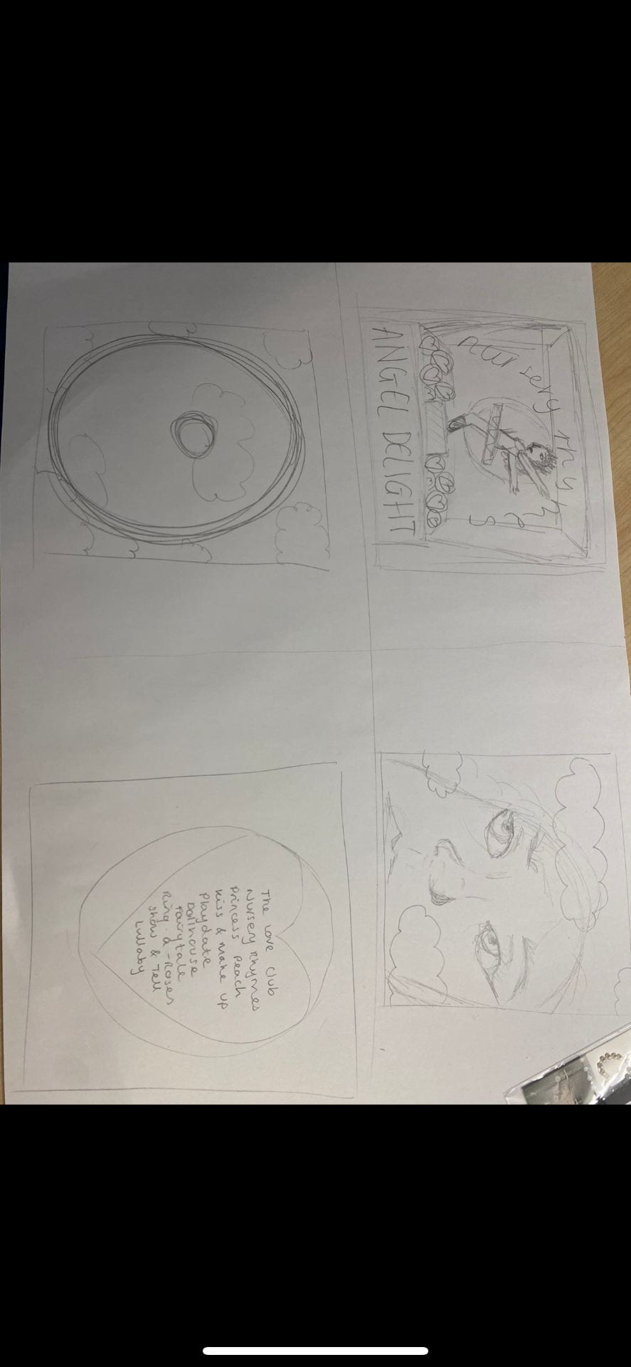
Hand drawn mock up
We sketched out a rough drawing of what theme we are going for in the digipak and the layouts of all our components such as the tracklist etc. We did 4 small drawings for each side of the digipak; we will keep coming back to this sketch when filming our shoot and the first stages for our draft 1 on InDesign we will use this drawing as a basic structure.
Here is an image of our hand drawn mock up, it is very rough but it is what we will follow when shooting. The first image is of our model which we are going to photoshop onto a music box with the titles around her.
The second image is going to be an extreme close up of our model as she is going to have some really exaggerated makeup, using pinks, blues and gems. We are also putting a purple transparent sunset image over the top of her face.
The third image is going to be of a cloudy sunset, which we already have the image for as we need the inside right to be a plain image without the model in it.
And the back pane is going to be the tracklist, on an image of a ‘love heart’ sweet, if it looks effective when shooting, if not we will use another image of our model.
The digipak overall is going to be a similar colour scheme to our music video, therefore it is going to be sunset themed. The main pastel colours we are going to be using are:
- Light blue
- Light pink
- Purples
- Yellows
We decided these because of our sunset theme and conveniently ‘love hearts’ sweets are pastel colours also which works well with our theme. On top of this the music box that is going on the front cover is light pink, so the rest of the digipak has to match this.
Branding moodboard
Before we brainstorm what ideas we could potentially use for the frontcover of our digipak, we decided to look at some already made cd and album covers of famous artists similar to our own genre. We also looked at the common theme of colour schemes within our genre, and have decided the most popular colours by artists are pink and blue, as seen in our padlet.
We are most inspired by Charli XCX album ‘sucker’, we have put the front and the back of her digipak on our moodboard because it is so similar to our theme that we are going for and looks very effective. We want our star image to portray a very similar vibe to this, with the whole love and pink theme to show off our narrative. In doing this, we will be following the conventions of a typical indie/pop album cover but we want it to look effective as possible whilst following the conventions. However we don’t want this to be basic so when doing the photoshoot, we will work hard to use abstract props and makeup to prove our star is different and stands out.
Digipak conventions analysis
Our next task for preparing ourselves for the production of our digipak is to analyse an already made famous digipak, one of an artist similar to ours. I chose to do SIA’s album ‘This is Acting’ as she is of similar genre to our artist Lorde and I knew that her album was very bold and clever and unconventional.
We had to label each part of the album front and back, this proves we know what to look out for when we create our own digipak and to gather a proper understanding of the conventions.
This album is very alternative, and uses quirky fonts which represents SIA as an alternative, not mainstream artist and likes to play with the look of her albums. By looking at the front cover we can tell it is clearly a SIA album by her famous half black half white hair. This represents SIA as always keeping her statement look as part of her album cover but switching it up and making it quirky and different each time.
Our mission statement- The package brand
First, we had to come up with the foundations for our digipak, components such as coming up with an album title, mission statement for our star, brainstorming ideas and images that we wanted our digipak to look like etc. We needed our mission statement and brand to match and go alongside our already made star image and narrative.
We made a powerpoint summing up the main features of our artist and artists’ morals to portray our brand.
Music video draft 4
Finally we have our final draft of our music video, draft 4.
What we have changed:
- Filled in the gaps of the clips where the roses were
- Did the final colour corrections (muted all the oranges and greens of the bush)
- Turned down the saturation of a few clips as this was some criticism we got when other media students left feedback on our video.
- In the previous draft, there was a clip at the end which we forgot to take the original audio out of, so we muted this.
I think that is everything we changed for this very final draft 4 of our music video The Love Club. All we need to do now is film some peoples reactions to the video and take their advice of what went well and what can still be changed.
Next, to get our final bit of feedback, we filmed some of our media peers watching our music video to give overall positive and negative feedback, in which they had no negative feedback for us!
Here is the video
Music video draft 3
Here we have the draft 3 of our music video The Love Club
What was changed:
- Edited the outdoor shot to make it less orange/green to make it more pink and cover up the tones of the bush.
- Slightly adjusted some of the clips so they are now more on the beat.
What we are still going to change for draft 4:
- Edit the outdoor shots again using colour wheels to completely remove the colour green from the clip to enhance the colour of her dress and makeup more.
- Remove the clips with the roses as they are too blue for the video, and fill the gaps with a different aesthetic clip
Here is some feedback we got from peers whom commented on our music video giving us advice on what is good and what to improve…
Positive:
-Mise en scene on point
-Good shot variety
-Good pacing of the cut clips
-Love the rose coloured filter on the clips, match the theme and aesthetic
Constructive criticism:
-Thinks the message portrayed was about ‘going crazy over love’ rather than loving then hating love
-From 2:36 onwards cut the clips more to the beat as they don’t sound like they are to the beat of anything? (However they are meant to be fast paced as she rips the paper to portray anger.)
-2:02 over exposed/saturated filter
I used snipping tool to take a screenshot of the emails the students sent me of the feedback for my video.

Teacher feedback – screen castify
After uploading draft 2, it was time for our teacher to watch our video and give constructive criticism and feedback to us to help us improve our video for draft 3. Using the application screencastify, it allows you to record your screen whilst talking over the top. This is an extremely helpful way of giving feedback as we can see exactly which parts Miss is talking about so it is clear to know what to change.
Some of the feedback that we got was:
- Bring out Millie’s blue eyes by adding saturation to the pink
- Bring drone shots slightly closer together
- Colour correct the shots as the bush has turned an orange/brown colour, maybe change this background to black and white?
- Some lip sync slightly out
- Flash of pink right after balloon shot
- Zoom in on some shots
- Nice fairy ring shot but maybe colour correct so she stands out more
Specsavers Feedback
We had many different professionals coming in to view and give feedback on our music videos. Lenny from Specsavers is extremely advanced at the software premiere pro so he provided us with lots of useful tips to make our video excel even more.
Overall, he was extremely impressed with what we had done so far, especially our mise en scene and effective makeup and could only help us make the video better.
He created a pink adjustment layer for us, which meant all the shots we put beneath the layer would be the same colour of pink with the same saturation, vibrance etc which was incredibly helpful as it saved us a lot of time trying to get each individual clip the exact same as the previous one.
He suggested that we moved our narrative footage to the top of the adjustment layer and the performance footage beneath to help us keep organised.
Overall, I found this specsavers feedback incredibly helpful and I don’t think our draft 2 would be as good as it is if it wasn’t for Lenny and Elliot.
Music video draft 2
We have finally completed our second draft of our music video! Here is our second draft –
In my opinion this video is very different to our first draft which I think is a good thing as it proves how far we’ve come, especially with ideas regarding editing.
What I particularly like about this video;
- We learnt how to use an adjustment layer so all of our pink shots have the exact same colour tones on them, which I think looks really effective and brightens the clips more as now looking back at the first draft it was very bland and grey.
- We added all of the summer shoot footage that we got which I think adds a really bright vibe to the video and advances the technology used a lot by using the drone to collect effective performance shots from above.
- We zoomed in on a lot of our shots, especially the teddy bear ones, to fill the frame more rather than having empty space.
Targets for next draft;
- Colour correct some, especially close ups, to make them brighter as they are quite dark at the minute
- Remove the shots with the roses as the large area of blue sky contrasts and looks disjunctive alongside all our pink clips and colour scheme.
- Add more narrative shots, to add more anger into the video.
- Sharpen some shots
Proudly powered by WordPress.
Theme: Flat by YoArts.