Now I had looked at the conventions of a contents page and the type of catchy headlines used, I was now ready to begin drafting mine for my magazine. Below is my draft one and the improvements which I can make to it.
Please click on the page to open it up as a pdf.
What works?
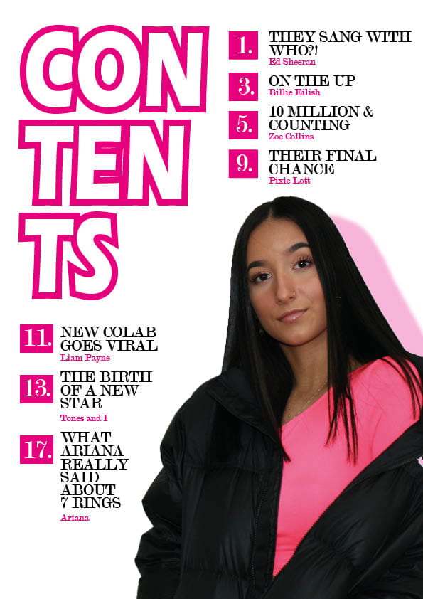
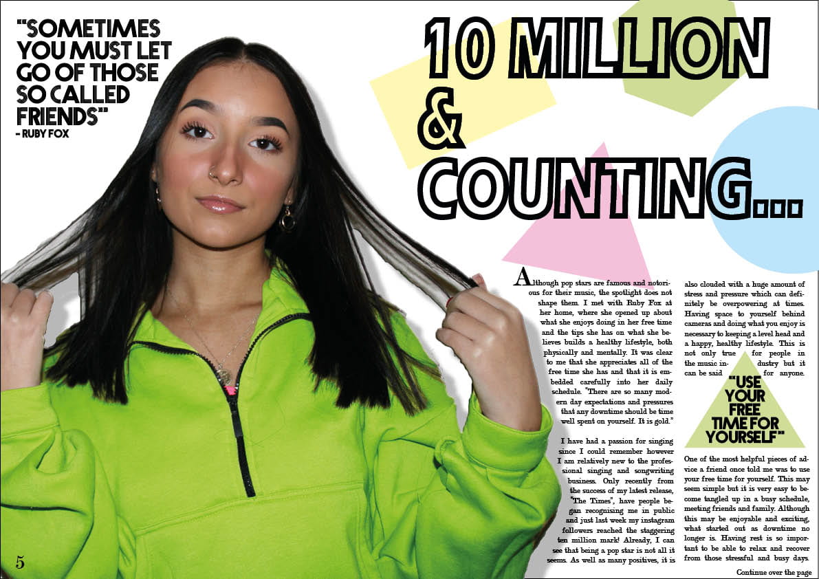
- The large heading clearly shows what this page of my magazine is. It is also quite unique and interesting as it runs across three lines.
- The colour pink runs throughout and fits in with the colour scheme of my magazine.
- The image used is large and interesting. It catches the readers eye.
- The headlines are catchy and are clearly labeled with page numbers.
- The entire page is quite minimalist which avoids any confusion or boredom from too much text.
What doesn’t work?
- There may be too much pink making it a little plain.
- There is only one image.
- The number of articles are uneven. If I add an eighth, there will be four on the top and four on the bottom.
So what are the improvements to be made?
- I need to add a page number to the bottom right corner.
- I can add another headline to fill the gap in the bottom left corner.
- I could add something interesting in the background to add more detail to interest the reader.
- I could add another image or two to intrigue the reader even more into reading the articles.
- I could add/change the colour of the title “contents” so there is more difference and less of the same colour.


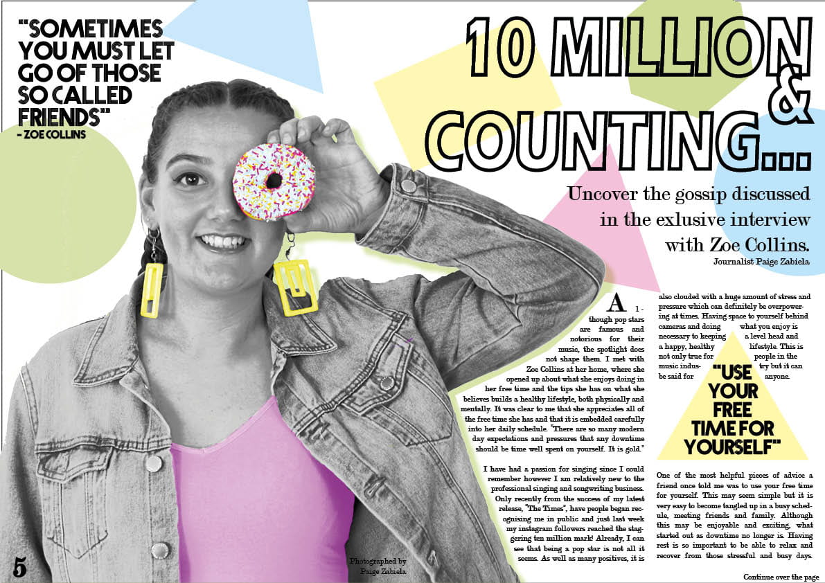

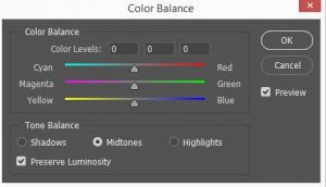 I have learnt how to adjust coloring in my images using the curves and colour balance settings. For example, I used this in making the donut and jumper on the front cover brighter and more fun. This allowed the genre of pop to really be identified through my photos.
 I have discovered and used the spot healing and sharpen tool in my images to make them even more clean and perfect. This helps with the star image look (of perfection) and makes the image more clear and sharp.
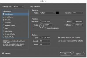 I have learnt how to add effects on In design to make my images even more interesting. I have used the drop shadow to add a sense of dimension to my page. This hopefully interests my audience into feeling a connection to my magazine as it seems more real.
 I have used the stroke and colour settings along with the other font settings to make my text even more unique and fun. I have used this in all of my headings and masthead to make them more aesthetic and in fitting with my genre. Making the text unique allows my audience to be interested as it is different to other magazines.